We spent a good chunk

Taiwo Folu


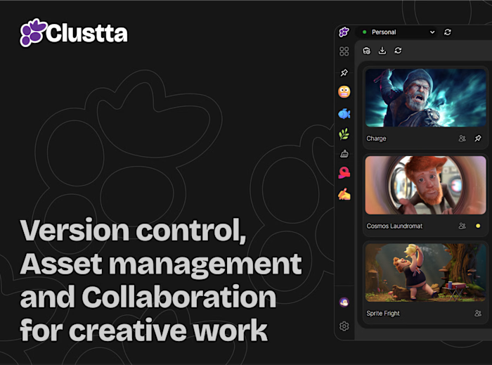
We spent a good chunk of time on the Clustta website going back and forth on tone. There was a real pull to make it feel loud and playful, custom illustrations, quirky copy, that whole energy. But every time we pushed too far in that direction it started working against the product itself.
What we kept coming back to was Notion. It's playful in small doses (icons, tiny illustrations, the occasional line of copy with personality) but the actual interface and messaging stay clean and out of your way. GitHub and Slack were reference points too, since both trust their product to do the talking rather than the marketing page.
So that's where we landed: a site that's calm and direct, with just enough personality showing through (a basketball emoji here, a crossed-out "final final" there) without turning into a distraction. Still tweaking things as we go, but happy with where it's settled for now
Like this project
Posted Sep 2, 2026
We spent a good chunk of time on the Clustta website going back and forth on tone. There was a real pull to make it feel loud and playful, custom illustratio...