UX Design for a High-Converting E-Commerce Website

Stefan S


I led the redesign of D-Toys, a Romanian board-game and puzzle brand, and rebuilt it end to end into ROOVI — a modern webshop. The old site barely worked: people couldn't find products, and most left before buying. As lead UI/UX designer and researcher, I owned the whole thing, from user interviews to the design system.
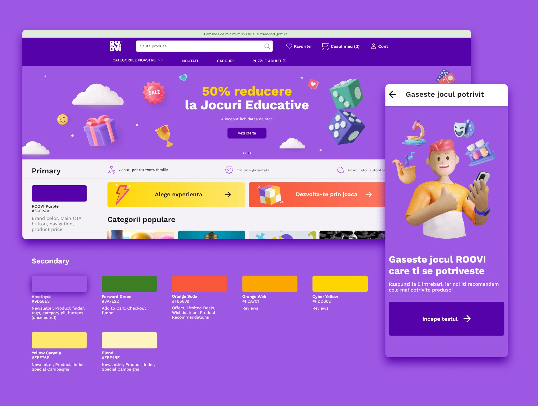
D-Toys to ROOVI — project hero
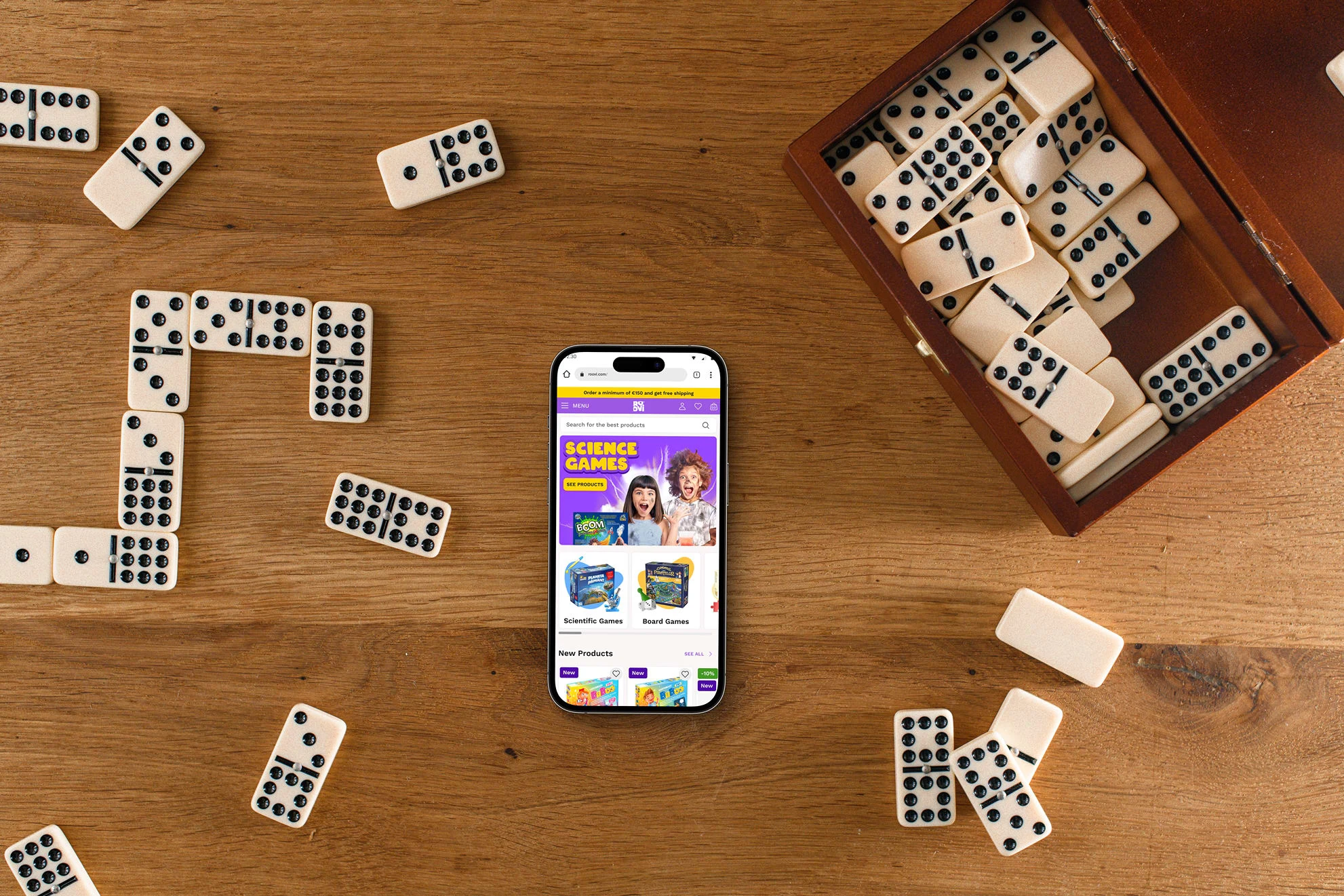
ROOVI redesign overview
🧶 Problem
D-Toys had a loyal offline following but a webshop that actively got in the way. Navigation was confusing, the catalog was hard to browse, and the checkout leaked customers at every step. The brand was also rebranding to ROOVI, so I wasn't just fixing a store — I had to earn back trust from shoppers used to bigger, more familiar marketplaces, and give them a reason to buy here instead.
💡 Solution
I rebuilt the experience around one question: how does a parent actually shop for a kids' game? Grounded in interviews and research, I streamlined the path from landing to purchase — clearer product discovery, filters that match how parents think (age, theme, number of players, skills), and a checkout that stops fighting the user. Every screen had to feel modern and trustworthy enough to convert first-time visitors.
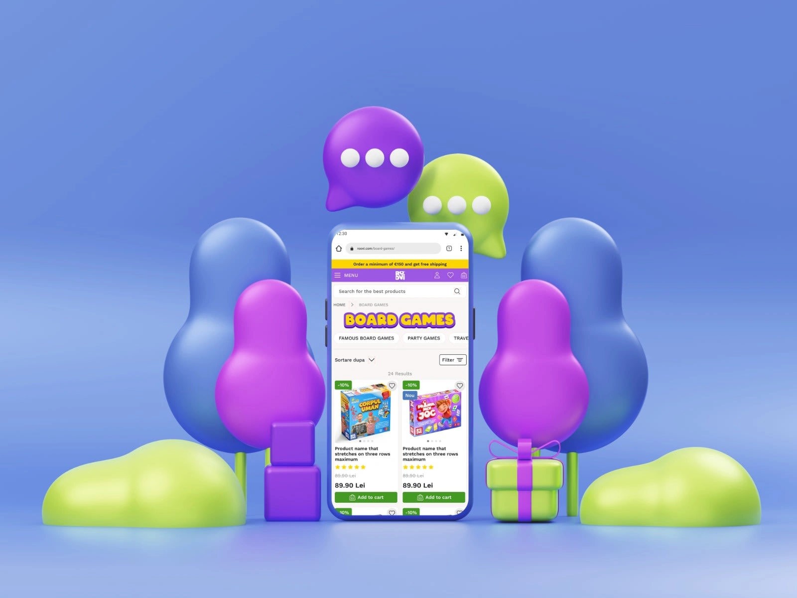
ROOVI UI preview
🔬 Research Strategy
I ran a mix of qualitative and quantitative research to understand both the shopper and the market.
What I wanted to learn:
How Romanian parents aged 25–45 actually shop, and what they expect online
Where the current experience frustrates them
What makes someone switch from a familiar marketplace to a new store
What parents look for when choosing educational games for their kids
What would change how people saw the rebranded ROOVI
User Interviews
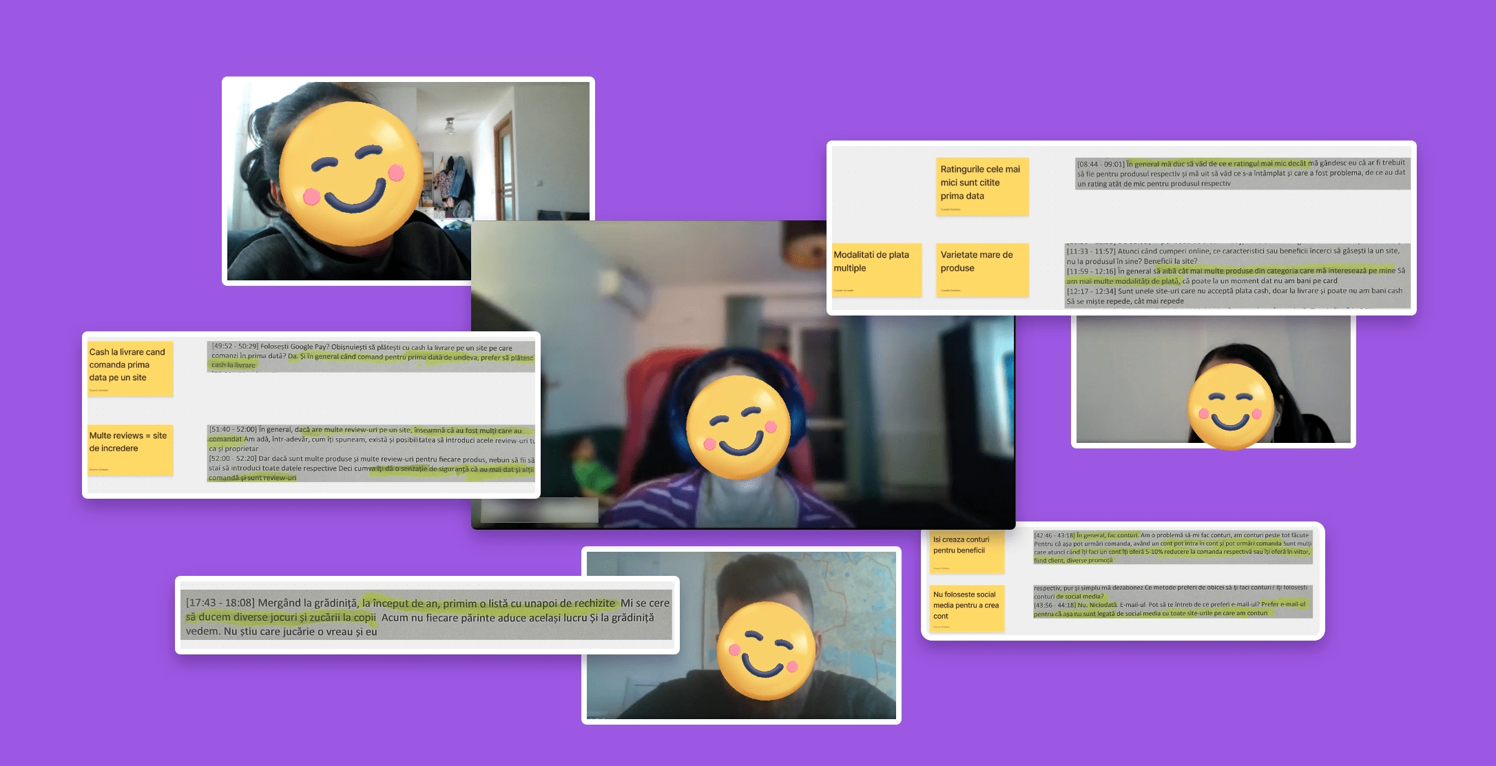
User interview insights
I interviewed 5 parents over a week about their routines and how they shop for games. Clear patterns emerged: they lean heavily on detailed product images and reviews before buying, they build lists to remember and share options, and they want to filter by age, theme, number of players, and skills. These findings drove the personas and stayed pinned to the wall through every design decision.
User Persona
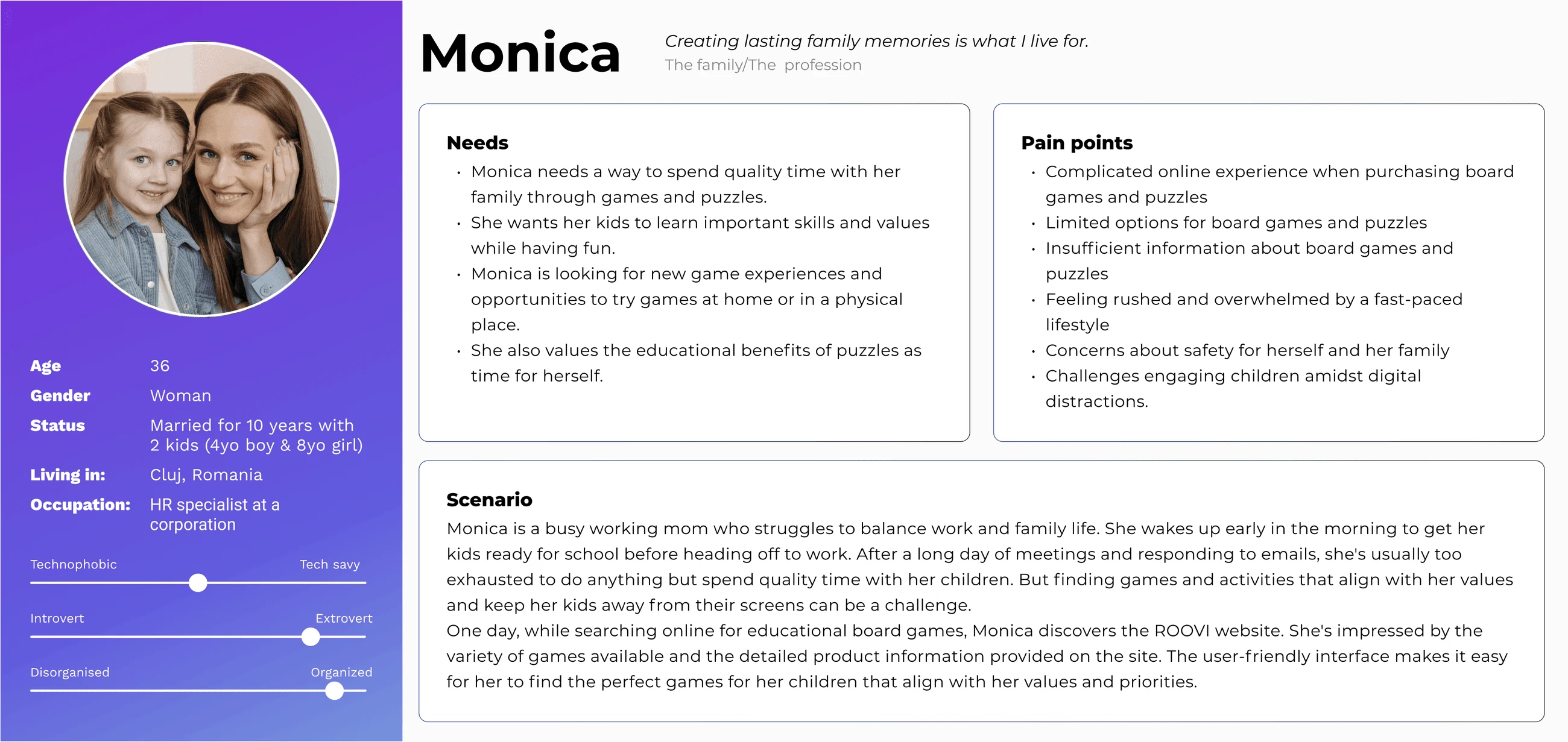
Monica — user persona
Meet Monica, the persona that anchored the work: a busy parent who wants to make a good, quick choice she feels confident about.
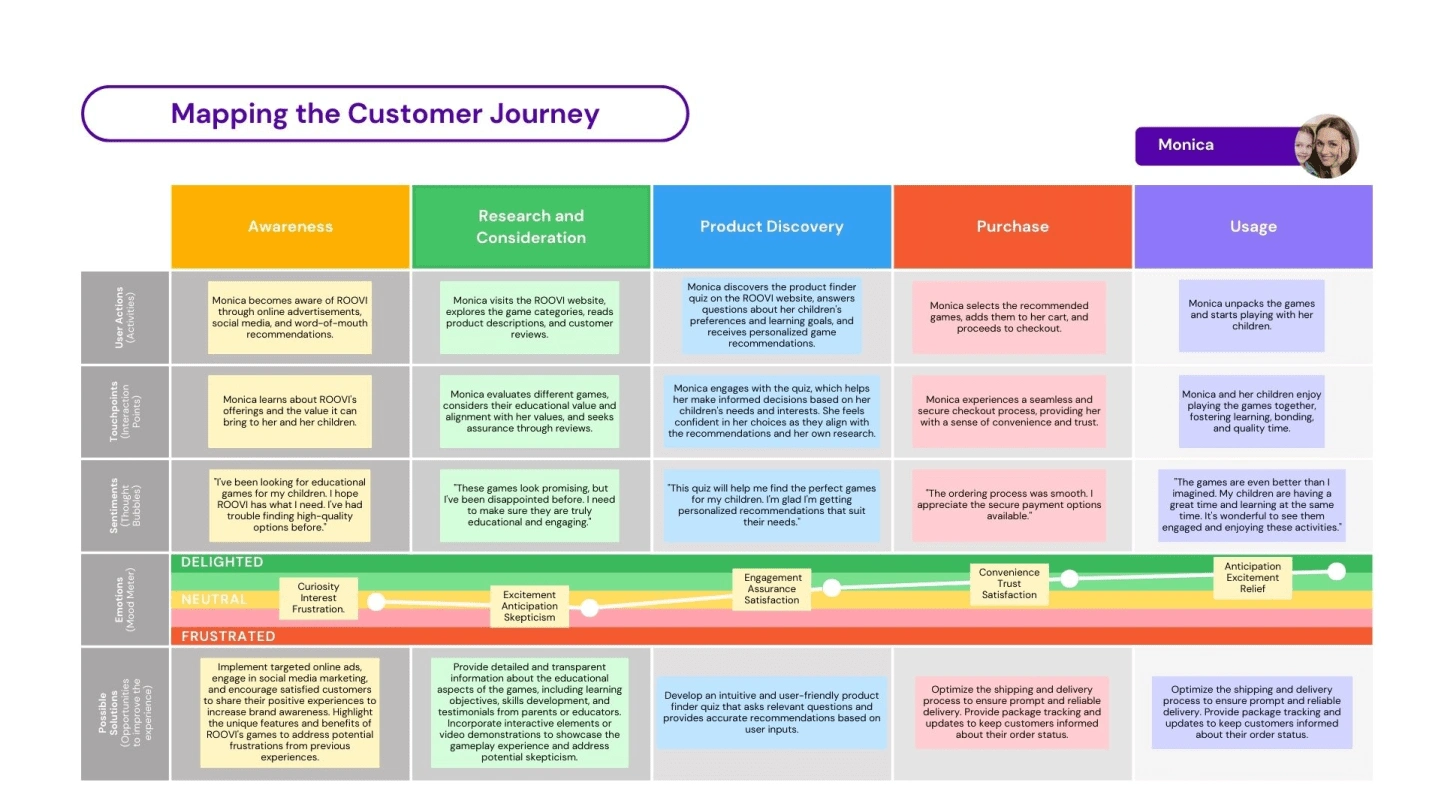
Customer Journey
I mapped Monica's journey stage by stage — what she does, thinks, and feels, and where trust breaks down — so the design could target the real friction points instead of guessing.
Customer journey map
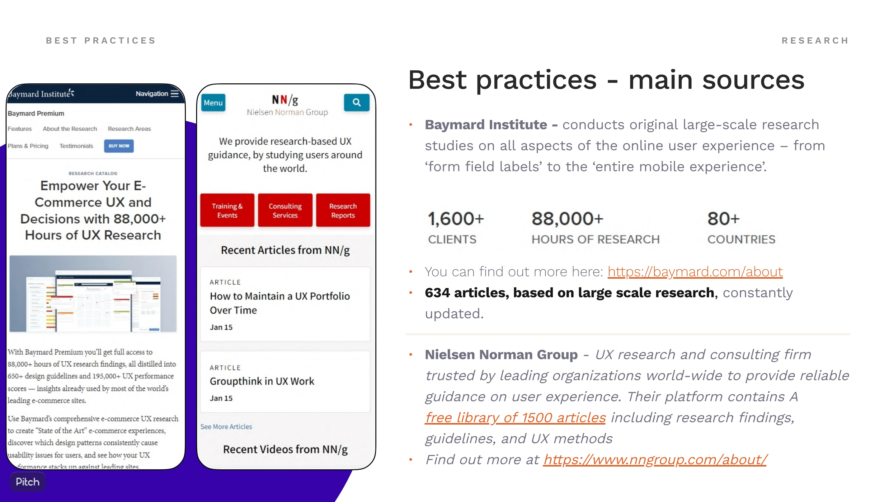
Secondary Research
I studied e-commerce and UX best practices to benchmark ROOVI against industry standards and find concrete opportunities to do better.
Secondary research
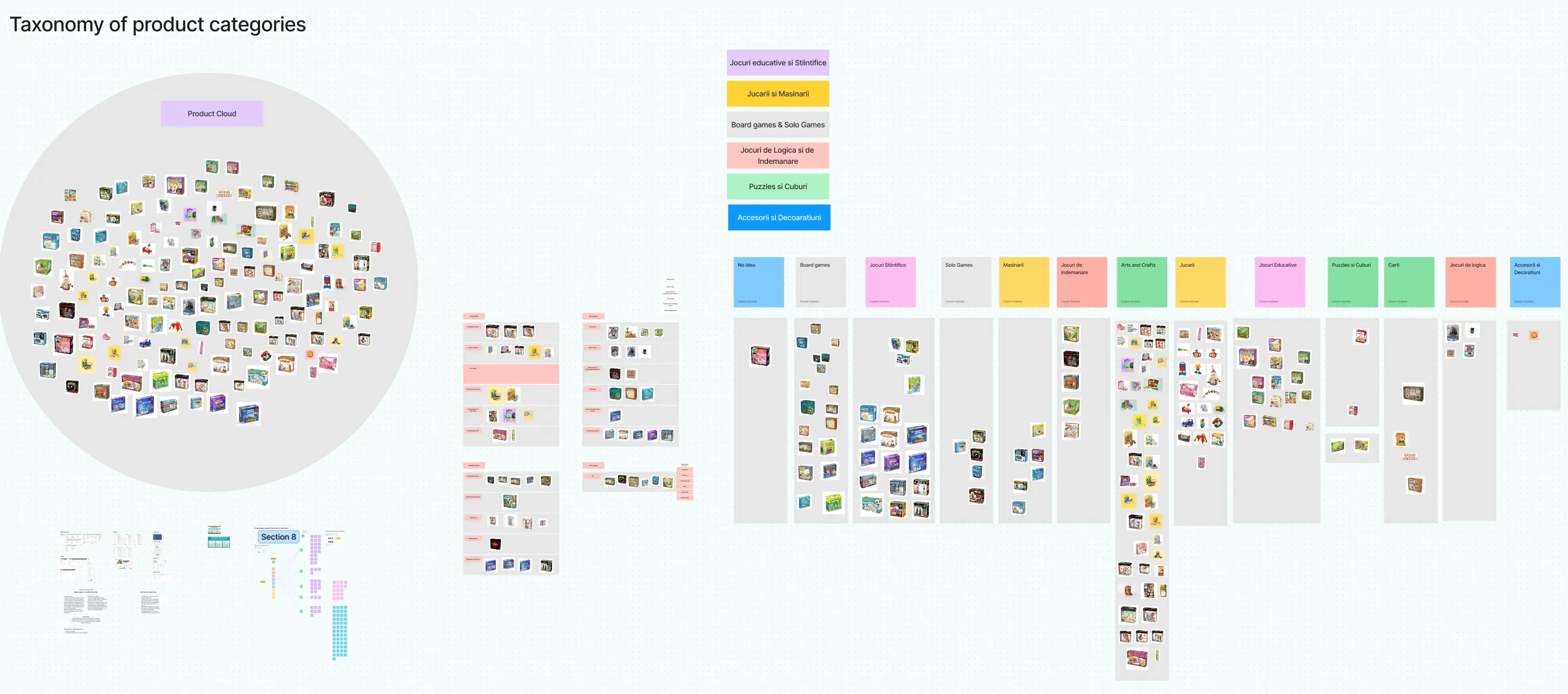
Category Taxonomy
Product category taxonomy is a crucial aspect of any e-commerce website, including D-Toys. It involves organizing and categorizing products in a logical and user-friendly manner, making it easier for customers to navigate and find what they are looking for. By carefully crafting the product category taxonomy, I aimed to enhance the user experience on the D-Toys website. The taxonomy provides a clear and organised structure, allowing users to easily locate and explore the desired products, ultimately driving engagement, conversions, and customer satisfaction.
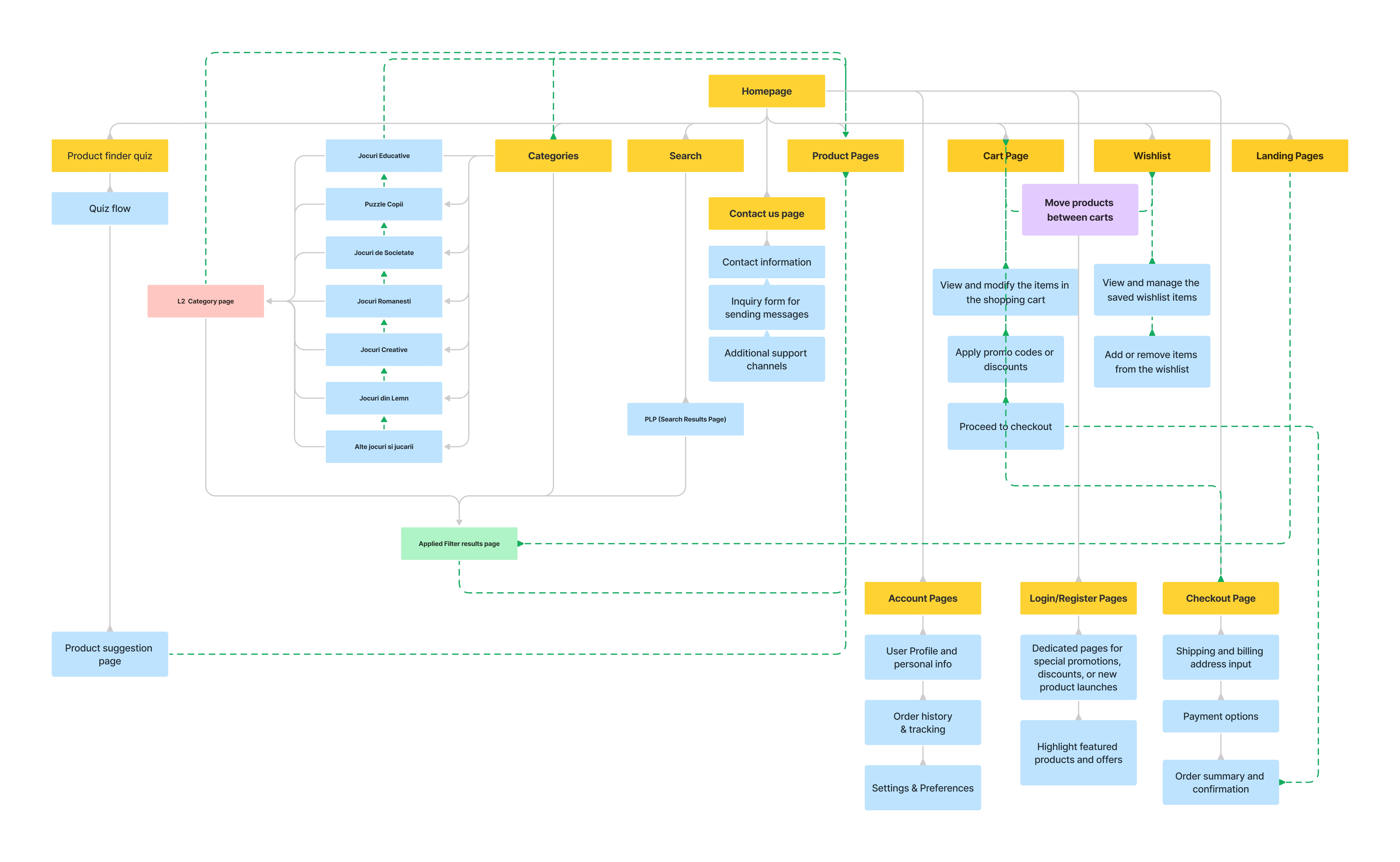
🧭 Information Architecture
I restructured the catalog around how parents like Monica search — by age, theme, and skill rather than internal categories — so finding the right game takes a couple of taps, not a scavenger hunt.
Information architecture and sitemap
📐 Wireframes
Wireframes let me lock the hierarchy and page structure before any visual polish — where navigation, content, and calls to action sit — so the flow made sense on its own, guiding users through the store intuitively.
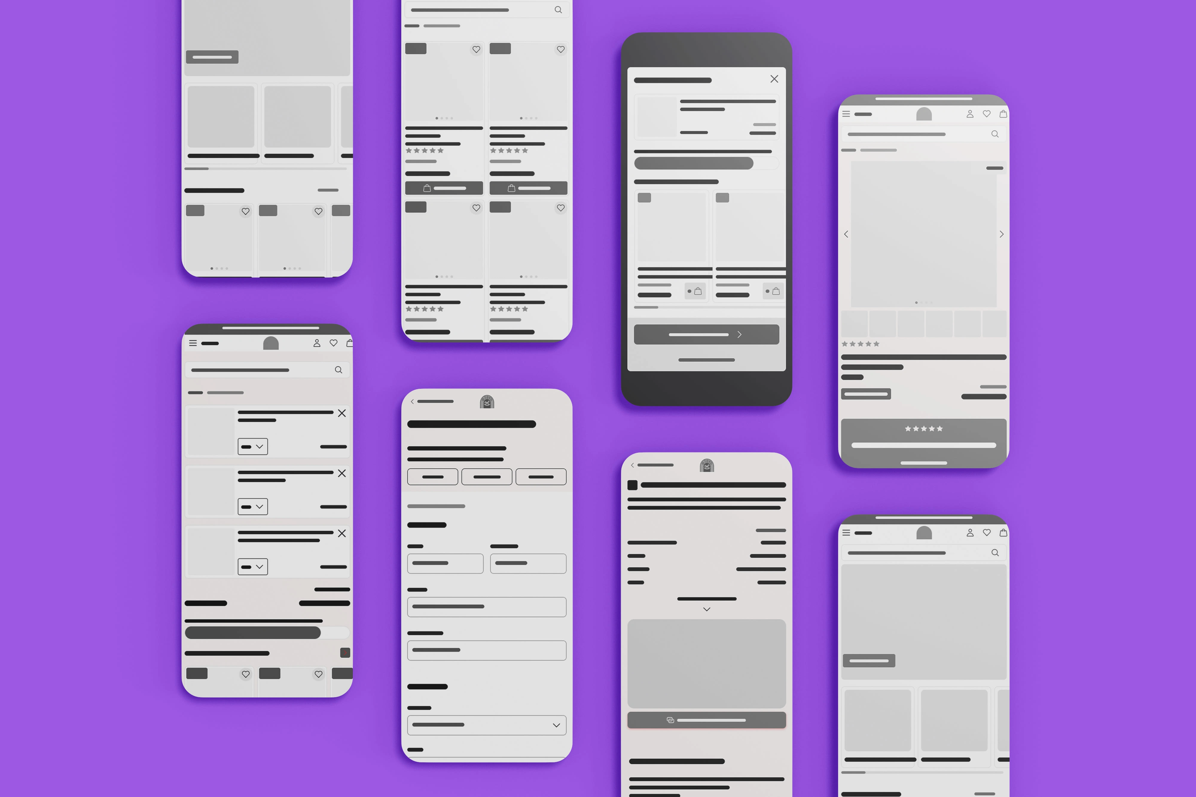
Wireframes
👩💻 Usability Testing & Iteration
A real example of testing changing the design:
The problem: once users added a product to the cart, they felt stuck. 3 of 5 testers said they had no clear way back to the search or filtered list they'd been browsing.
The decision: keep people in the shopping flow. I replaced the now-redundant "go to cart" button in the add-to-cart confirmation with a "back to list" button, and added the same escape hatch to every product page (or "back to home" for users who landed directly on a product). Small change, but it removed a dead end that was cutting sessions short.
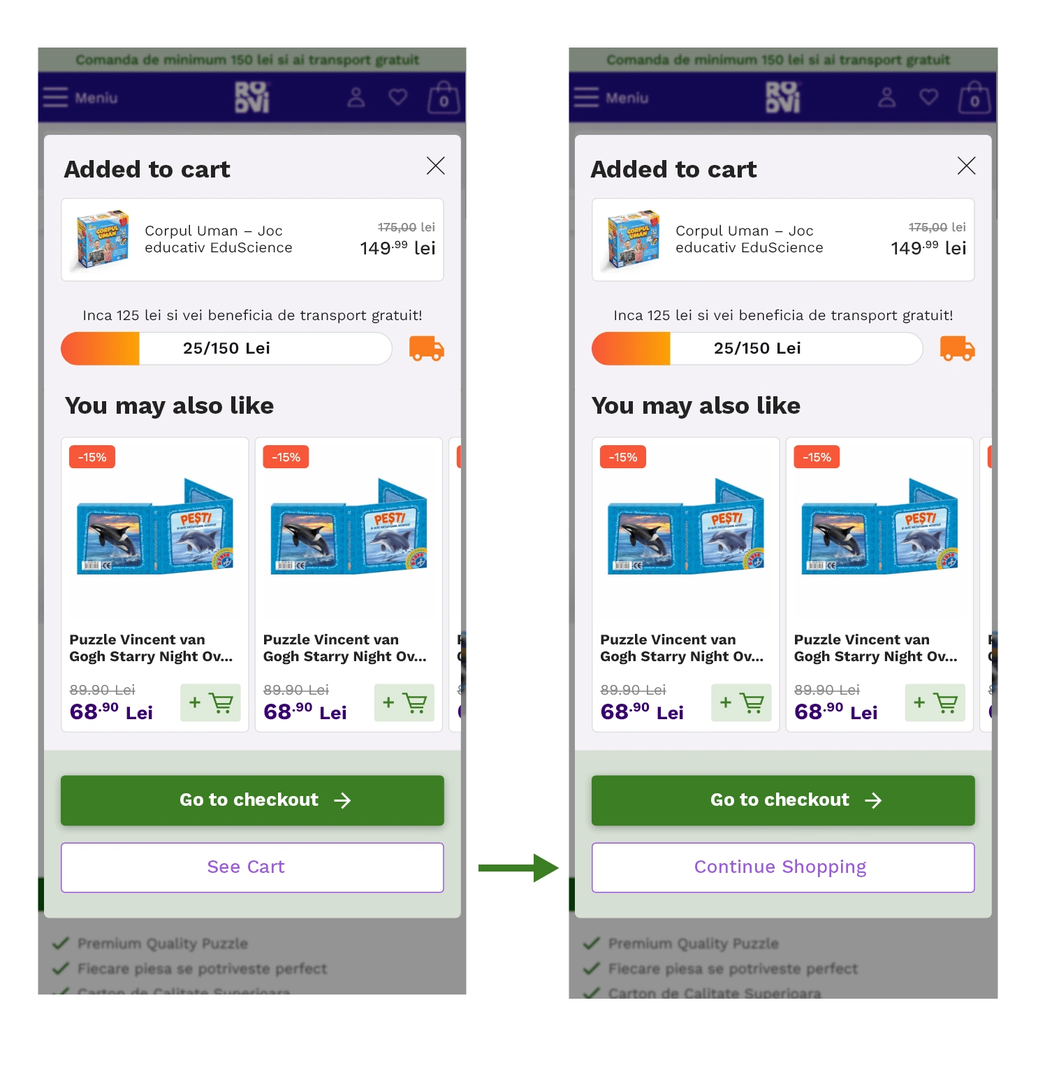
Left: the product-added modal with the option to go to cart or checkout. Right: users can keep exploring before entering the checkout funnel.
⭐ UI Design
With the usability issues fixed, I designed the final screens in Figma. I gave ROOVI a fresh, modern, welcoming look built on Material Design principles — clean visuals and familiar, intuitive interactions — so the store felt contemporary and easy to trust.
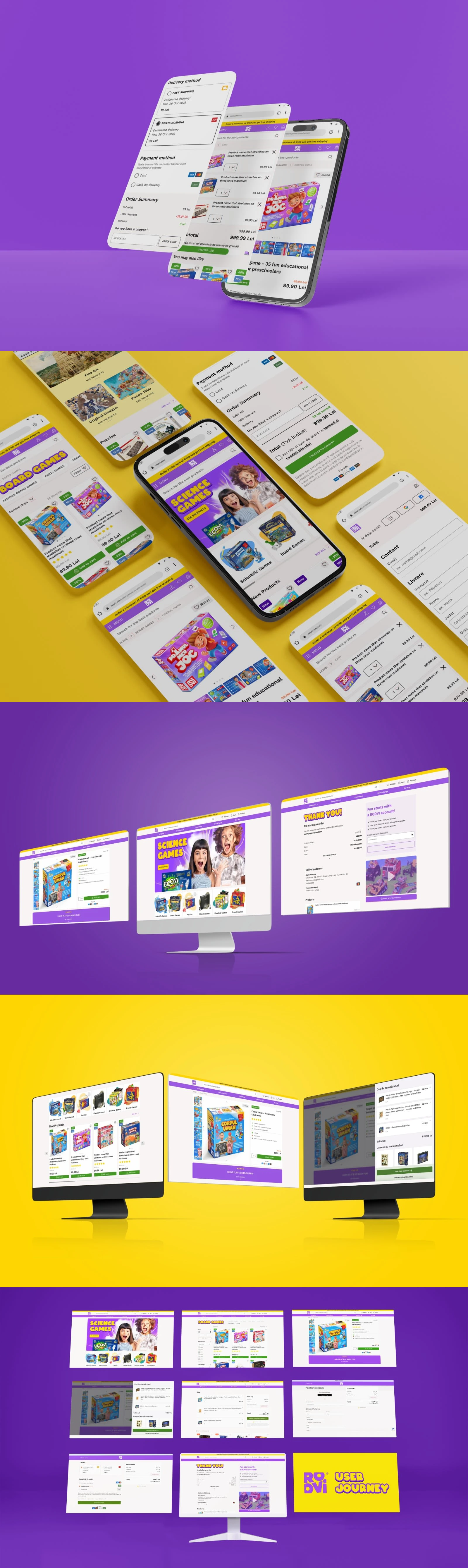
ROOVI final UI screens
ROOVI UI interaction
🧱 Design System
I built ROOVI's design system from scratch, drawing on Material Design and IBM Carbon. Reusable components, a set type scale, color palettes, and layout rules keep the whole platform consistent — and made it far faster to design and ship new pages without the UI drifting.
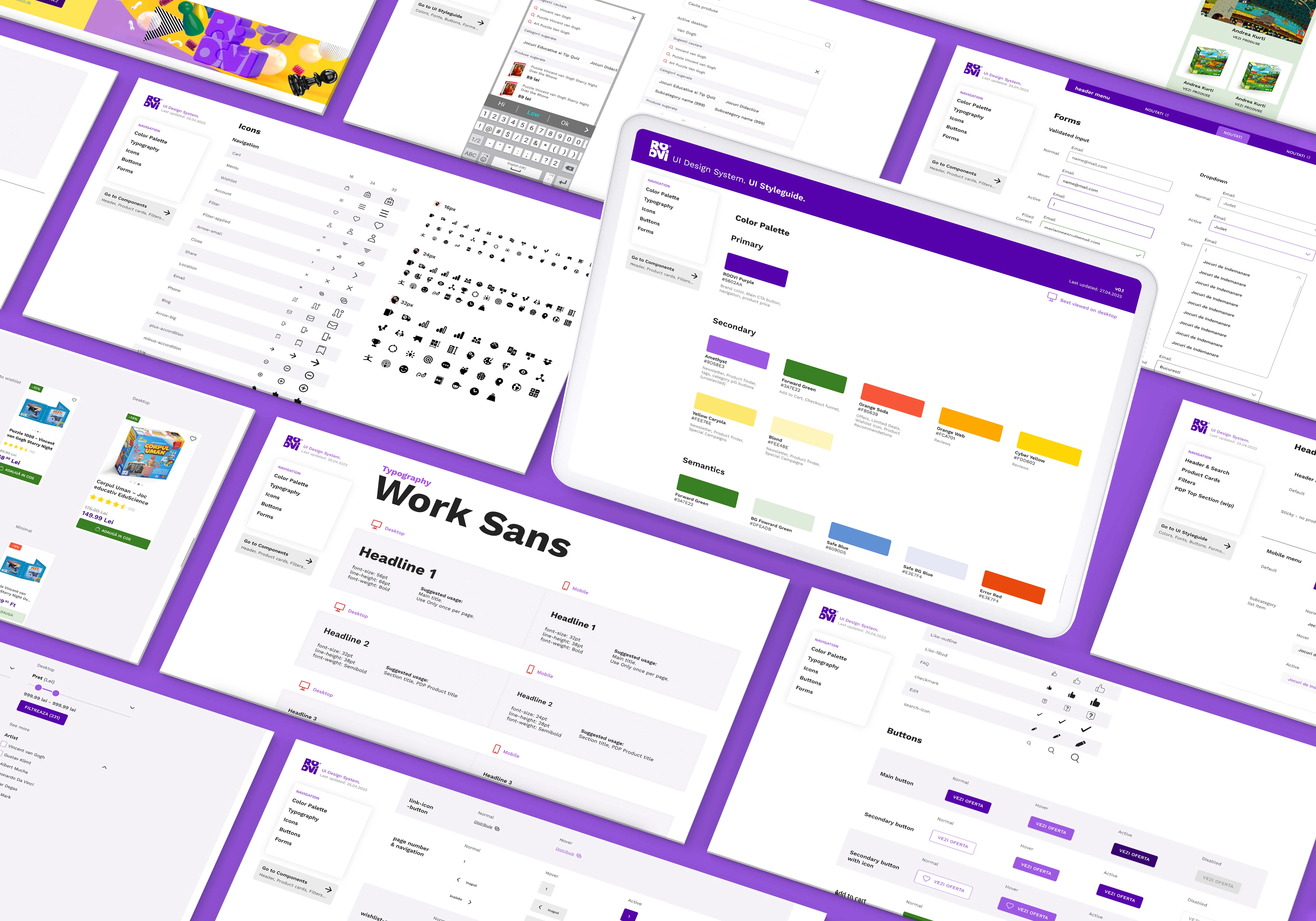
ROOVI design system
✨ Conclusion
This project was a full turnaround: taking a webshop people avoided and rebuilding it into one they actually buy from. I stayed close to the users' needs and frustrations the whole way, and let the research — not opinion — drive the decisions.
Measurable results
⬆️ Nearly tripled conversions — a 269% increase in the second half of the year, after launch, compared with the first half on the old site.
⬇️ Bounce rate cut by ~40% — after redesigning the shopping cart and rescuing users from dead ends.
What I've learned
This reinforced how much simplicity, focus, and intuitive interaction matter — and how far careful research can move a business result. It's the kind of work I want to keep doing: sweating the details until the whole experience just works.
Thank you!
Feel free to contact me for the design project of your dreams.
Like this project
Posted Mar 22, 2024
How I rebuilt D-Toys into ROOVI — a modern store that nearly tripled conversions: research, IA, interaction design, and a design system built from scratch.
Likes
0
Views
61