Kidolin: Baby Care Brand & Packaging Design

Abox Agency
The Brief
Kidolin, a baby care brand, needed a complete visual transformation. The existing packaging and brand identity weren't connecting with modern parents. They came to us for brand refinement, packaging design, and 3D product visualization that could work across both physical shelves and digital channels.
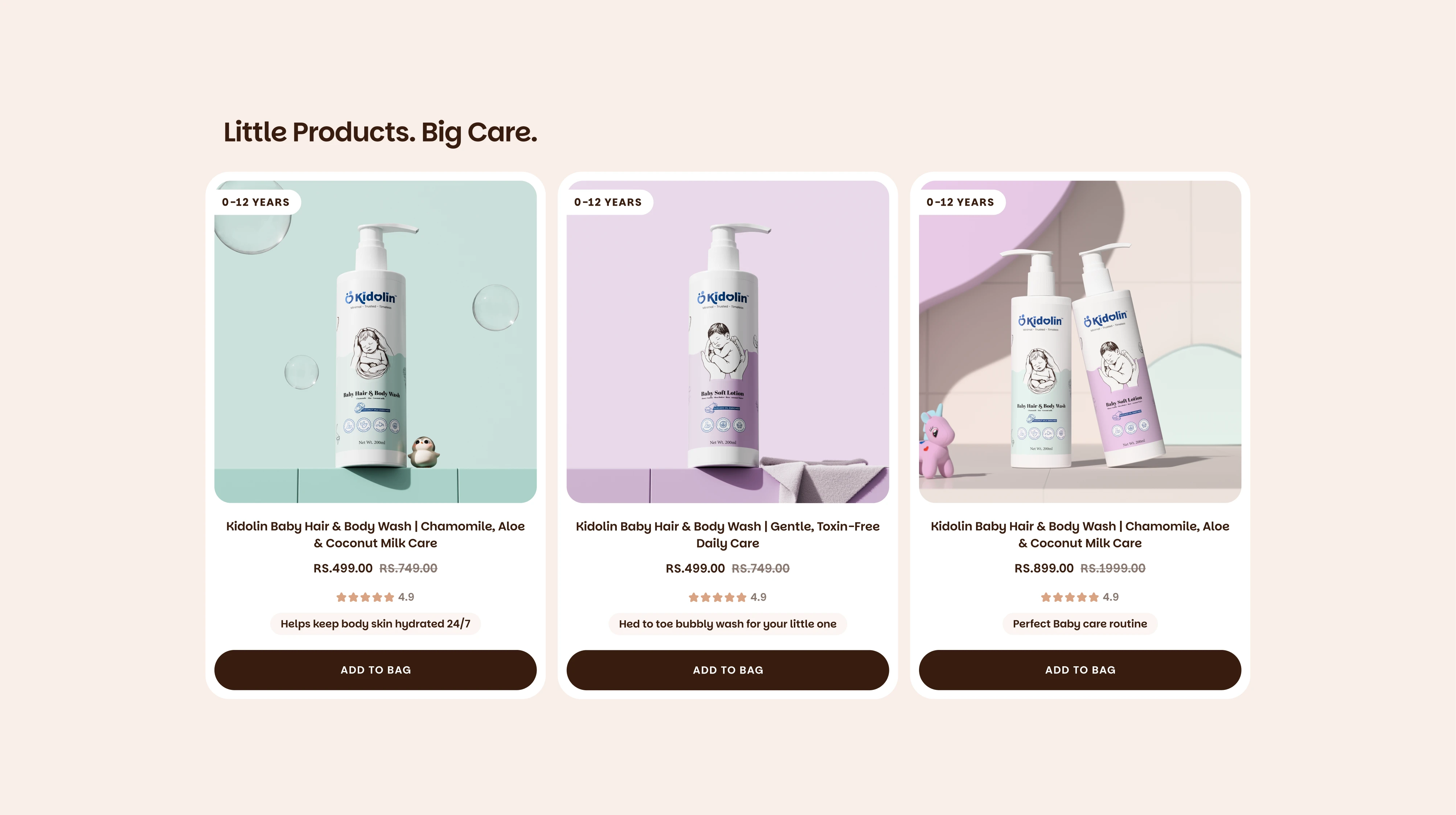
Kidolin brand analysis
The Challenge
The existing identity relied on vibrant colors, inconsistent typography, and packaging that failed to communicate safety, softness, or trust. In baby care, those are the three things parents look for before anything else. The packaging needed to earn confidence at a glance.
Our Approach
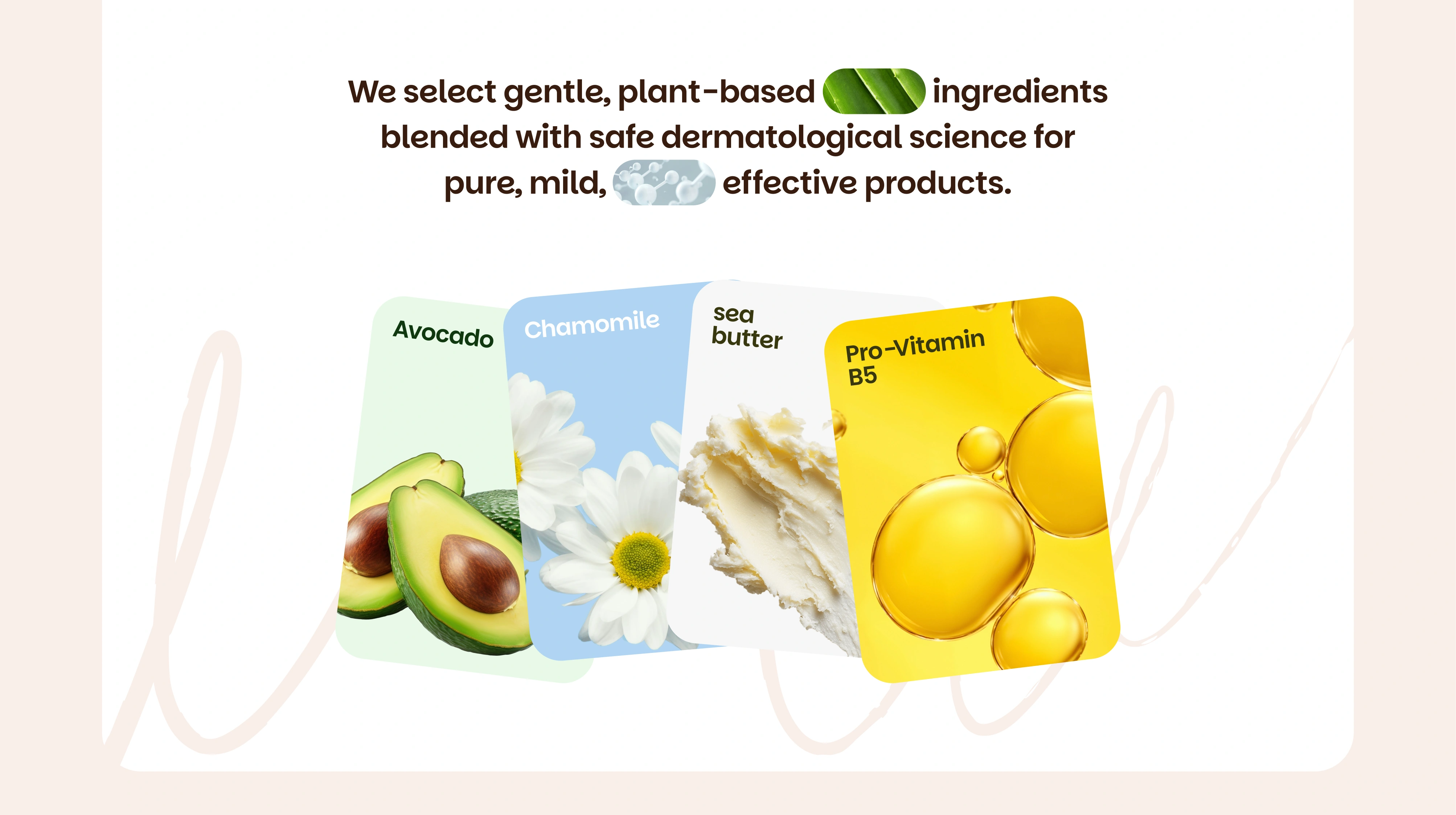
Visual Language: We stripped back the noise and built a softer color palette around warm neutral tones. Typography was simplified for readability while keeping a friendly, approachable personality.
Custom Illustration System: We designed a parent bear holding its cub as the emotional anchor of the brand. Rather than decorative graphics, this character system communicates protection, care, and parental bonding through storytelling. It's memorable, approachable, and specific to baby care.
Kidolin packaging design
Information Hierarchy: Parents make decisions based on ingredients, safety claims, and age suitability. We restructured the packaging layout so product name, key ingredients, benefits, and safety information are easy to scan and clearly prioritized.
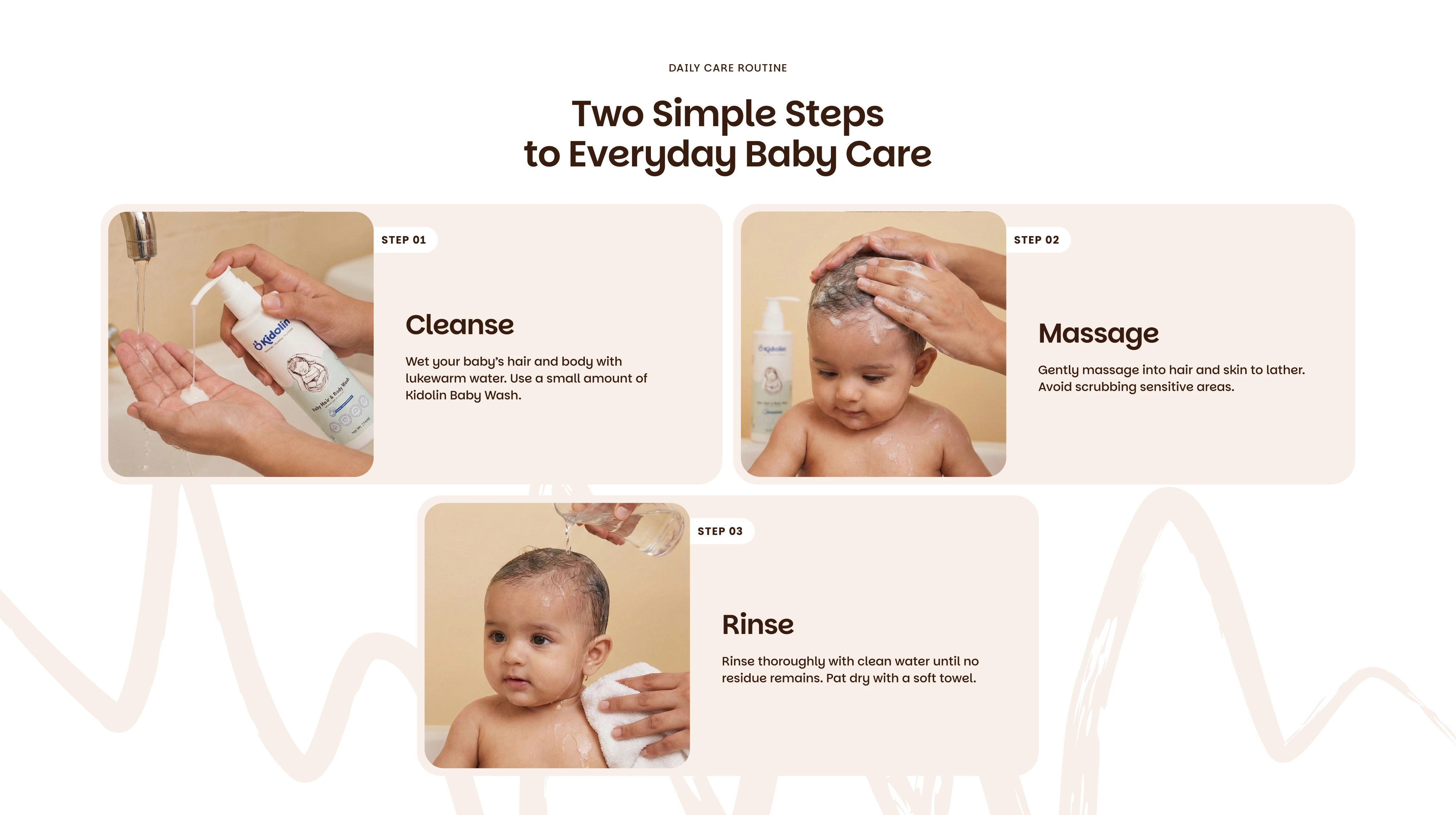
Kidolin packaging details
The Work
The final packaging combines soft peach tones, generous white space, rounded forms, and clean typography. It feels gentle enough for baby care while standing out on the shelf.
To extend the brand into digital, we created a full set of 3D product visualizations. Soft lighting, floating bubbles, and warm environments maintain the same emotional tone across eCommerce listings, social media, advertising, and the website.
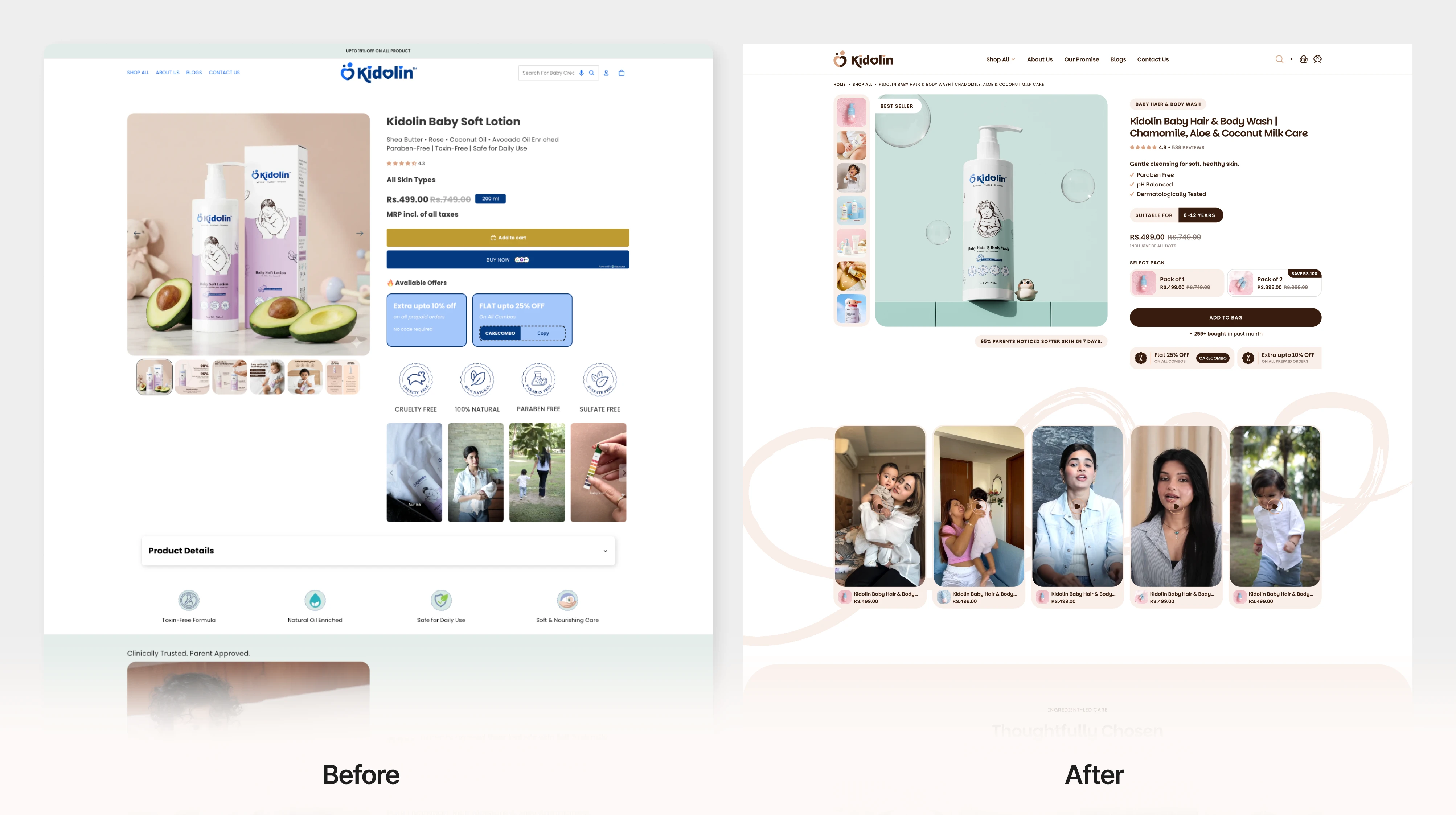
Kidolin 3D product visualization
The Result
Kidolin now has a cohesive brand system that works across every touchpoint. The packaging communicates trust and comfort before a parent even picks up the bottle. The 3D renders give the brand a consistent, premium visual presence online. Every element, from illustration to typography to color, works as a single system built around one idea: parents buy trust first.
Like this project
Posted Jul 22, 2026
Brand identity, packaging design, and 3D product visualization for a baby care brand built around trust and parental connection.
Likes
1
Views
10
Timeline
Jul 1, 2025 - Ongoing
Clients
Kidolin