Design a donation flow for a charity
The product:
The Donation Drive for DonationApp is an initiative
aimed at raising funds and resources to support the
noble cause and activities of DonationApp The project
seeks to engage individuals, organizations, and
communities in contributing towards creating a
positive impact on the lives of those in need.
Project overview
Project duration:
May 2023 to June 2023
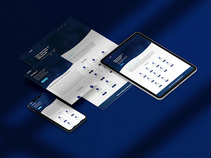
Preview of selected polished designs.
The problem:
Insufficient donations hinder the charity's
ability to provide essential support and
services to those in need, jeopardizing their
well-being and limiting the organization's
impact on improving lives.
Project overview
The goal:
Our goal is to raise funds and donations to
support our charity's mission, making a
positive impact on the lives of those in need
and creating a brighter future for our
community. Together, let's make a difference
and inspire hope through your generous
contributions.
My role:
Leading UX Designer
Project overview
Responsibilities:
Conducting user interviews, paper and digital
wireframing, low and high fidelity prototyping,
conducting usability study, accounting for
accessibility, iterating on designs and
responsive design.
Understanding
the user
● User research
● Personas
● Problem statements
● User journey maps
User research: summary
The purpose of this user research was to gain insights into the motivations, preferences, and
experiences of individuals when it comes to making donations for a charitable cause. The research
aimed to understand the factors that influence donation decisions, the preferred donation
methods, and the overall donor experience.
Methodology:
The user research employed a combination of qualitative and quantitative methods to gather data
and insights. The research methods included:
• Online Surveys
• In-depth Interviews
User research: pain points
Lack of Transparency
Many donors feel
uncertain about how their
donations are being used
and whether they are
making a meaningful
impact. The lack of
transparency in the
donation process can be a
major pain point for users.
Complex donation Process
Some charities have
complicated and lengthy
donation processes that
require donors to navigate
multiple steps, forms, and
payment options. This
complexity can frustrate
users and discourage them
from completing their
donations.
Lack of Personal Connection
Some donors desire a
more personal connection
with the causes they
support, but they may find
it challenging to establish
such a connection through
traditional donation
processes. This lack of
personalization can leave
users feeling disconnected
and less motivated to give.
Difficulty Tracking Impact
Donors may have concerns
about the legitimacy and
credibility of a charity. If a
charity lacks clear and
detailed information about
its mission, impact,
financial accountability,
and governance, users
may hesitate to donate.
1 2 3 4
Persona: Lisa
Problem statement:
Lisa is a high school student who
needs create own fundraising
page because make charitable
initiatives involve her friends and
classmate.
User journey map
I created a user journey
map of Lisa’s experience
using the site to help
identify possible pain point
and improvement
opportunties.
● Sitemap
● Paper wireframes
● Digital wireframes
● Low-fidelity prototype
● Usability studies
Starting
the design
Sitemap
Difficulty with website
navigation with a primary
pain point for the user So I
create a sitemap.
Paper wireframes
Next I sketched out paper wireframe
for each of my screeen in my app,
keeping the user pain point about the
navigation, browsing and checkout
flow in mind.
The home screen paper wireframe
variations focus on optimize the
browsing experience for the users
Paper wireframe screen size variation(s)
Because my app customers
access the site on variaty of
devices, I started to work on
designs for additional
screen sizes to make sure
the site is would be fully
responsible
Digital wireframes
Moving from paper to digital
wireframes made is easy to
understand how to redesign
could help address user pain
point and improve user
experience.
Prioritizing useful button
locations and visual element
placement on the homepage
was key part of my strategy.
Clear click to call action button
Pages are easily accessible.
Digital wireframe screen size variation(s)
Low-fidelity prototype
To create a low-fidelity
prototype, I
connected all of the
screens involved in the
primary user flow. View Low-fidelity prototype
Usability study: parameters
Study type:
Unmoderated usability study
Location:
United States, remote
Participants:
5 participants
Length:
20-30 minutes
Usability study: findings
Insert a one to two sentence introduction to the findings shared below.
Participants expressed a strong
desire for transparency and clarity
regarding how their donations
would be utilized.
Clear Donation Purpose
Simplify Donation Form
Multiple Donation Options
Several participants found the
donation form to be lengthy and
overwhelming, leading to
frustration. Simplifying the form
by reducing the number of
required fields and utilizing a
progress indicator could enhance
the overall user experience.
Participants appreciated
having multiple donation
options, such as one-time,
monthly, or custom
amounts.
1 2 3
● Mockups
● High-fidelity prototype
● Accessibility
Refining
the design
Mockups
Based on the insight from the Usabilty study, I have made the changes to improve donation
purpose event. I added the fundrasing the categories
Before usability study After usability study
Mockups: Original screen size
Mockups: Screen size variations
High-fidelity
prototype
My hi-fi prototype followed
the same user flow as the
lo-fi prototype and included
the design changes made
after the usability study.
Accessibility considerations
I used heading with
different sized text for
clear visual hierachy.
This includes providing
alternative text for
images, using clear and
easy-to-understand
language, providing
captions for videos, and
ensuring that the website
is compatible with screen
readers and assistive
technologies.
Provide clear and concise
instructions for making
donations. Use plain
language and avoid
jargon or complex
terminology. Make sure
the steps are easy to
follow and understand for
all donors.
1 2 3
● Takeaways
● Next steps Going forward
Takeaways
Impact:
Our target users shared that the design was
intuitive to navigate through, more engaging
with the images, and demonstrated a clear
visual hierarchy.
What I learned:
I learned that even a small design change can
have a huge impact on the user experience.
The most important takeaway for me is to
always focus on the real needs of the user
when coming up with design ideas and
solutions.
Next steps
Conduct follow-up
usabilty testing on the
new website.
Indentify any additional
areas of need and ideate
on the new features.
1 2
Let’s connect!
Thank you for reviewing my work.
If you’d like to see more, or would to like to get in touch, my contact information is provided below:
Like this project
Posted Sep 20, 2024
The project seeks to engage individuals, organizations, and communities in contributing towards creating a positive impact on the lives of those in need.


