Beaufort Private Equity Rebranding Project

Artur Mikhov



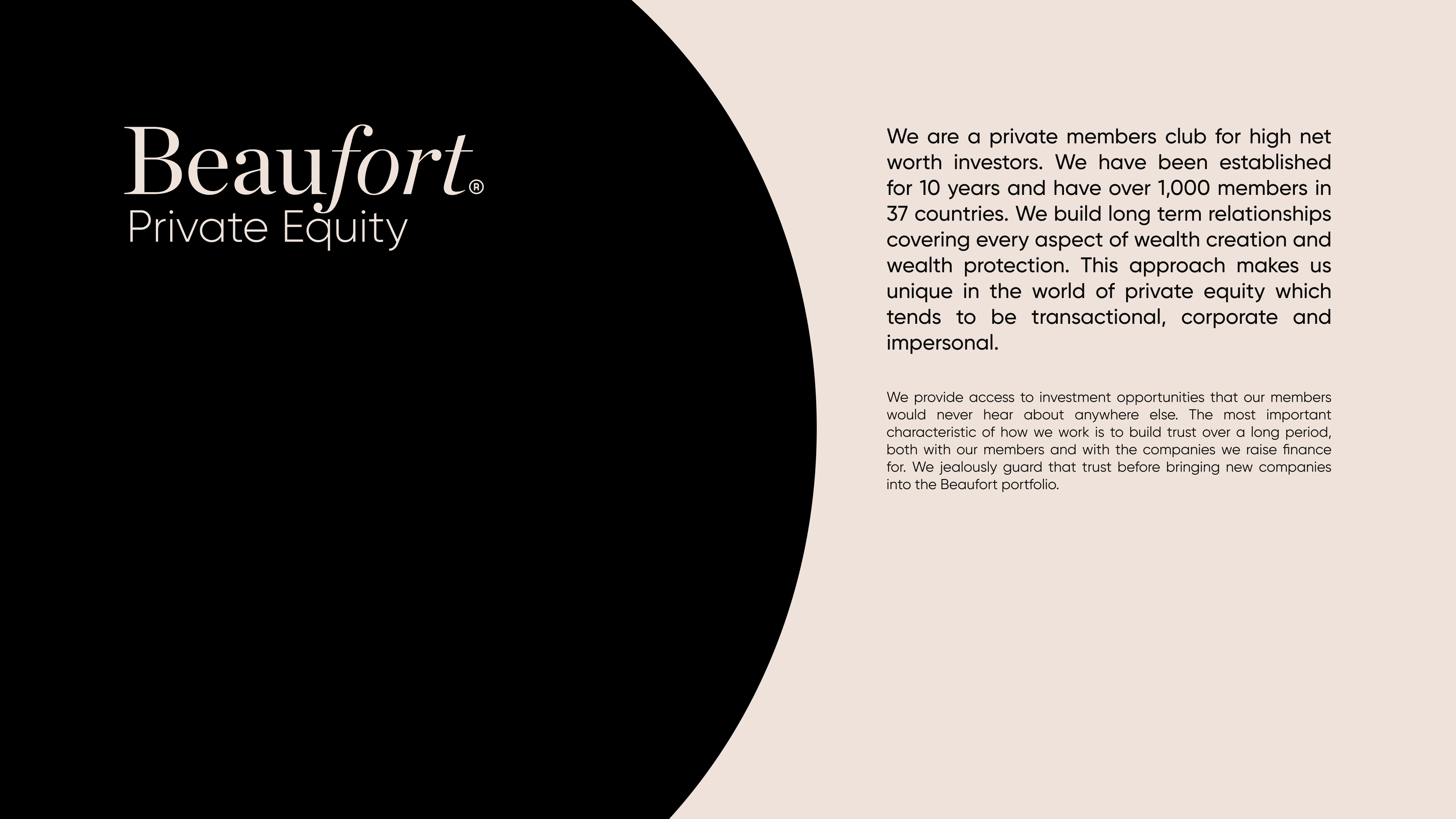
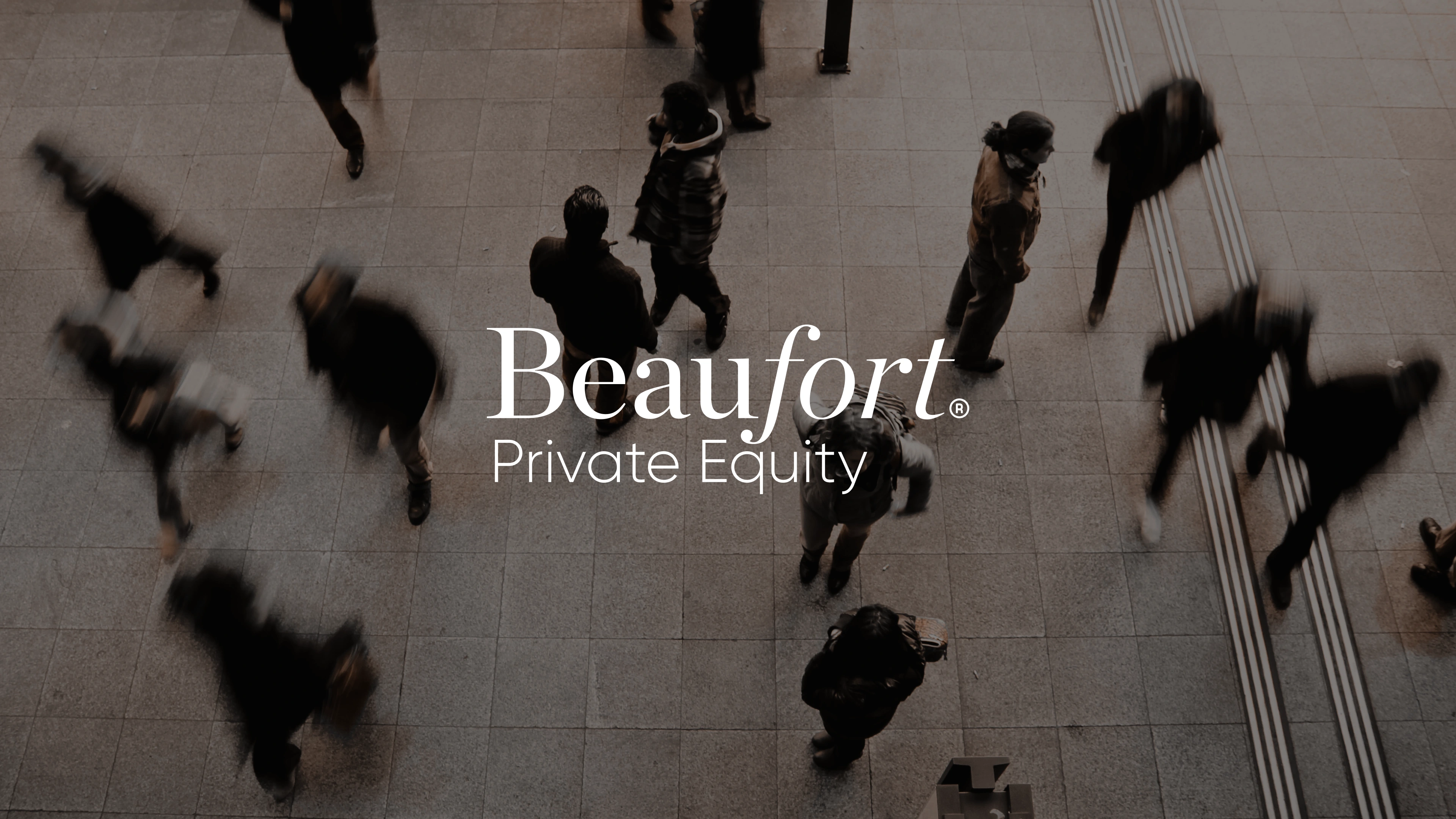
Beaufort Private Equity is a private members club for high-net-worth investors, focused on long-term trust, relationships, and unique investment opportunities. The rebrand was created to move away from traditional corporate finance aesthetics and build a more personal, confident, and inclusive identity.
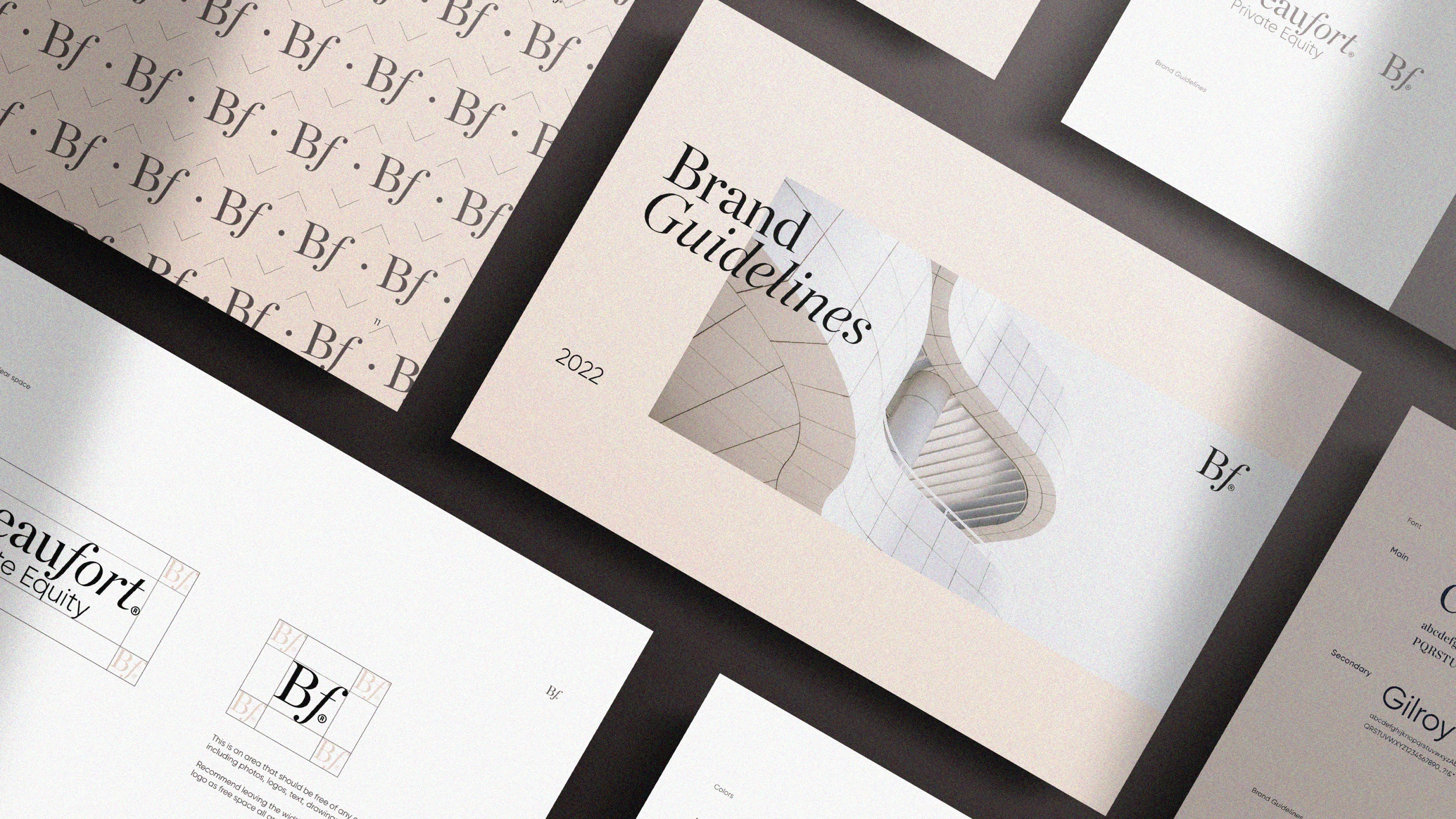
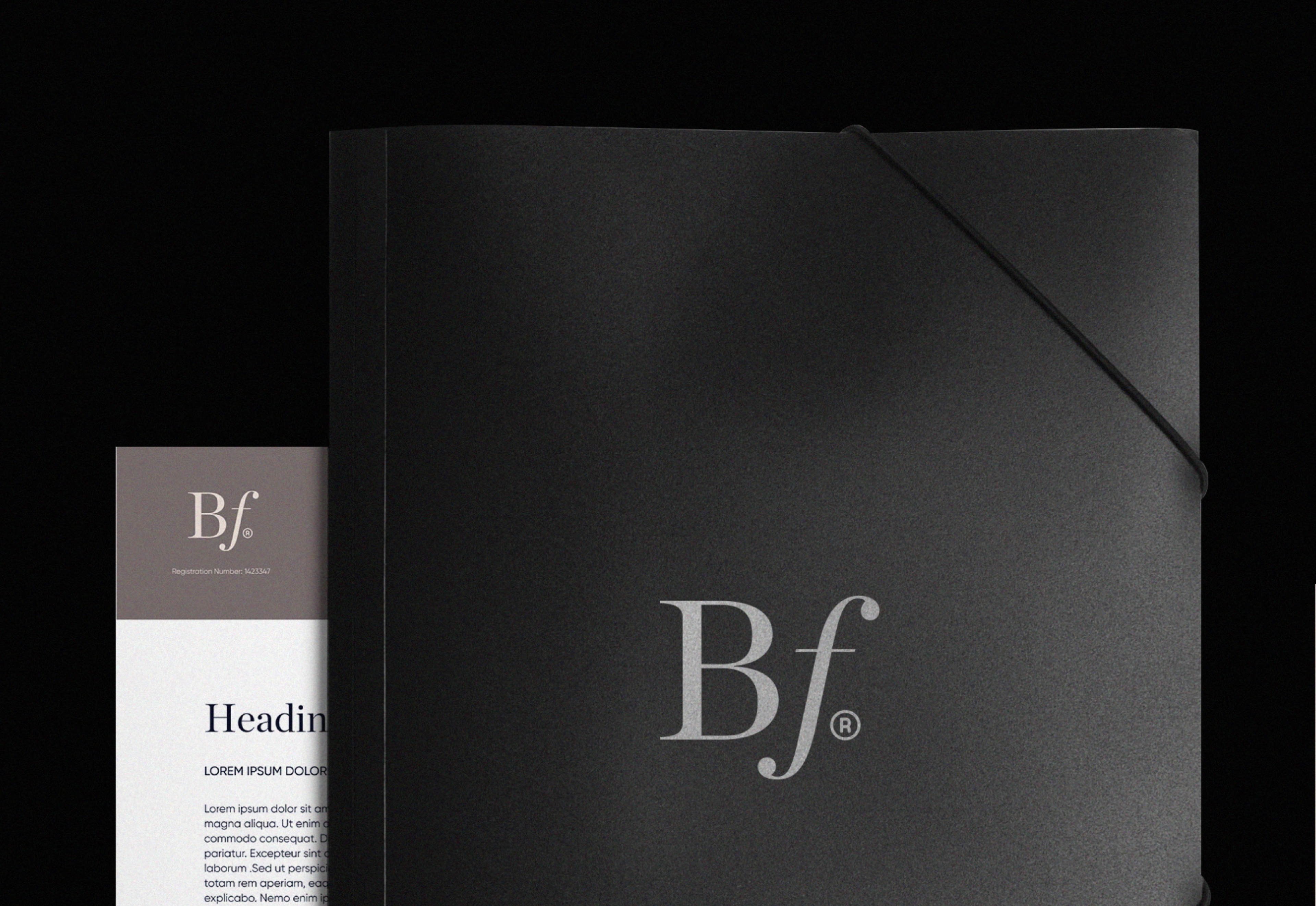
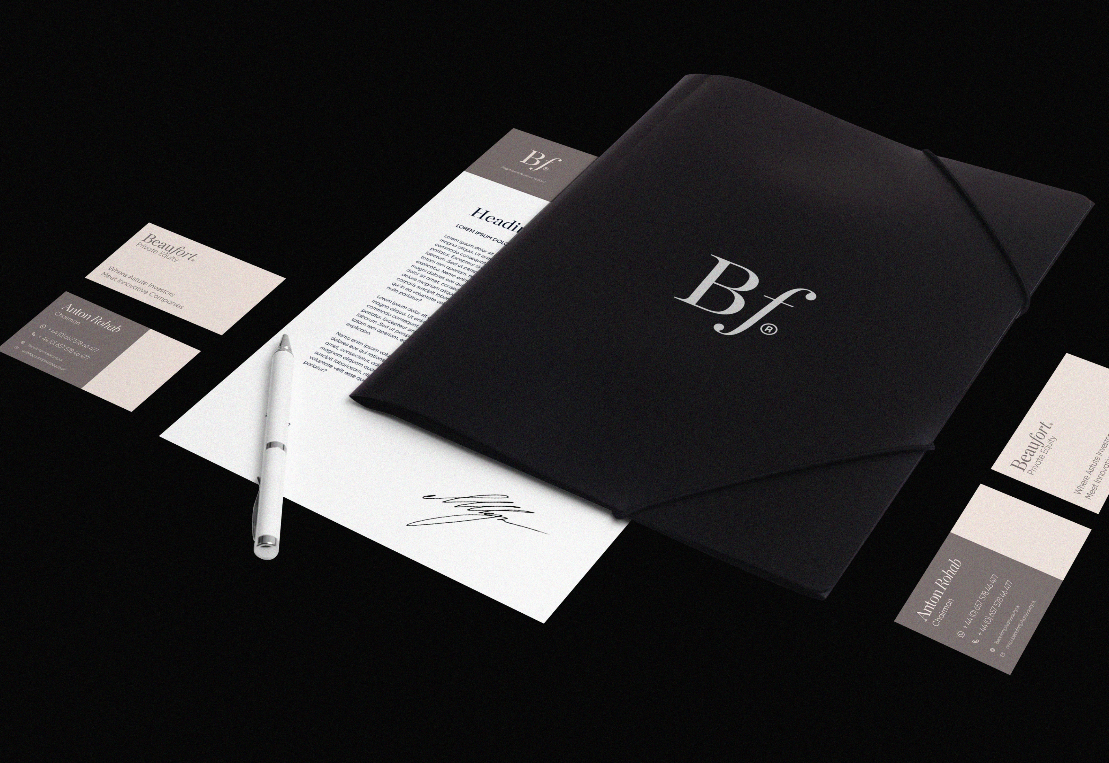
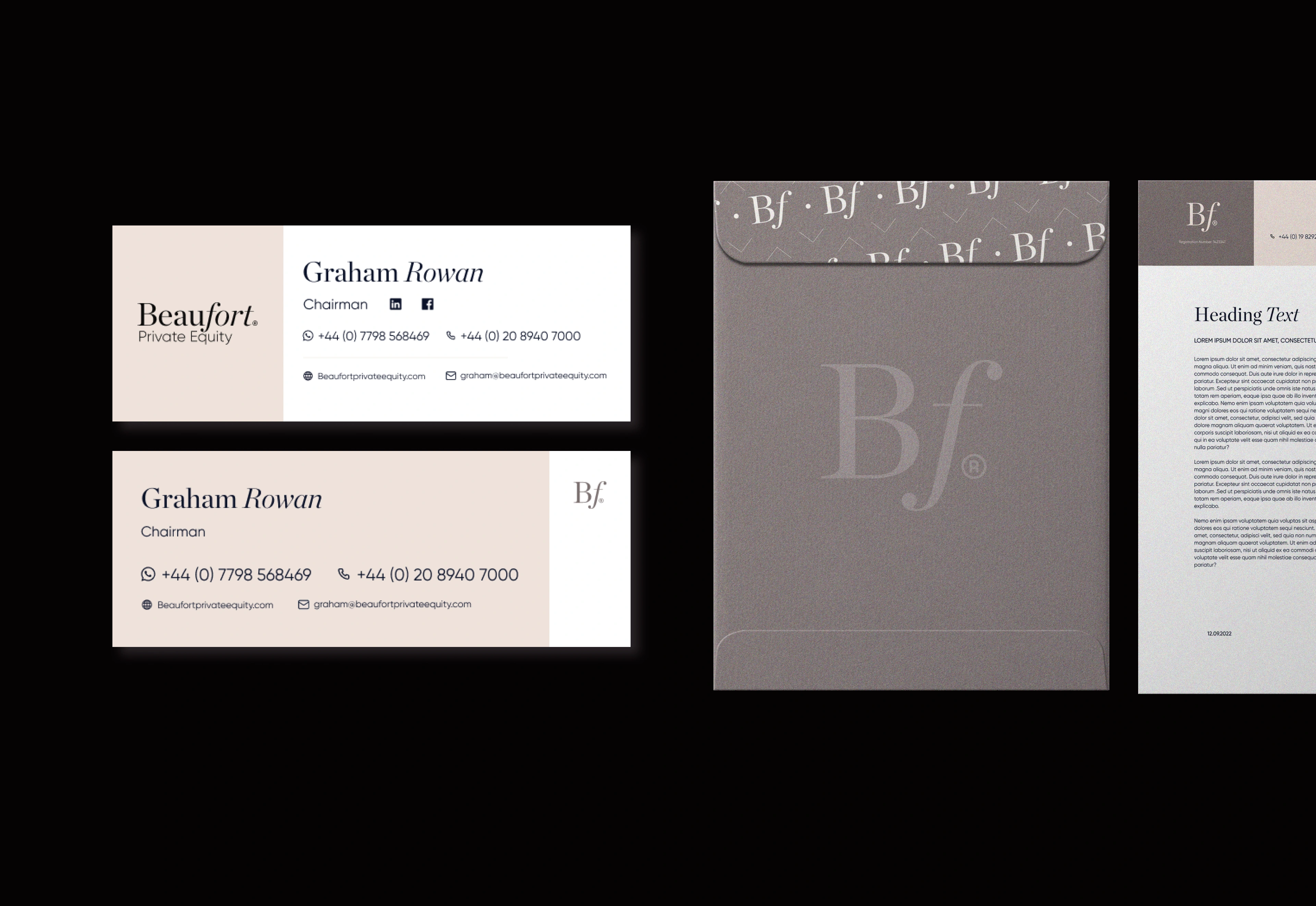
The project focused on brand identity, logo design, wordmark, finance branding, and stationery design, creating a sophisticated visual system for an international investment community.
Brand strategy. Logo design. Brand identity. Visual identity. Finance branding. Investment branding. Private equity branding. VC branding. Financial services branding. Corporate identity. Wordmark design. Stationery design. Typography. Graphic design.
The Concept
The challenge was to make Beaufort feel like more than a traditional private equity firm.
The identity needed to communicate trust, expertise, exclusivity, and long-term relationships, while still feeling approachable and member-focused.
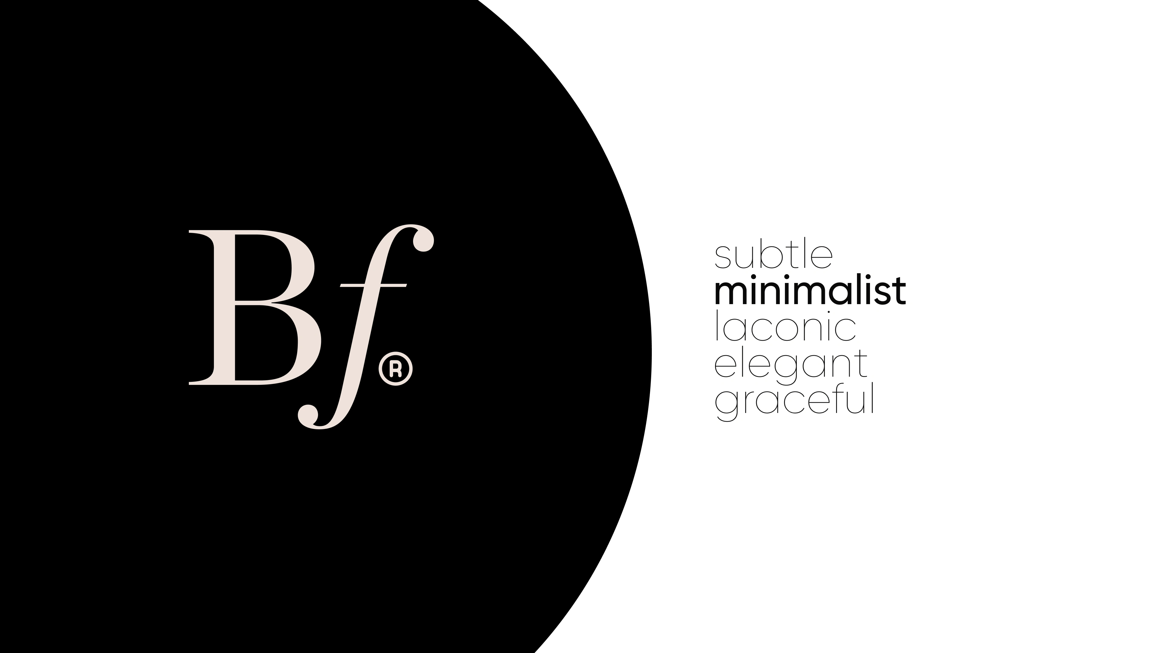
The result is a refined visual direction that balances the credibility of financial branding with a more human and contemporary character.
The Identity
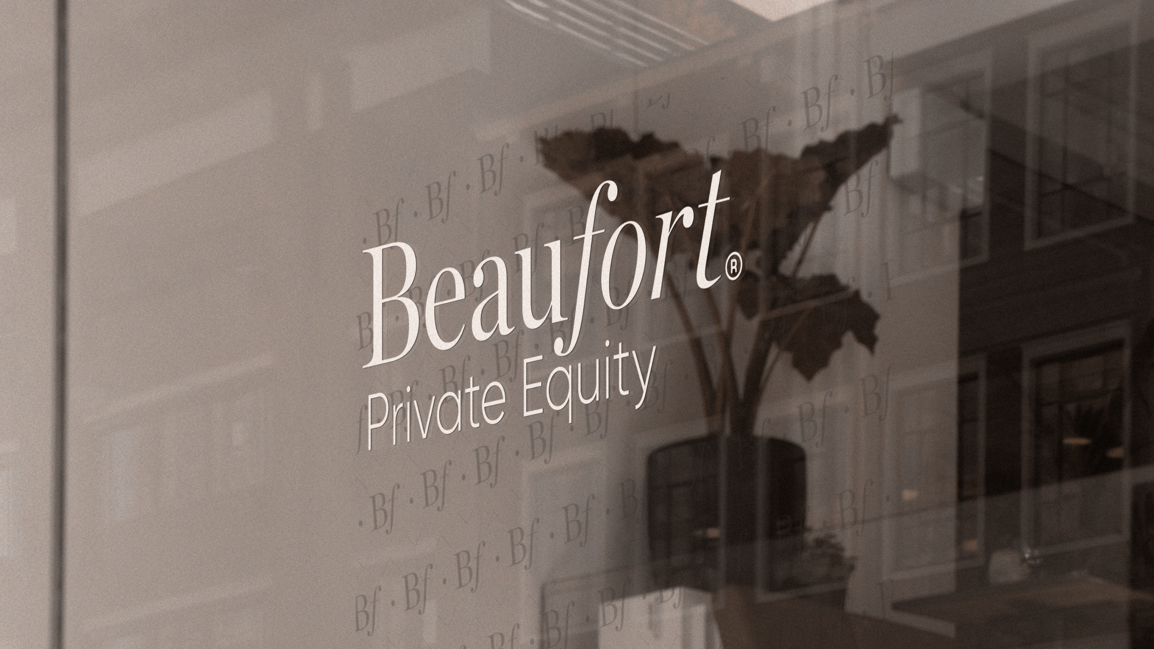
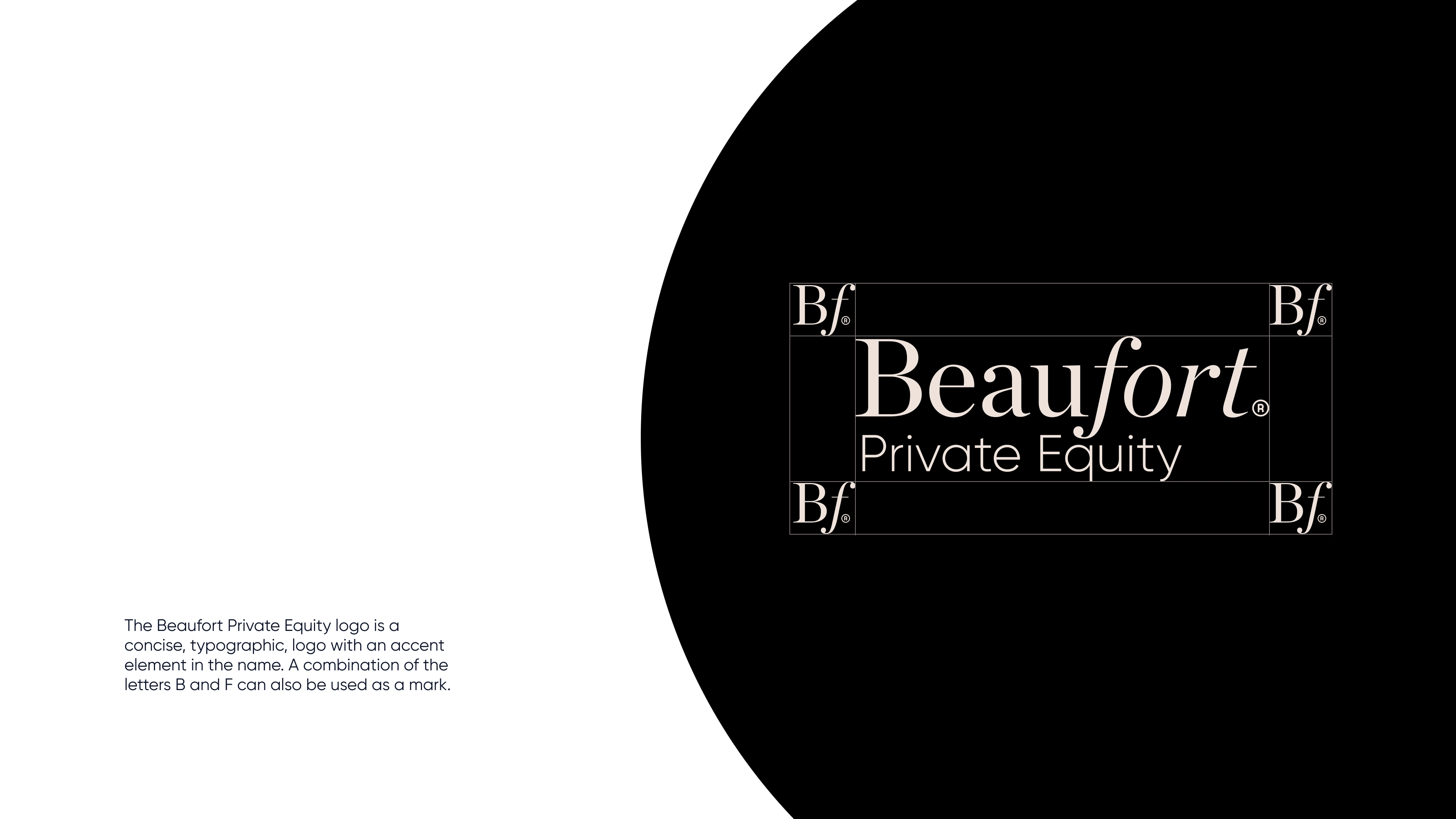
The Beaufort logo and wordmark create a strong, elegant foundation for the brand.
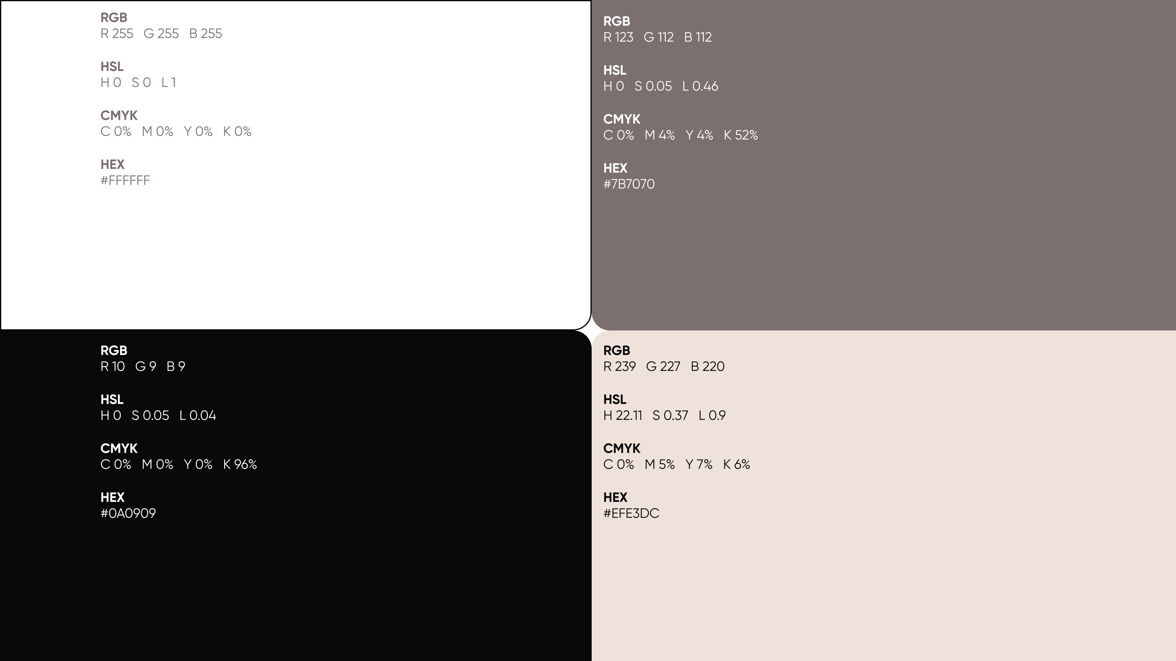
A restrained typographic approach gives the identity a premium financial character, while the broader visual system introduces flexibility across different brand applications.
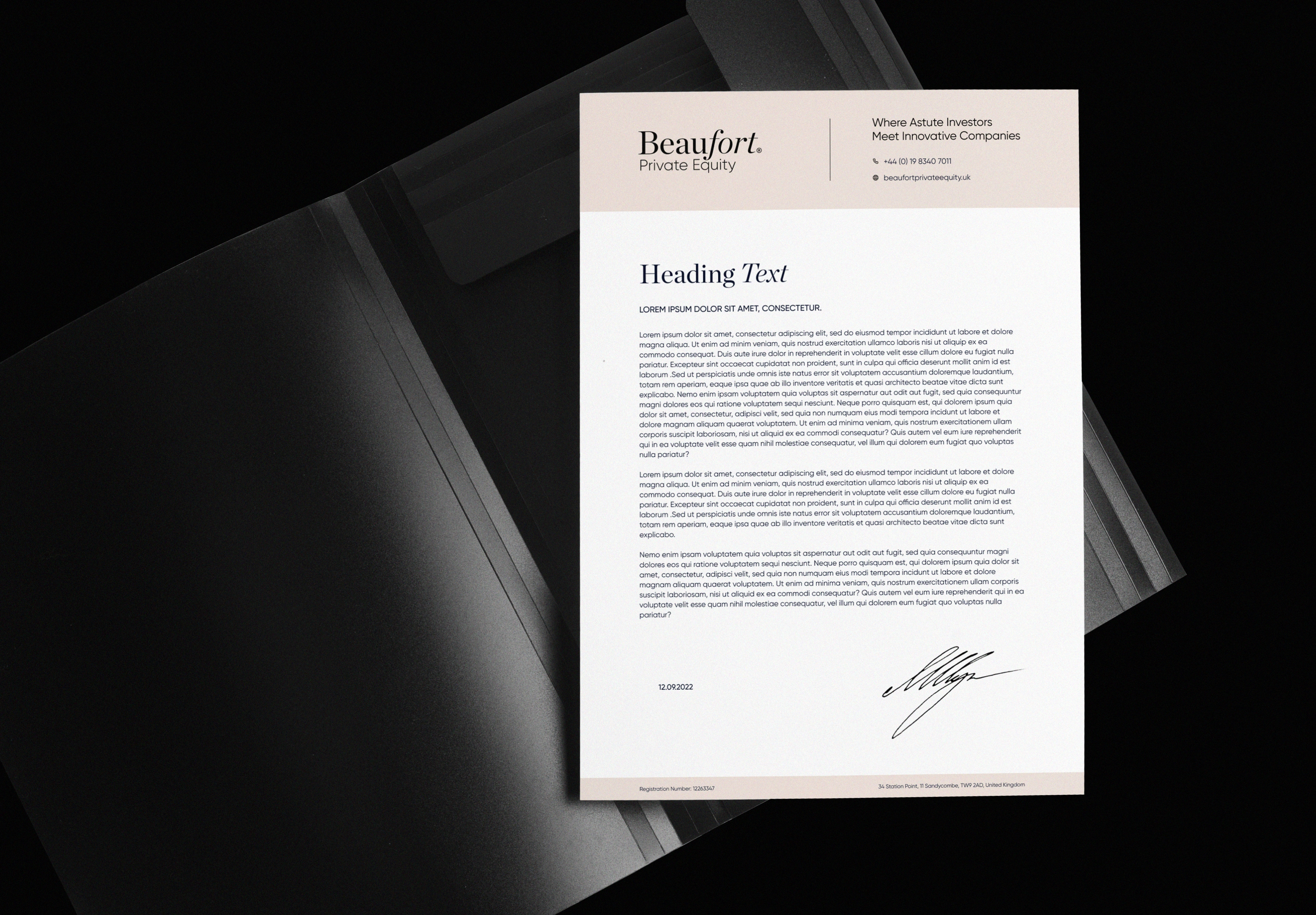
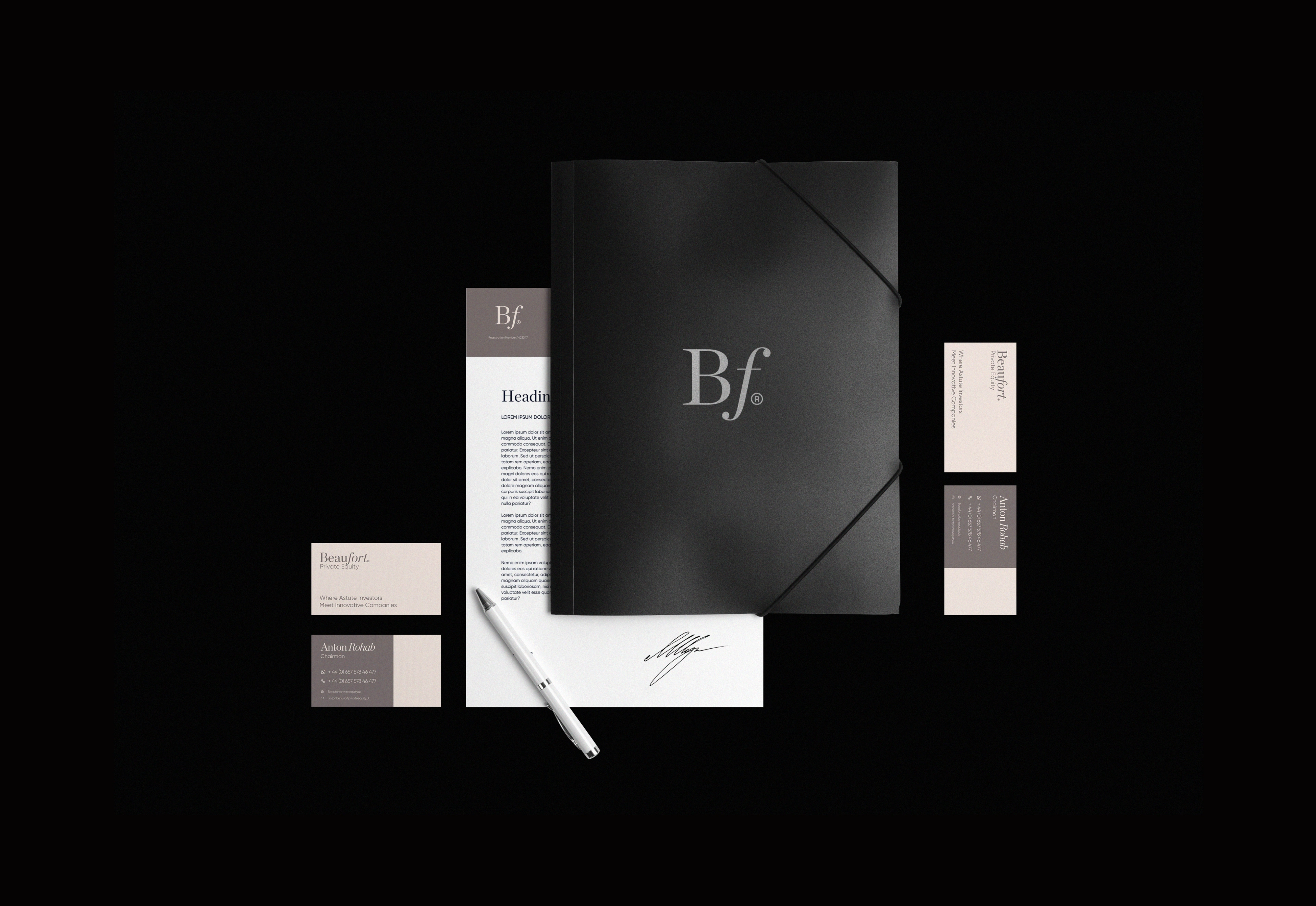
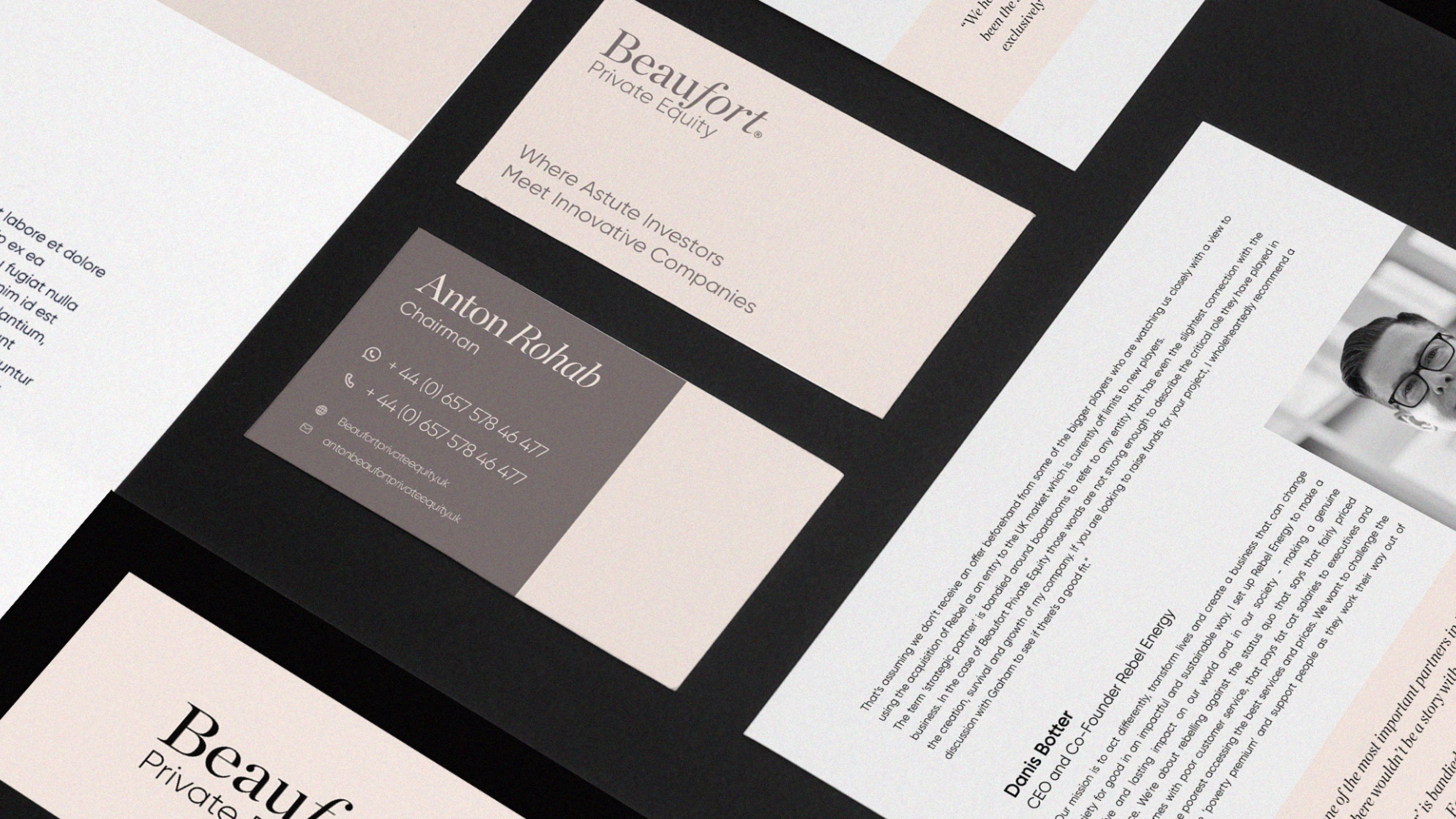
The identity was designed to work across stationery, business communications, investment materials, and digital touchpoints.

The Impact
A sophisticated private equity brand identity designed for an international community of investors and entrepreneurs.
The project combines branding, logo design, visual identity, finance branding, investment branding, private equity branding, financial services branding, wordmark design, stationery design, typography, and graphic design.
The Takeaway.
Finance can feel credible without feeling corporate.


Creative Director - Artur Mikhov
Graphic Designer - Darlin Ka
WHALES AGENCY:
Like this project
Posted Aug 28, 2026
Private equity brand identity for Beaufort, featuring logo design, finance branding, investment branding, wordmark design, stationery, and visual identity.