
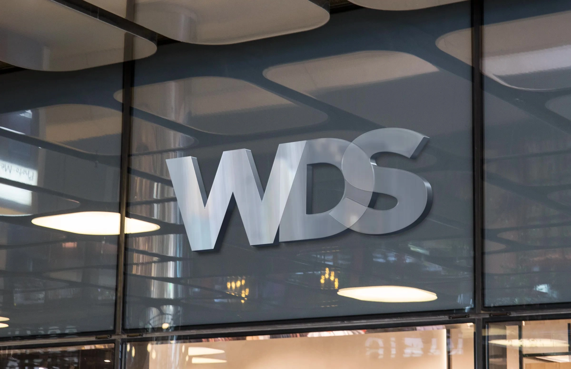
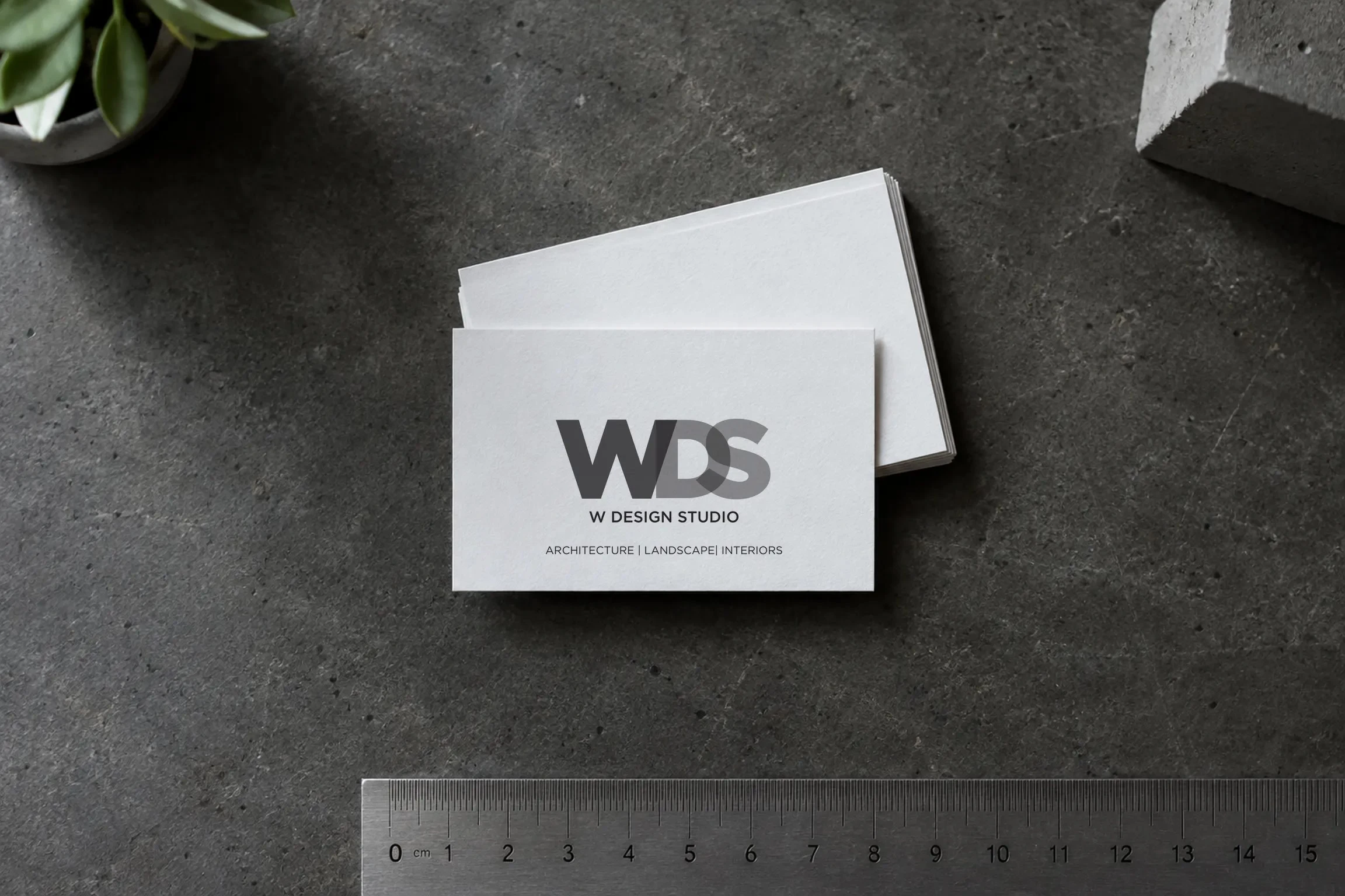
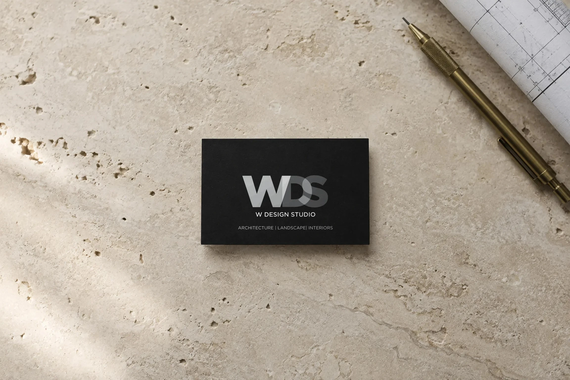
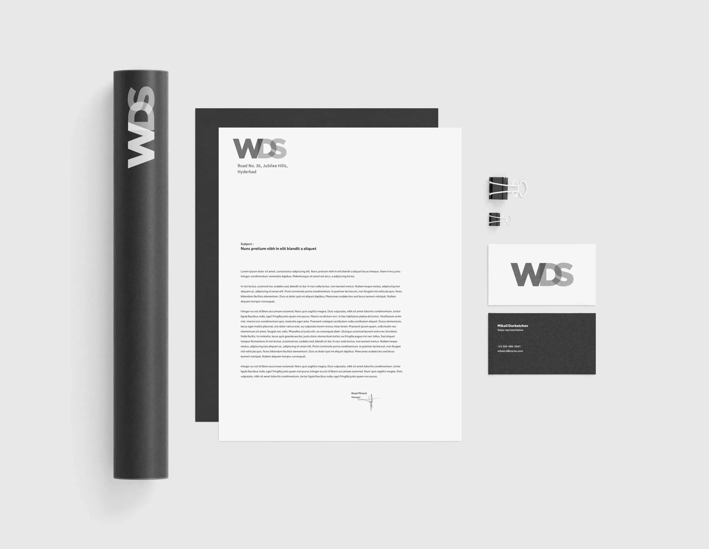
Letters that overlap like layered glass. W Design Studio practises architecture, interiors and landscape, and its new identity had to feel as considered as the buildings, on a facade as much as on a business card.
Swiggles set W, D and S in a plain geometric sans and laid them over one another like panes of tinted glass. Where two letters meet, the tone deepens: integration, strength and teamwork. Only greys, black and white, so the mark reads the same in brushed steel, frosted glass or print.
Scope: logo, identity, steel facade sign, business cards, letterhead and envelopes.
0 likes · 2 views · Nov 18, 2026
Monogram identity for an architecture practice: three letters overlapping like tinted glass, built to be cut in steel.
