Brand & Visual Identity for Therapy Clinic

Mockup | Business Cards
Project Overview
Client: Aurora Psychotherapy
Project: Branding and Visual Identity Design
Scope: Primary & Secondary Logo, Brand mark, colour palette, typography, brand assets, visual identity
Goal: To create a welcoming, reflective brand identity that resonates with Aurora Psychotherapy’s mission to offer a safe, nurturing space for self-expression and personal growth.
Background
Aurora Psychotherapy, a private counselling practice, needed a visual identity that mirrored its purpose: helping clients "find their light in the darkness." Founded to support adults processing past trauma, emotional struggles and life’s challenges, Aurora wanted a brand that felt both approachable and uplifting, with themes of warmth, authenticity and transformation.
Concept Development
After an initial consultation and a deep dive into Aurora’s mission, values and target audience, I gathered insights to steer the branding direction. The branding needed to balance warmth and professionalism, offering a sense of both safety and inspiration.
I developed a Brand Strategy Deck touching on Identity, Audience, Marketing and the Creating Direction including a mood board. This was presented to the client for feedback to drive the following stages.
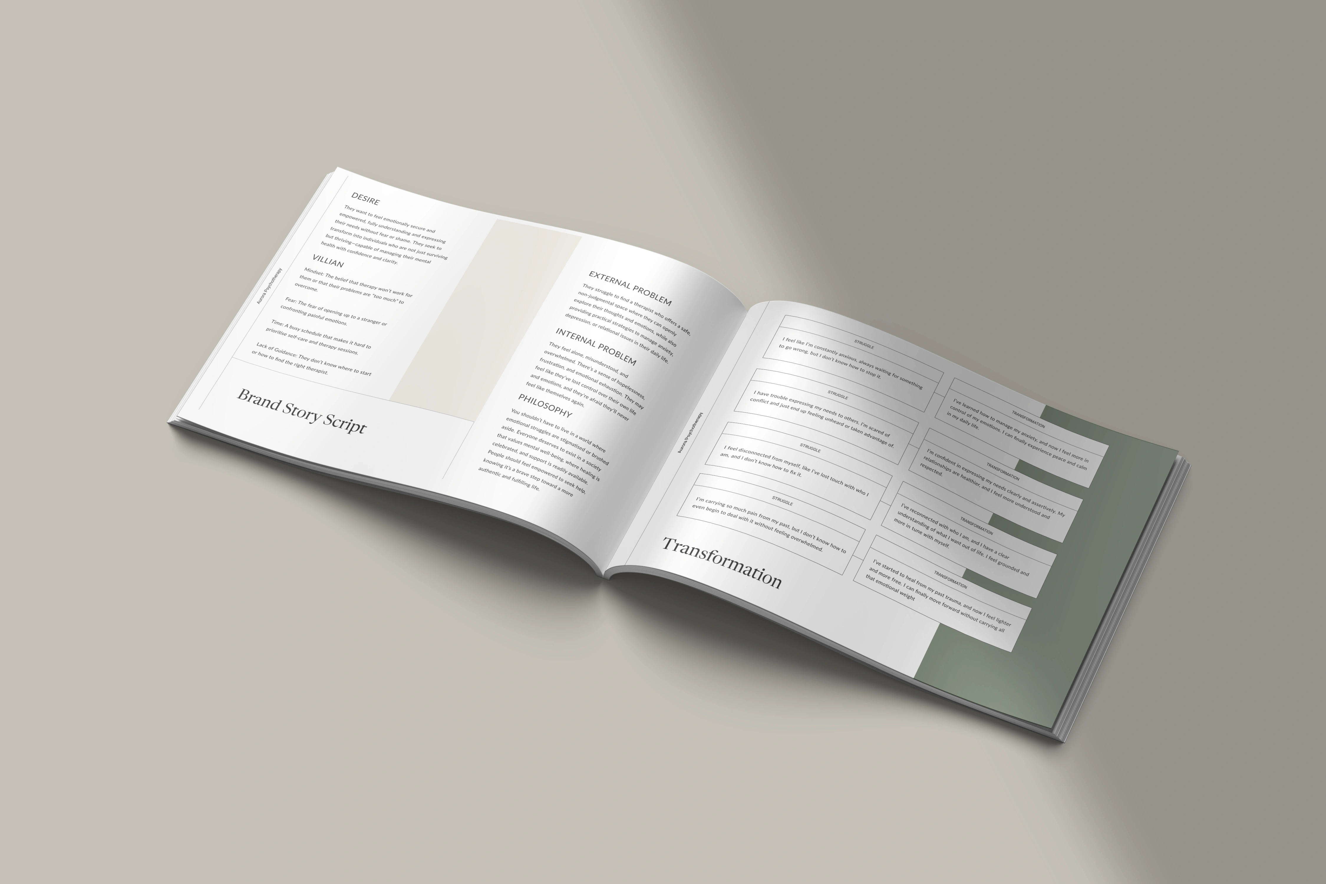
Brand Strategy Deck
Visual Elements and Design
Primary Logo
The primary logo for Aurora Psychotherapy integrates both a flowing wave and a four-point star, symbolising emotional movement and light. The star reflects guidance and self-discovery, while the wave represents the therapeutic journey of healing. Both the star and the wave are paired with the custom-edited Tenez font, which has been refined to fit the brand’s unique identity. This customised version of Tenez gives the logo an elegant, modern feel, enhancing both its readability and its personal touch, aligning perfectly with the practice’s values of warmth, safety, and professionalism.

Primary Logo with Tagline
Secondary Logo
The secondary logo retains the same essential elements as the primary logo—the star and the wave—yet simplifies the design for versatility in smaller formats or different applications. This minimal version of the logo ensures that the core symbolism of guidance and healing remains intact while making the logo more adaptable for social media, stationery, or other spaces where space is limited. The custom-edited Tenez font is also preserved here, ensuring consistent brand messaging across both logos and maintaining a cohesive, sophisticated look.

Secondary Logo
Brand Mark
The brand mark is a distilled, focused version of the logo that emphasises the wave and star motif as a clear representation of Aurora Psychotherapy’s mission. The four-point star remains central, symbolising guidance, self-discovery, and hope, while the wave captures the flow of emotional healing. The Tenez font is subtly reflected in the brand mark’s clean lines and modern style, ensuring continuity with the primary and secondary logos. This brand mark serves as a powerful symbol for the practice, perfectly embodying the essence of Aurora’s approach to personal growth and transformation.

Brand Mark
Color Palette
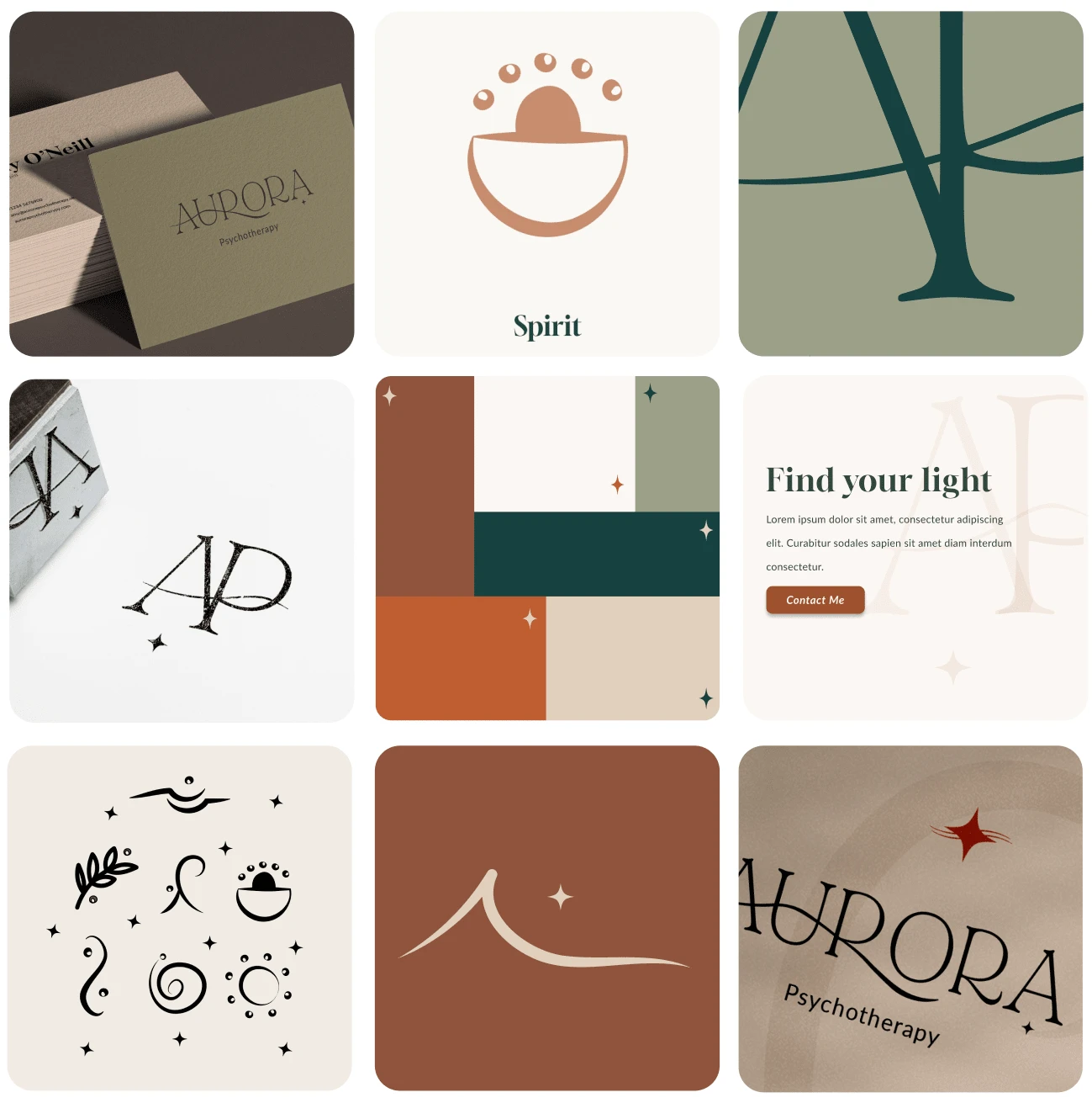
I curated a colour palette that combines earthy, calming tones with subtle warmth. The client described her image for Aurora Psychotherapy like drinking a hot cup of coffee on a crisp autumn day.
The palette includes:
Chestnut (#90553C): grounding, warm
Autumn Mist (#FCF8F3): soft, inviting
Tawny (#BF5D30): energising yet restrained
Sage (#9BA187): calm, healing
Dark Cypress (#17413F): grounding, strong
Cotton (#DFD0BD): gentle, neutral
These colours harmonise to evoke both the peace of natural landscapes and a therapeutic atmosphere, avoiding overly clinical or corporate vibes.
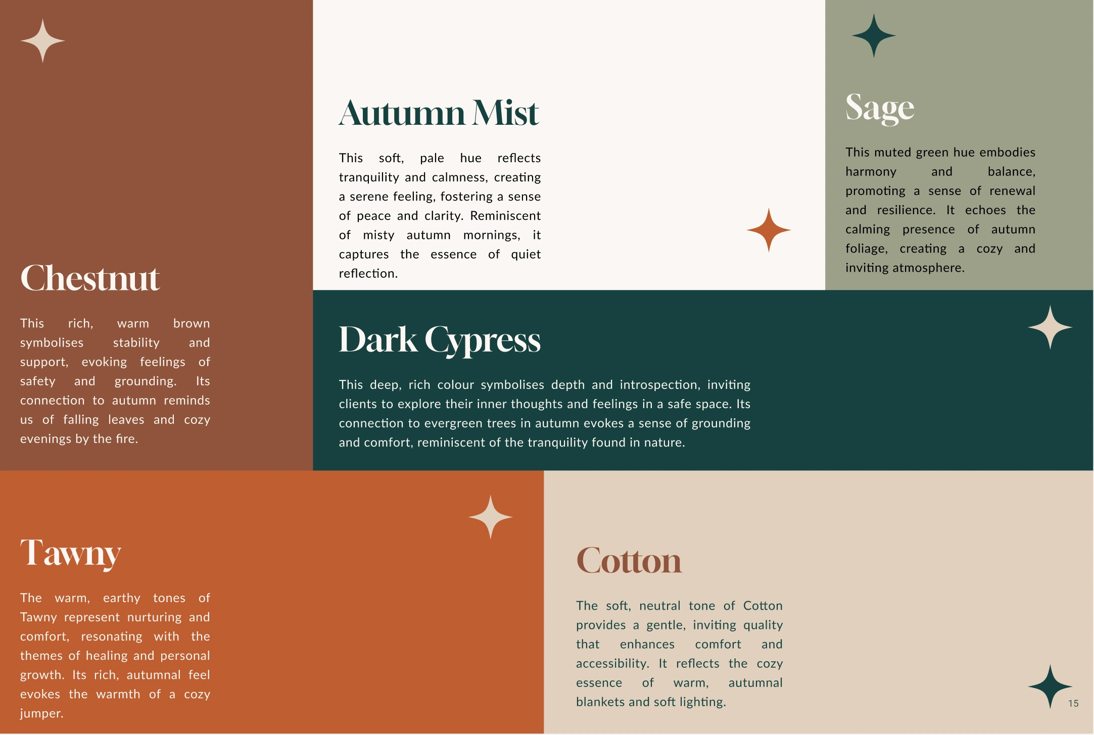
Colour Palette | Included in the Logo & Branding Presentation
Mood Boards and Brand Direction
To anchor each visual element, I developed a mood board that captures the essence of warmth, nature, and calm reflection. This process was instrumental in defining Aurora’s look and feel and ensuring consistency across all branding elements.
Outcome
The final branding for Aurora Psychotherapy successfully embodies its mission, creating a space that feels safe, nurturing, and transformative. With a clear visual identity, Aurora Psychotherapy is now equipped to connect with clients seeking emotional support and personal growth.
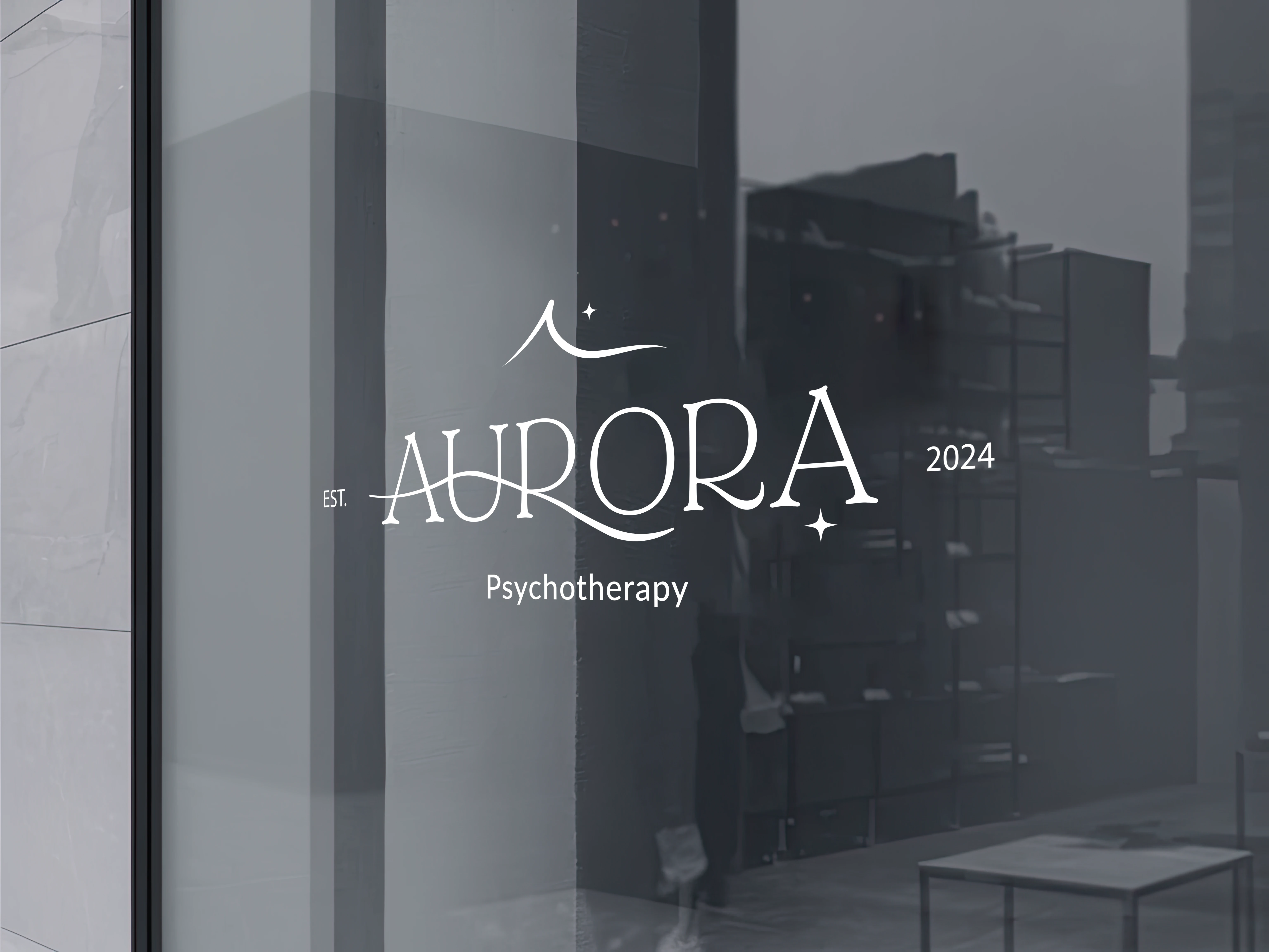
AP Office Sign
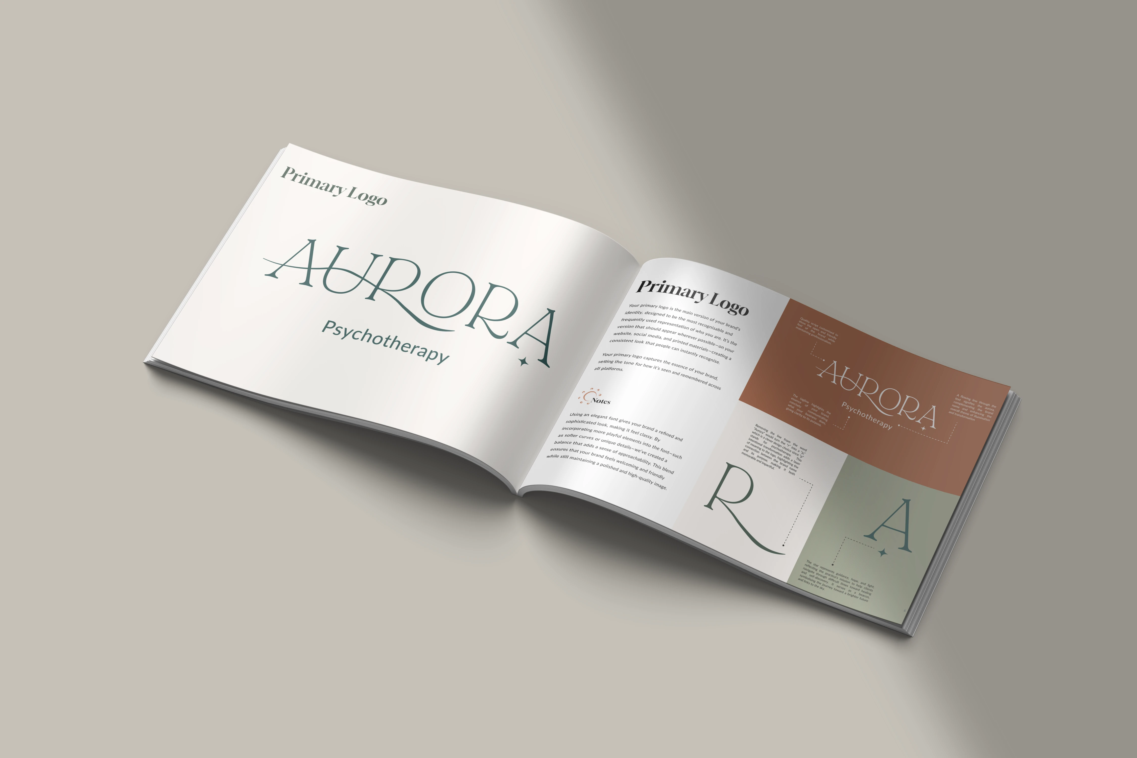
Brand Presentation
Like this project
Posted Nov 7, 2024
I crafted Aurora Psychotherapy's brand through deep discovery using symbolic design, and soothing colours to evoke healing, safety, and self-discovery.

