Staples' The HUB Intranet Redesign
Phil Schroeder
Staples' The HUB Redesign
Saved Staples millions in support costs by designing an award-winning intranet solution.
Support Cost Savings
$2m annually
Increased Traffic
+35%
Search use decreased
-40%
Role
Lead Designer (worked with UX Researcher, Product Owner, Engineering Lead, Director of HR)
Timeline
3-6 months
Brief
The HUB is a highly used resource amongst associates and managers alike but was due for some design love. We were asked by leadership to partner with HR and our internal comms teams to do generative research to identify the biggest pain points and come up with designs to help remediate those issues across multiple phases with the goals of:
Reducing calls to support
Increasing findability and user confidence
Making search match best-in-class web experiences
Why so many rage clicks?!
1. Search either didn't work or when it did it wasn't as expected
2. Multiple logins between various areas of the site caused a lot of friction and frustration for users
3. Due to poor search function users are forced to navigate the application and often feel "overwhelmed" or "confused"
4. Users noted that the dashboard was “cluttered”, “too much”, and “overwhelming”
5. Users expected The Hub’s dashboard to show information based on their location and business unit
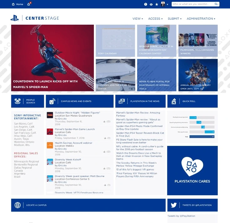
Competitive Analysis
We took time to look at other competitors in the intranet space to make sure our redesigns would align with common mental models and design patterns used elsewhere. We also took of common features as well as potential UX or design failings we could improve upon.
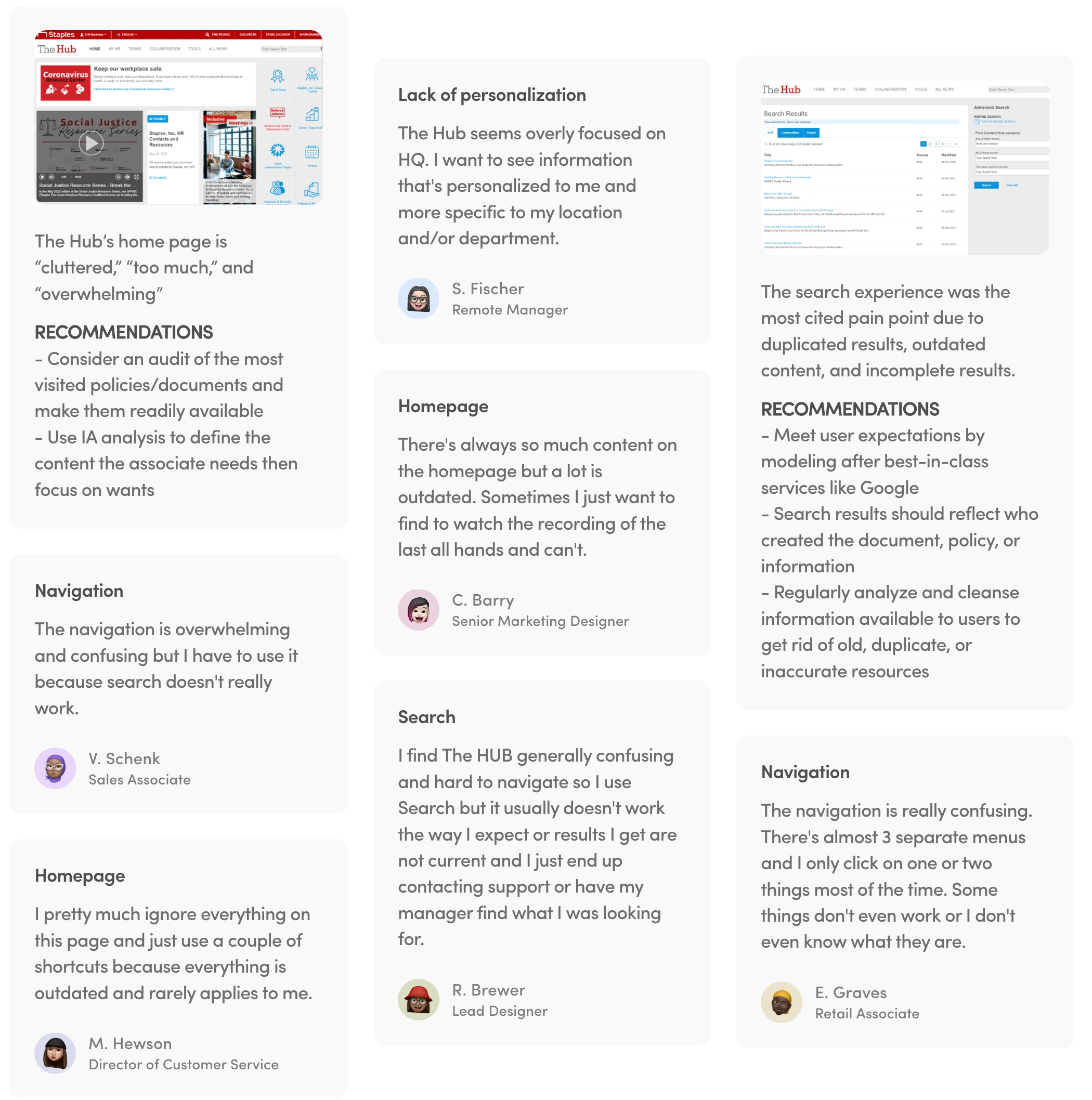
User Research
We performed generative research to define user pain points using 1:1 live remote user interviews. This research was conducted with 26 participants that represented various roles and types of users.
What did we learn?
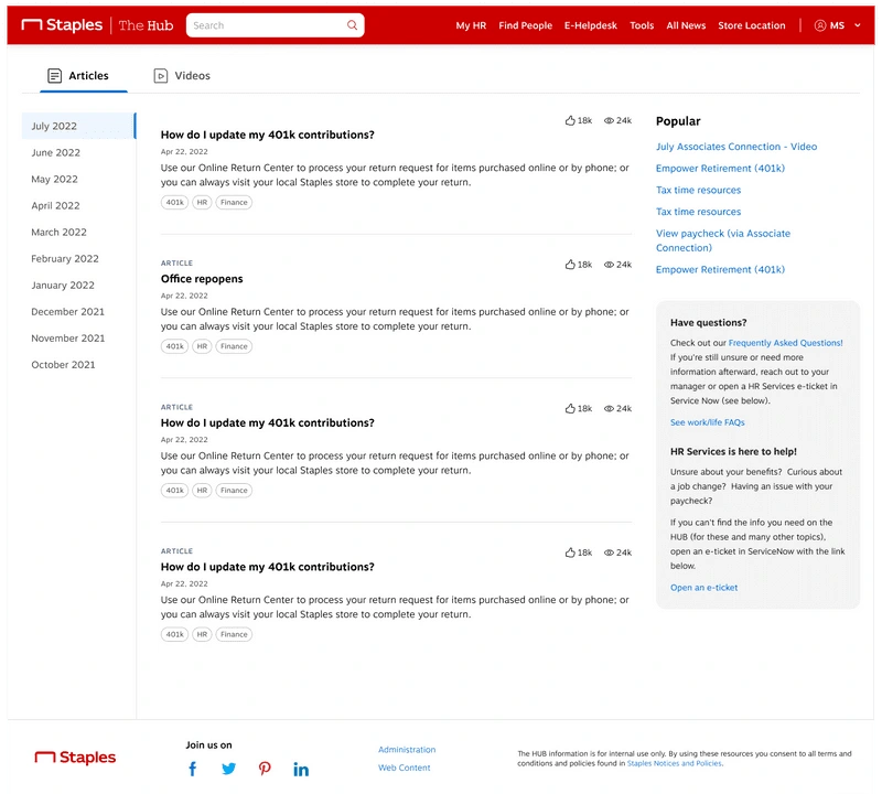
1. Redesign Homepage and Nav
The overall feelings from users is that navigation and the home page are cluttered, confusing, and overwhelming leading to lack engagement and excessive support calls.
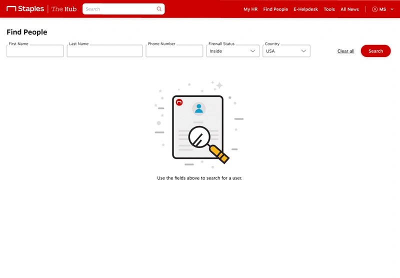
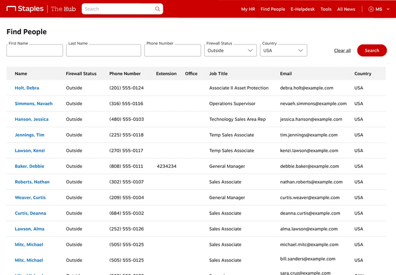
2. Fix Search
How Search worked simply didn't match users' expectations. We need to make this match current best-in-class experiences and do a full content audit to remove stale information from our help articles and resources.
3. Personalize the HUB experience for users
Users expect the experience to be more personalized and see information on their home page, and other pages, be customized to their role, location, and business unit. Users want to log in and see relevant information as soon as possible.
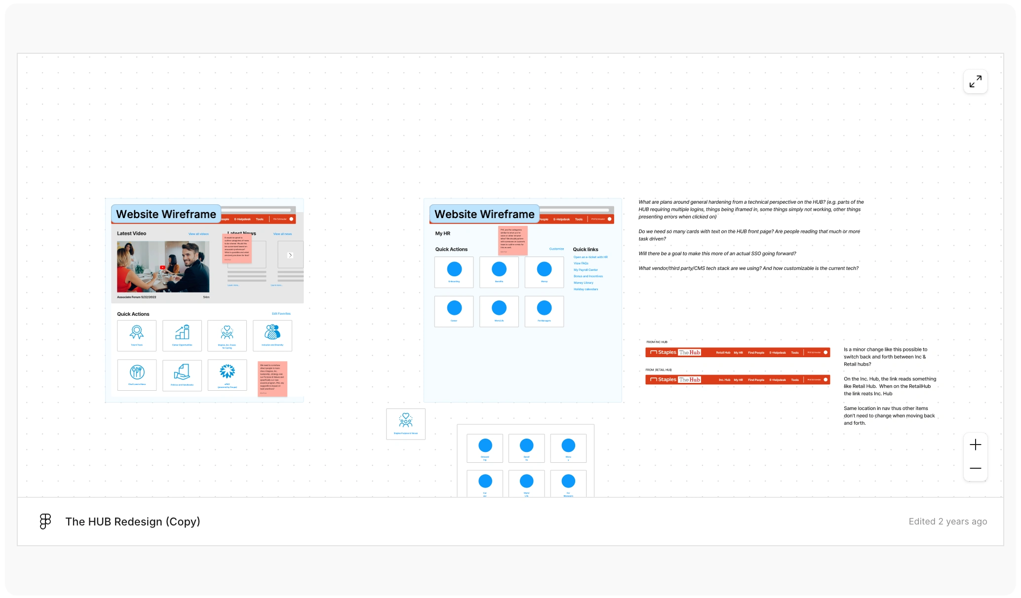
Early FigJam Collaboration with UX, Product, and Engineering
I started a FigJam file based on research takeaways. I wanted to start with something low-fi to encourage stakeholder collaboration through commenting or low-fi design ideation. Some user feedback you'll see represented are having content personalized and customizable, shortcuts for most used areas of the portal, surfacing latest and most important information at the top, reducing clutter in the navigation, and more.
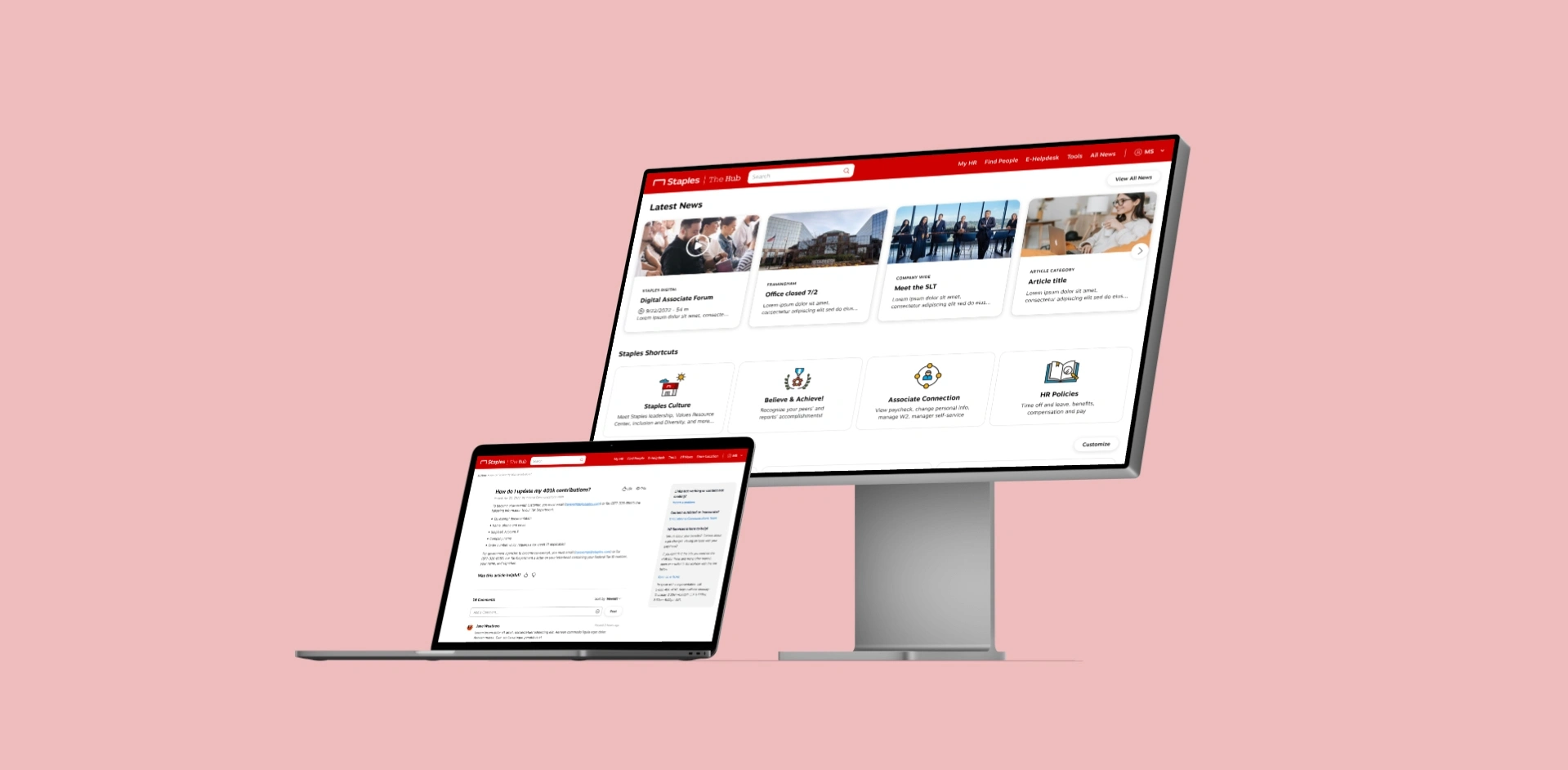
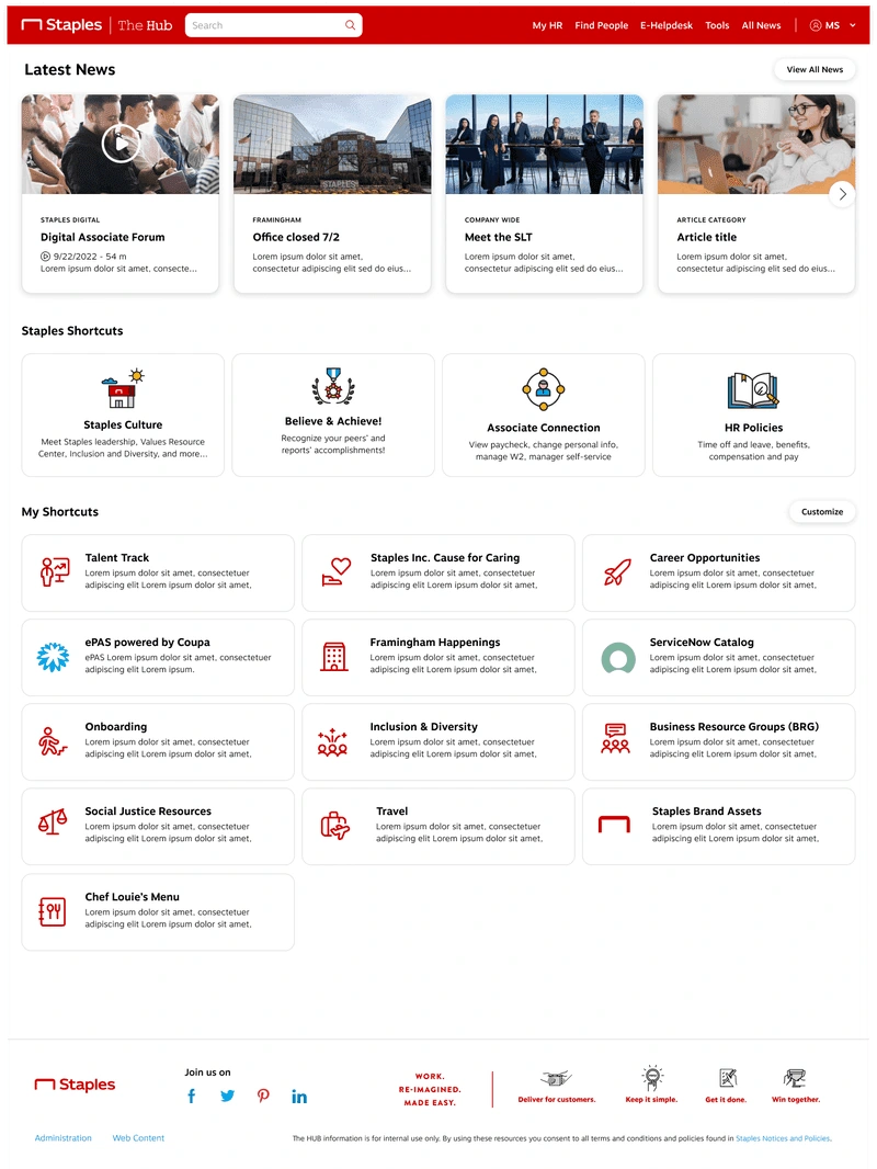
Final Designs
Some highlights are: improved affordances throughout, a cleaner and simpler bottom nav, better charting and data visualizations, top KPIs more clearly called out, and the ability to chat with your coach from any screen.
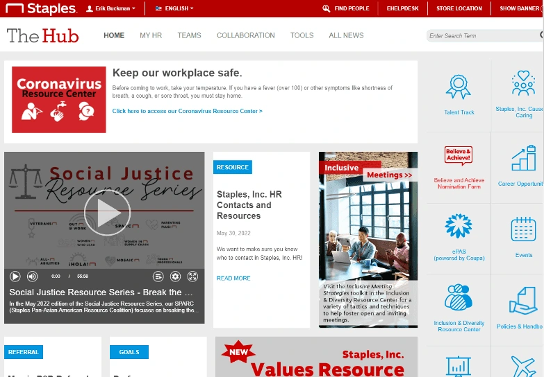
Before
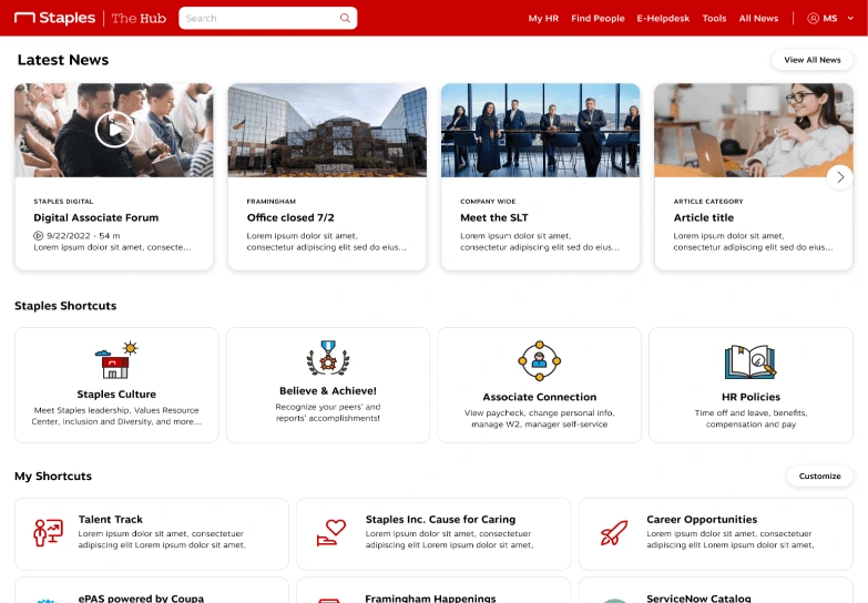
After
Measuring and Validating Designs
Research Feedback
We conducted unmoderated research using UserTesting.com with a subset of our previous participants in the generative research study.
Homepage highlights:
Overall feedback was positive with words like "simple", "clean", and "easy to use" used
New shortcuts section was well received and users liked the customizability
Don't rename any of the shortcuts as it's confusing
Search highlights:
Add being able to filter by category
Was positively received as much more usable but also technically more functional
Results and Reflection
This project was difficult to lead at times as there were product owners who didn't know what they really wanted and hadn't led a project like this before. This required patience and a fair amount of leadership on my part as UX to help guide and shape the requirements and goals of the project as it progressed.
Site traffic: Increased by +35%
Use of search decreased by over 40% because the site was that much easier to navigate
Was selected out of over 600 nominees to receive an award for our work and impact
Like this project
Posted Jul 31, 2025
Saved Staples $2m+ in support costs by designing an award-winning intranet solution. - Site traffic: +35% - Search use decreased: -40%