Fat Straws: Online Ordering Process
Chaunhi Le
Overview
This was roughly a 2 month project that I started during my time in the User Experience program at the University of North Texas.
The goal of this project was to re-design and improve the mobile experience of online ordering of a local business. The team consisted of myself for the designing process and about twelve peers in the program for feedback and criticisms.
Role
User Experience Designer - User Researcher - Wireframing - Prototyping - Testing - Visual Design - Pitching
The Problem
The mobile site was overall very cluttered with excessive photos, words and colors. This makes the site difficult to navigate and overwhelming.
This can be a huge problem for the business as it can turn away users who aren't willing to navigate through a frustrating experience. This leads to the user either abandoning the cart or the website altogether - negatively impacting the business's brand, sales numbers and returning customers rate.
The Solution
To find a solution to our problem, I defined the main goals for the project and prioritized the top three goals based on importance:
• Reduce the cognitive load to allow users to find exactly what they are looking for without the clutter
• Restructure the information architecture of the online ordering page to create a smooth and appealing experience for users to shop
• Increase business sales by upselling products during the check-out process
Process
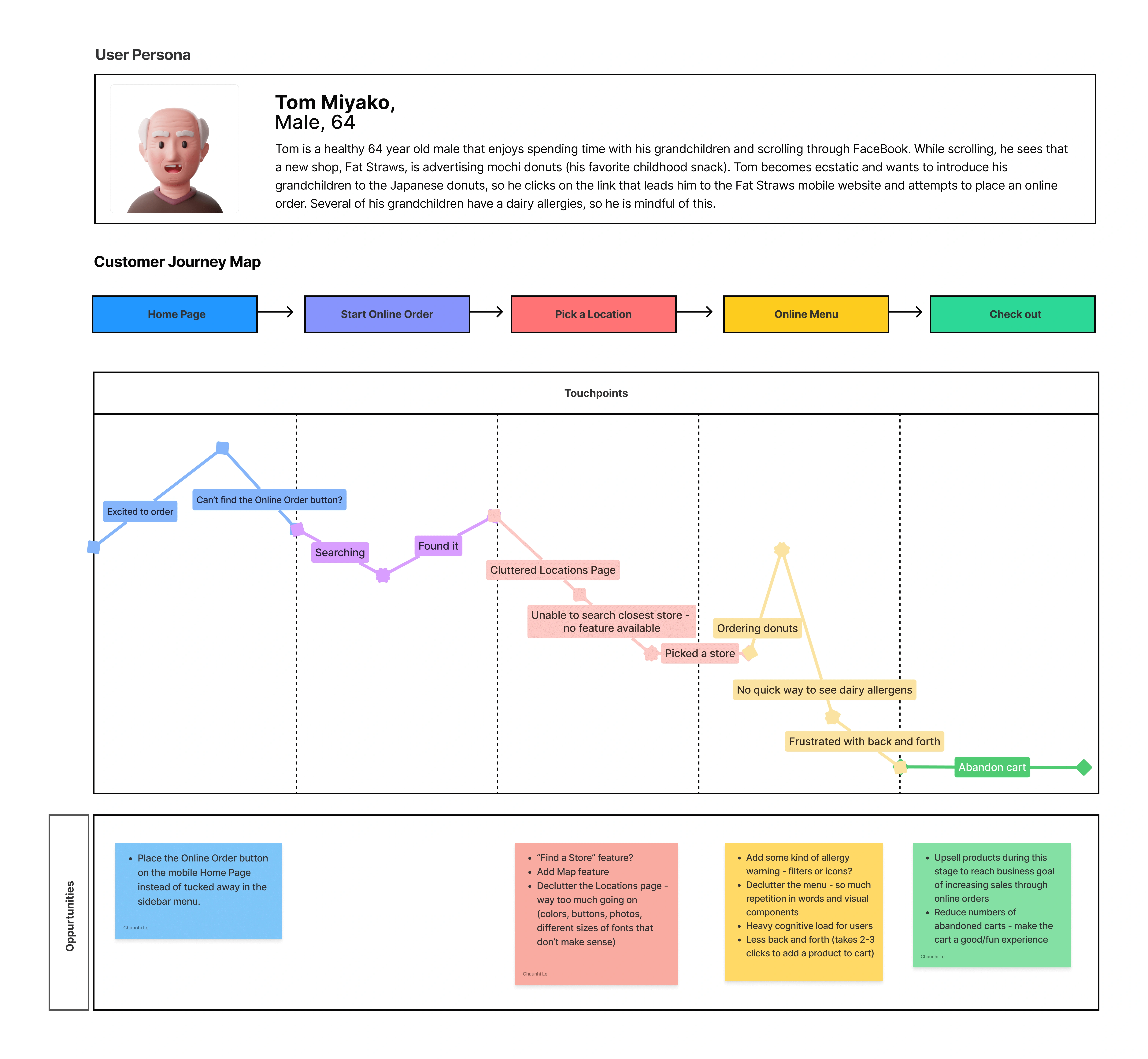
User Persona & User Journey Map
The first step I took was to create the user persona and user journey map in Figma to better identify pain points in the mobile ordering experience and empathize with the users. In doing so, I was able to begin brainstorming about different features as solutions for each pain point identified.
(See Opportunities section below the User Journey Map)
Wireframes & A/B Testing
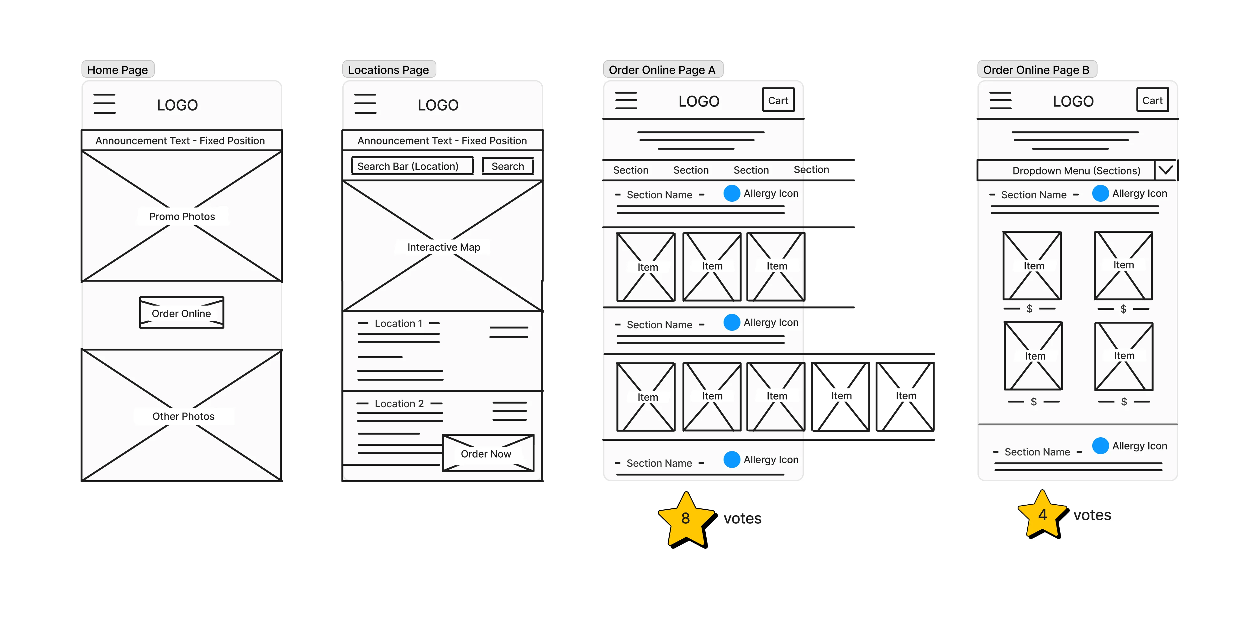
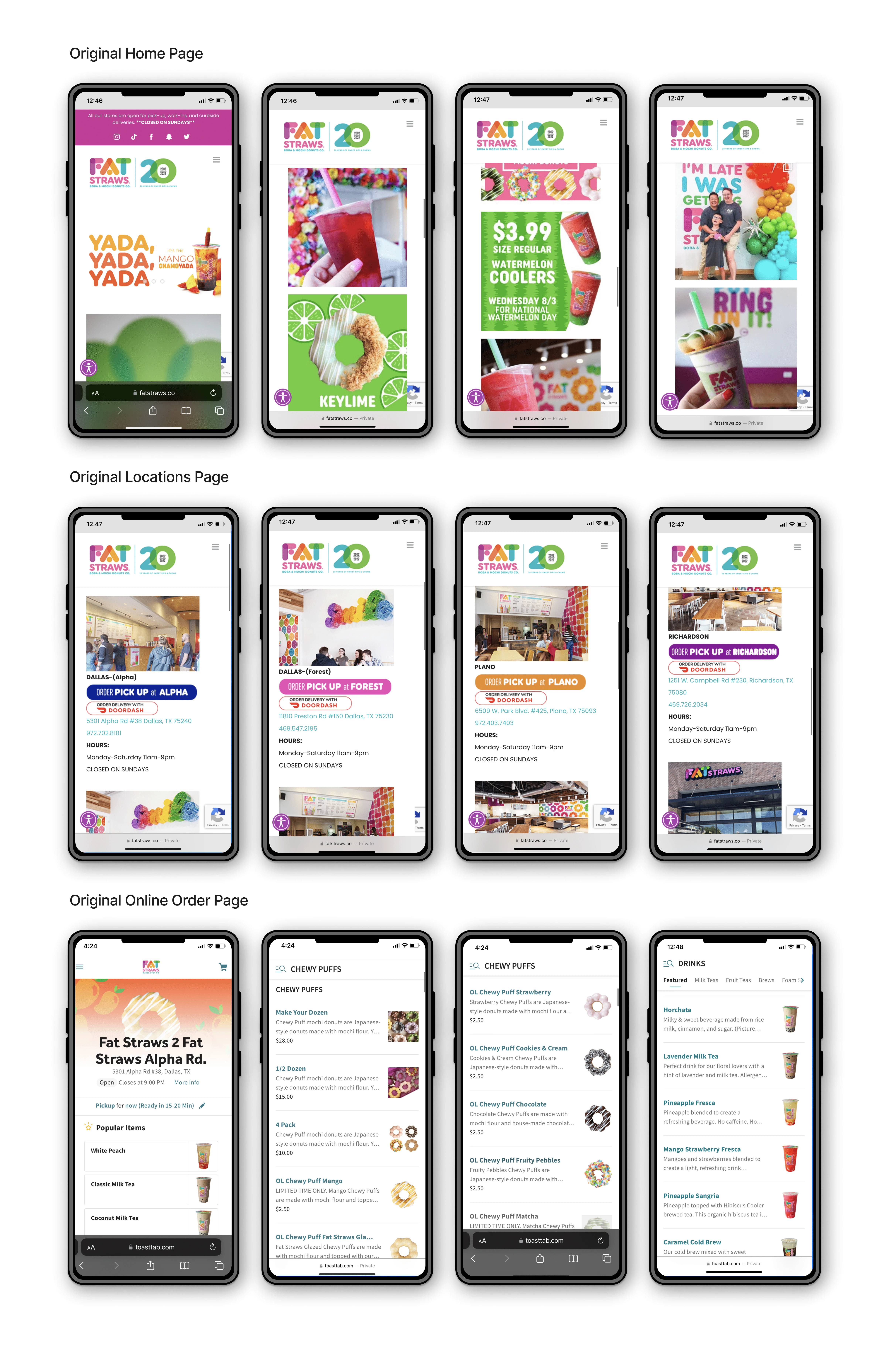
I conducted multiple competitor analyses with Dunkin' Donuts and Starbucks, which helped me solidify the "Home" and "Locations" wireframes, as they seemed to be the most optimal.
I completed the wire-framing process in Figma and conducted an A/B Test with my UX cohort at the University of North Texas for the "Order Online" wireframes. Wireframe A received 8 votes, winning the majority vs. Wireframe B with 4 votes.
Results
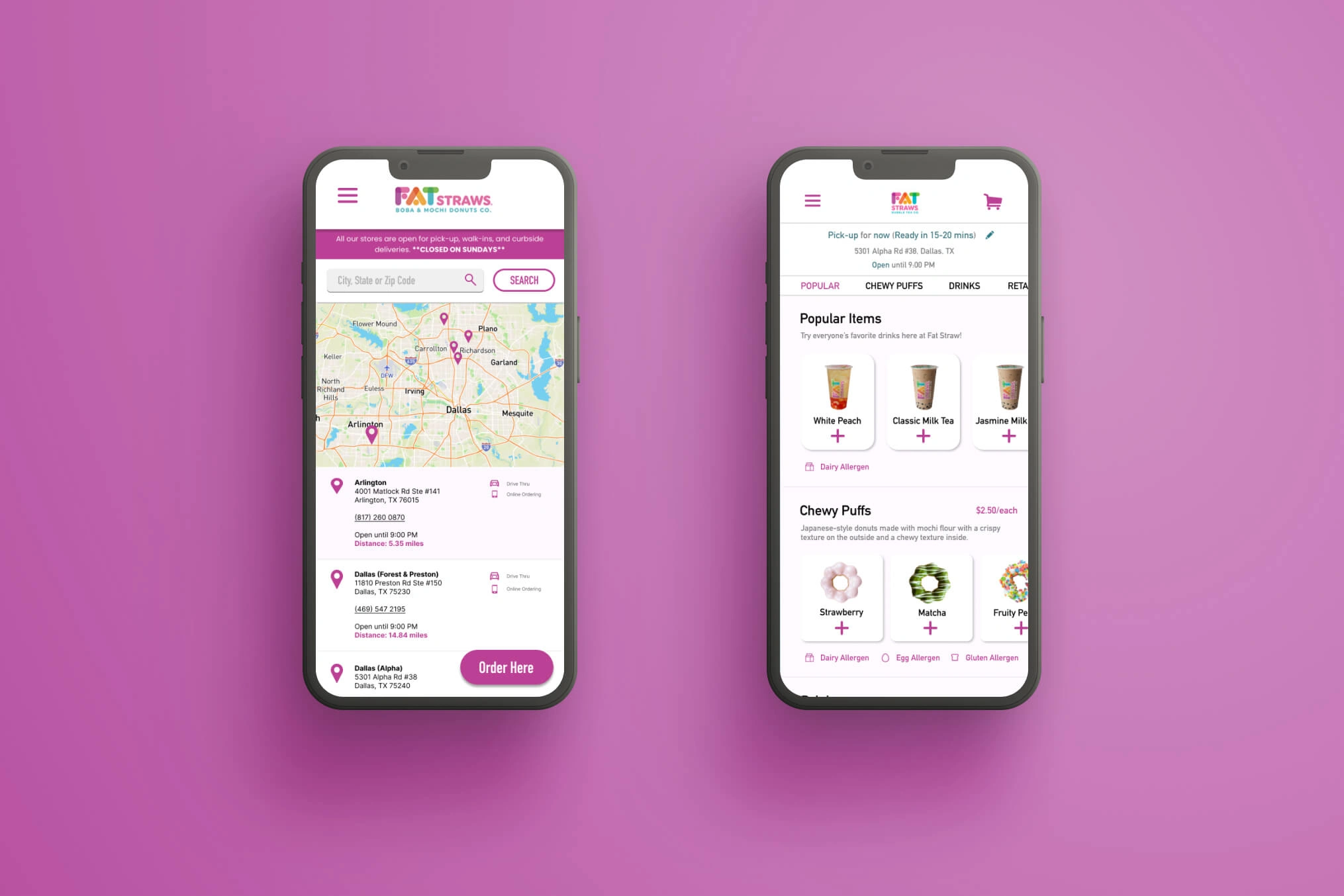
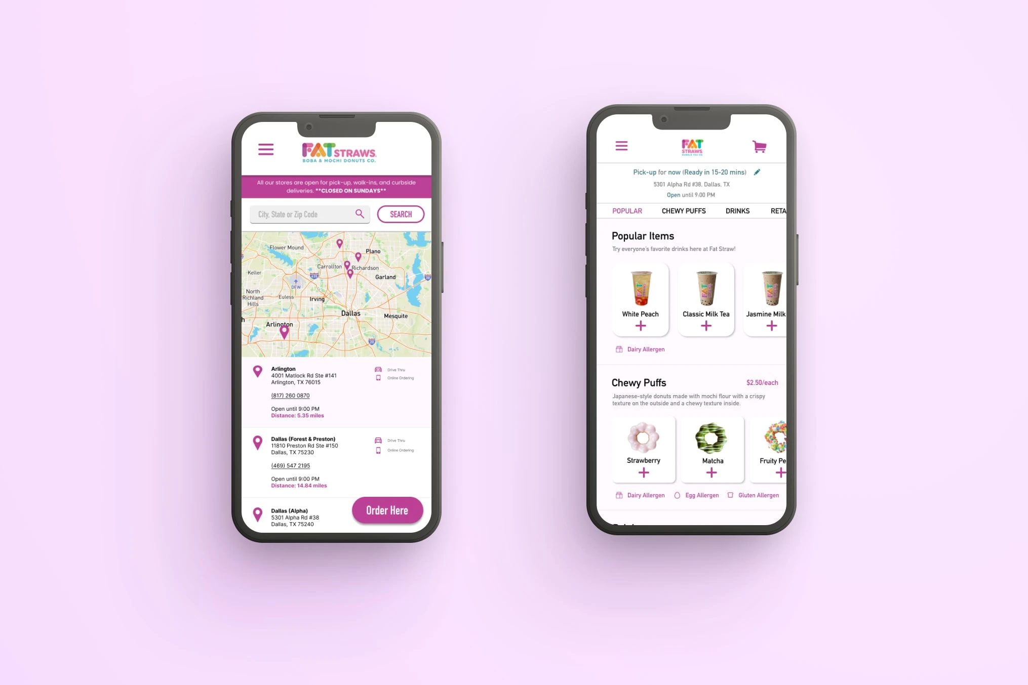
New Locations Page
Interactive Map and "Find a Store" feature
Decluttered of excessive photos and colors
"Drive Thru" and "Online Ordering" icons
New Online Menu/Order Page
Horizontal scrolling feature for each section of the menu to break up the original long, repetitive vertical scrolling throughout the entire menu.
Eliminated unnecessary text and photos to reduce the user's cognitive load
"Allergen" icons in each section
One-click Add to Cart feature
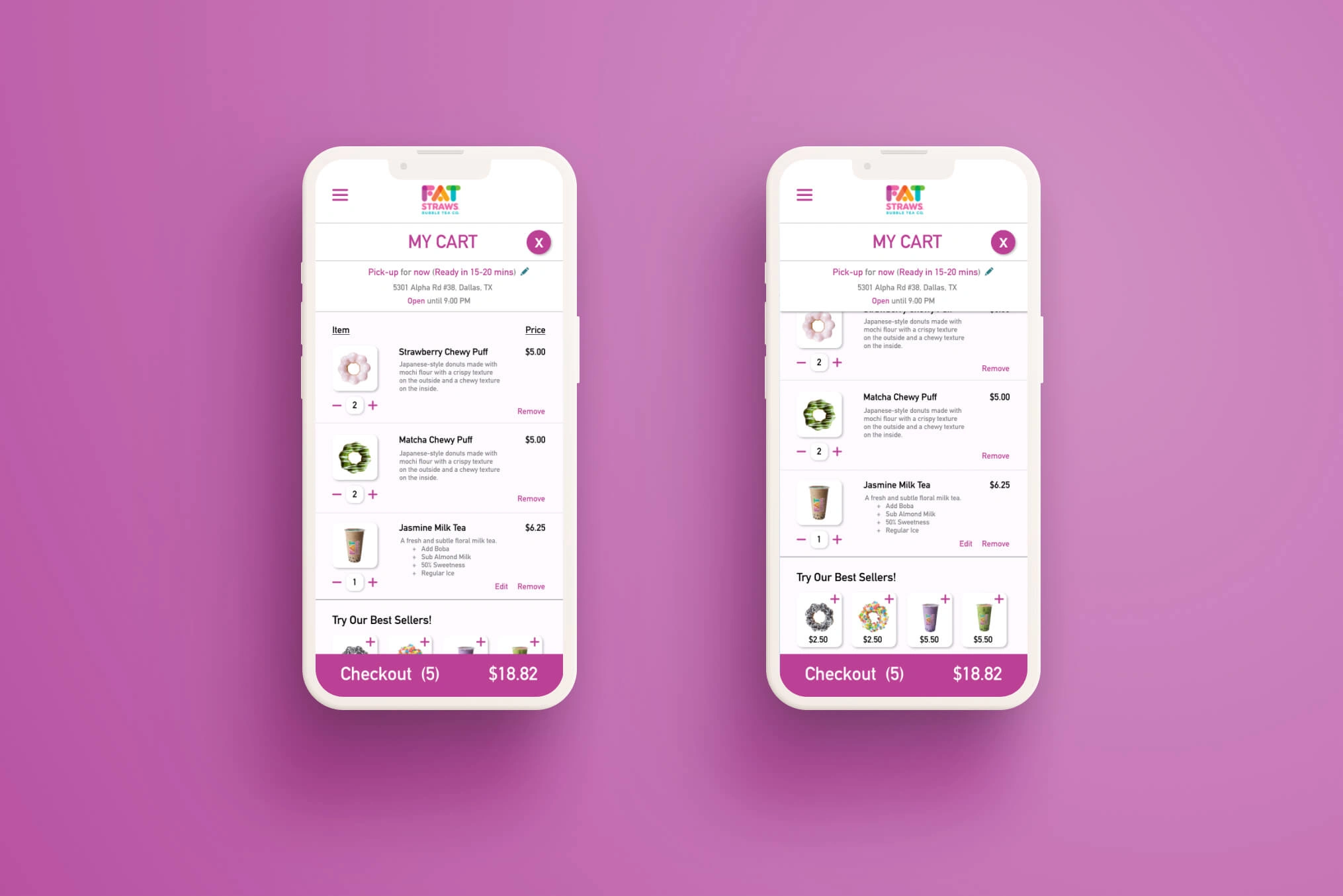
My Cart Page
Upsell section with a one-click Add to Cart to encourage users to purchase more
Visuals of each product to "see" what is in the user's shopping cart to emulate a real shopping experience
Prototype GIF
Prototype of the Re-Design
Takeaways
The biggest takeaways from this project were:
Too much information can be as detrimental to an experience as too little information
Heuristic evaluations and user journey maps are great tools to pinpointing pain points from a consumer's perspective
How to take constructive criticism from my peers/team in order to make better design decisions for the project as a whole
Improvements
If I could do anything differently, I would be more mindful of placing the price of the items in their respective sections so that the user would not have to add the item to the cart in order to see the price.
Like this project
Posted Aug 8, 2022
Decluttering and re-organizing a local small business's mobile online ordering experience to create a smooth and memorable user experience and increase profits.
Likes
0
Views
22