Open Source Design: Visual Identity for Django Commons
Jeff Karl
Integrating the Historical Commons into Django’s Visual Identity
The Django Commons project recently sought out the assistance of the Open Source Design community for creating a new logo. Below is one concept that came out of that design exploration. The goal behind this particular logo concept was to take the historical roots of the term "commons" and translate it into a visual identity that speaks to the ethos of the Django project and to the open-source community more broadly.
Inspiration from the Commons
The concept of the "commons" originates from medieval times, referring to shared land where communities collectively managed resources. A comment by Tim Schilling in the Django Commons discussion thread highlighted this historical meaning as a metaphor for OSS:
"It was definitely created to represent the commons area of land for animals to pasture as a callback to the historical meaning of the commons. I personally think that the definition of shared natural resources is relevant to OSS and worth trying to evoke visually."
So I decided to do some research on the historical commons, and I found some interesting imagery. One that jumped out at me was this conjectural map of a medieval manor:
Finding "Gemæne"
After doing some research on what the actual commons may have looked like, I thought it made sense to learn what the actual word for "the commons" was in Old English. Turns out there's a pretty exact translation "gemæne" (or "ġemǣne").
The word "Gemaene" (more accurately spelled as "gemæne" or "ġemǣne" in Old English) means "common," "general," or "mutual" and refers to something shared or held in common by a group. It was used both as an adjective (for describing collectively shared qualities or possessions) and as a noun (meaning "fellowship" or "intercourse").
It also carries connotations of "fellowship" or "united," aligning with the collaborative spirit of Django and OSS. So I thought "gemaene" would serve as a perfect base for a logotype.
Since I was using the original Old English word for commons as my visual basis for the logotype, it only made sense to base it on the writing system of that time. So I went looking for an original transcript that actually includes the word "gemæne". It took a little bit of digging, but I found an entry from the Junius Manusript, written in 1000 AD.
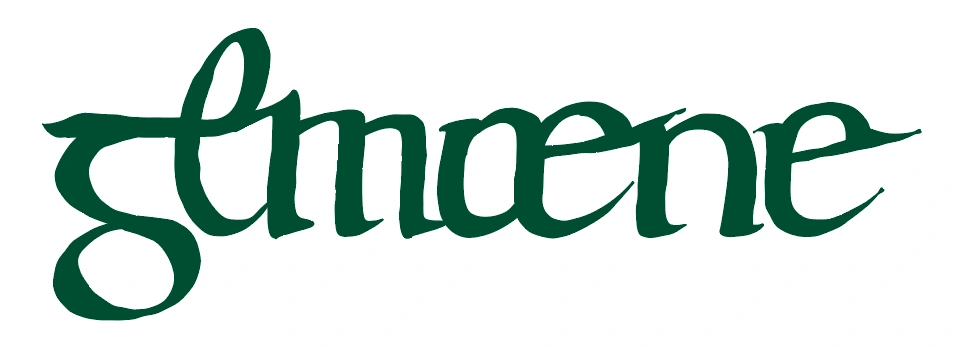
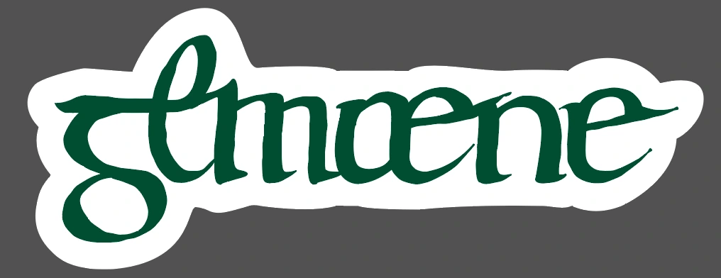
Designing the Logotype
To make the logo look like authentic calligraphy, I designed the logotype in Adobe Illustrator with slightly jittered edges. The green color is taken directly from the Django Style Guide.
LLM Hallucinations for the Wynn
While researching the original Old English word for “commons,” there was a happy accident: the LLM I was using hallucinated at first and created a new word: "Ƿæmaene" (pronounced "wamaene").
While this word is complete nonsense, I was interested in the first letter: it's called a "Wynn." It is a letter from Old English that originally came from Old Norse. It was originally a rune that had its own meaning: joy or bliss
A few things that stood out to me about the Wynn:
First, it's a homophone of "win."
The obviously positive connotation with the real meaning: joy, bliss.
The connection to Old English.
Visually, it almost looks like a miniature conjectural map of a medieval manor.
The Wynn almost looks like an inverted "d" and "j" from "django" merged together.
It has its own Unicode character. So, if used as a symbol, it could be copied and pasted anywhere on the web.
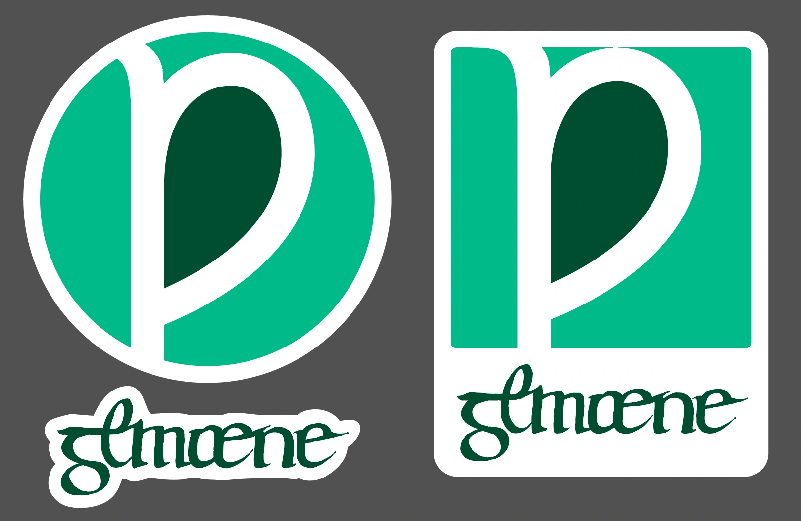
So I thought this rune—the Wynn—would make the perfect base for a logomark.
Designing the Logomark
Taking the wynn as a base, and using the original conjectural map as inspiration, I designed the following logomark. The inner part of the Wynn is the darker green. This is meant to symbolize this inner enclosure (the commons) being more fertile than the surrounding land. Again, the two green hues are both taken from the Django Style Guide.
Expanding the Concept: Swag and Community Ethos
While the logos were initially proposed as a potential brand identity for the Django Commons project, they could also serve as a broader symbol of the Django community’s values—collaboration, joy, and shared resources.
Additionally, I think the logos lend themselves to merchandise, such as t-shirts with playful slogans like "Django, for the Wynn."
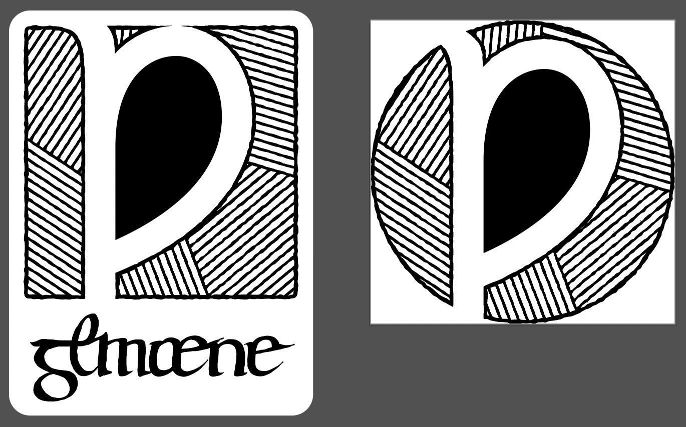
To make these two logos more widely usable, I created a black-and-white version inspired by the hatching lines of the medieval manor map. So while the “fertile” inner commons of the Wynn logomark is solid black, the parallel lines on the edges have a “hatching line” effect, creating the illusion of a gray tone.
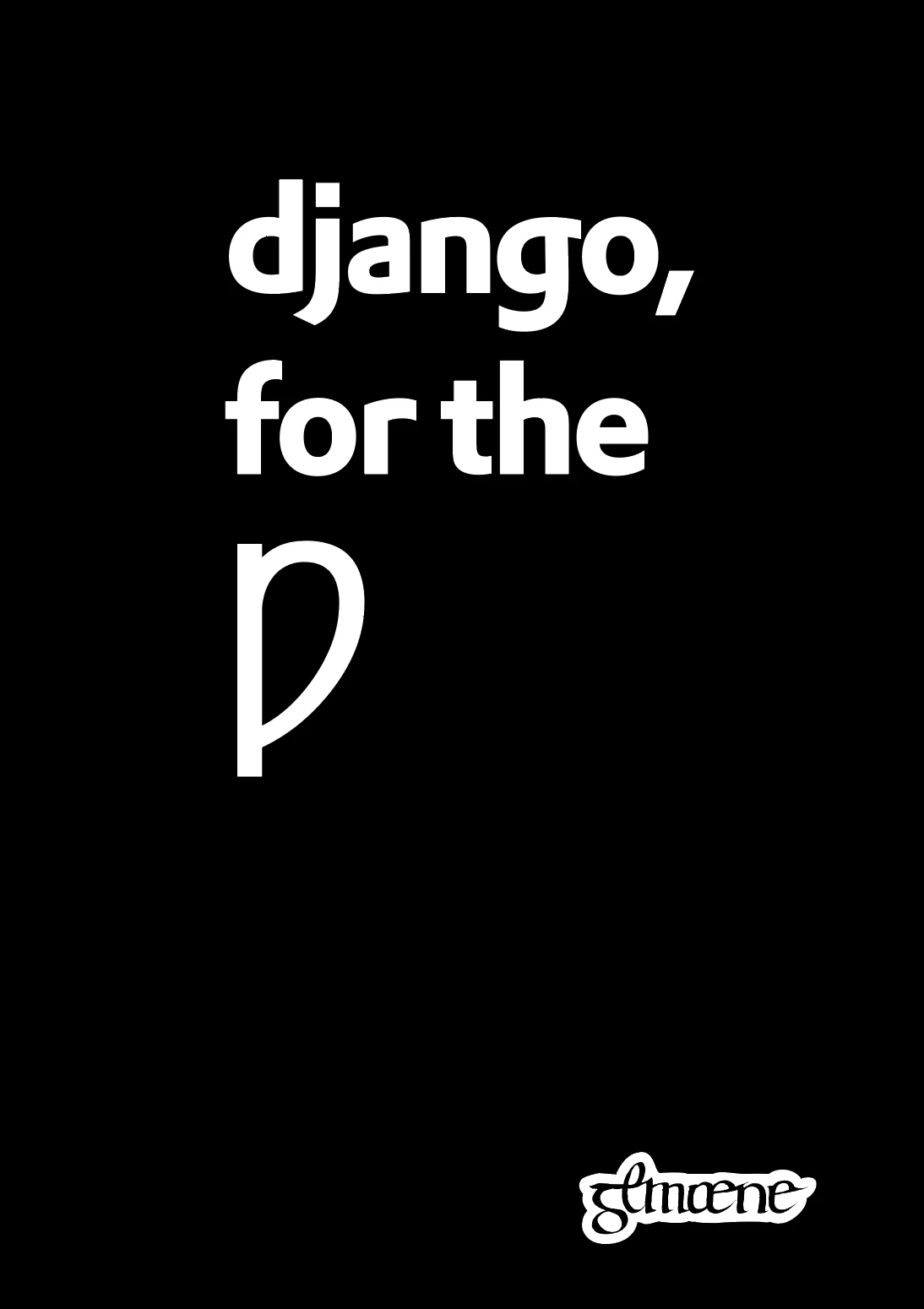
"Django, for the Wynn"
Like this project
Posted Feb 10, 2026
Designed a logo for Django Commons inspired by historical and linguistic research.
Likes
0
Views
6