Chaz Virtual Assistant Solutions
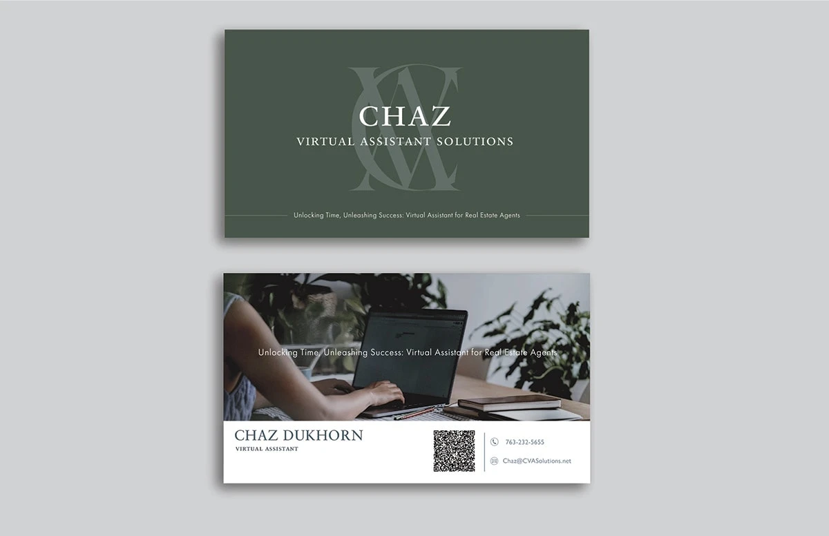
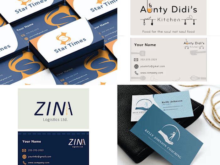
This case study gives you a quick look at how I crafted a unique logo and business card for this client. My goal was to capture the efficiency and professionalism of Chaz Dukhorn as a virtual assistant for real estate agents.
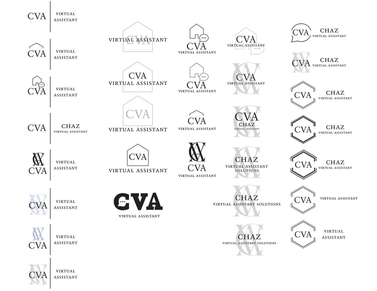
I began by sketching out ideas before moving on to create different logo options using Adobe Illustrator. The client preferred a Serif font and a clean, minimalistic style for the logo. This process focused on meeting those preferences, resulting in a simple and professional design.

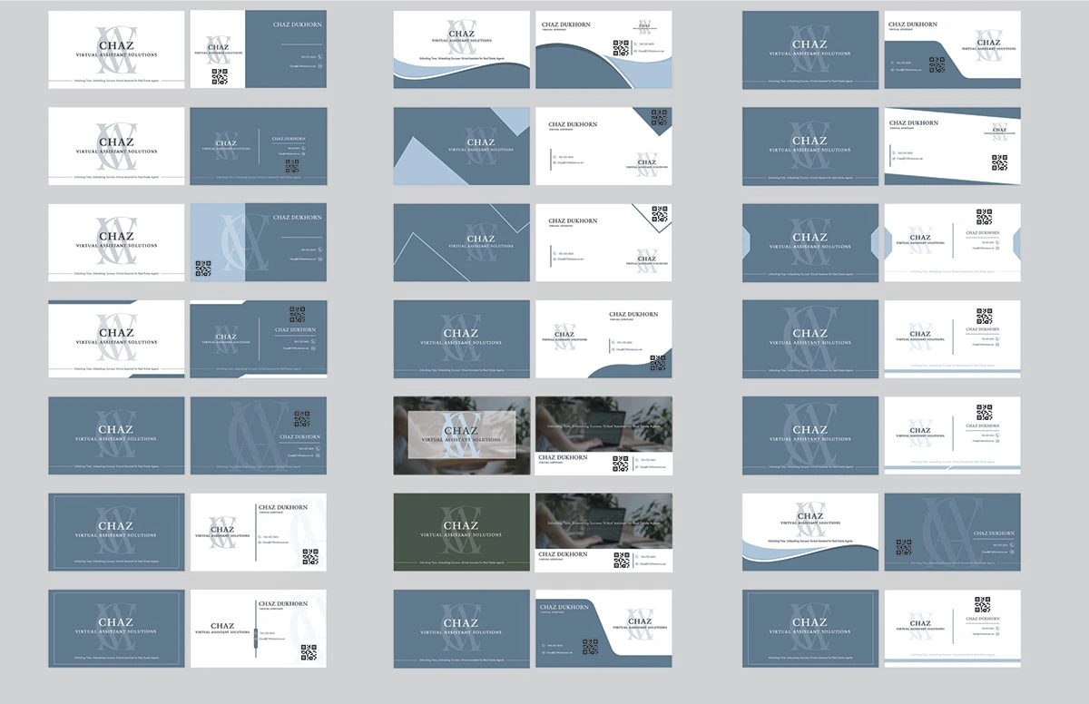
After a few rounds of revisions, we settled on a logo design. I then moved on to making business cards for the client. The client expressed a preference for a cool and professional aesthetic. Initially, a colorless palette was favored, but as the design process unfolded, a muted blue color stood out in various business card examples, resonating well with the client. While exploring options, the client discovered an image through her Canva subscription that resonated with her vision. This prompted a shift in the color scheme to a muted green, harmonizing with the selected image. The iterative process not only incorporated the client's evolving preferences but also ensured the final business card design reflected a cohesive and professionally appealing look.

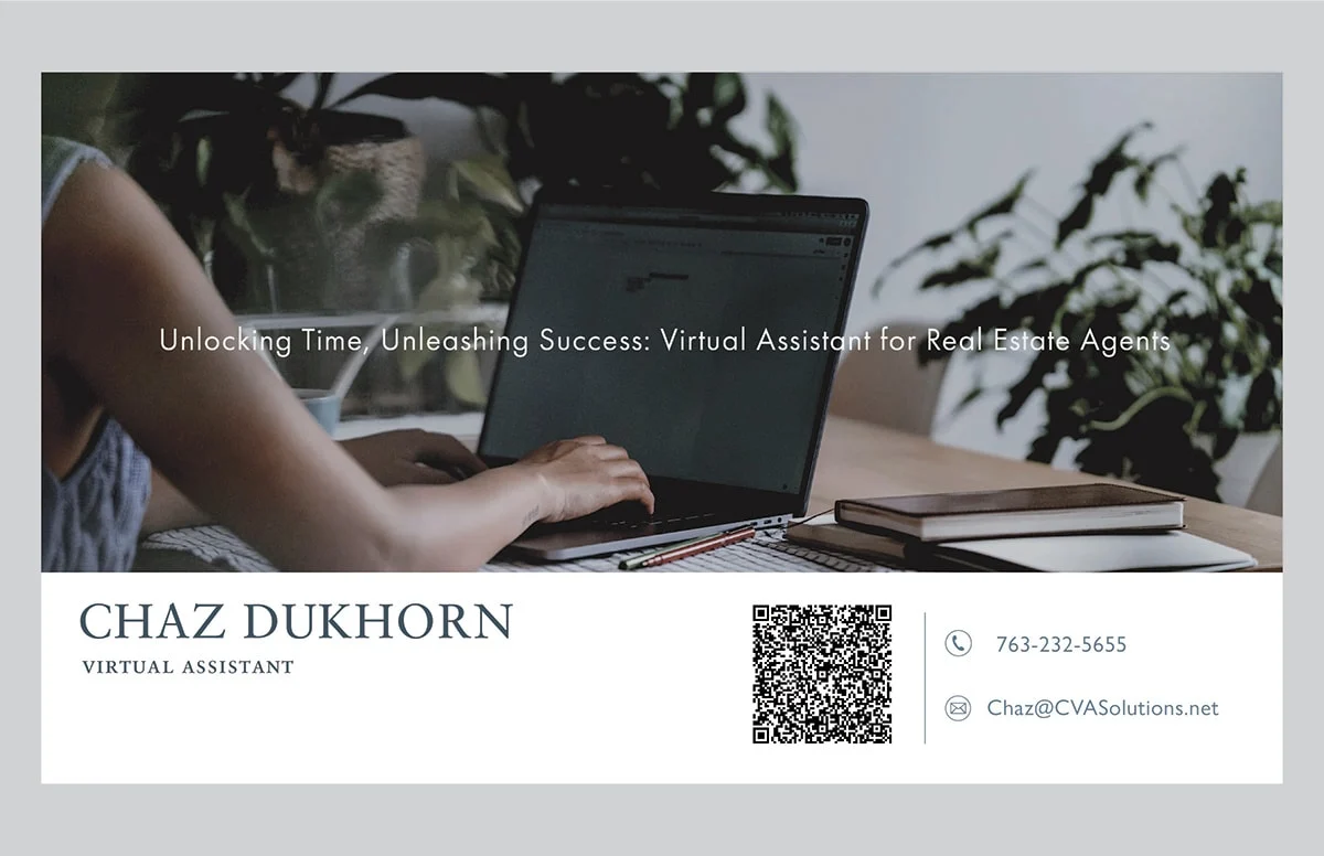
In wrapping up, we've crafted a logo and business card for the client that reflects their efficient and professional services. The logo captures the core identity, while the business card, evolving from colorless to a muted green, ensures a cohesive look.
This project aimed to meet client preferences while staying functional. The final designs stand as symbols of the client's professionalism. Thanks for the opportunity, and I'm here for any future collaborations.
Best,
Oyin Omole
Like this project
Posted Jan 1, 2024
I designed a sleek logo and business card for the client, a virtual assistant, who was aiming for a professional and efficient look.
Likes
0
Views
13

