Helping Young Africans Invest in USD Assets Portfolio

Helping Young Africans Invest in USD Assets Portfolio
The Product
Cowrywise is a YC fintech startup digitizing the investment management industry in Africa and democratizing access to savings and investment products for the growing population of the underserved African middle class and millennials. With a mission is to empower the next generation with powerful wealth-building tools to enable them to improve their financial health.
The Problem
A significant number of our users are usually saving with only a tiny fraction investing in mutual funds. With the introduction of stocks, the challenge was how might we help these users invest more?
The Goal
Design a totally new experience on Cowrywise that helps users easily invest in a curated portfolio of US assets that align with their risk appetite.
My Role
UX designer leading the US Dollar portfolio project
Responsibilities
Conducting interviews
Paper and digital wireframing
Low and high-fidelity prototyping
Conducting usability studies,
Accounting for accessibility,
Iterating on designs
Responsive design.

User Research Insights
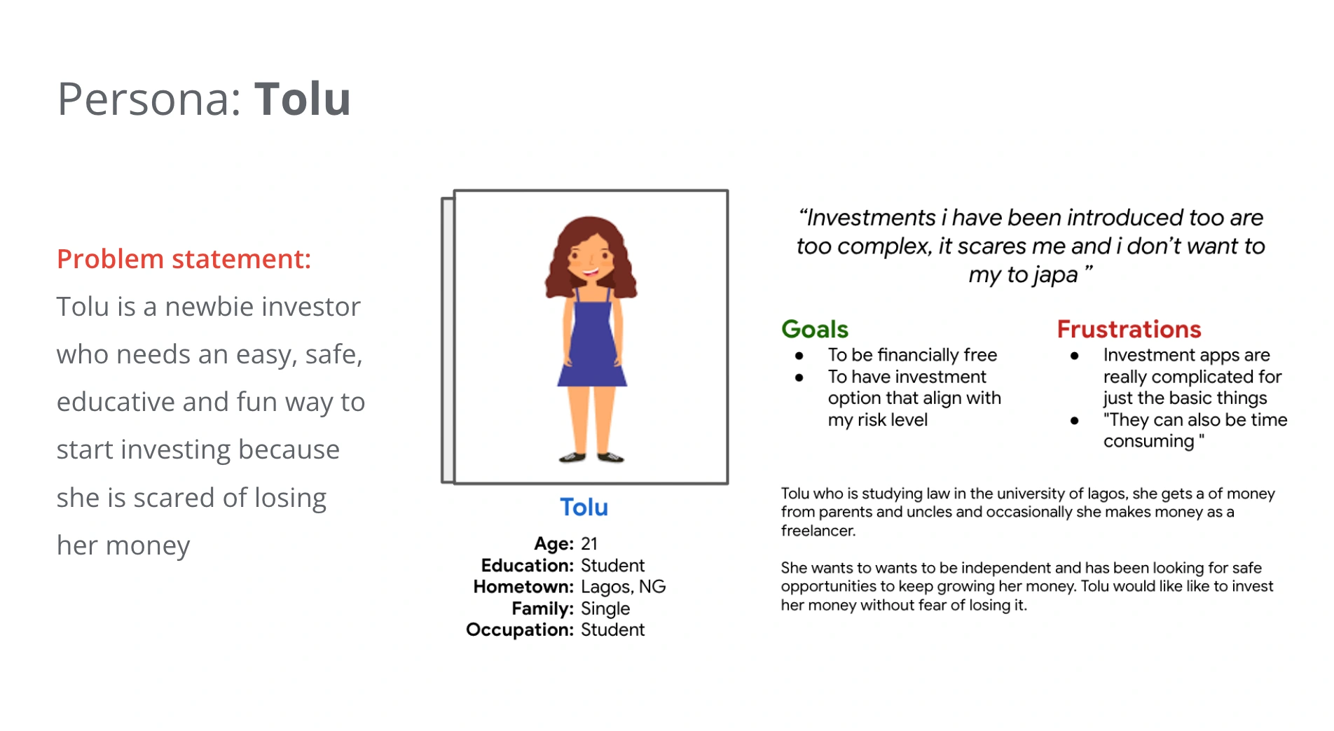
A number of users are afraid of investing because of past poor investments.
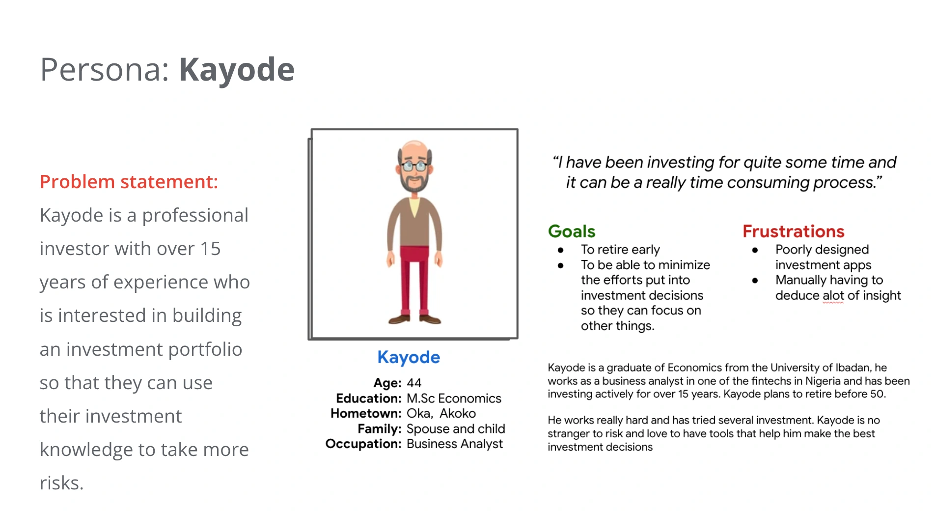
The overly complex and time-consuming process of creating an asset portfolio.
Quick rewards and little or no investment education.
User Persona


Usability Study Finding
Findings from the study helped guide the designs from wireframes to mockups and revealed what aspects of the mockups needed refining.
Users want invest in a USD portfolio quickly i.e reducing the steps
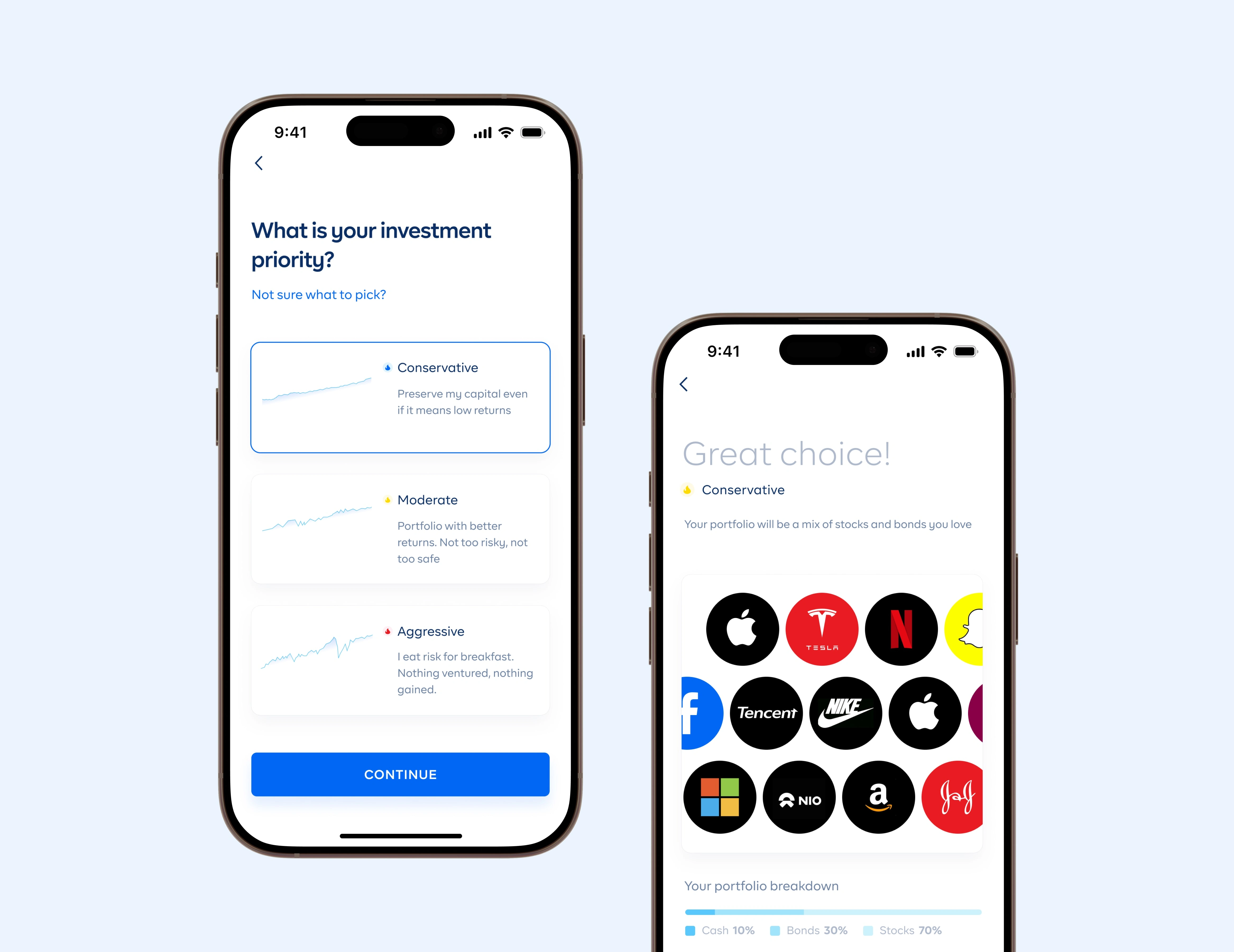
Users want portfolios based on their risk
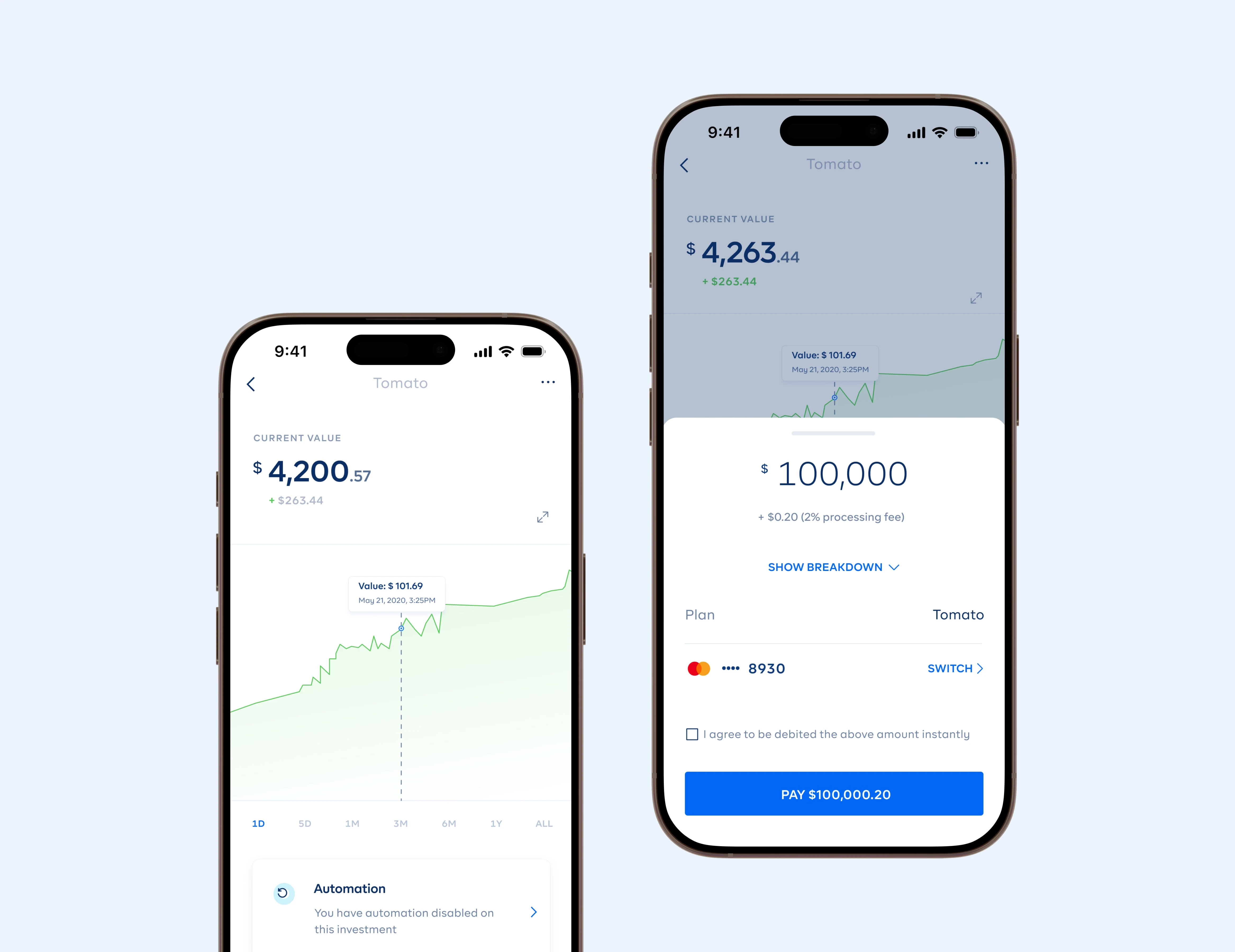
Users want a to be able to visualize forecast of the investment
Users want to preview assets in their risk level
Some users didn’t know the RIGHT portfolio
High-Fidelity Prototype
The final high-fidelity prototype presented cleaner user flows for creating and investing in a USD portfolio. It also met user needs based on customization with risk appetite.
View the high-fidelity prototype

High-Fidelity Design (Mobile)


High-Fidelity Design (Web)


Takeaways
Impact
Our users shared that the design was easy and fast to navigate through, and most importantly, they felt empowered.
One quote from peer feedback:
“The app makes it so much fun and easy to invest in alot of stocks, especially for a newbie like me. With this returns i am seeing, i am definitely investing more.
What I learned
I learned that even a small design change can have a huge impact on the user experience. The most important takeaway for me is to always focus on the real needs of the user and test as early as possible.


Like this project
Posted Sep 22, 2025
Redesigned the Cowrywise USD investment experience, enabling young Africans to seamlessly grow wealth and diversify through global asset portfolios.


