Roomies

My first attempt at human-centered design, Roomies (we’re still working on the name), was inspired by my challenges and experiences as a roommate throughout my university experience. I have lived in a range of housing arrangements, from dorms and apartments to townhouses, with eleven different characters, each with their own traits and idiosyncrasies. Our first attempts at an independent life, with all its trials and tribulations, were a struggle. But suffice it to say, getting on the same page with all these differing characters was a challenge of its own.
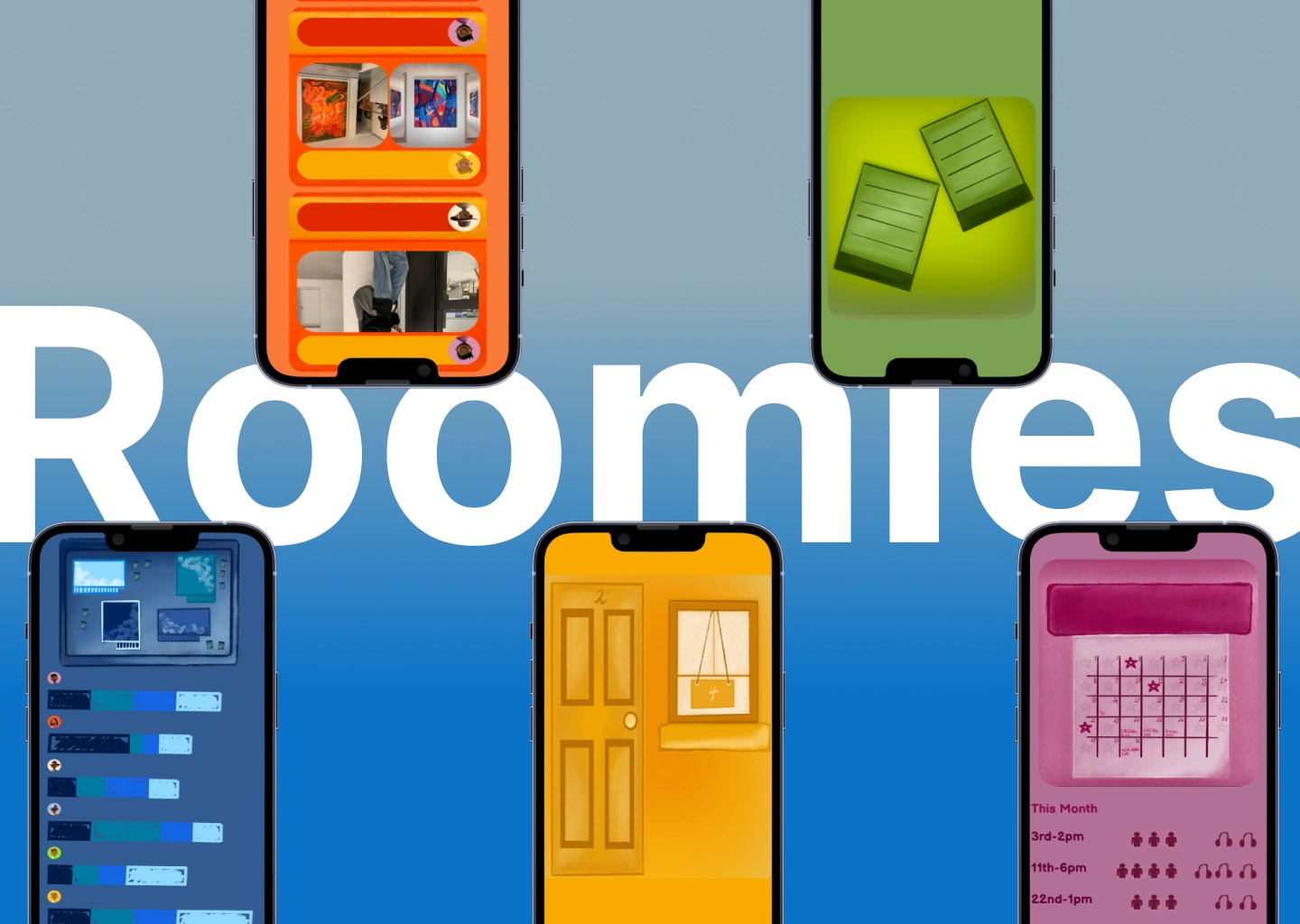
I was left scratching my head, wondering how to translate my personal framework for maintaining a household. “Well, there’s gotta be an app for that, right?” And there were. However, none seemed to have the feeling of what it was to have roommates and would boil down the experience to a simple business transaction between people who shared a home, when in all actuality, from my experiences, having roommates was an intimate and complex dynamic which is more akin to having a family than simply people you share responsibilities with. On a more practical note, all these apps we found would have all the required attributes and services but never in one package or were tailored for finding roommates rather than managing life with roommates. Leaving you having to download multiple applications for an experience that could easily be contained in one. “Well, why don’t we just make one of our own?” (a conclusion that took too long to reach in a house with four computer science students). Thus, Roomies was born. But of course, in true poetic fashion, I have finally completed the initial prototype now that I have graduated, and we are all slowly trickling out of our home. Nevertheless, though we were never able to use it, we could only hope that our brainchild could prevent years of passive-aggressive remarks and side-eyes and bring generations of roommates closer than ever.

The Design
The goal was simple, to break as many rules as possible without getting in the way of user experience. As from my user research of my roommates, something had become very clear. Users around our age, those who grew up with mobile applications, had become bored and too accustomed to the UX/UI that was available in the market, to the point that sometimes you may even forget that you had left one app for the other. The same experience over and over again, it seems as though a global consensus of what good UX/UI is has been reached and has left individual apps without their magical and escapist element they once had in my youth. And so, with Roomies, I wanted to strip away everything I felt was unnecessary or self-explanatory but keep all the perfect imperfections that give it its homemade feel. Straight lines and conventional elements to a minimum to cut through the clean and monotonous UI design we face today, in the hopes of giving users a distinct experience that sticks out from the rest. When you’re using Roomies, you’ll know exactly where you are. And though those design principles are in place for good reason, I felt with this project and with the target demographic, I would be afforded the opportunity to break some of these rules to give users a novel experience as most users would naturally intuit how the various elements work.

I wanted to create something that looked and felt strikingly unique, so I digitally drew as much as I could and tried to give the application as much character of its own through the colours, the architecture, the navigation, the cartoonish designs and even the philosophy behind all the features. While still stripping down the app from any unnecessary features or “UI/UX handholding” that could prevent users from discovering how to use this app for their own purposes, an opportunity I felt could be taken advantage of with this demographic. As you can see from the design, I took heavy inspiration from analog methods of tracking all these elements necessary for maintaining a household. From the calendar on the wall, the sticky notes on the fridge, and the bulletin board with all the chores, the message was simple: This could all be done in the physical world.
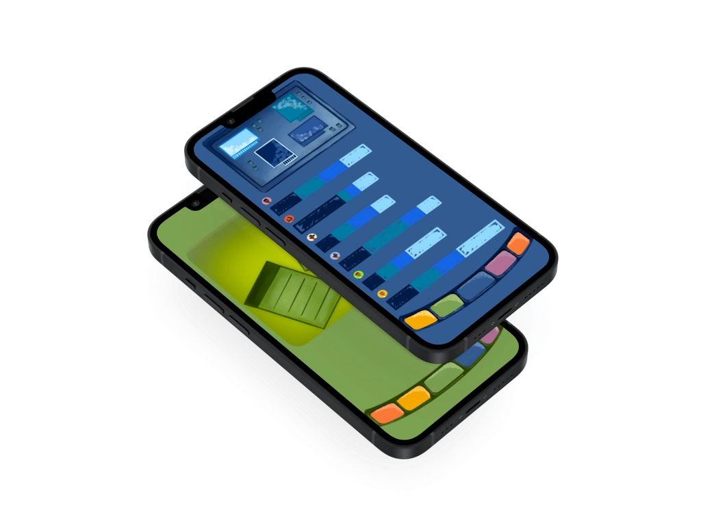
The ultimate aim of this app is to provide a model for real world solutions to these real world problems, and for the app to serve as an easily accessible snapshot of these methods that could be in place physically. Though, as I have discovered, this is easier said than done, I hope this application can serve as a worthy placeholder. But the app's goal is to keep a portable copy of your home, get users off the app, and apply these principles in the real world!

Another key feature of this app for me was finding a way to integrate as much interaction between roommates as possible. To help foster a sense of community. I hoped to accomplish this through a house feed, a mini social media network to bring occupants closer together on a personal level. An opportunity to share with your roommates even when your away and to keep them up to date with your life. A separate chat to help users compartmentalize any in-house conversations amongst themselves and even with a landlord.
Compartmentalization is a key element to running a household, and I wanted to make sure to translate this into the app. I did so with the distinct colors of each page and the overall themes behind them. For instance, a little healthy competition when it comes to chores wouldn’t hurt anybody and should be seen as a team effort. But other matters, such as bills and having guests over, can be kept somewhat personal and more or less serve as reminders for users. By dividing the various tasks and responsibilities into distinct pages, I feel users can extend this compartmentalization mentally and be able to fulfill each task with focus and without feeling overwhelmed.
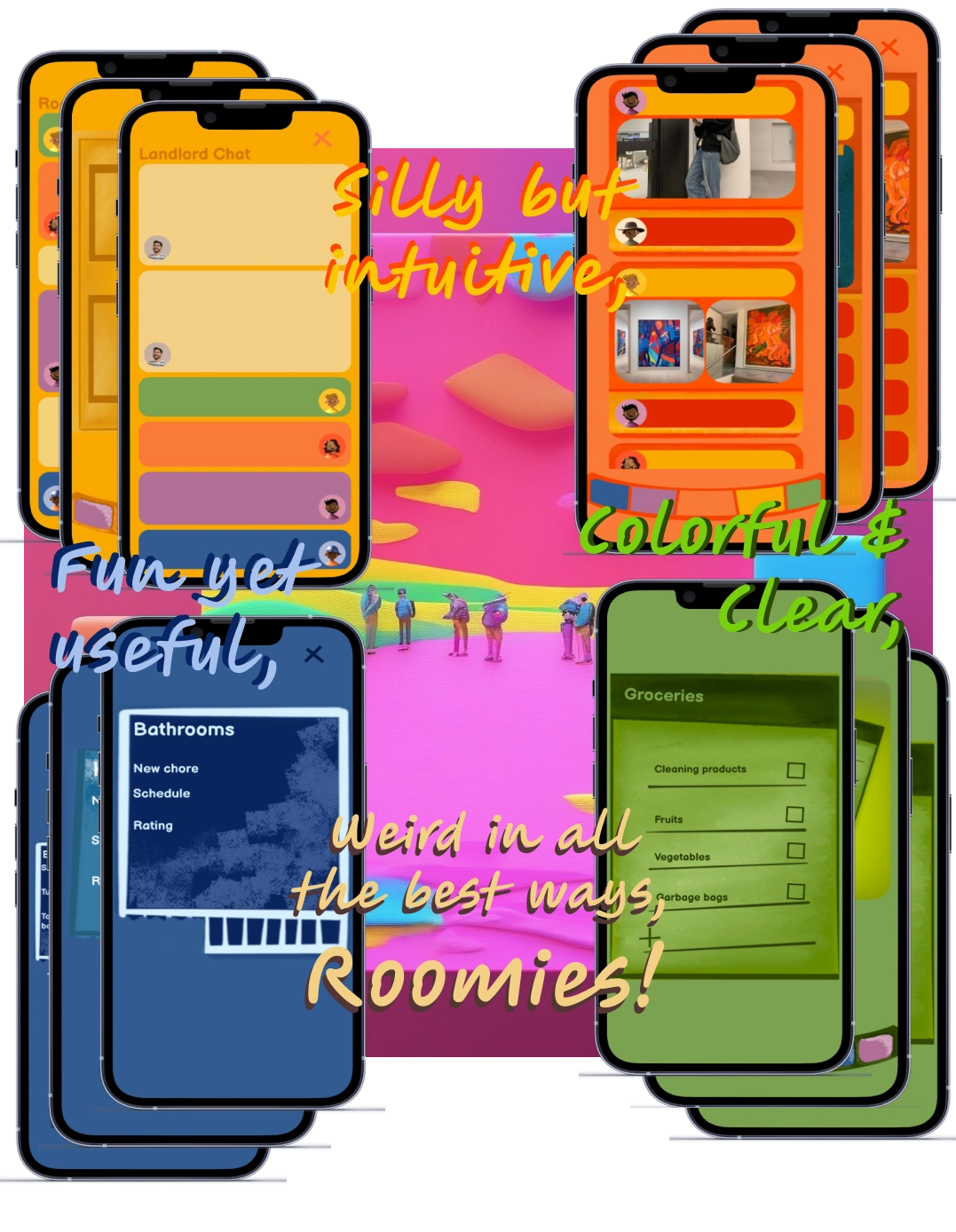
Novelty was what I set out to find, and I believe I have found it. And though I may have taken some concessions on design and initial usability, I know that through time users will find it is quite intuitive and very simple to use. Straightforward but memorable; don’t let the aesthetics fool you. This app is quite ambitious yet efficient, and with each iteration, we got closer to bringing a product to market that could actually make a difference in people’s lives and give them a new experience to enjoy.
User Research
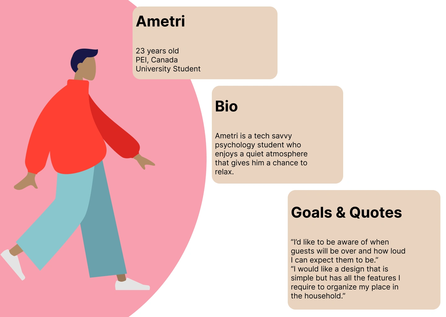
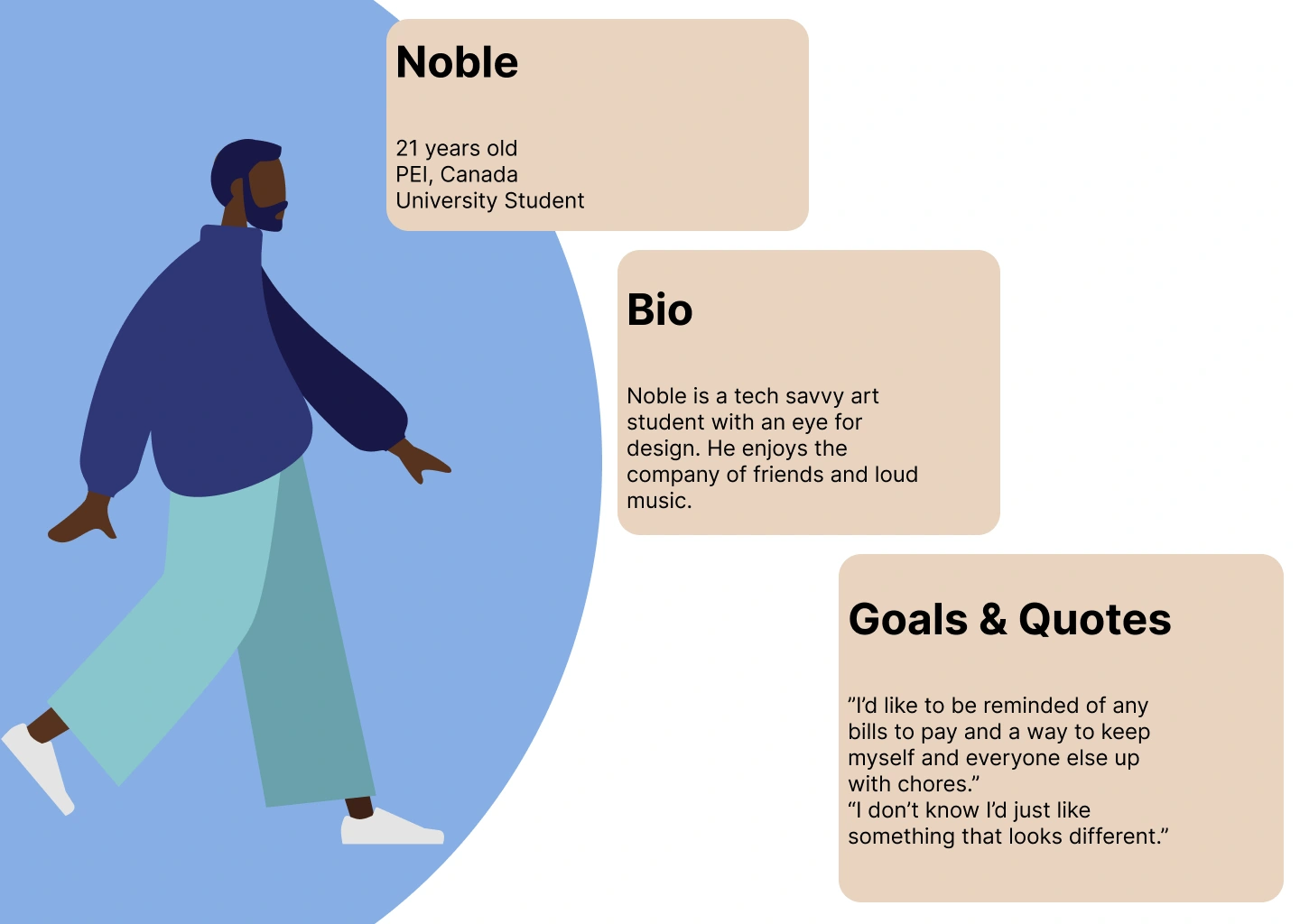
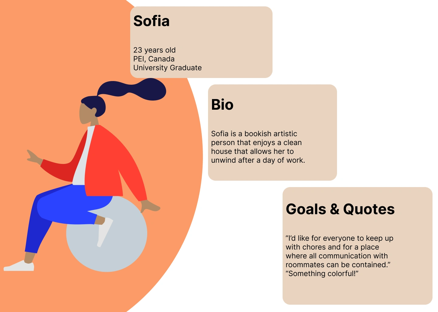
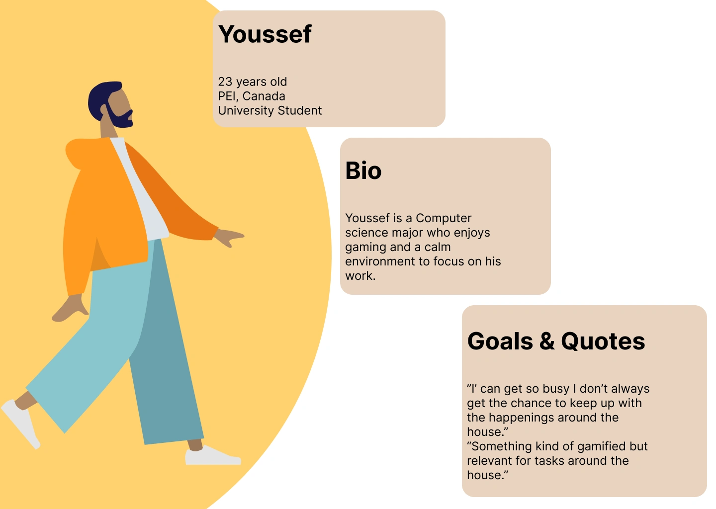
For this project I took advantage of the demographic of young adult roommates around me as I feel as though this is the population that could benefit the most from this app. I set up structured interviews and was able to create personas based on this research. These personas aided me in creating a prototype that met both their design and experience goals.
User Journey Map
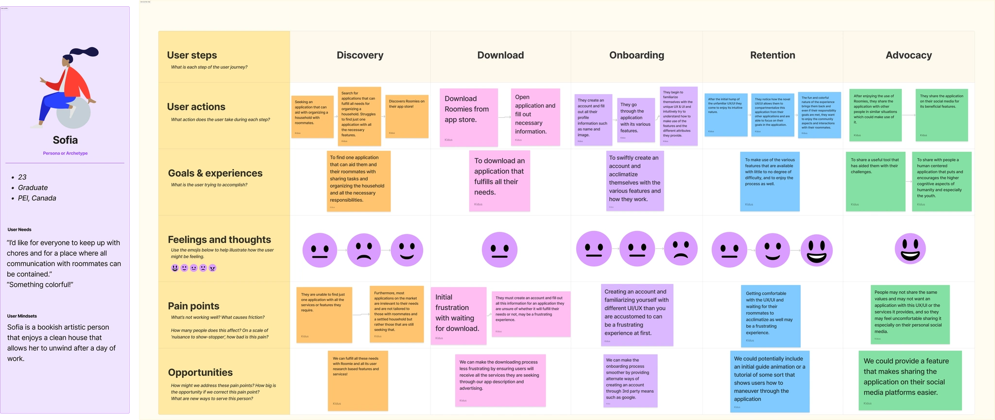
I created a user journey map from the persona I found most useful to better layout the various scenarios leading up to product use and post their experiences with the app.
Wireframes
The various iterations of the lo-fidelity wireframes.
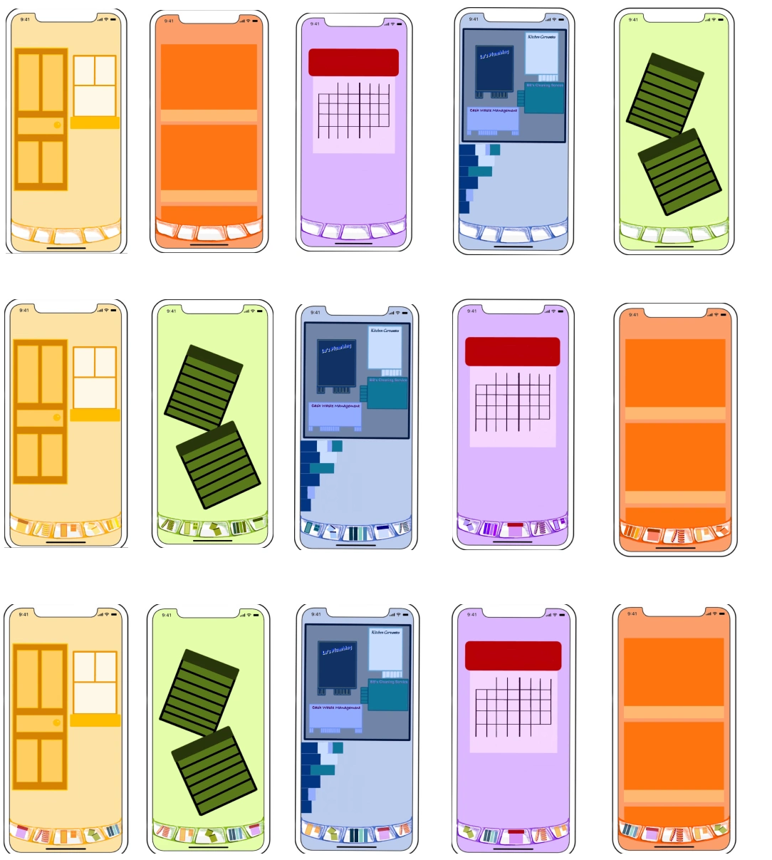
Final Design
I present Roomies!
👇 Play with the prototype here!
Like this project
Posted Nov 7, 2024
Turning roommates into more, check out the full breakdown of my first human-centred design project, Roomies, the app for family!


