Magnetic Communications Rebrand
Elissa Woods

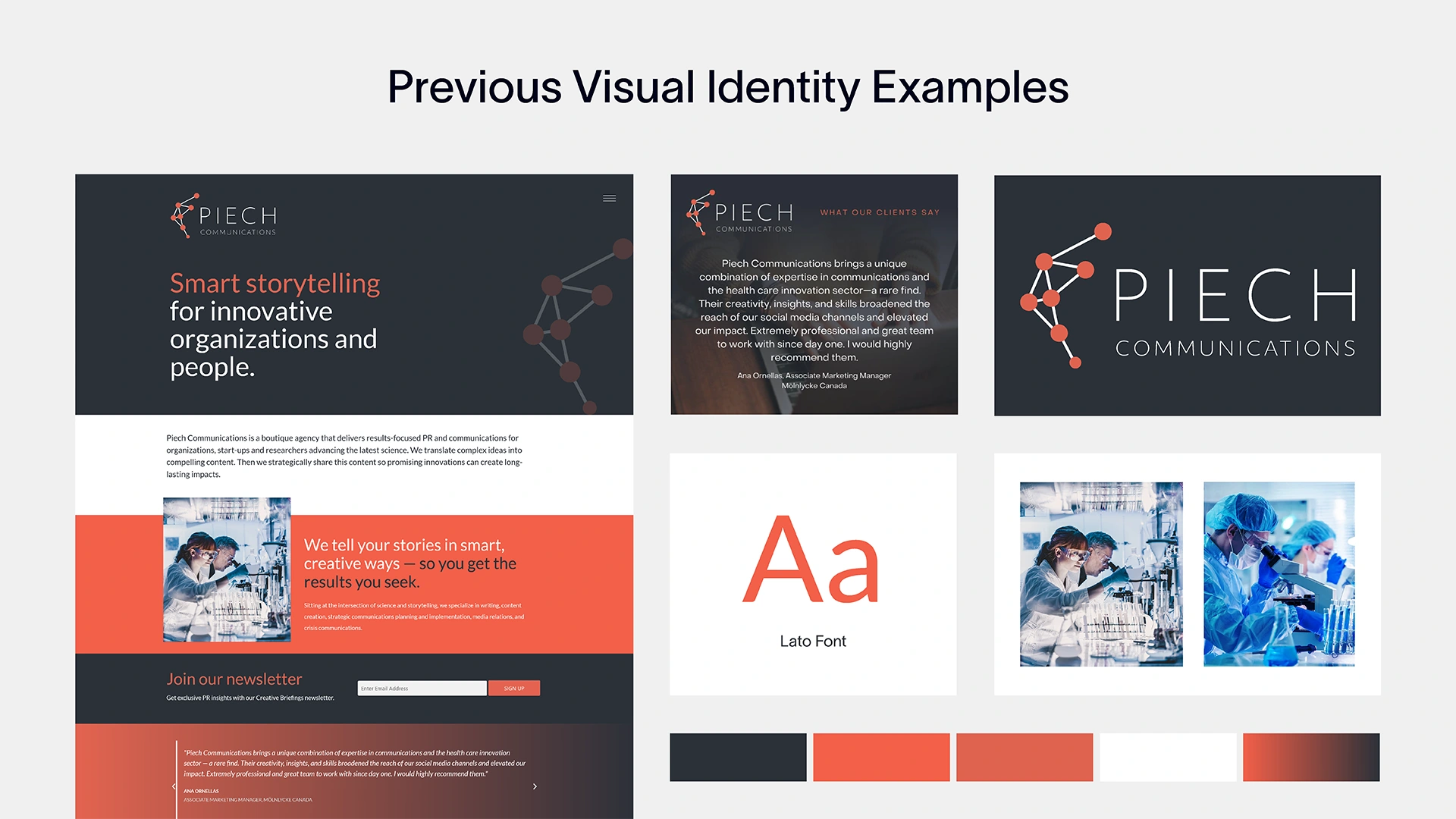
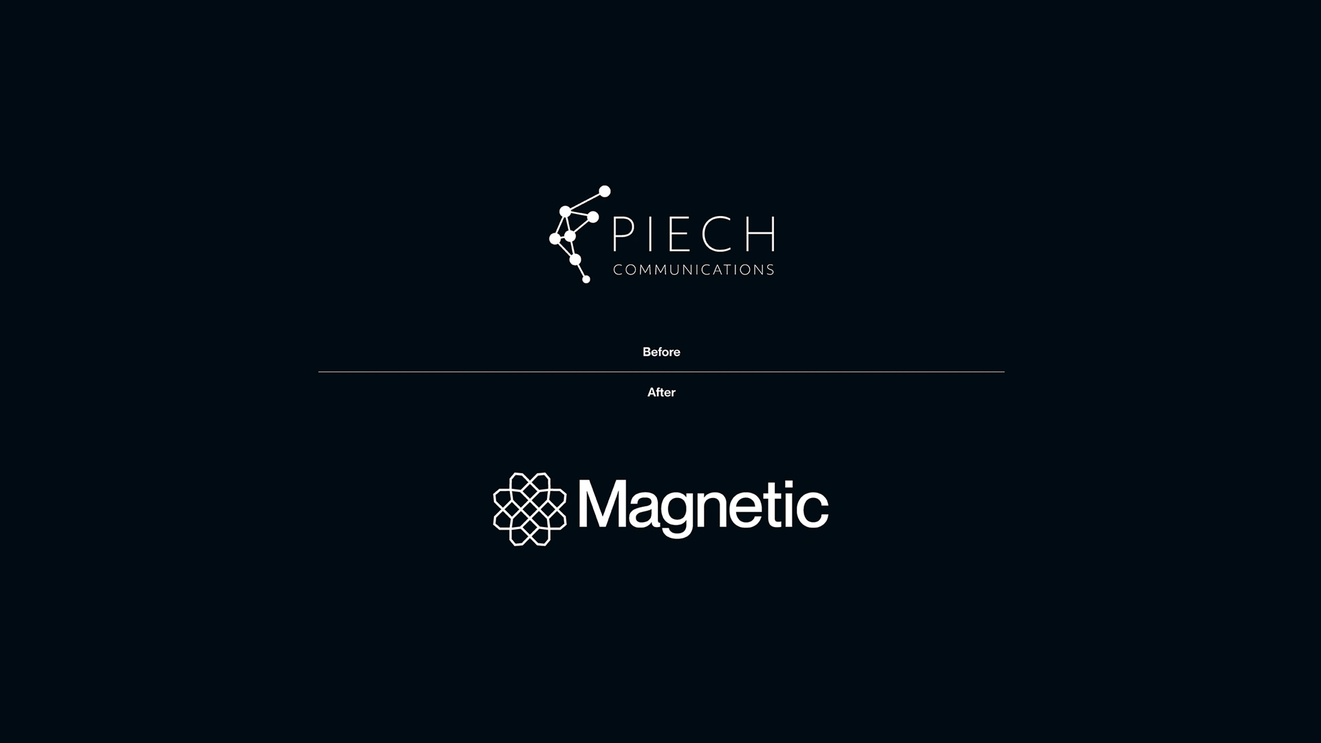
Magnetic Communications, attractive storytelling for leading-edge science. Nestled in the vibrant landscape of British Columbia, Canada, the PR and Comms agency specializes in transforming complex scientific advancements into stories that inspire and connect, led by its Founder, Claire Piech. Claire's original brand had outgrown its roots as a solo enterprise. The vision for her business had evolved, and the brand needed to reflect that transformation, a shift from an individual consultancy to a full-service agency, boldly taking scientific communications to new frontiers.
Overview
Led by Principal and Founder Claire Piech, Magnetic is a scientific PR and communications trailblazer. With over 16 years of experience, Claire’s expertise broadly spans scientific sectors in biotech, climate tech, and life sciences, and beyond, where communication is as vital as the sector's innovations. Claire recognized a pressing need as her client base grew to include some of the most forward-thinking start-ups and organizations across Canada and the U.S. Her company’s original identity, Piech Communications, had outgrown its roots as a solo enterprise.
By the Fall of 2024, Magnetic Communications’ trajectory was clear: the agency was becoming a leader in scientific PR, but the brand needed to evolve to match the caliber of its services and growth. Claire’s goal was ambitious yet focused, to position Magnetic Communications as the premier partner for science-driven start-ups looking to amplify their stories. She sought a brand that would balance technical sophistication with a bold and modern edge, a visual identity that mirrors the spirit of discovery her clients embody.
Claire approached me with a simple yet powerful request: “I’ve always loved your work, and I want to get this rebrand right.” Her clarity of purpose set the tone for a dynamic collaboration rooted in trust, respect, and a shared commitment to excellence.
Designing the Future
Reimagining Magnetic Communications was a journey guided by purpose and precision. Our process was methodical yet creative—a balance of structure and exploration designed to capture the essence of Claire’s vision. She and I began with an immersive discovery phase, diving deep into Magnetic’s values, competitors, and audiences. Together, we crafted a high-level “design wish list,” identifying the elements that would differentiate Magnetic while staying true to its scientific storytelling roots.
Visual ideation followed. Two distinct mood boards were presented, each offering a unique take on the brand’s personality. Claire’s thoughtful feedback honed the direction, paving the way for a cohesive visual language. The approved creative direction informed every decision, from logo development to typography and illustrations.

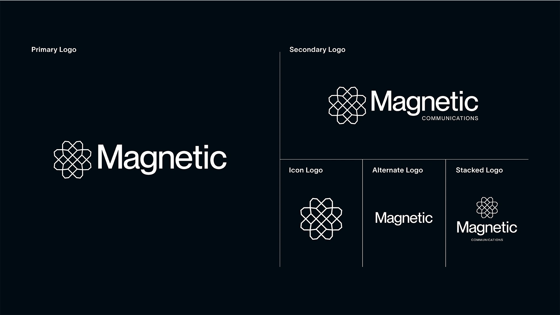
Logo
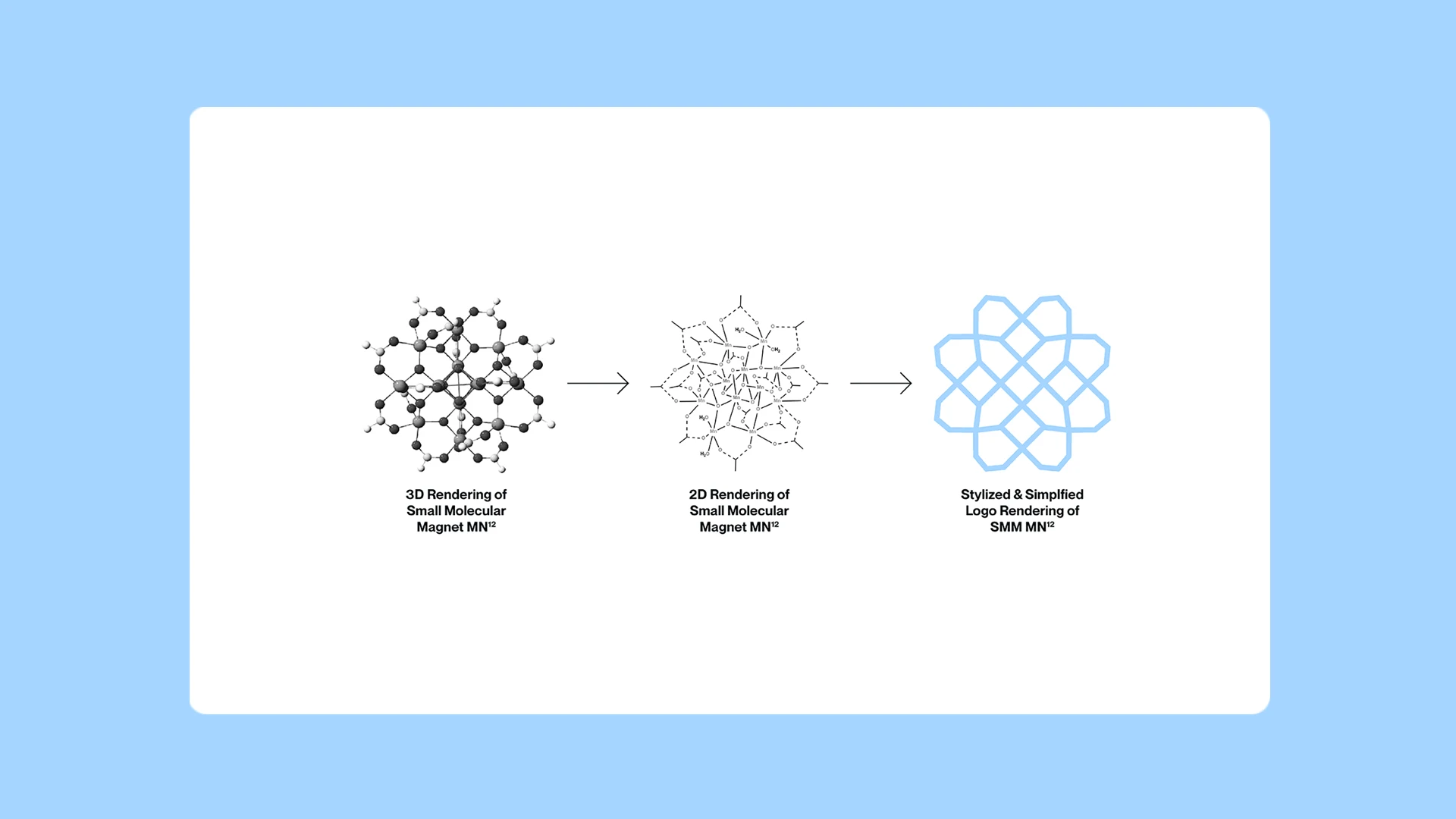
Magnetic's logo needed to embody the spirit of the agency—modern, sleek, minimal, and edgy, yet be deeply rooted in science. This wasn’t just about aesthetics; the logo required a meaningful story to resonate with the agency’s audience, which spans diverse scientific and technological fields. It needed to speak to the pioneering work Magnetic’s clients are advancing, from biotech to climate tech, and beyond. The solution lay in a deep dive into single-molecule magnets (SMM), a revolutionary concept perfectly aligned with the agency’s mission.
Single-molecule magnets, specifically [Mn12O12 (OAc) 16 (H2O) 4] (nicknamed "Mn12"), became the inspiration. Mn12 was the first identified SMM, marking a breakthrough in magnetic memory and the building blocks of quantum computing.
Beyond its scientific significance, manganese’s versatility across fields like electronics, engineering, and human health mirrored the multidisciplinary nature of Magnetic Communications’ clientele. The choice was deliberate and layered with meaning, symbolizing the past, present, and future of scientific and technological advancement.
When presented with the story behind the logo, Claire’s reaction affirmed its impact: “This is wonderful! Thank you for your well-thought-out approach and design.” Her enthusiasm reinforced the alignment of the logo’s design and narrative, ensuring it was not just a visual asset but a representation of Magnetic Communications’ purpose and ambition.
Visual Identity
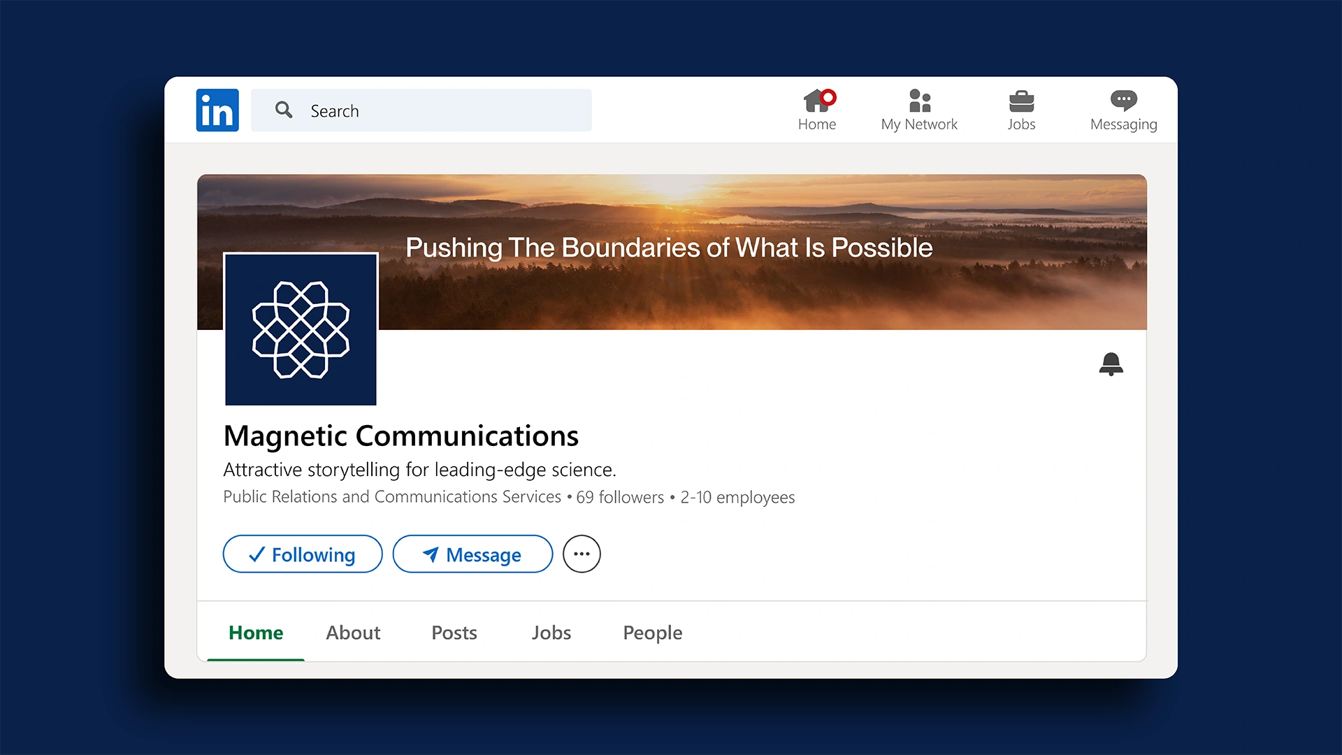
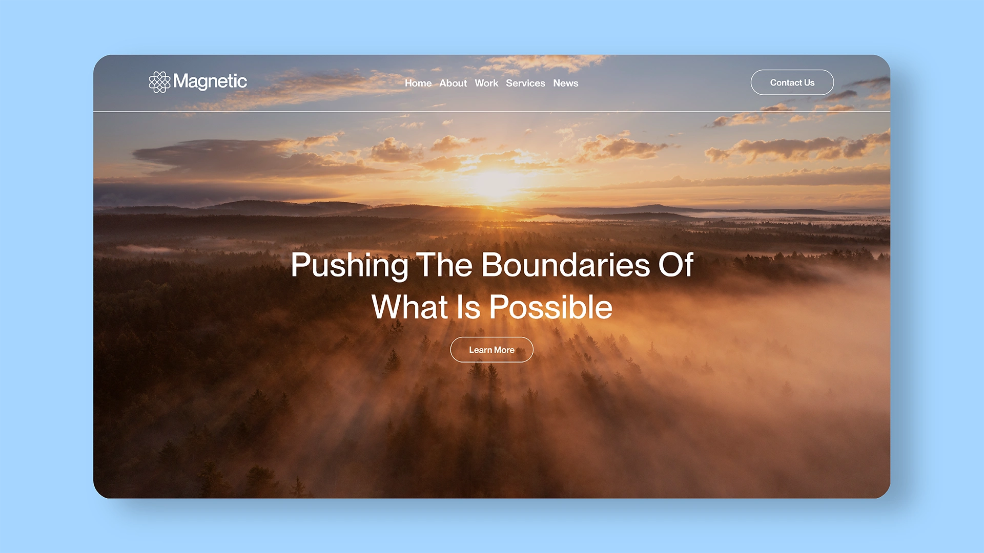
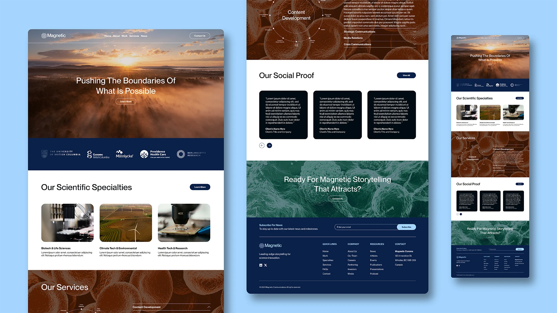
The outcome was a visual identity as dynamic and forward-thinking as the agency itself. The geometric MN12-inspired logo symbolized Magnetic’s mission to translate complexity into clarity. A desaturated, earthy color palette infused the brand with sophistication and approachability, while sepia-toned imagery added depth, blending science, technology, and climate visuals.
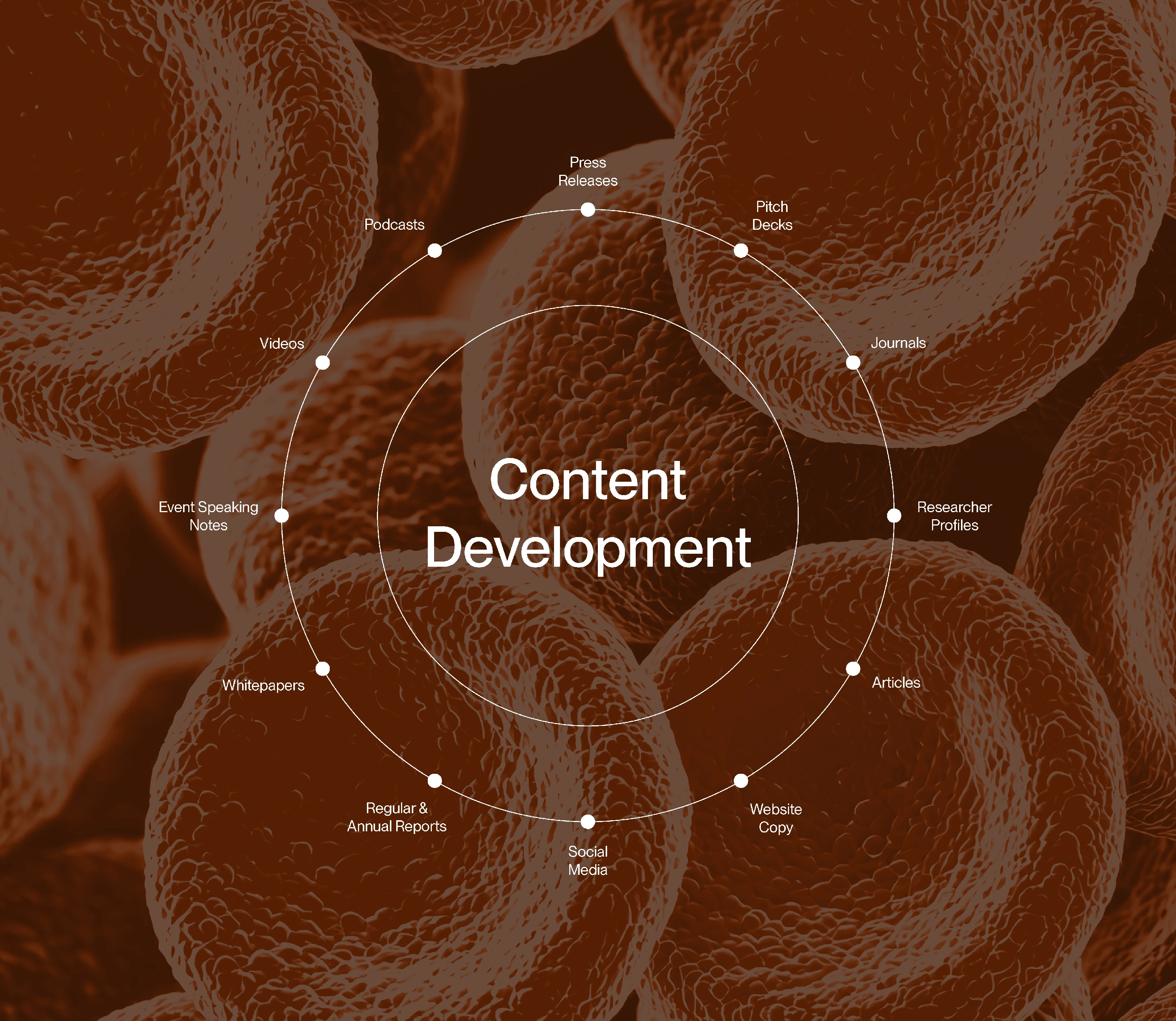
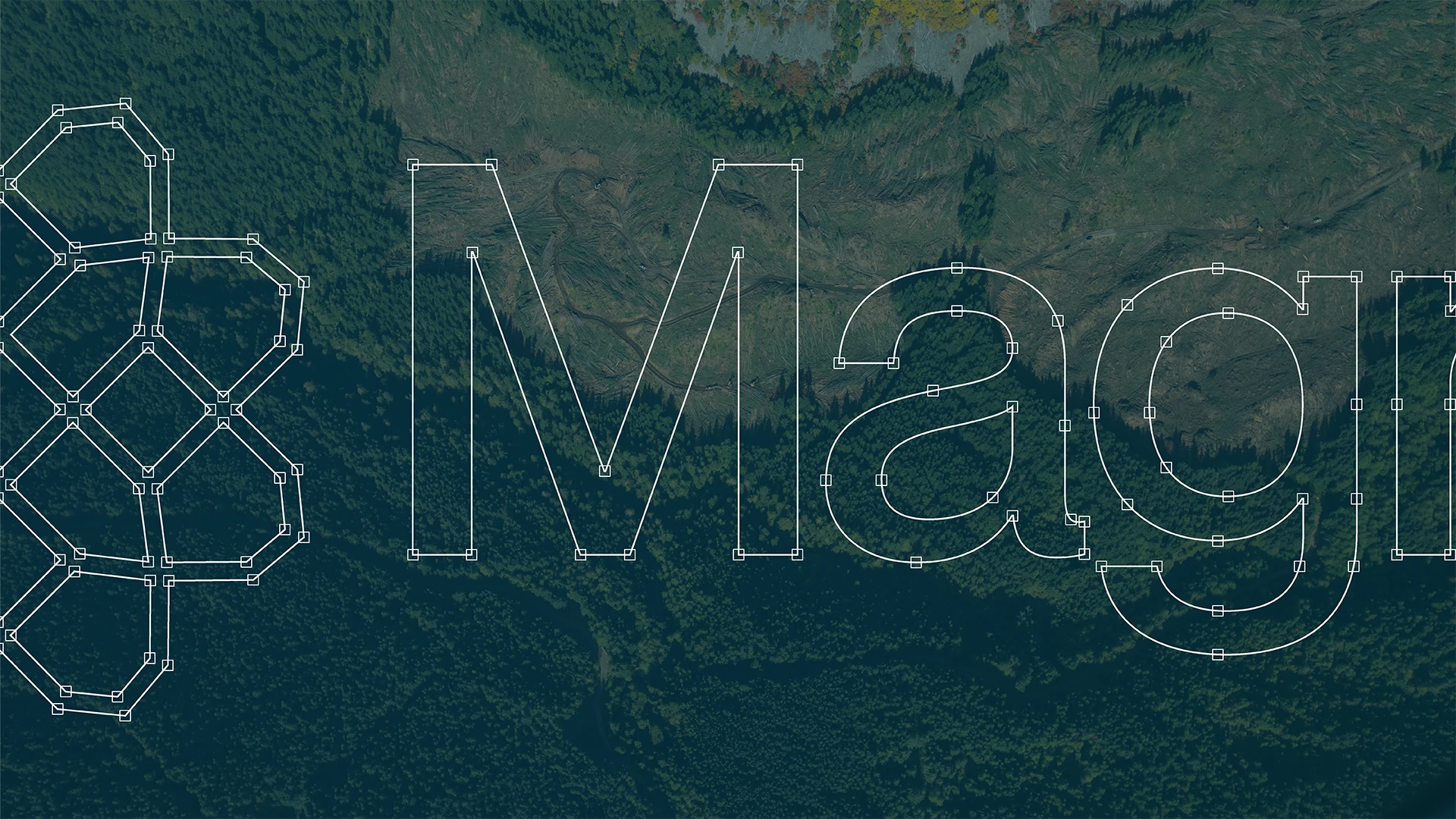
Custom illustrations brought data and strategy to life, offering a sleek and minimal way to communicate the agency’s services. The typography—Neue Montreal, a modern sans-serif font—grounded the brand in its Canadian origins while projecting a contemporary, global outlook. Every element was meticulously designed to reflect the agency’s ethos: “Boldly taking science communications where they’ve never gone before.”
Transforming Possibilities
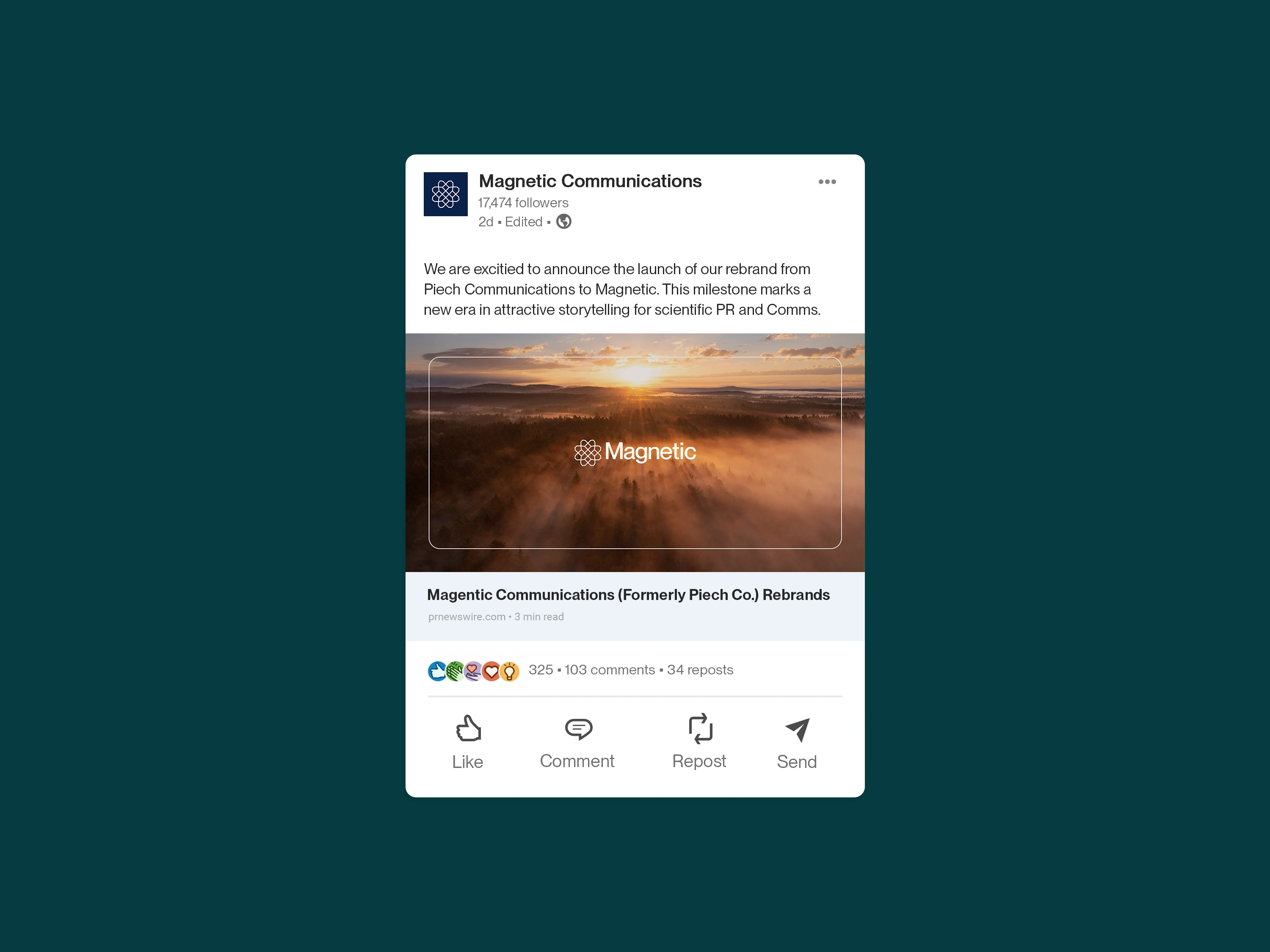
The rebrand's impact was immediate and profound. Claire’s response captured the success of the collaboration: “We are excited to roll this out, and we appreciate all of the thought and creativity you put into it.”
Magnetic Communications now stands as a beacon in scientific PR, with a brand reflecting its expertise and ambition. The rebrand elevates the agency’s visual identity and solidifies its position as the go-to partner for science innovators across British Columbia and beyond. By aligning the brand’s story with its mission, Magnetic Communications is poised to lead the next era of scientific storytelling.
This transformation underscores what’s possible when purpose meets design. Magnetic Communications isn’t just a brand; it’s a movement charting new paths for science, technology, and communication to intersect and inspire.
While I did not have a hand in crafting Magnetic's website, its internal team applied its new branding strategically. To learn more about Magnetic's leading-edge services, please visit their website.
Elissa's work is consistently outstanding. Having worked with her in the past, I knew she could deliver a well-crafted and compelling brand identity, and she exceeded my expectations. She has a unique insight into the science communications space that is hard to find. Our new brand is elegant, thoughtful, and aligns with our company vision.
- Claire Piech, Principal & Founder, Magnetic Communications
Like this project
Posted Jun 25, 2025
Magnetic Communications is a rebrand for a PR and Comms agency that specializes in transforming complex scientific advancements into stories that inspire.
Likes
1
Views
13
Timeline
Nov 1, 2024 - Nov 30, 2024