All Yoga Training - Website Redesign

Norbert Kurunci

All Yoga Training - Landing page and sales page redesign
Industry: Yoga Teacher Training · Bali & Thailand
Focus: Conversion-focused web design
The Challenge
All Yoga had been growing since 2009, but its website had grown with it. Over time, new sections and styles were added without a unified system, leaving the experience visually inconsistent, text-heavy, and difficult to navigate.
The school had a strong offer and a credible reputation, but the website wasn't making that value easy to understand — or making the path to application easy to follow.
Landing Page Hero - BEFORE
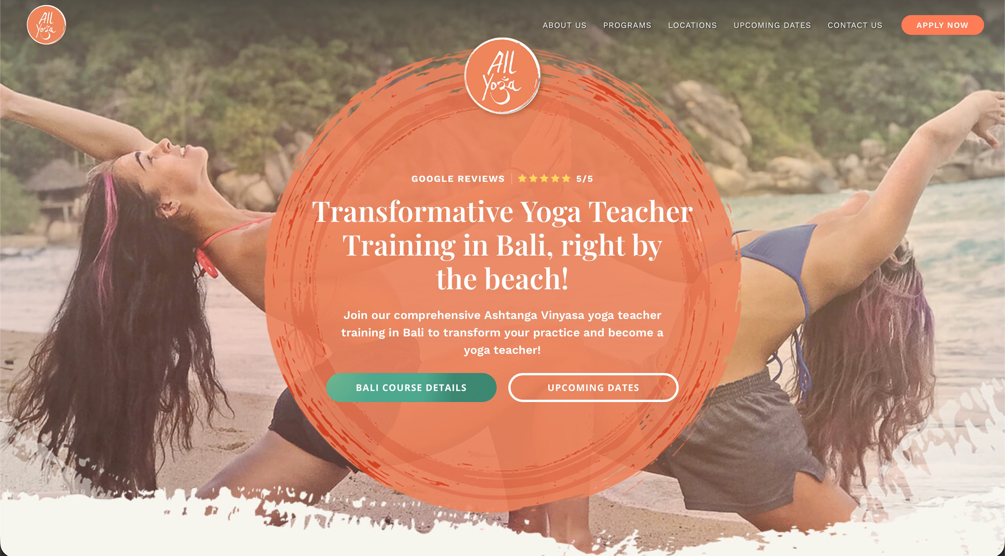
Before the redesign, the landing page didn’t visually communicate anything about the teacher training program. Two girls on a beach didn’t really convey what the teacher training program was about
Landing Page Hero - AFTER
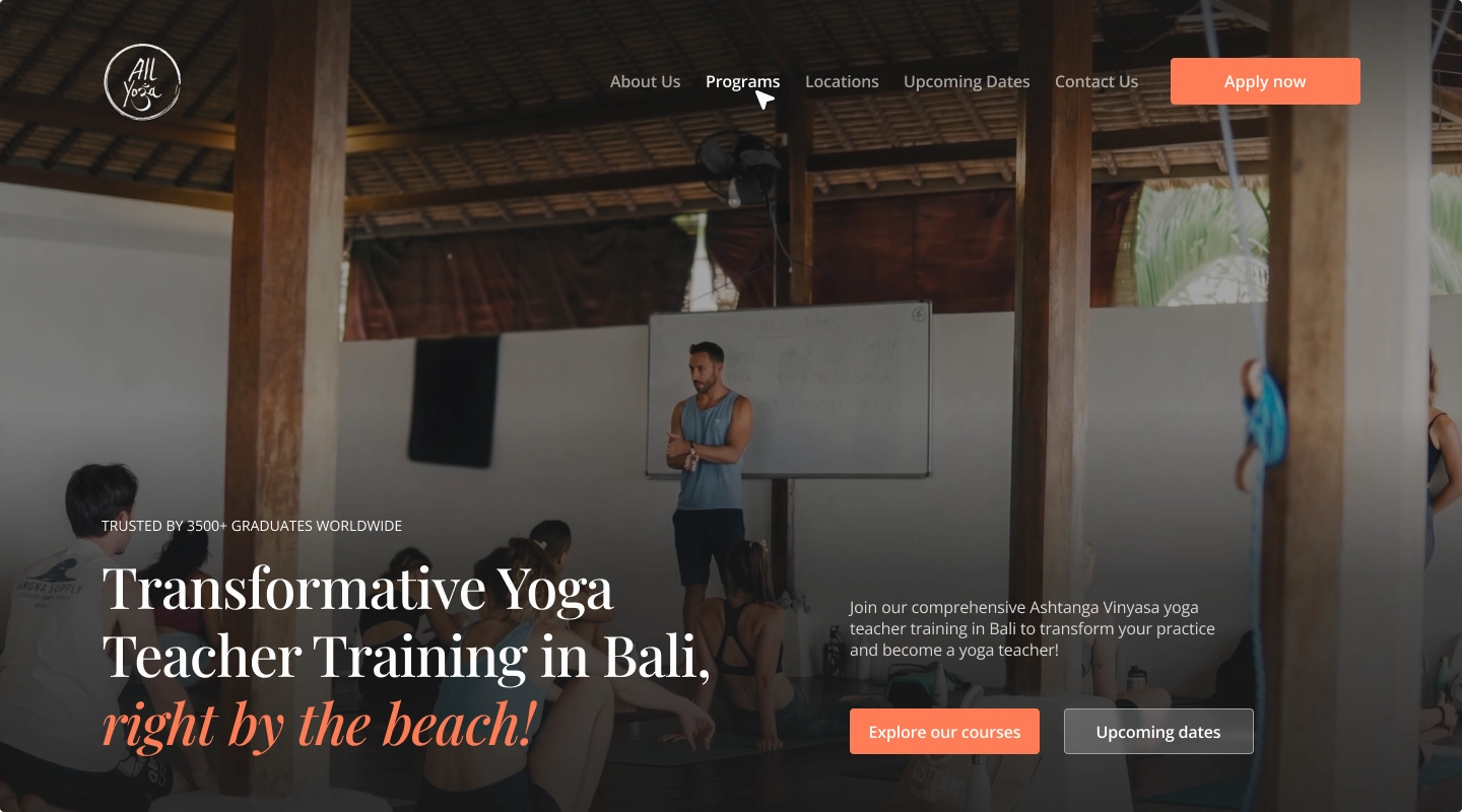
The redesign incorporated a video provided by the client, showcasing the entire work process. The layout improves readability and creates a clearer user flow.
The Approach
I redesigned the experience around one simple goal: make the decision to apply clearer and easier.
The new direction introduced a consistent design system, a mobile-first layout, and a modular card-based interface inspired by the clarity of Apple and Airbnb.
Content was reorganized around the visitor's decision-making journey, with information grouped into concise, scannable sections. Key actions such as Apply Now, Contact Us, and Get Brochure were given a consistent presence throughout the experience.
The visual language was intentionally minimal and image-driven, allowing the school's locations, courses, and real student experience to become the focus.
Sales Page Scroll-trough
Pricing section - BEFORE

Before the redesign, getting the price was difficult and unintuitive. When you selected a date, the page reloaded with a new hero section displaying the price for that specific date. Visitors had to go through several steps to book their spot, and every point of friction meant a potential lost student.
Pricing section - After
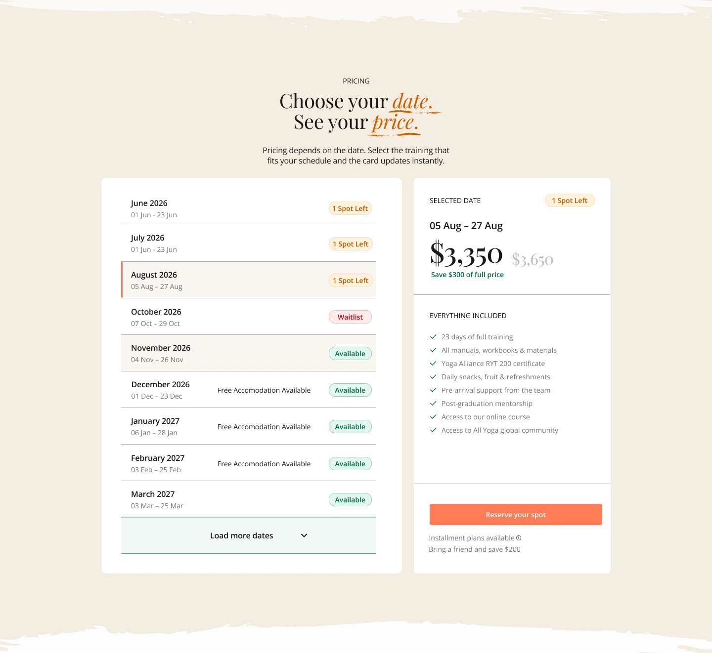
The completely rethought pricing section made the booking process much easier. By selecting a date, the modular pricing card automatically updates without refreshing the page, displaying a clear “Reserve Your Spot” call to action that leads directly to checkout.
The Result
The redesign transformed a fragmented website into a clearer, more cohesive conversion experience.
A unified visual system now connects the pages, dense information has been simplified, and the application journey is more intentional — helping visitors move from discovering the school to understanding the offer and taking action.
The result is a website that feels as credible, professional, and inspiring as the experience All Yoga provides.
Like this project
Posted Aug 16, 2026
Redesigned All Yoga Training's website for improved conversion and user experience.
Likes
1
Views
7
Timeline
Jun 20, 2026 - Jul 4, 2026
Clients
All Yoga Training