Energi Landing Page - Design for Children's Energy Drink
Client: Energi
Project Type: Landing Page Design
Industry: Children's Health & Wellness Beverages
Tools Used: Figma
Target Audience: Parents of active children aged 6-12
The Challenge
Energi needed a landing page that would accomplish three critical objectives:
Educate parents about the health benefits of a caffeine-free, all-natural energy drink for children
Build trust with health-conscious parents through credible testimonials and transparent ingredient information
Drive conversions by encouraging product trials through clear calls-to-action and promotional offers
The challenge was to create a design that felt fun and appealing to children while maintaining the credibility and professionalism needed to convince parents this was a safe, healthy choice.
Design Strategy
Visual Identity & Typography
The typography system was carefully selected to balance playfulness with professionalism:
H1 (HUBBY BUNNY): A bold, chunky typeface that immediately captures attention and conveys energy and fun—perfect for the hero headline "Nature's Energy For Growing Champions"
H2 & H3 (Quicksand): A friendly, rounded sans-serif that maintains readability while feeling approachable and modern
Body Copy (Open Sans): A clean, highly legible typeface that ensures parents can easily digest important health and nutritional information
Color Palette
The design employs a warm, natural color scheme dominated by soft beiges and creams, punctuated by:
Energetic oranges and yellows (representing citrus fruits and natural energy)
Fresh greens (symbolizing health, nature, and safety)
Playful accent colors (coral, mint, navy) that add visual interest without overwhelming
This palette communicates both the natural ingredients and the vibrant energy the product provides.
Page Sections & Design Solutions
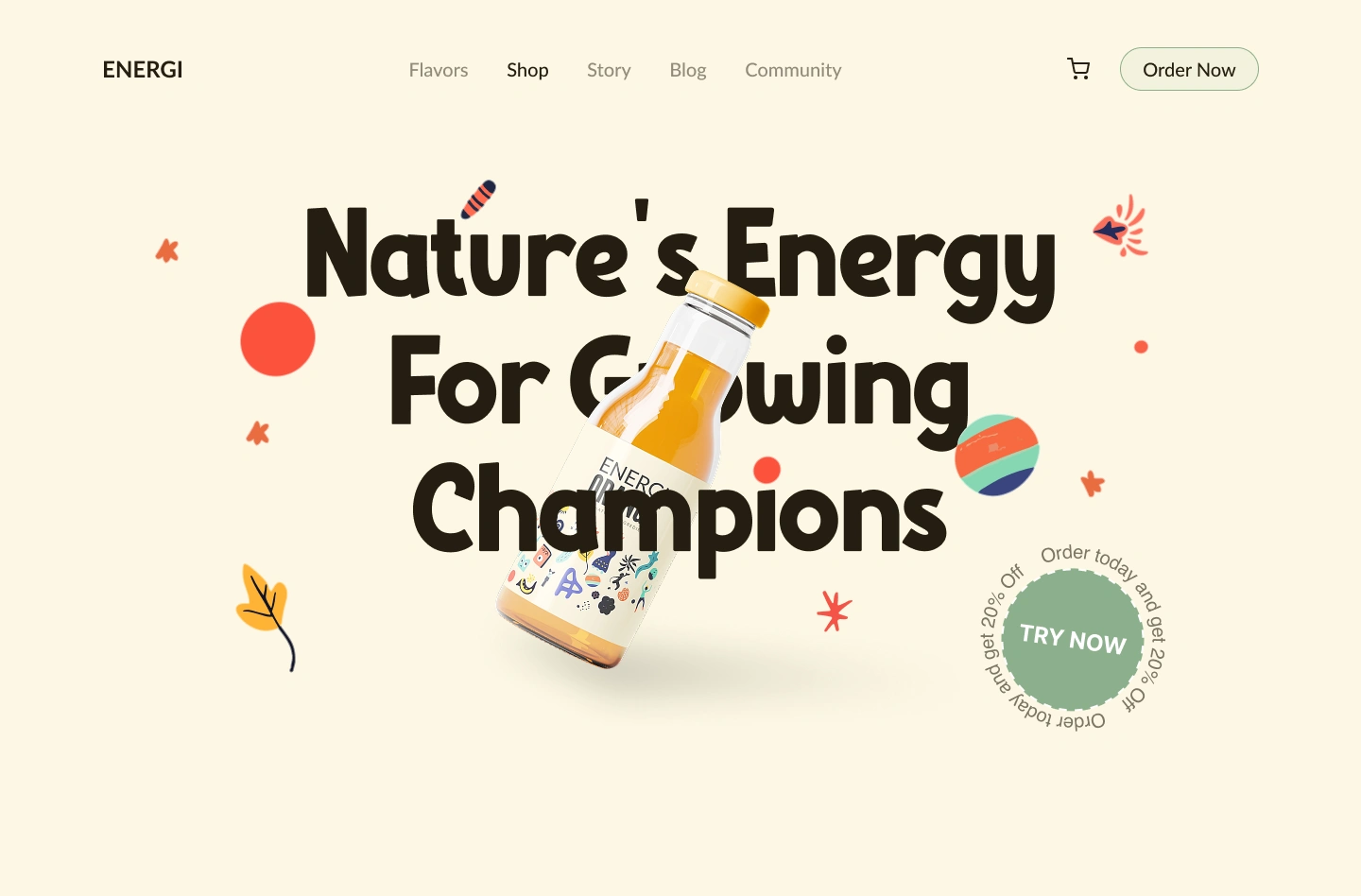
1. Hero Section: "Nature's Energy For Growing Champions"
Design Elements:
Large-scale hero headline using HUBBY BUNNY typeface for maximum impact
Dynamic product photography featuring the orange flavor bottle at an energetic angle
Playful illustrated elements (leaves, stars, abstract shapes) create movement and energy
Prominent circular animated "TRY NOW" call-to-action with "Order today and get 20% off" promotional messaging
Clean navigation with shopping cart icon and "Order Now" button for easy conversion
Strategic Decisions: This section immediately establishes the brand's dual promise: natural ingredients (emphasized through "Nature's") and active lifestyle support ("Growing Champions"). The tilted bottle and scattered playful elements suggest motion and vitality without being chaotic, perfectly targeting both parent and child appeal.
Hero to Flavours
Flavours Section
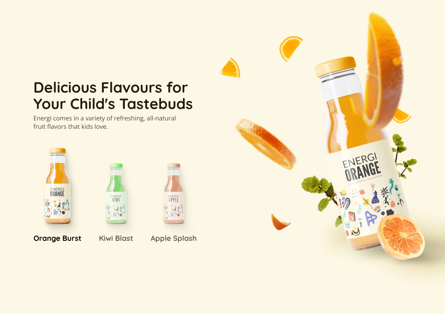
2. Product Showcase: "Delicious Flavours for Your Child's Tastebuds"
Design Elements:
Three product variants displayed prominently (Orange Burst, Kiwi Blast, Apple Splash)
Large-scale product photography with fresh fruit imagery (orange slices, mint leaves)
Clean, organized layout with generous white space
Strategic Decisions: By showcasing the variety of natural fruit flavors, this section addresses a key parent concern: "Will my child actually drink it?" The emphasis on "all-natural fruit flavors that kids love" directly tackles taste appeal while reinforcing the natural ingredient positioning. The product photography includes actual fruit elements, visually reinforcing the "fruit-derived" sugar claim from the brief.
Benefits Section
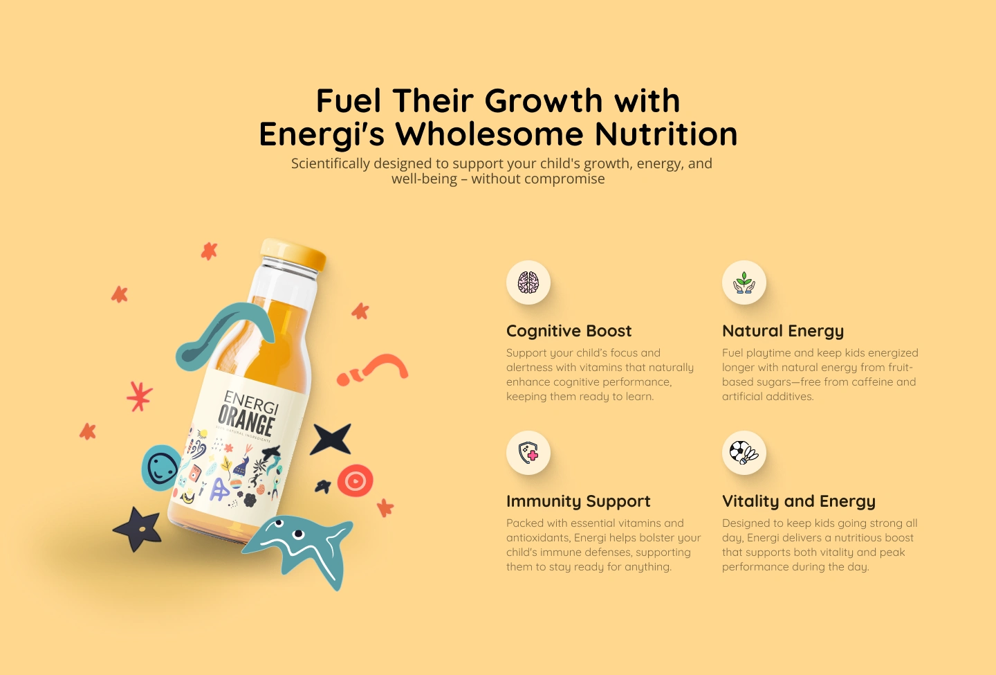
3. Nutritional Benefits: "Fuel Their Growth with Energi's Wholesome Nutrition"
Design Elements:
Warm yellow background creates an optimistic, positive emotional tone
Four benefit cards with custom icons: Cognitive Boost (brain), Natural Energy (plant), Immunity Support (shield), Vitality and Energy (soccer ball)
Product bottle with playful illustrated cutout shapes
Clear, benefit-focused messaging with supporting explanatory text
Strategic Decisions: This section directly addresses the brief's first objective: educating on health benefits. Each benefit is presented as a clear icon-headline-description combination, making complex nutritional information digestible at a glance. The scientifically-oriented headline ("Scientifically designed to support your child's growth, energy, and well-being") builds credibility, while the approachable design keeps it accessible. The emphasis on "without compromise" subtly differentiates from traditional energy drinks and sugary beverages.
Testimonials Section
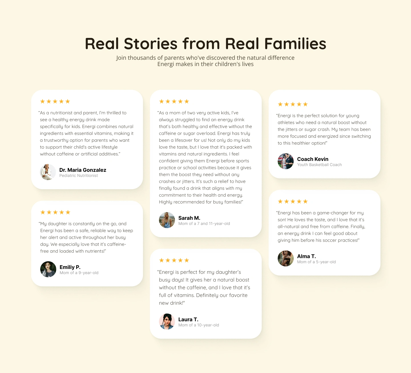
4. Social Proof: "Real Stories from Real Families"
Design Elements:
Five testimonials presented in card format with rounded corners
Mix of credentials: Dr. Maria Gonzalez (Pediatric Nutritionist), parents with specific child ages, and a youth sports coach
Five-star ratings prominently displayed
Profile photos add authenticity
Varied card sizes create visual interest while maintaining organization
Strategic Decisions: This section addresses the brief's second objective: building trust with parents. The testimonials are strategically diverse:
Professional endorsement (nutritionist) provides expert validation
Peer testimonials from parents address real-world use cases
Sports coach endorsement appeals to parents of athletic children
Specific details ("mom of a 7 and 11-year-old") add authenticity
Key phrases reinforce the brand's core messages: "caffeine-free," "loaded with nutrients," "natural boost," "no crashes or jitters," and "aligns with my commitment to their health."
FAQ Section
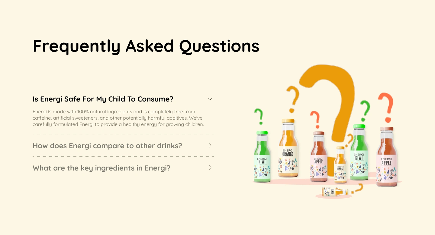
5. FAQ Section: "Frequently Asked Questions"
Design Elements:
Clean accordion-style layout with expandable questions
Colorful question mark graphics and product bottle arrangement add visual interest without distracting
Right-side illustration creates balance
Strategic Decisions: The FAQ section addresses parent concerns head-on, with safety as the very first question—acknowledging this is the primary barrier to purchase. The expanded answer immediately emphasizes "100% natural ingredients," "completely free from caffeine, artificial sweeteners, and other potentially harmful additives," and positions Energi as "carefully formulated... to provide a healthy energy for growing children."
This transparent approach builds trust by proactively addressing objections rather than waiting for parents to ask.
Final CTA
6. Final CTA: "Give Your Child The Gift Of Natural Energy"
Design Elements:
Soft sage green rounded rectangle container
Clear, benefit-focused headline
Prominent "Try Now" button
First-time customer discount (20% off) prominently displayed
Playful illustrated characters peeking from corners add whimsy
Strategic Decisions: This section fulfills the brief's third objective: encouraging product trial. The design choices are purposeful:
"Gift" framing makes the purchase feel like a positive parenting choice
Action-focused subheadline ("Try Energi today and see the difference") lowers commitment barrier
Discount offer provides immediate incentive for first-time buyers
Sage green color feels calming and trustworthy, perfect for final conversion moment
Results & Success Metrics
The landing page design successfully addresses all three main objectives from the brief:
✓ Educate on Health Benefits: The nutritional benefits section with clear icons and the FAQ section provide comprehensive, accessible health information.
✓ Build Trust with Parents: Strategic use of professional and peer testimonials, transparent ingredient information, and prominent safety messaging establish credibility.
✓ Encourage Product Trial: Multiple conversion points with promotional offers (20% off for first-time customers) and low-barrier CTAs ("Try Now" vs. "Buy Now") encourage trial.
Design Takeaways
This Energi landing page demonstrates how thoughtful design can bridge the gap between two distinct audiences—children and their parents—while maintaining a cohesive brand identity. By balancing playfulness with professionalism, energy with calm, and marketing with education, the design creates a persuasive case for Energi as the healthy energy drink choice for growing children.
The success of this design lies not in any single element, but in how all components work together to tell a complete story: this is a fun, flavorful drink that kids will love, made with natural ingredients that parents can trust.
Like this project
Posted Nov 13, 2025
Landing page design for Energi, an energy drink for kids. Balanced playful, kid-friendly design with parent-focused trust-building.
Likes
0
Views
2
Timeline
Nov 1, 2025 - Ongoing
