Redesigning the website for a biotechnology startup
Rewire Neuro is a startup located in Portland, Oregon, dedicated to empowering the diverse future of science. They develop intelligent technologies to push forward biomedical research and help improve the pace, ease, and reproducibility of research.
Project Overview
I worked in a team of 4 UX Designers for Techfleet, an organization dedicated to providing real world experience to upcoming UXers through apprenticeships. Our team partnered with Rewire Neuro to help identify and reduce user hurdles and redesign the website in order to increase more conversion. We worked in an agile environment for eight 1 week sprints.
The Challenge
Rewire Neuro partnered with Tech Fleet to help add strategy to their web presence, increase engagement, and showcase a better experience than they currently have.
Business Goal
1. Help Rewire Neuro better understand their user's wants and pain points by providing them with quantitatively and qualitatively supported deliverables.
2. Help Rewire Neuro redesign their website in order to reduce user hurdles and increase conversion.
The Process
Our UX research process was adapted to an agile environment. Each 1 week sprint utilized design thinking.

Client Kickoff
We began our research phase by preparing for our first meeting with Rewire Neuro's founders, working together to brainstorm possible questions to ask our clients that would better inform the direction we'd take for our first few research sprints.
After brainstorming and grouping our ideas, we engaged in dot voting to refine and finalize which questions we felt were most valuable to our objectives:
1. Understand Rewire Neuro's Business Model and two products - Pipsqueak Pro & Pipsqueak AI
2. Establish Methods of Communication & Rewire Neuro's Involvement
3. Establish that Tech Fleet & Rewire Neuro Project Expectations Align
4. Understand Different User Groups & Target Audience
5. Determine Organizational Pain Points
Website Audit
We conducted a website audit to understand possible users’ pain points and frictions. We decided to use popular UX heuristics to identify possible usability and design issues on Rewire Neuro website. I conducted an audit independently and then later met with my team to discuss the findings and share any feedback.
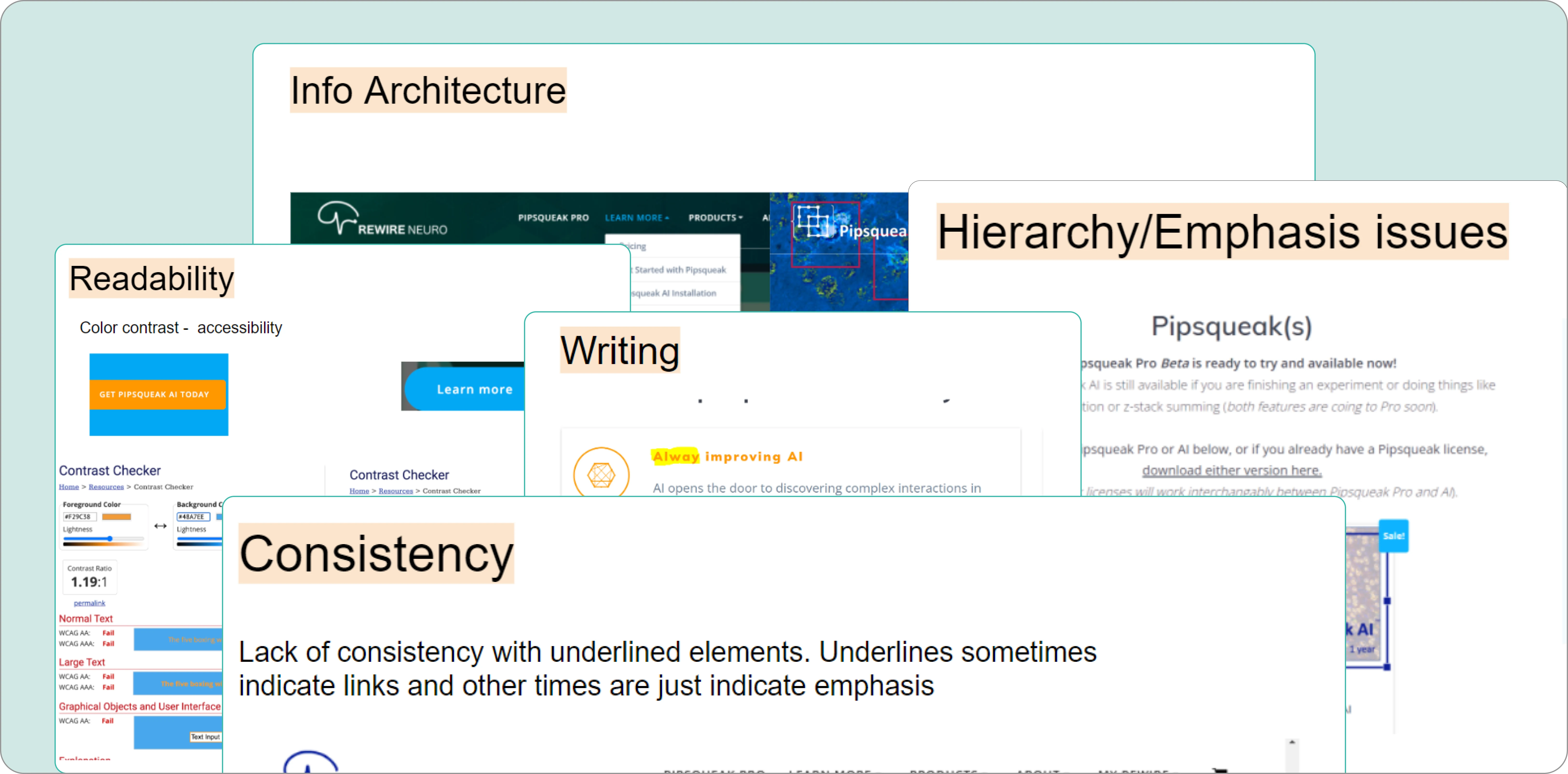
The potential issues that we discovered during the site audit:
1. lack of consistency across pages
2. legibility issues caused by insufficient contrast
3. lack of hierarchy when it comes to presenting information
4. problems with architecture of information
5. repetitiveness of information
6. lack of brand establishment
7. Two different URLs used for the same website
Before conducting research, it was important to define the goals and our assumptions:
☐ Test audit insights against real user behaviour
☐ Understand additional usability issues
☐ Understand what info users prioritize or seek
☐ Understand past user engagement with website
☐ Validate assumptions about RWN website and user needs:
1. It is currently difficult to understand the difference between Rewire Neuro and Pipsqueak
2. It is currently difficult to understand the difference between Pipsqueak AI and Pipsqueak Pro
3. It is currently unclear how users can get started on and use Pipsqueak (The process, the setup, how long it takes, etc)
4. Current navigation/menu is difficult to use to find the information desired information

Speaking to Users
We first identified users to interview as a team: Existing users (trial + paid): They were all-encompassing in their experience as they can speak about what influenced them to try the product/convert to paid, how they were able to acquire it (for lab), what worked/didn’t work on the website.
But due to client’s last minute feedback, had to pivot into different user base (potential users), which meant we had to change the script and screener on short notice. Client was hesitant to have us talk to existing users and wanted us to shorten our interviews to 30 minutes (was 45 min prior). We eventually had to remove and rework some questions.
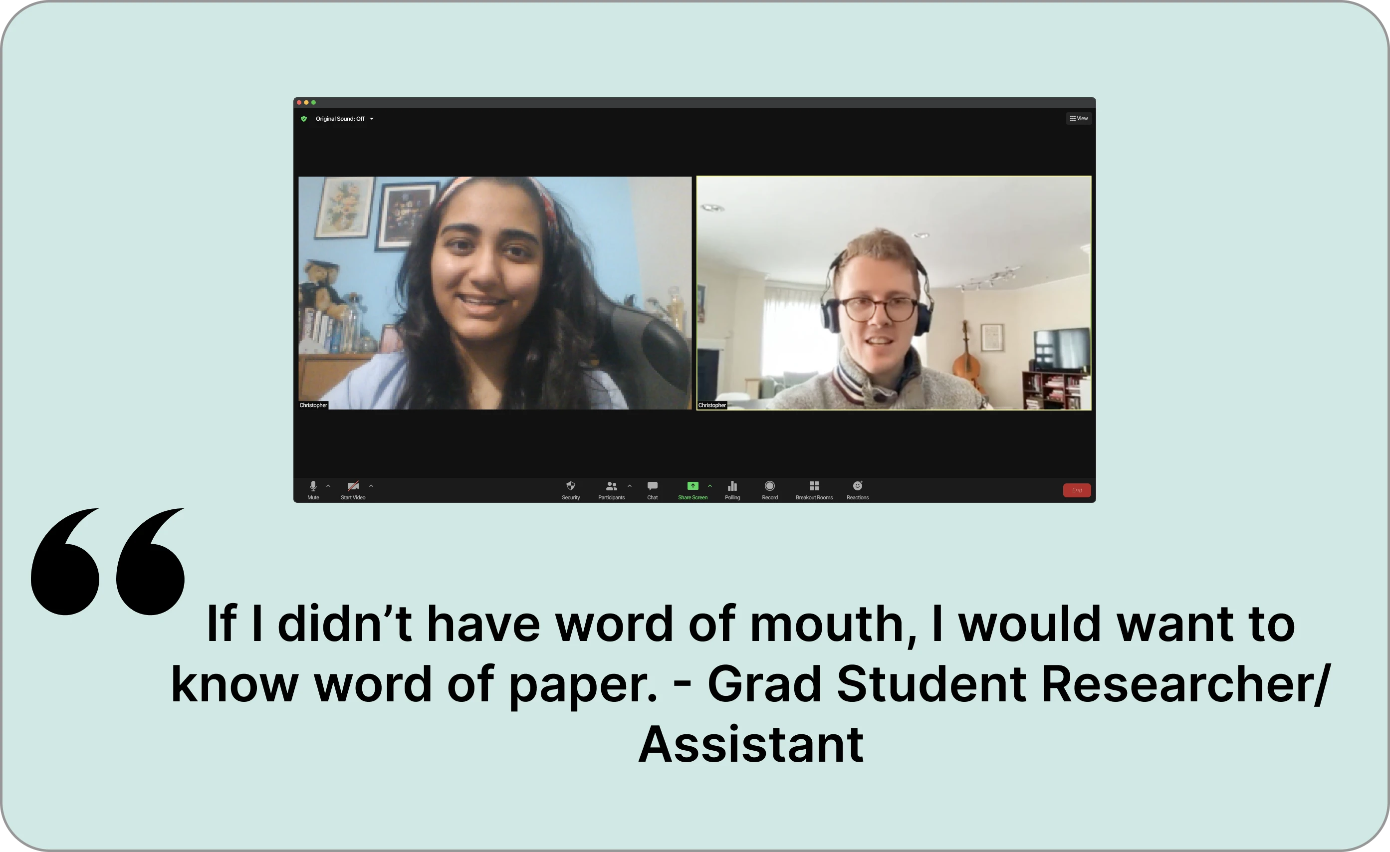
Users were recruited using personal networks, Tech Fleet network, and Rewire Neuro's mailing list. Our team then conducted scheduled zoom interviews with potential Rewire Neuro users (people working with cells/image analysis) over 1 week time span that included:
1. Questions about user’s work role and how they decide on a new tool.
2. Moderated usability test where user was tasked to learn about the products and try the checkout process.
Writing user stories
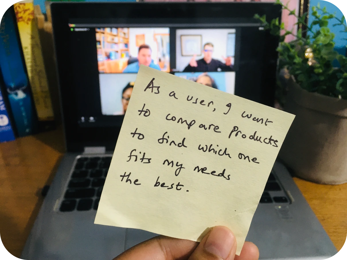
It was important to place ourselves in the shoes of the user and understand why users wanted a certain feature. Writing user stories not only helped in visualising the functionality of website but also helped organise and prioritize the way each feature is designed on the website.
The main user stories that came out of this exercise were:
1. As a user, I want to trial the product, so I can see if it lives up to the hype and meets my needs.
2. As a user, I want to compare products to find which one fits my needs the best.
3. As a user, I want to get support in learning how to use the product so I can successfully integrate it into my work.
4. As a user, I want to see publications and citations so I can see if others have used the technology for their work.
How Might We
Armed with the knowledge of what users were trying to accomplish, we jotted down some challenges to think about in the form of How Might We questions.
I then asked the team to group similar HMWs together and make any changes needed to create a team-approved version representing each category. I chose to do this to be certain the team knew the exact problems we were attempting to solve. After prioritizing HMW on the Impact to business/Value to user matrix, we worked on design goals:
❔ Boost product comprehension
- What products are offered?
- What are the differences between each product?
❔ Simplify product comparison and checkout
❔ Highlight sections users found compelling
- Social proof, research papers
- Support, FAQ
Sketching
After defining the design goals, we did a Crazy 8's sketching session. Each participant brainstormed crazy 8s for two different topics - homepage and flow of product exploration to checkout. There were 3 rounds for five minutes each with feedback/voting in between each step.
We were able to identify core flows to help narrow down what pages we need. Even primitive, rough sketches provided a wealth of opportunities to pursue. For example, these two sketches of mine were eventually incorporated into the homepage. We dot voted to select our favourite sketches from the different options which were later translated into mid-fi wireframes.
Wireframes
As the client wanted to increase conversions, we created mid-fidelity wireframes for checkout flow screens. Screens redesigned for the checkout flow:
Usability Testing and Recommendation
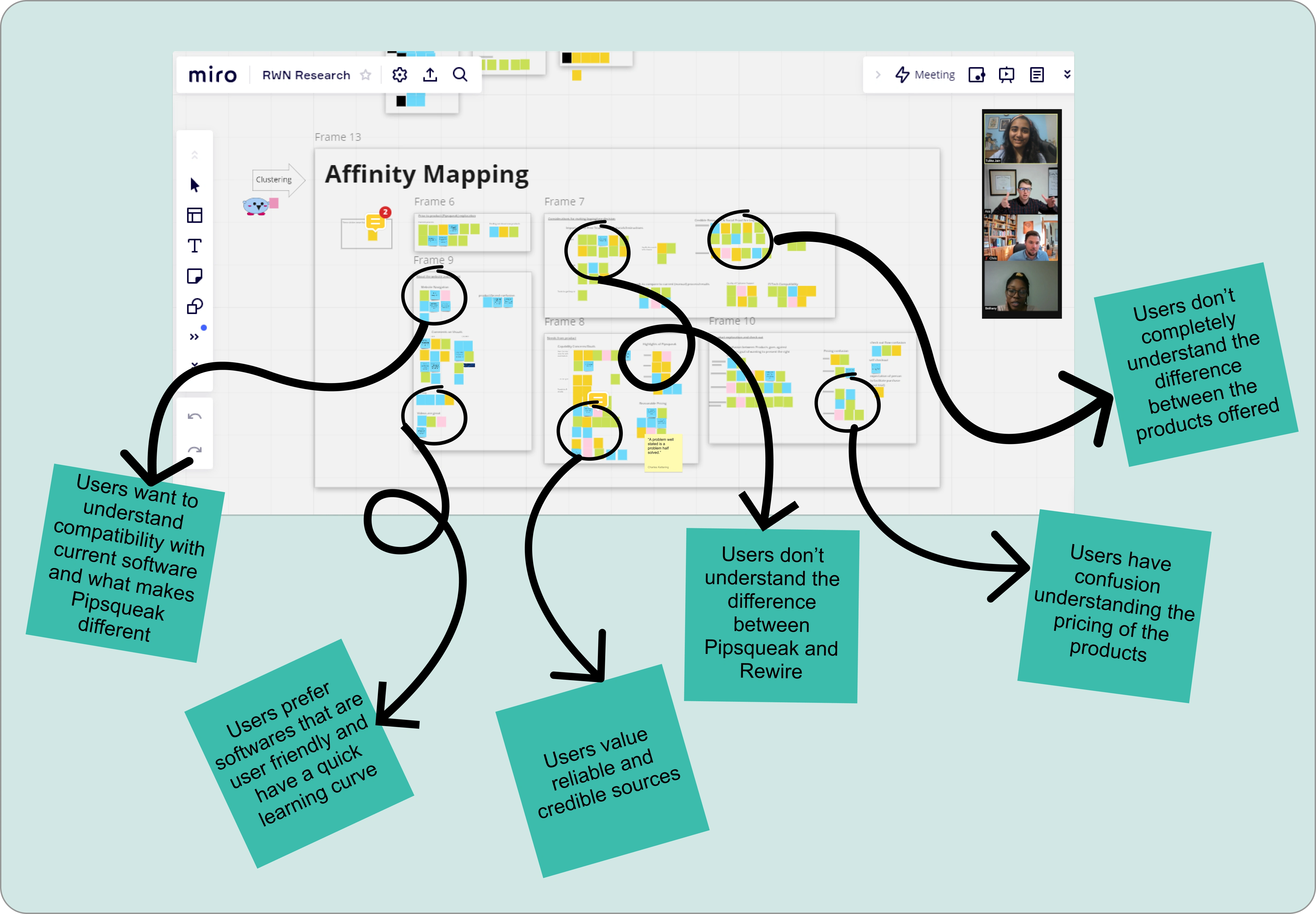
To test the different pages of wireframes, 5 usability tests were conducted to check for ease of flow, understanding of the products and final checkout to make a purchase. After gathering the data from the moderated usability tests in an affinity map and grouping it into different pages category, the following insights were observed and recommendation provided to Rewire Neuro Team.
2. Signup/Checkout
💡 Insight 2: Info on trial end date period missing.
✔️ Recommendation: Consider disclosing end of trial date and disclose what happens after trial (if anything specific).
Final Prototype
This website uses cookies, pixel tags, and local storage for performance, personalization, and marketing purposes. We use our own cookies and some from third parties. Only essential cookies are turned on by default. Cookies settings
This was my first experience with a UX project for a real-world client, and it was an excellent learning experience for me. I had a lot of fun collaborating with other UX designers and navigating the design process together so that we could offer our clients the most effective design solutions.
At the end of our project, we also had a team reflection session during which we discussed what worked, what could be improved, shout-outs to team members, and any ideas we had that could improve things.
Phase 1 of the project ended with an agreement that Tech Fleet would continue with the second phase of work for Rewire Neuro. To set ourselves for success, we compiled a set of future research recommendations:
1. Path for graduate student or research assistant to make the case for purchasing
2. Informational needs of advanced researchers
3. Navigation, findability, terminology
4. Usability of product and onboarding
Read the next case study
Waste-ED App
Building an end-to-end app to help educate,
encourage, and track recycling of everyday household waste items
Skills Focus: UX Research, UX Design, Business Model Canvas
Like this project
Posted Sep 22, 2023
Our team partnered with Rewire Neuro to help identify and reduce user hurdles and redesign the website in order to increase more conversion.

