Waste-ED App
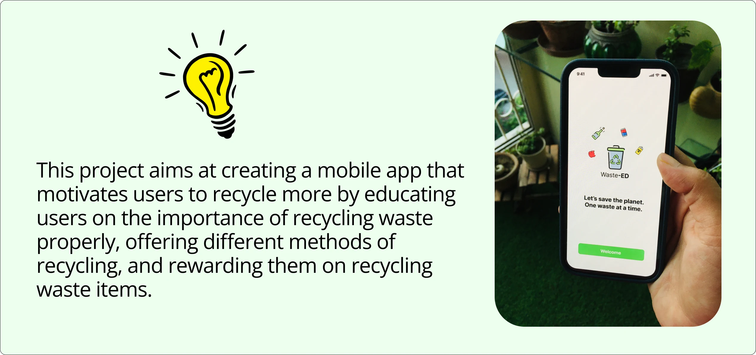
Reimagining how we dispose of household waste by building an app to help educate, encourage, and track recycling of everyday household waste items
The problem
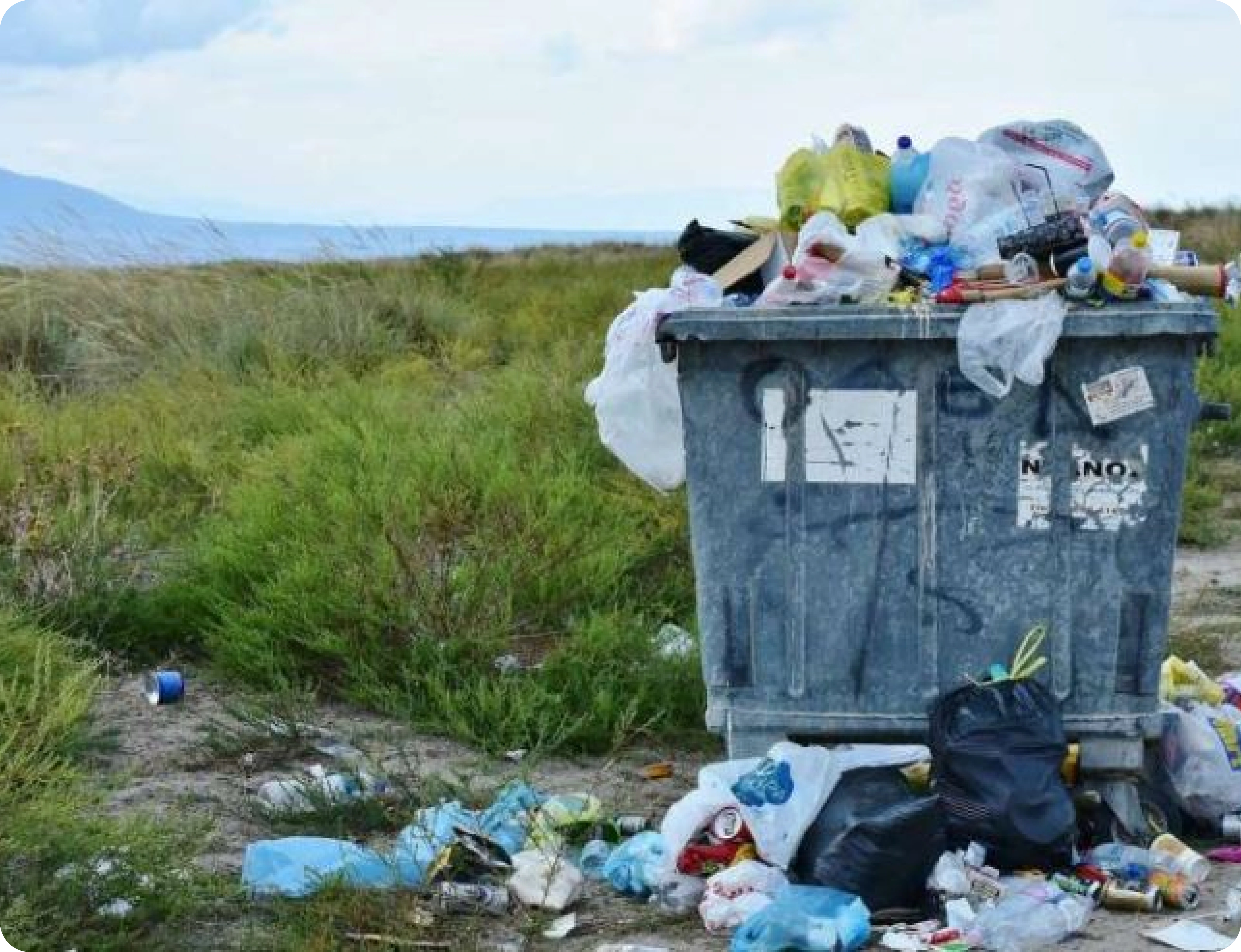
We throw out 60 tons of household waste a second which makes over 2 billion tons of household waste a year globally.
As the world's population grows, so does the generation of waste. It is estimated that the amount of household waste will grow by 70% by 2050, reaching 3.4 billion tons a year, which means waste generation will actually outpace population growth by more than double if we don't make changes!
The majority of waste is disposed of in landfills or burned. The burning and generation of waste are the biggest sources of dioxins that contribute to global warming, accounting for about 5% of global emissions leading to climate change. If major actions aren't taken, this number will increase by over 60% by 2050.

Despite the climate crisis being a hot topic on news and social media across the globe, this increased awareness is not translating into consumer action, and for many of us, it has not fundamentally changed the way we behave.
Our waste problem is not going away by itself. A more sustainable approach to waste management is needed at individual level.
Even the smallest contributions can counter a global challenge
Solution

The design process that I undertook during the journey


I kicked off the project with some desktop research and discovered interesting insights

Competitor Analysis
As I understood more about the general outlook of people towards recycling, I wanted to explore other applications that were trying to find solutions to these problems. My goal was to find out what works well in each application and what doesn't.
I found 3 different mobile apps in the environmental space to evaluate and used the 10 usability heuristics for user interface design by the Nielsen Norman Group to analyze each application. The end goal was to figure out what works well in each application and what doesn’t.
1. JouleBug is an app that encourages users to participate in challenges and earn achievements to build better sustainability habits. Great design, marketing, and love the idea of using achievements for user engagement.
But it uses confusing language like “buzzing” to describe different actions the user can take when plain language would be less confusing- users shouldn’t have to guess what something means.
3. RecyleMate uses artificial intelligence and photo recognition so a person can take a photo of an item with their phone to find out whether it can be recycled, wherever they are. It has a very simple to use interface which solves one of users’ key challenges - what’s recyclable and what’s not.
The key takeaway from this process was that these apps don’t balance features of gamification and education well as one feature tends to fall short rather than working together for a more seamless experience. Interestingly, most of these apps are very location-specific (e.g., the USA, Australia). Thus, recycling options are only available to people in these locations. There was no feature that could be used universally by anyone, anywhere in the world.
In order to get a deeper understanding, I decided to conduct user research
In addition to the desktop research and competitor analysis, I decided to conduct user interviews. I wanted a deeper understanding of the consumer's motivation when it comes to recycling, their current household waste management practices, and their current understanding of the climate crisis. I held 5 user interviews on Zoom and it took approximately 30-45 minutes each.
“I think people just have a hard time putting things into perspective like long term things when it comes to the climate crisis.” - User interview participant
“I guess it just doesn't really come to mind. Like, I feel like what I think of like, oh, like a plastic water bottle. I already use it a couple times. And I don't know what else I would use it for.” - User interview participant
After gathering insights from user interviews on an affinity map, I started noticing 3 interesting themes:
1. People feel the problem is too big to solve at an individual level. Although users recycle, they still believe that the climate crisis problem is too big, and that no matter what they do, it won't make any difference.
2. People lack motivation to recycle. Users feel they don’t have enough incentive to recycle waste.
3. People are unaware. Users lacked information about what/how to recycle or repurpose waste.
Defining the Problem
From the research conducted, it is clear that users care for the climate crisis
BUT...

Who needs this and why?
Understanding the user personas
How might I solve this?
1. Ease the process of recycling
The app will have AI which will recognises the household waste item and provide user different methods of recycling that the user can choose from based on their preference and convenience.
2. Educate people on the positive outcomes of recycling
The app will include an educational feature in the form of bite-sized explainer videos and interactive games which will help users not only learn the importance of recycle but also understand how their individual action contribute to the global crisis.
3. Motivate people to recycle more
The app will include a feature which will reward users every time they recycle an item based on the recycling method they choose or videos watched/games played.
Every app at the end of the day is a business and it is important to align the business and user goals in order for business to be sustainable. Waste-ED's business model canvas explains how the app would work as a profitable & sustainable business. We keep up the revenue stream, working with key partners and giving free access to the users. A business model that is profitable without giving up on its goal of creating a positive impact on the environment.
Planning the user flow.
And setting up the information architecture.
As part of my user flow, I sketched a few screens in order to visualize how the user will go through the recycling process.
To get an idea of which screens are most important to help the user accomplish their goal, I even did some initial user testing with these sketches.
After testing these sketches with users, I realized that I shouldn't complicate the app with many features such as social media, and I should just focus on the key goal that users want to achieve i.e. recycling.
Some sketches that made it to the final wireframes:
Wireframes
I designed the Hi-fidelity MVP that addressed the most important user need. Among the flows, I tested one that allows users to recycle waste items by following the process and earning rewards.
In order to refine the final product and make it more accessible and usable, I wanted to evaluate users' interaction with the Waste-ED app to complete certain tasks, understand their pain points, behaviour with the product, and negative and positive emotions.
Five users were recruited for the usability testing that was conducted remotely over zoom.
I then created an affinity map to gather my findings from each interview and noticed some interesting insights during the process.
The key iterations made were based on the alignment between highest value to the user and impact on the business:
During my user interviews, many users mentioned that they are unaware of what really happens to the waste if it is not recycled properly which shows that the users lack motivation if they don’t understand the big picture i.e. impact on the planet.
I decided to change the position of the video by putting it on the screen where the user is deciding which method of recycling to go forward with.
Many users mentioned this during the user interview that they would like to get something in return if they recycle. So it is important to make this as intuitive for the user.
I added a short description of what the icon meant using an ‘*’ sign.
Showing users the total amount of carbon emission saved if the user recycle the waste item help users connect their action to the bigger impact on the planet.
I included the carbon emission calculated by putting it on the screen where the user decides which method of recycling to go forward with in order to give user an insight into how much carbon will they save i.e. the impact they will create before they decide to recycle the item using any of the methods offered.
Try it yourself :)
Play around with the prototype and see if you manage to recycle an item.
I thoroughly enjoyed the process of designing a solution for a problem I passionately care about in the form of an app and interviewing potential users to identify the key challenges when it came to recycling. Due to limited time, I was only able to interview users who already had some interest in recycling but who needed some awareness and a little incentive. It would be interesting to investigate the other user category where users do not recycle at all, and learn their thought processes in order to develop a solution that can help change their behaviour.
Airbnb
Adding new feature 'hire space for private events' to Airbnb's website
Skills Focus: UX Research, UI Design
Like this project
Posted Sep 22, 2023
Building an end-to-end app to help educate, encourage, and track recycling of everyday household waste items
Likes
0
Views
9


