Farol Imobiliária | Visual Identity & Branding by marluce schwingelFarol Imobiliária | Visual Identity & Branding by marluce schwingel

Farol Imobiliária | Visual Identity & Branding

marluce schwingel

marluce schwingel

PT  - Uma marca forte começa com propósito. 
A Identidade Visual da Farol Imobiliária | Hélio Carlos foi criada para transmitir confiança, clareza e segurança em cada detalhe.
Inspirada no farol, símbolo de orientação e direção, a marca representa o compromisso de guiar clientes com transparência nas decisões de compra, venda e locação no litoral.
Do conceito aos mockups, cada elemento foi pensado para fortalecer autoridade, profissionalismo e presença visual, do digital ao físico.
 Litoral - Casas e apartamentos - Confiança para comprar, alugar e investir - Projeto desenvolvido por Flora Design
IN - A strong brand starts with purpose. 
The visual identity for Farol Imobiliária | Hélio Carlos was created to convey trust, clarity, and security in every detail.
Inspired by the lighthouse, a symbol of guidance and direction, the brand represents the commitment to guiding clients with transparency in decisions involving buying, selling, and renting properties on the coast.
From concept to mockups, every element was designed to strengthen authority, professionalism, and visual presence, across both digital and physical platforms.
 Coastal area -  Houses and apartments- Trust to buy, rent, and invest
 Project developed by Flora Design
Like this project

Posted May 31, 2026

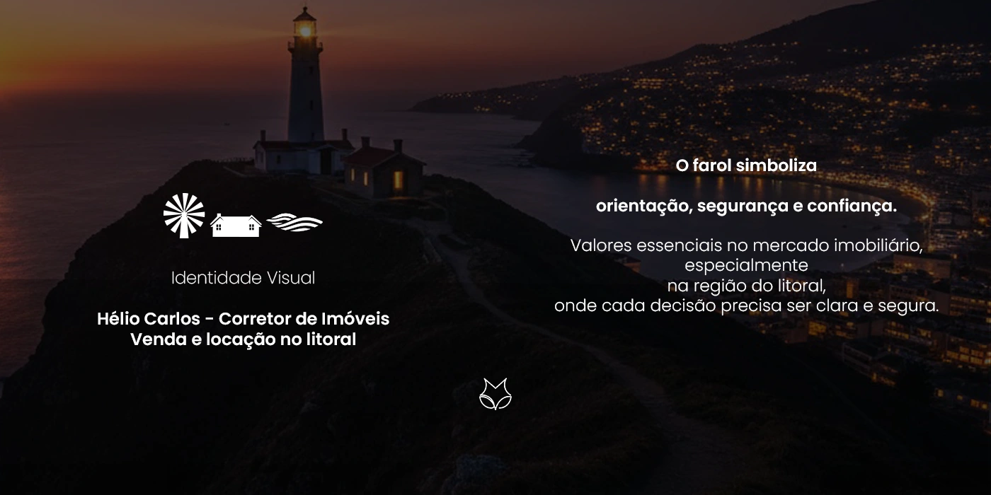
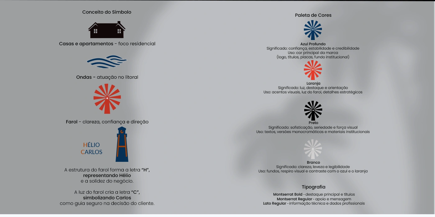
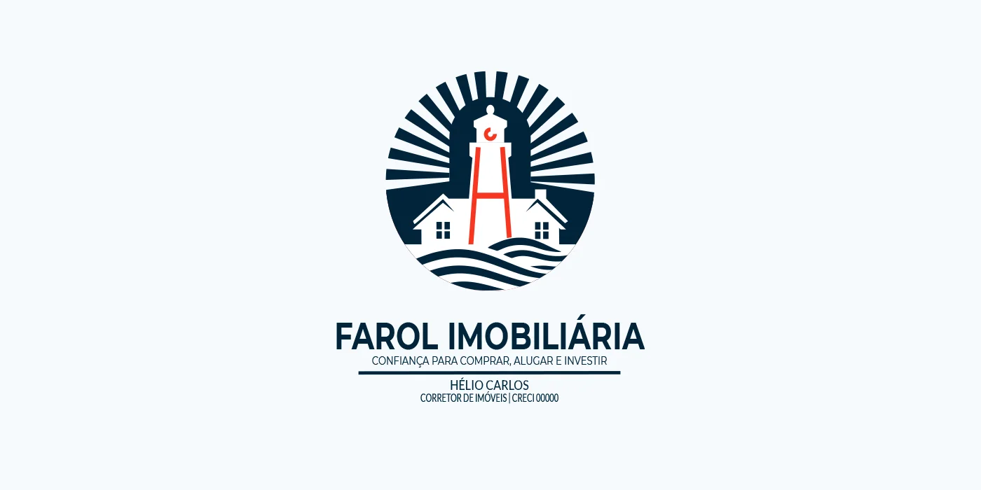
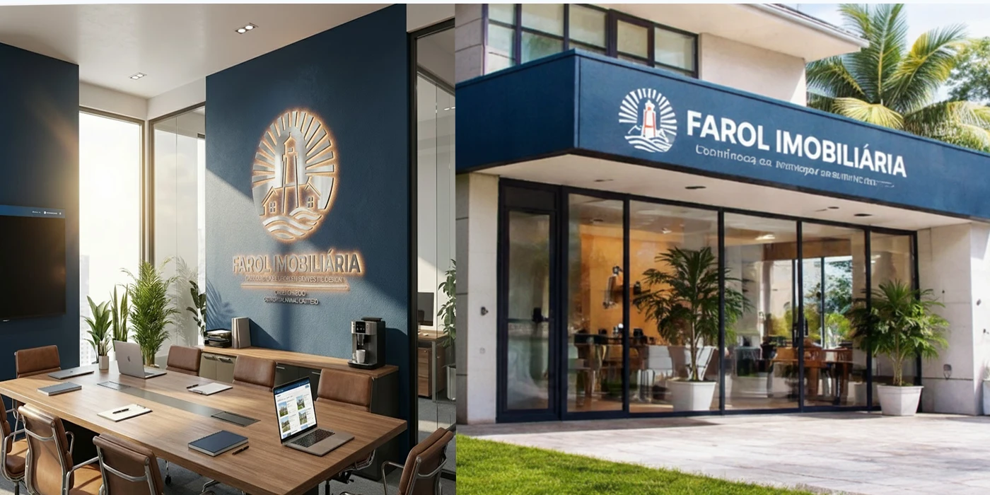
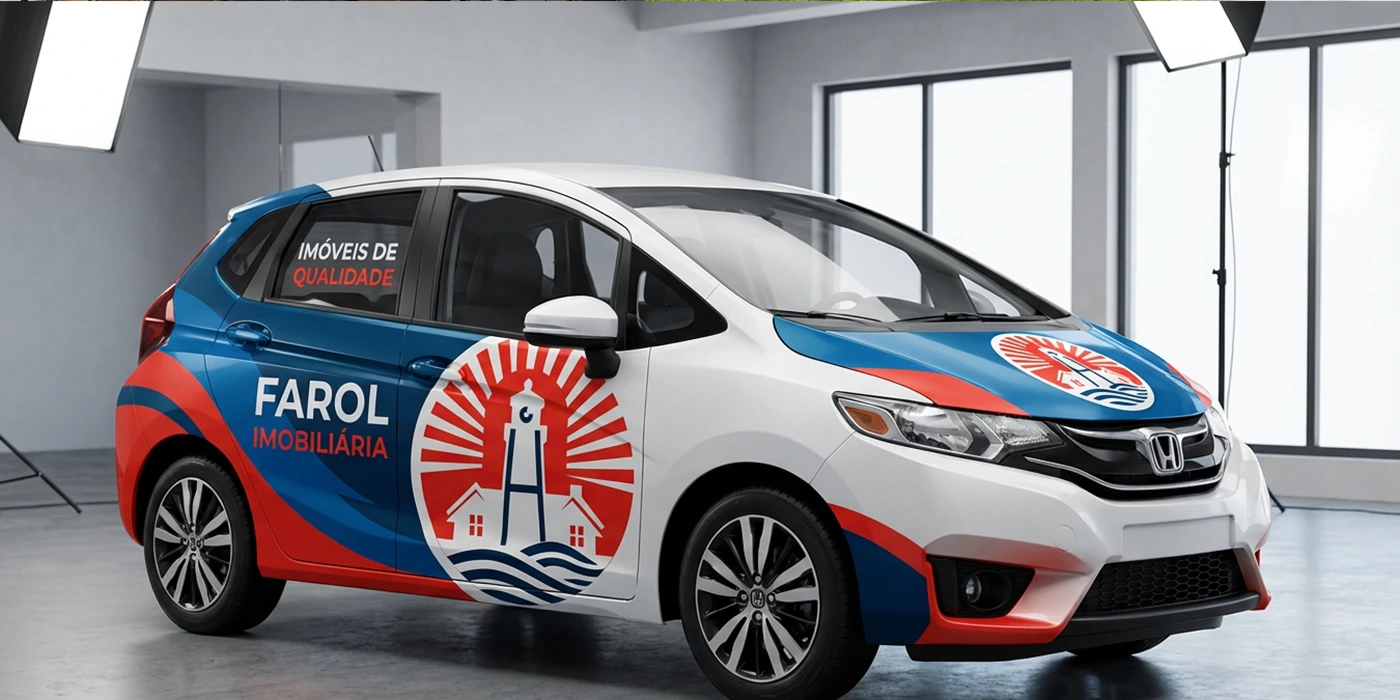
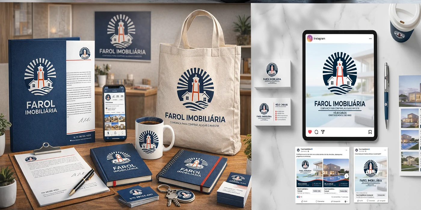
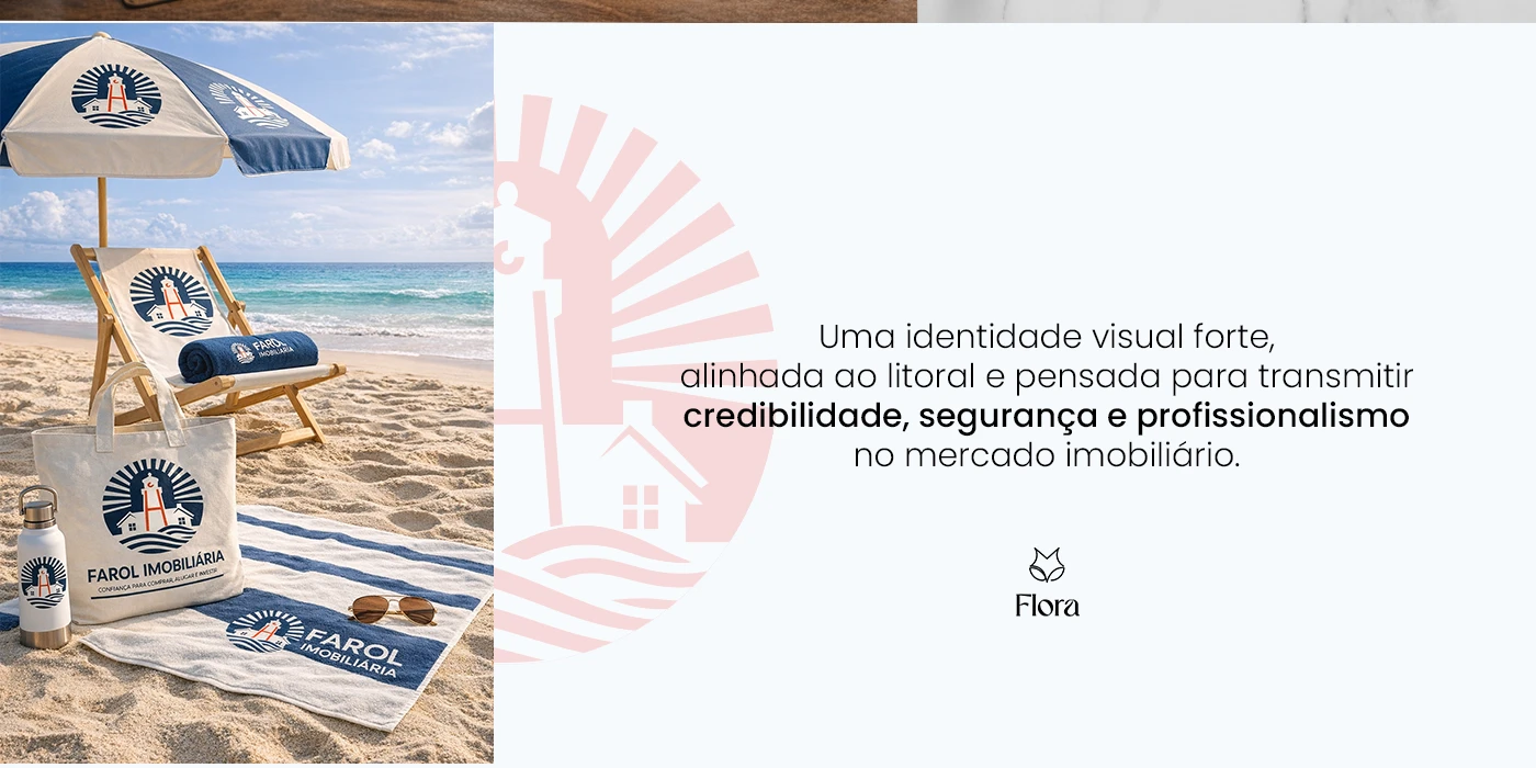
The visual identity for Farol Imobiliária | Hélio Carlos was developed to communicate trust, clarity, and security in the real estate market. Inspired by the lighthouse as a symbol of guidance and direction, the brand reflects a commitment to leading clients with transparency in decisions related to buying, selling, and renting coastal properties. The logo integrates meaningful elements such as houses, waves, and the lighthouse. The structure forms the letter “H”, representing Hélio and the solidity of the business, while the light creates the letter “C”, symbolizing Carlos as a reliable guide in the decision-making process. The project was applied across digital and physical touchpoints, ensuring visual consistency, professionalism, and a strong brand presence.