flatex - Broker UI rework
01 What is FlatEX
Flatex serves as a European online brokerage platform designed for private investors who are looking for fast, affordable, and easy access to financial markets.
With its well-known transparent pricing structure and competitive fees, flatex offers a straightforward trading experience free of unnecessary complications. The platform offers valuable tools like market data, research insights, and portfolio analysis features to help investors make informed decisions.
Its modern trading interface allows users to buy and sell stocks, ETFs, funds, bonds, derivatives, and more, all from a single digital platform.
With a focus on security, regulated
infrastructure, and user-friendly design, flatex has become a preferred choice for both beginner and experienced traders across Europe.
02 The Brief
The following website rework is voluntary work I did for practice and portfolio purposes.
My goal was to make trading, a very complex and sometimes overwhelming topic, easier. I chose a
simple, easily understandable, and very functional theme.
To achieve that, I tried to keep a simple layout, allowing much space between important elements,
guiding the visitors through their broker.
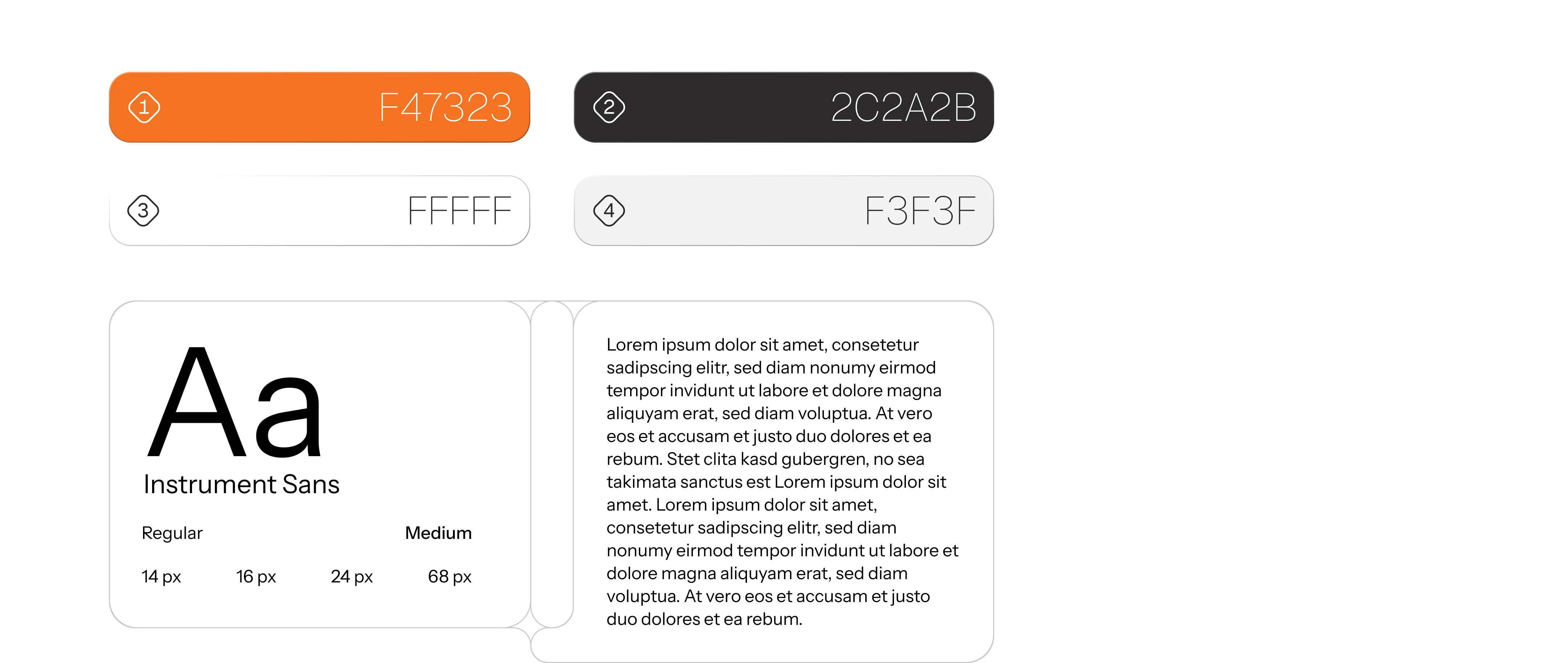
03 Guidelines

04 Problem
Finance platforms are often overwhelming.
The existing flatex interface felt crowded, inconsistent, and difficult to navigate especially for newer or younger users who expect modern, intuitive digital products.
Key information was hard to scan, visual hierarchy was unclear, and important actions were visually competing for attention. This increased cognitive load and made everyday tasks like checking portfolios, placing trades, or tracking performance feel unnecessarily complex.
The visual language also felt dated and failed to communicate innovation or confidence. In a market where trust and clarity are essential, the interface lacked a strong emotional connection and struggled to appeal to a design-conscious generation.
Overall, flatex risked losing relevance in a fast-moving fintech landscape where usability and brand perception define success.
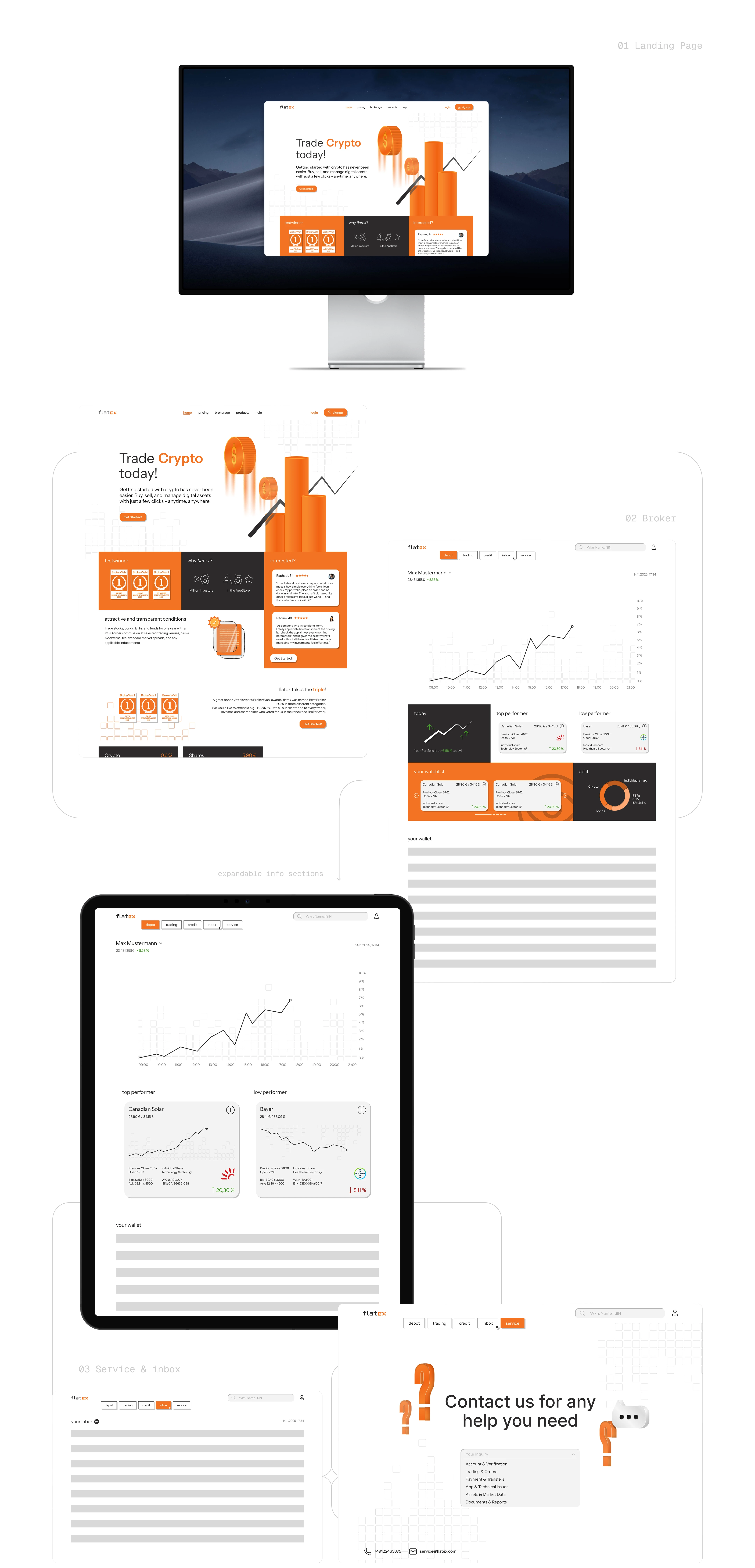
05 User Interface

06 Solution
Finance is complex, the product shouldn’t be.
The goal of this project was to reduce cognitive load and transform flatex’s interface into a clear, approachable and modern experience.
I redesigned the UI to simplify decision-making through structured layouts, improved visual hierarchy, and a cleaner information architecture. Core features were reorganized to feel intuitive, fast, and easy to scan, especially for users who actively trade or monitor markets.
The new visual system introduces a lighter, more contemporary look that aligns with current digital standards and speaks directly to a younger, design-aware audience without alienating existing users. Typography, spacing, and color contrast were optimized for readability and trust.
The animated logo brings motion into the brand experience, making flatex feel more dynamic, confident, and future-oriented. Subtle motion design was used to reinforce brand recognition while signaling innovation and reliability.
Overall, the solution balances professionalism with approachability, modernizing the platform while making finance feel less intimidating and more accessible.

Logo Animation: Emil Pfohl
User Interface: Emil Pfohl
Illustrations: Emil Pfohl
Icons: Iconex Freebie Icons
Like this project
Posted Dec 5, 2025
Redesigned flatex broker UI and animated logo to boost clarity and trust. Streamlined flows, modern visuals, motion led to faster tasks and higher engagement!
Likes
1
Views
6
Timeline
Nov 8, 2025 - Nov 19, 2025


