Doughnut Rebranding
Rebranded a new logo and box packaging for a doughnut shop
Overview
Client: Little Home Delights
Client requested for a fun quirky theme for their new rebranding to capture people's eyes with their vibrant products, which are colourful doughnuts.
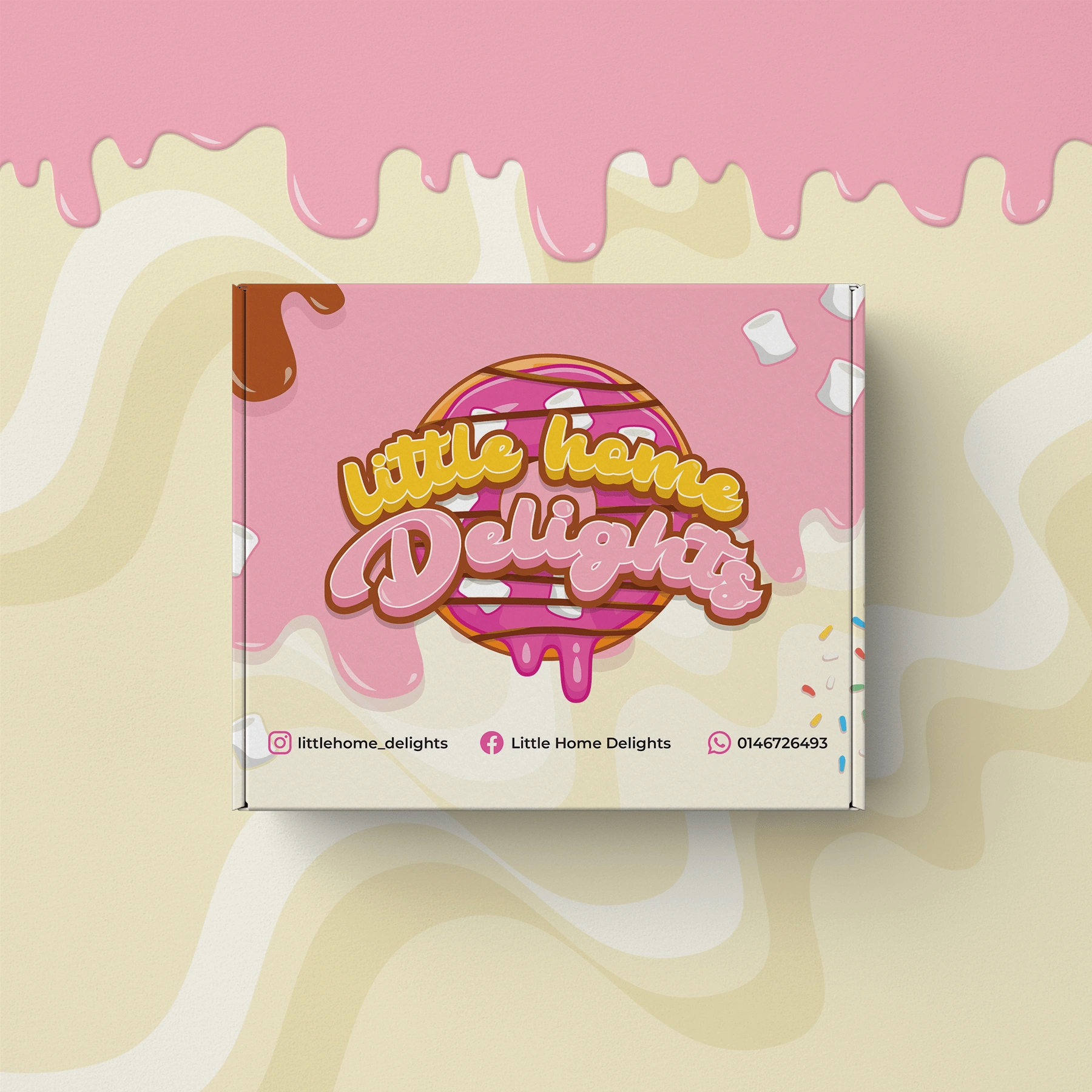
The new logo was an emblem type where we combine the doughnut icon and the lettermark. This style suits for a brand which has a clear vision of the product that they are selling. Here, people can instantly tell it is a doughnut brand without having to use the 'doughnut' word in it.

Box Packaging Design
Below is the design for their box packaging, theme color was pink, brown and cream which are the most famous flavours that were used in doughnuts.

Below is the image received by Client, the outcome of the printing.

Like this project
Posted Nov 22, 2022
Rebranded a new logo and box packaging for a doughnut shop


