House of Dolo Fragrance Brand Identity Design

Just Create It


House of Dolo: Luxury, Bottled
House of Dolo came to us looking for a fragrance identity that felt luxurious, distinctive and established from the very first impression. Rather than following the traditional black-and-white codes of luxury fragrance, we wanted to give the brand a world of its own.
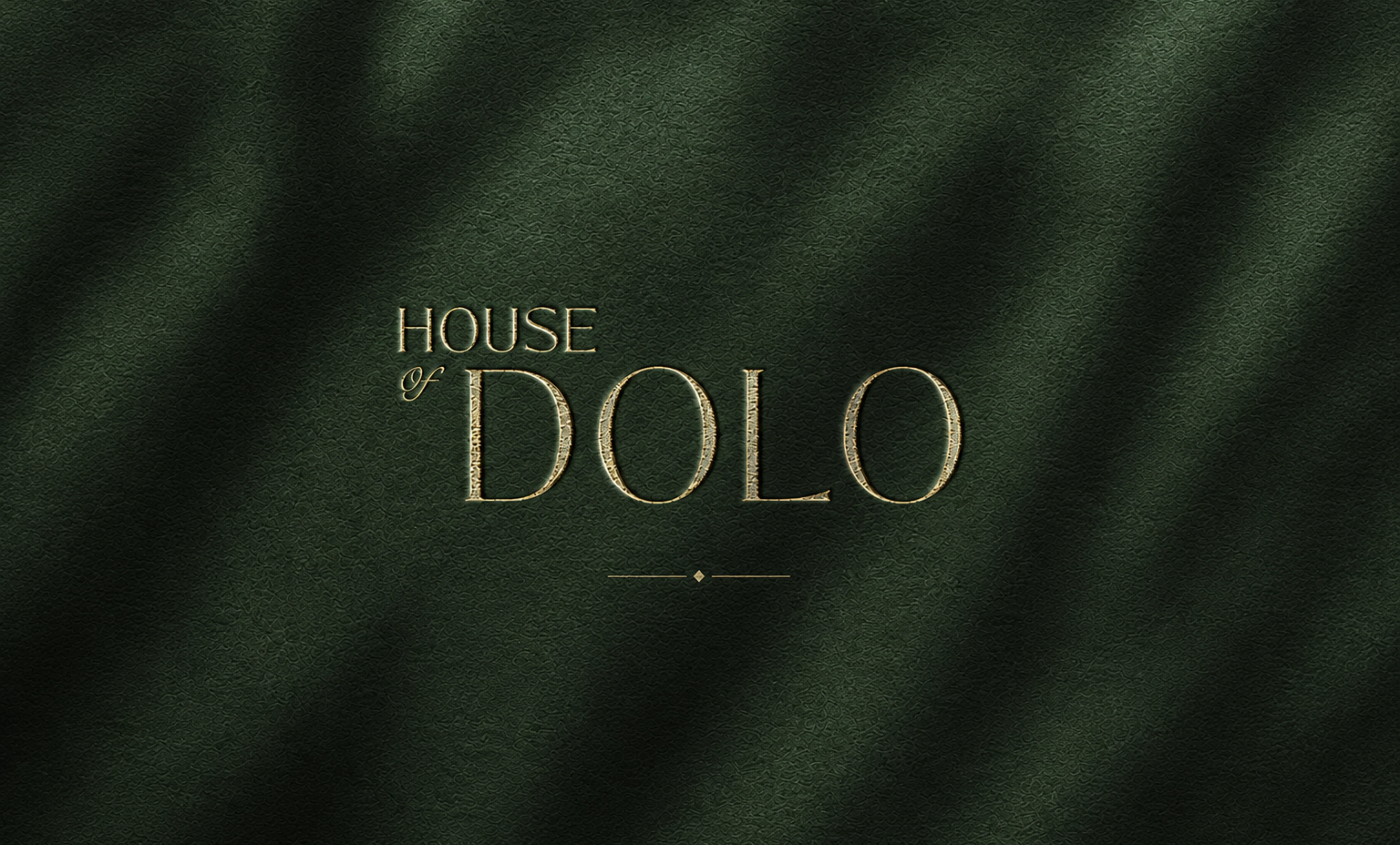
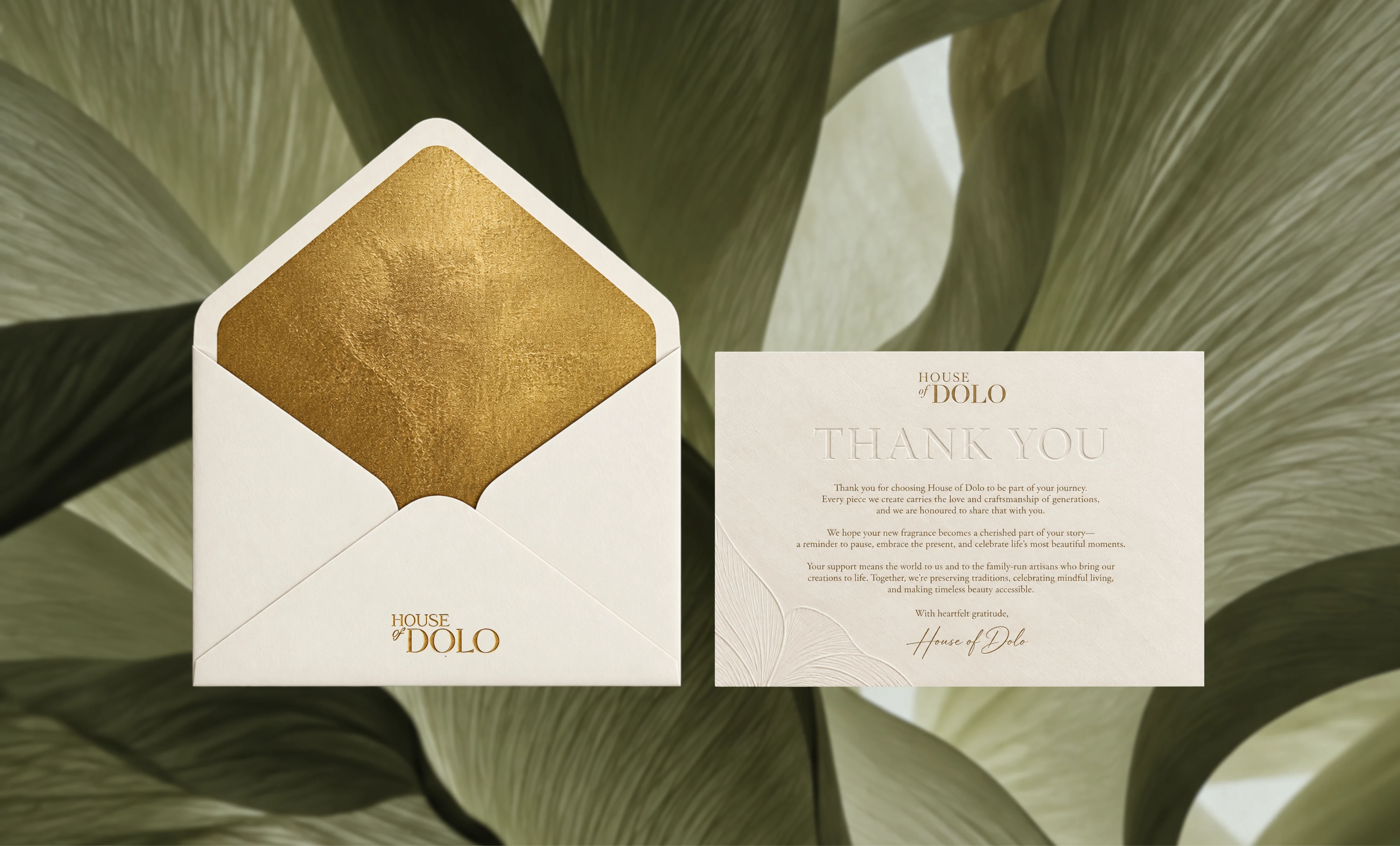
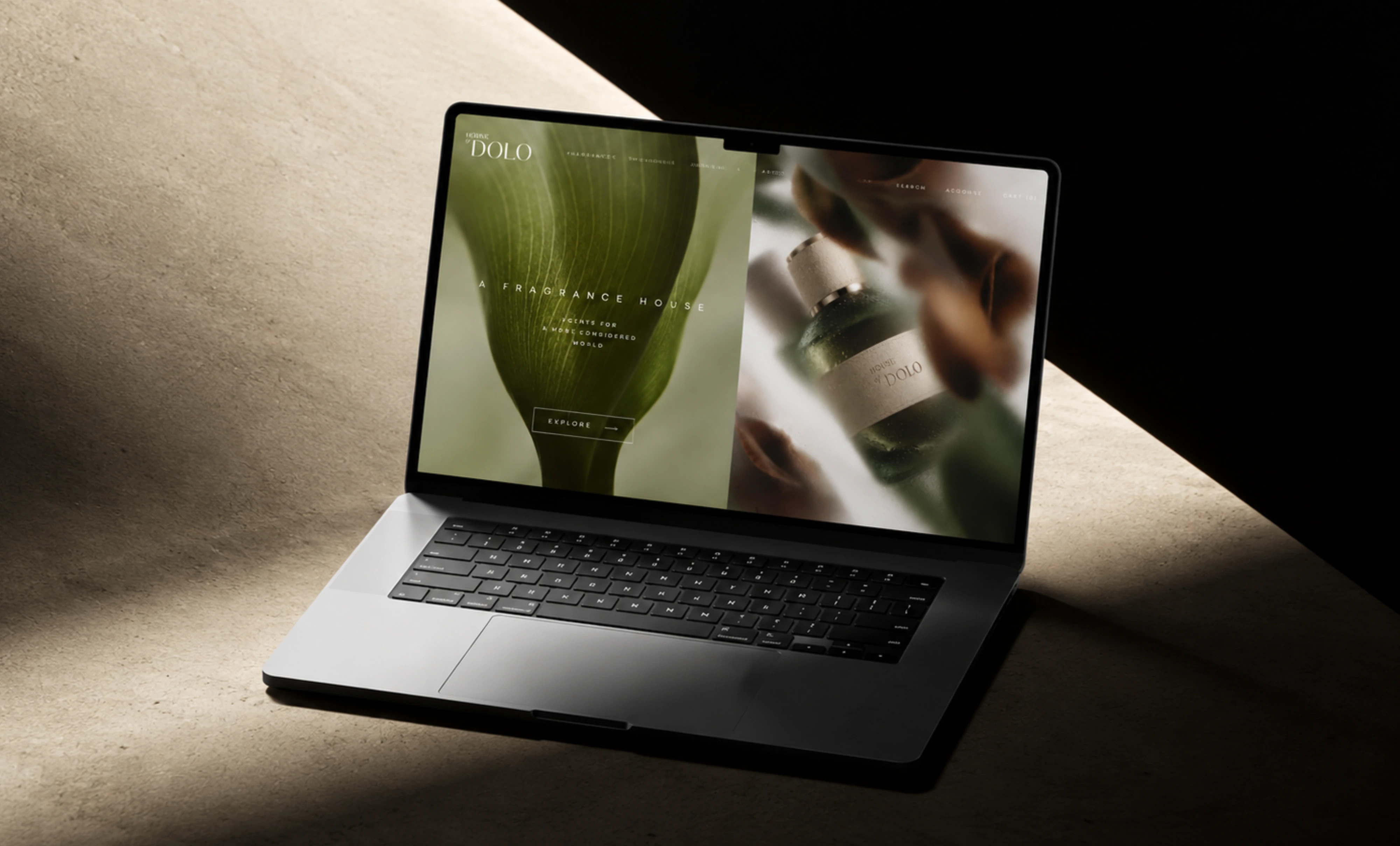
We built the identity around a deep emerald green, paired with warm gold and soft, earthy neutrals. The palette became the foundation of the brand: rich and sophisticated, with a subtle connection to nature and the raw ingredients behind fragrance.
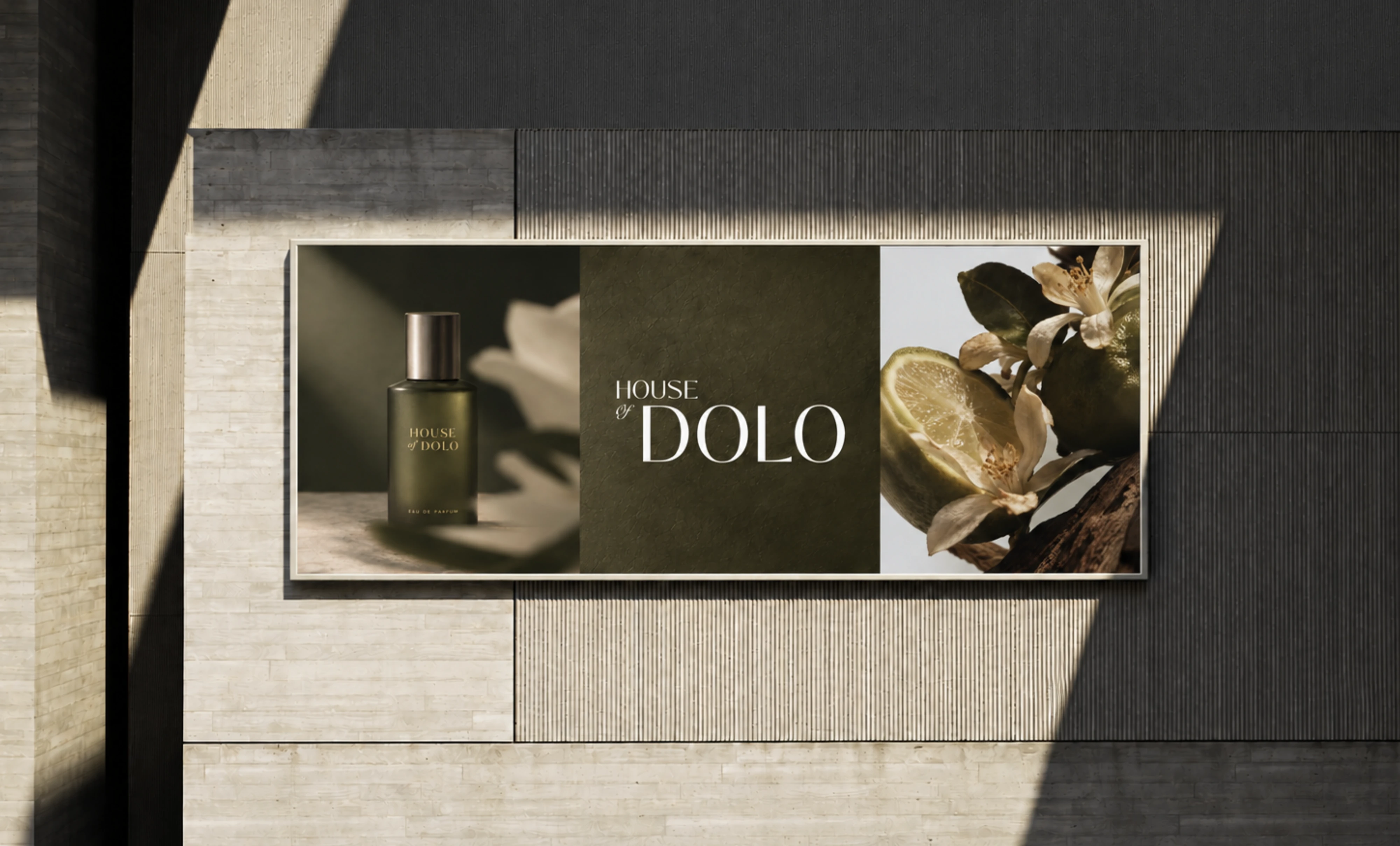
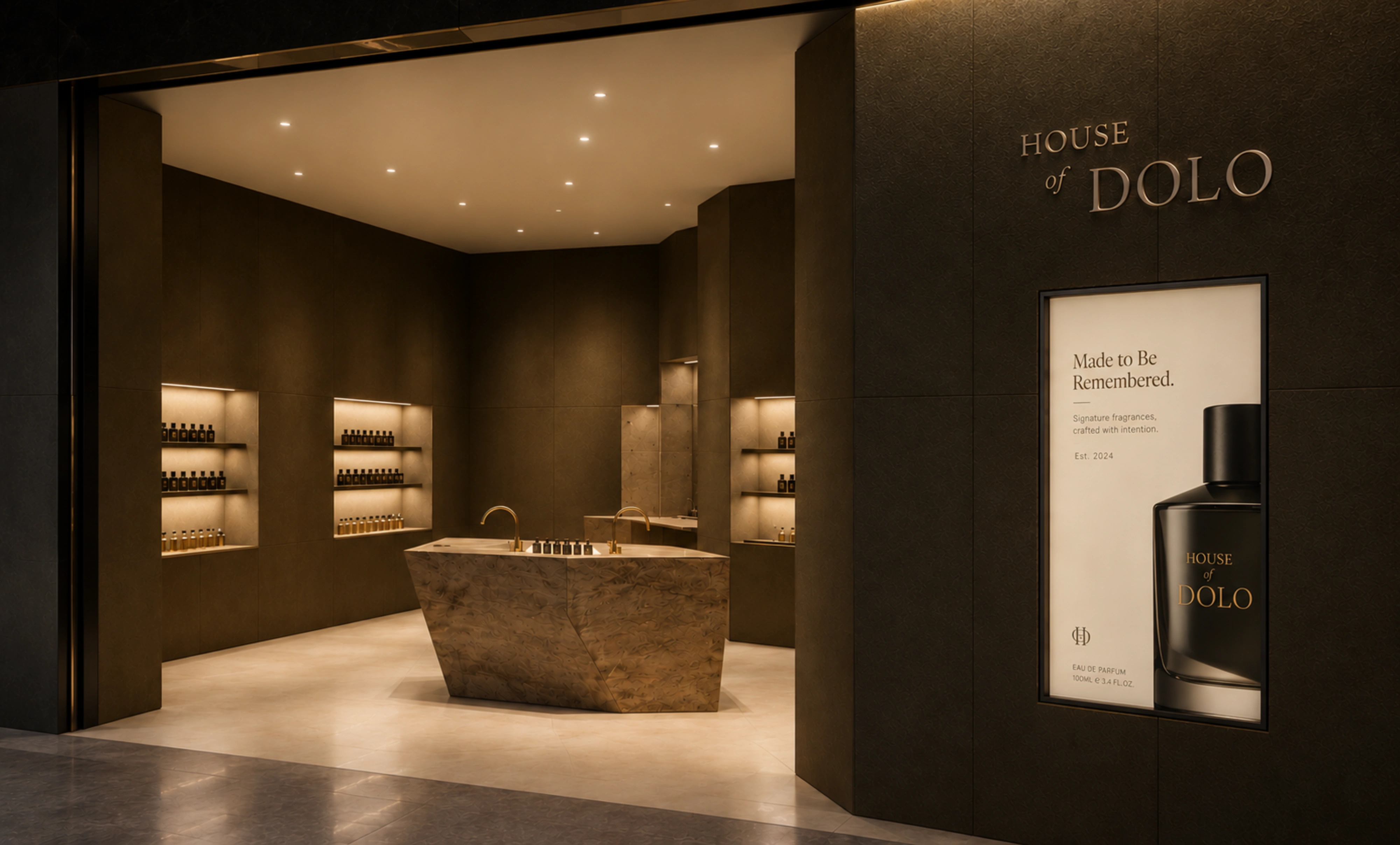
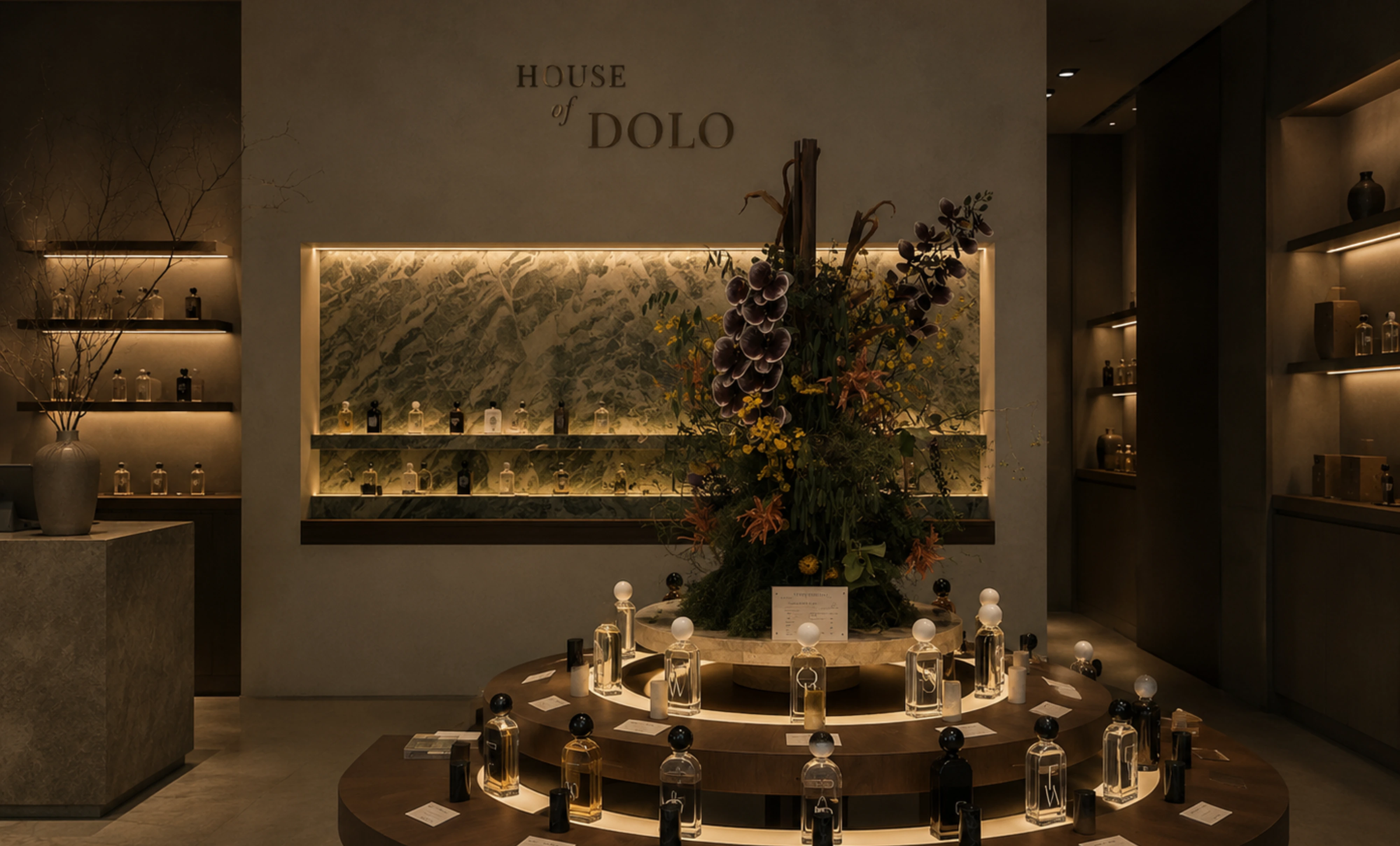
Botanical imagery, natural stone, deep shadows and tactile textures were woven throughout the art direction, creating a visual language that feels almost sensory. You can imagine the weight of the packaging, the texture of the paper and the scent itself before ever holding the bottle.
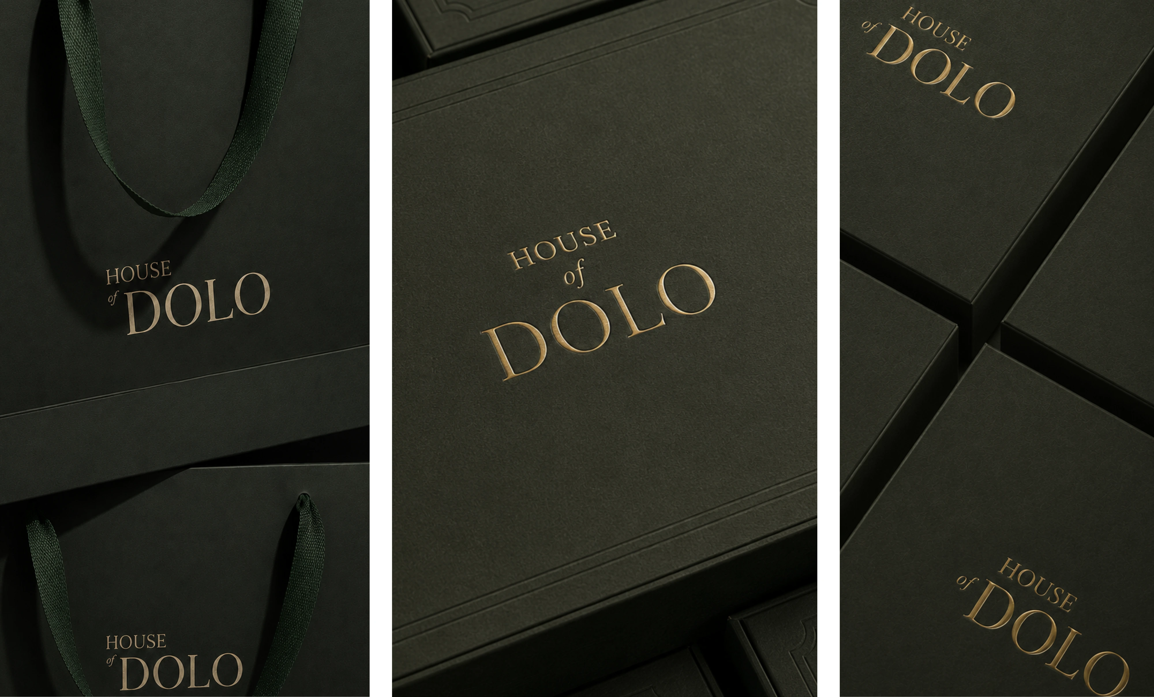
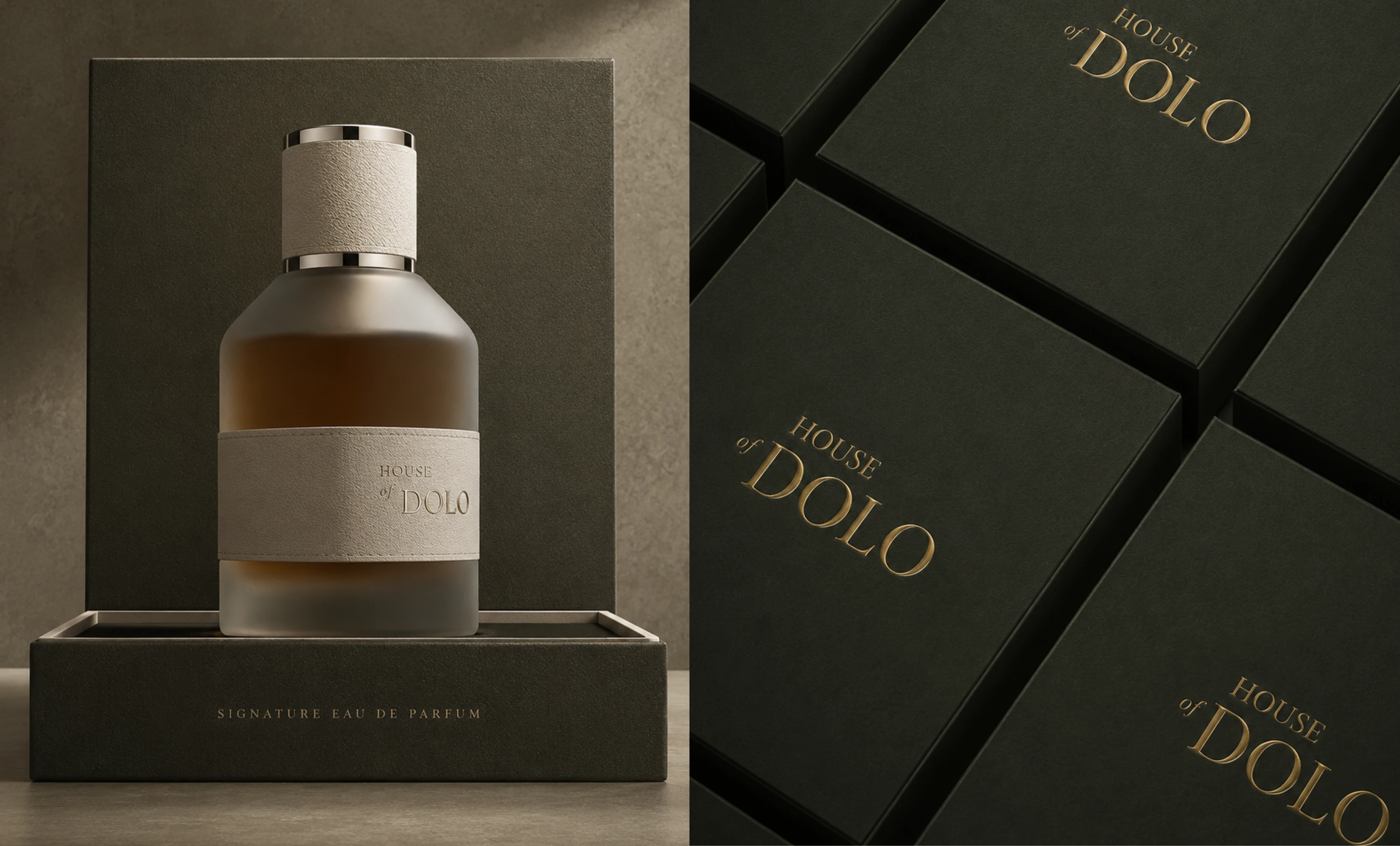
At the centre is a refined serif wordmark, with the smaller, more expressive of creating a subtle contrast within the typography. Finished in gold, the identity takes on a timeless, almost jewellery-like quality against the signature green.
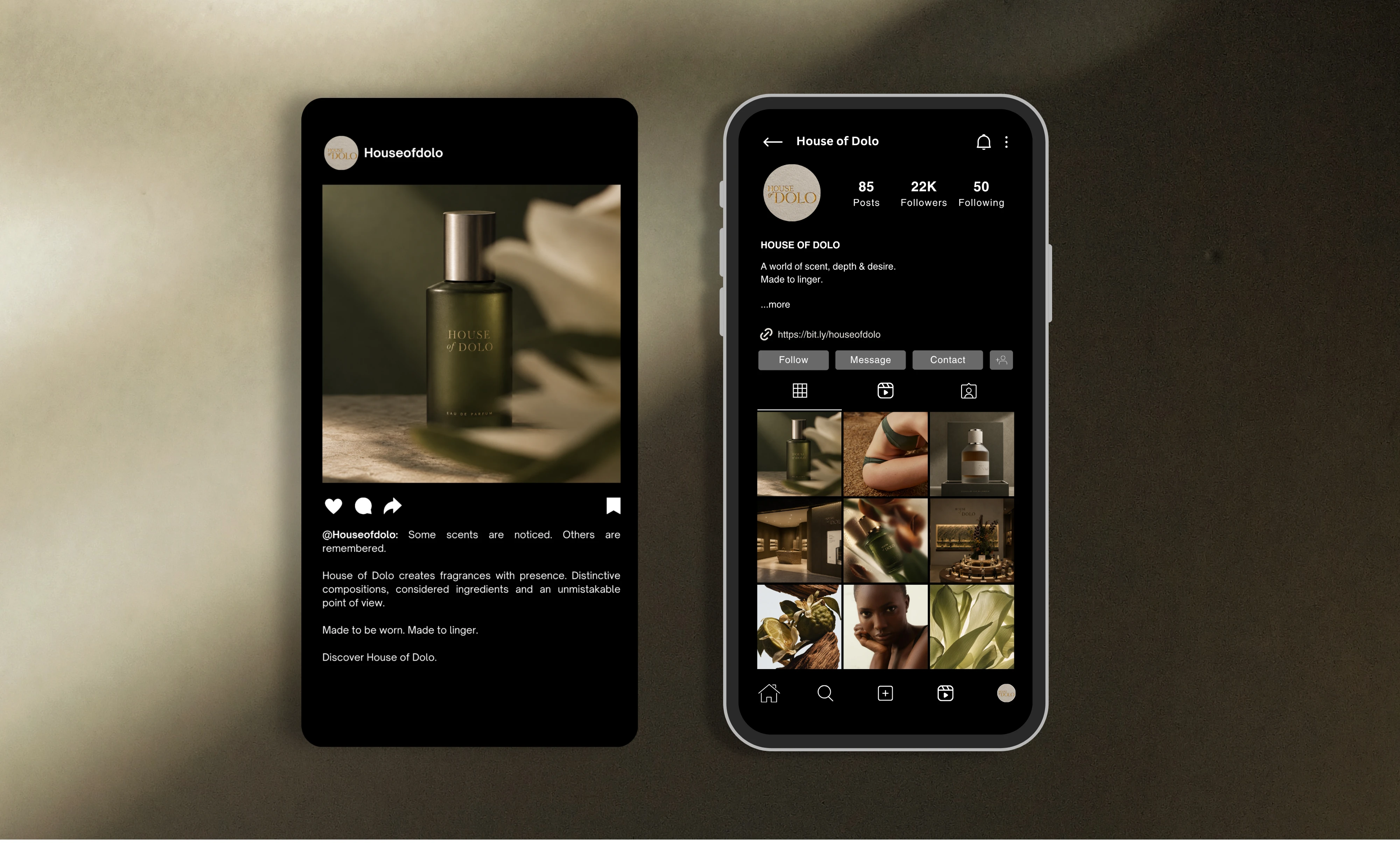
We carried the visual direction across packaging, fragrance bottles, printed collateral and social media to create a brand that feels considered at every touchpoint.
The result is House of Dolo: rich, sensual and quietly commanding.
A fragrance house designed to leave an impression.
Like this project
Posted Sep 22, 2026
Created a luxury brand identity for House of Dolo, emphasizing sophistication and nature.