Built with Framer
Case Study : Easy Anti-Cheat, Website Redesign
Josias Rufus
Before we start
What actually happens.. this is an experimental. just to showcase my design and ux thoughts in managing project
I collaborated with myself in a design sprint for Easy Anti-Cheat (Known as EAC) to rework their website usability, readibility and layout. I also translate its concept into a dynamic, interactive UX/UI for a Framer website that suits it's market which is Gaming/Esports or similar.
Clients (X) : Easy Anti Cheat
Industry : Gaming, Service
Category : Website
Use Case for : Information Extender
Role : UI/UX Lead
Tools : Framer (Development), Figma (Design), Photoshop (Complimentary)
Timeline : 2 Week
Live Website : Click Below
Introduction
How it started
As i said earlier, I collaborated with myself in a design sprint for Easy Anti-Cheat (Known as EAC) to rework their website usability, readibility and layout. I also translate its concept into a dynamic, interactive UX/UI for a Framer website that suits it's market which is Gaming/Esports or similar.
As part of a 2-week Design and Development Sprint, I want to enhance their positioning and messaging, crafting a voice that reflects their expertise and forward-looking vision in Guarding Gaming/Esports Community. The sprint culminated in similar visual, copy, brand information and a launch-ready website, designed to signal authority, safety, clarity, and conviction.
The current website also lack in telling the story and features of Easy Anti-Cheat, showing how strategic these area to improve to become leading service in Anti-Cheat System.
First Step : Ideation
Initial image & interaction based
In the world of gaming, every millisecond counts, every click, every frame, every unseen line of code can mean the difference between victory and vulnerability.
When designing the Easy Anti-Cheat website, I wanted to capture that tension between play and protection, the invisible guard that stands behind every fair match. So instead of treating this as a simple redesign, I approached it like a mission, a system activation sequence, where every motion, every grid, and every hover state tells the story of precision, control and status.
This idea collage became my visual battlefield.
The Resident Evil equipment UI inspired the bento grid system, reflecting tactical organization and readiness.
The “Wasted” desaturation effect evolved into a hover animation language, shifting between saturated and unsaturated states to mimic system alerts.
Grid lines and mechanical borders structured the layout, giving the interface a sense of engineered clarity.
Toggle switches transformed into interactive triggers, activating sections to reveal supported games, much like powering up different modules of a defense system.
And the crosshair interface symbolized the accuracy of EAC’s protection, the unwavering focus that keeps games safe.
Every visual cue, from animation timing to transition states, was built around this narrative: a living system that watches, responds, and evolves. The result isn’t just a website, it’s a digital control room that feels alive, mirroring the heartbeat of gaming security itself.
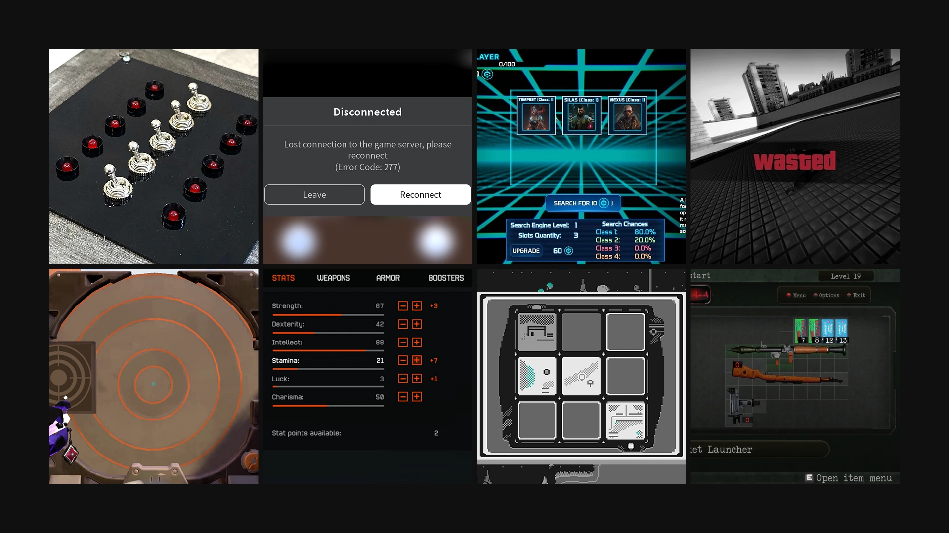
I use these elements as an idea to create website animation & mini-interaction.
Color picks & system
This color system was built around the psychology of competitive gaming, precision, awareness, and trust under pressure.
Since Easy Anti-Cheat mainly operates within the FPS environment, where quick decisions and silent protection define the experience, the palette mirrors that high-stakes energy while remaining neutral enough for other gaming genres.
The foundation begins with #1B1B1B, a deep black that embodies control, focus, and the invisible strength of the system, representing EAC’s unseen vigilance in guarding fair play. Beside it, #262626 acts as the structural layer, a graphite tone that brings mechanical precision and operational calm, grounding the interface in stability and discipline.
Second Step : Fidelity Design
The fidelity design of this project bridges tactical clarity and system emotion, translating the mechanical precision of anti-cheat technology into a visual and interactive experience that feels alive, confident, and gamer-centric.
Every element was designed to move with intent: from typography rhythm to toggle interactions, each motion mirrors the pulse of a system constantly scanning, detecting, and protecting.
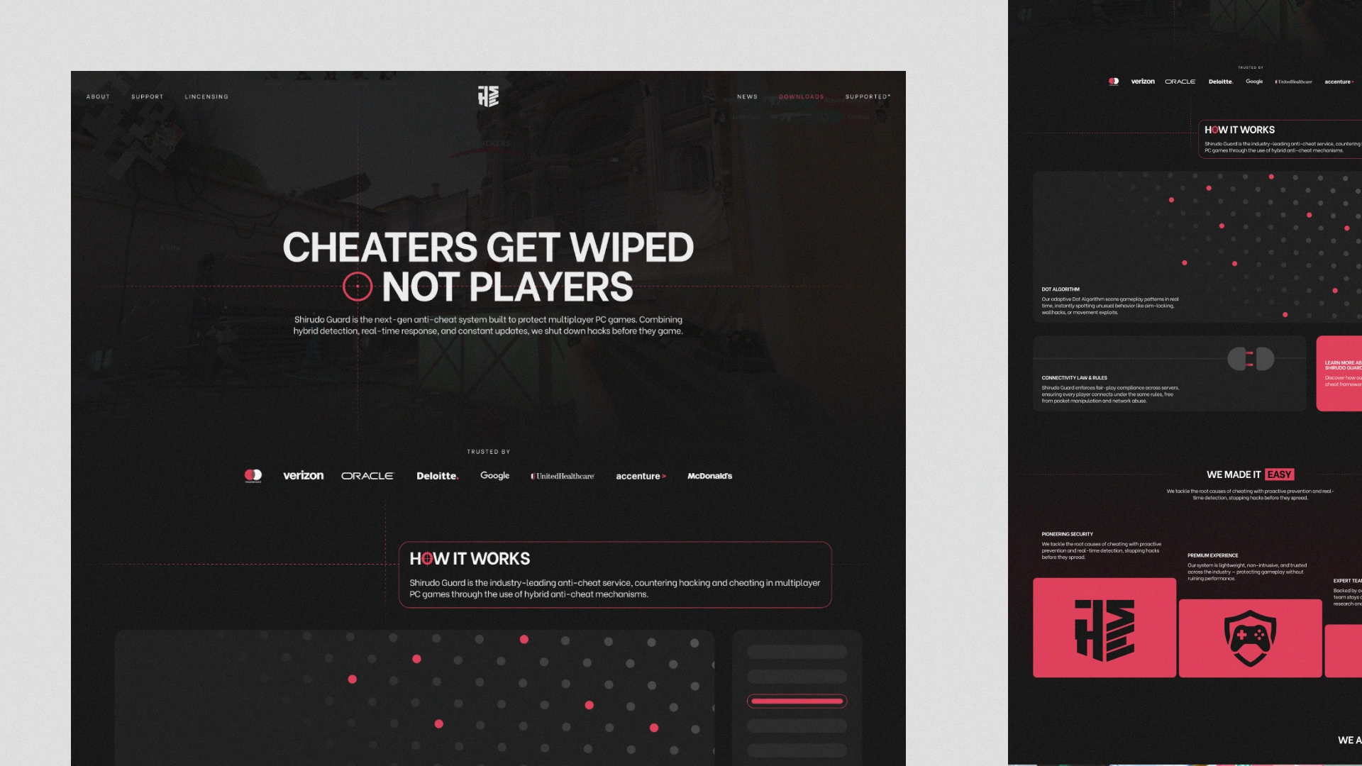
The hero section, with its bold “Cheaters Get Wiped, Not Players” statement, sets the tone — direct, fearless, and mission-driven. The dark-to-light contrast plays like a signal: danger meets defense. Supporting game visuals connect the interface to real-world gaming contexts — from tactical shooters to racing titles — visually reinforcing that EAC operates across multiple competitive landscapes.
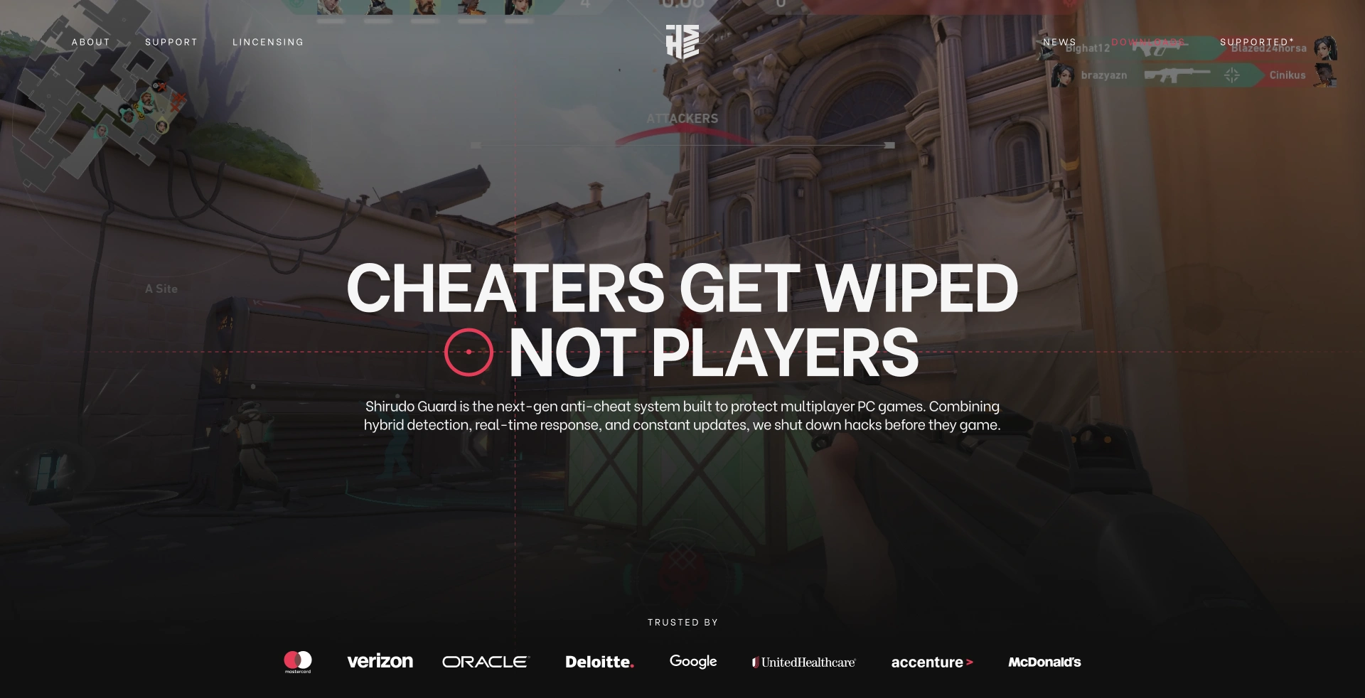
Initial Hero Concept
Down the page, the bento-style grid system translates data and structure into modular storytelling. Each card behaves like part of an active control dashboard, emphasizing system feedback through hover and saturation transitions.
Red accents pulse like alerts, responsive, never decorative, while minimal typography and breathing space communicate technical confidence without noise.
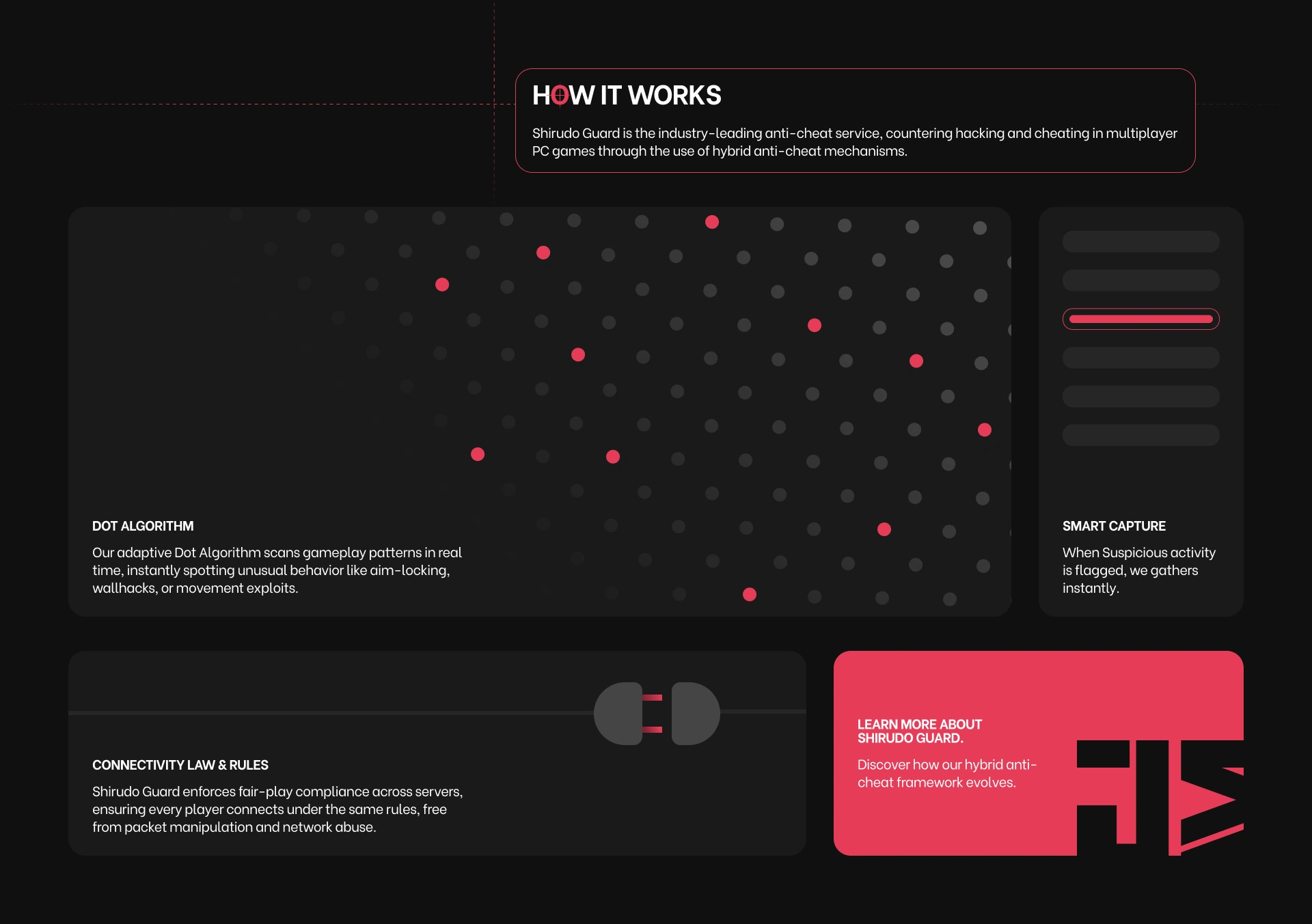
The “How It Works” section introduces algorithmic visuals: dot patterns, flowing grids, and subtle lines moving across sections to imply live scanning, a nod to EAC’s real-time detection system.
Every dot, every transition, evokes the image of a network constantly analyzing player behavior, maintaining balance in an invisible digital warzone.
Initial Features Section Concept
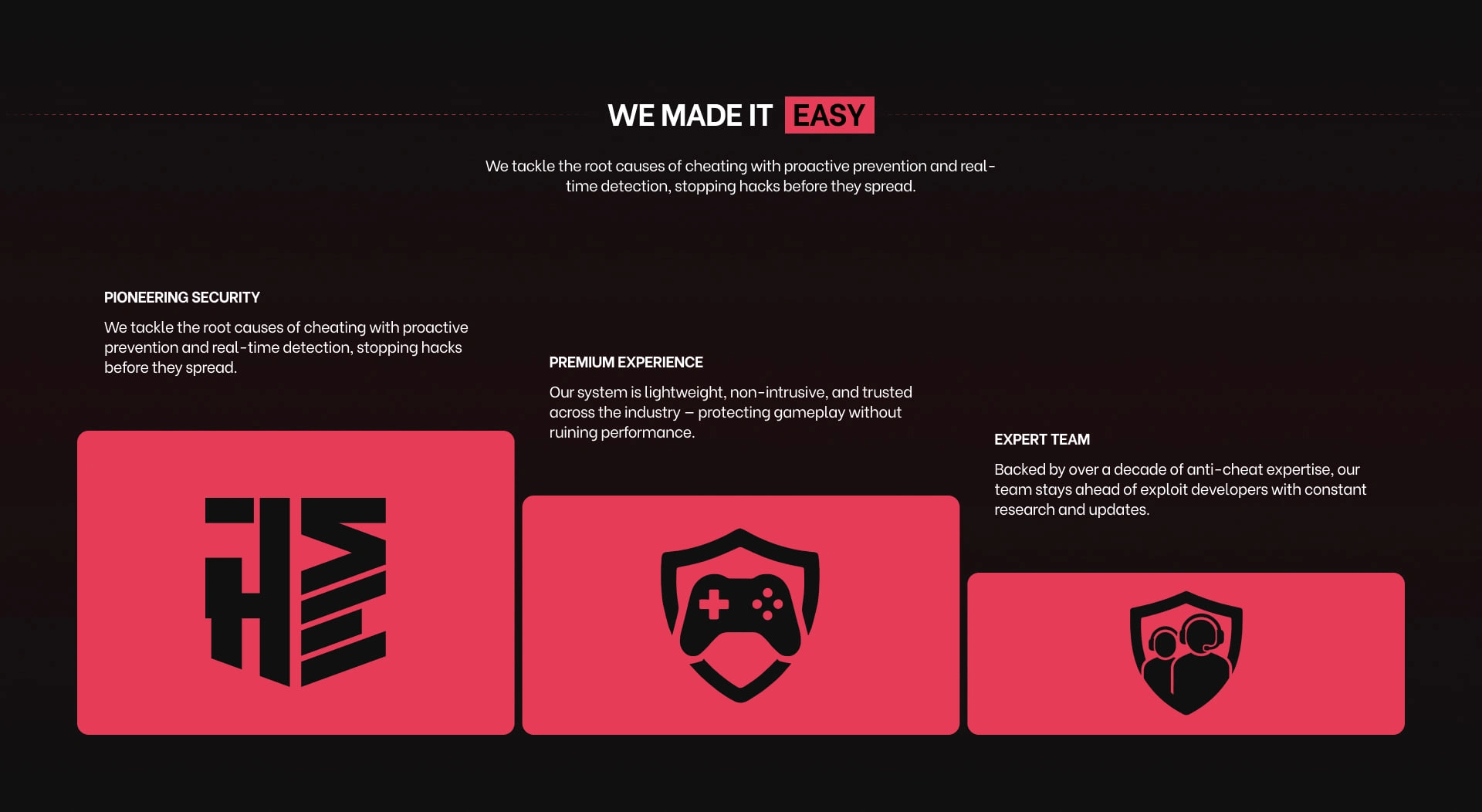
"What Makes Us Better" Section Concept
The toggle in “We Are / Your Games” becomes a metaphorical switch, symbolizing activation — turning protection on, keeping fairness alive.
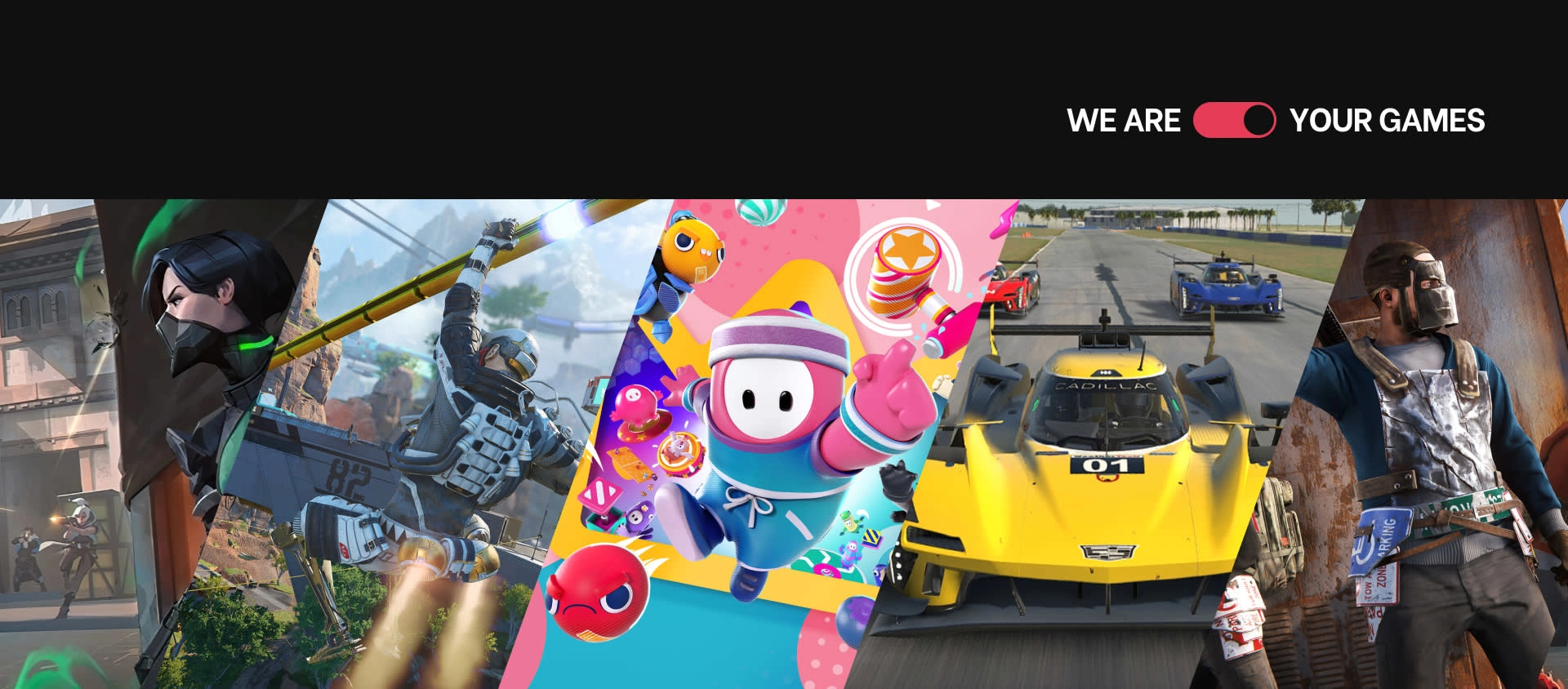
Supported Games Section Concept
Altogether, the fidelity design stands as a digital embodiment of precision, trust, and protection. It looks and feels like a living control system — one built not just for gamers, but for the integrity of gaming itself.
Third Step : Development (Framer)
During the development process in Framer, several tweaks were made to ensure the design not only looked visually sharp but also performed seamlessly in a live, interactive environment.
Some visual and structural adjustments were necessary to balance storytelling, usability, and responsiveness. For instance, the typography hierarchy and spacing were refined to improve readability and rhythm while scrolling. The original static design had strong visual presence, but once developed, certain text sizes and line gaps needed to be adjusted to maintain focus and flow, especially around key statements like “Guarded, Collected, Accurate.”
Responsiveness also played a major role in these refinements. Components and grids were slightly restructured to scale more naturally across different screen sizes, ensuring that every section maintained modular balance.
Some of the hover and animation effects were simplified or re-timed for smoother, faster performance, this kept the interface feeling responsive while avoiding excessive visual load.
The color calibration between deep blacks and accent reds was fine-tuned as well to maintain consistent contrast across monitors, preserving readability and clarity under various lighting conditions.
In the “How It Works” and FAQ sections, visual complexity was reduced to emphasize clarity and accessibility.
The animated dots and transitions were optimized to perform efficiently while keeping their technical and systematic essence intact.
These collective tweaks make the developed design feel more like a living system rather than a static showcase.
Reinforcing Easy Anti-Cheat’s core identity: responsive, intelligent, and built for precision.
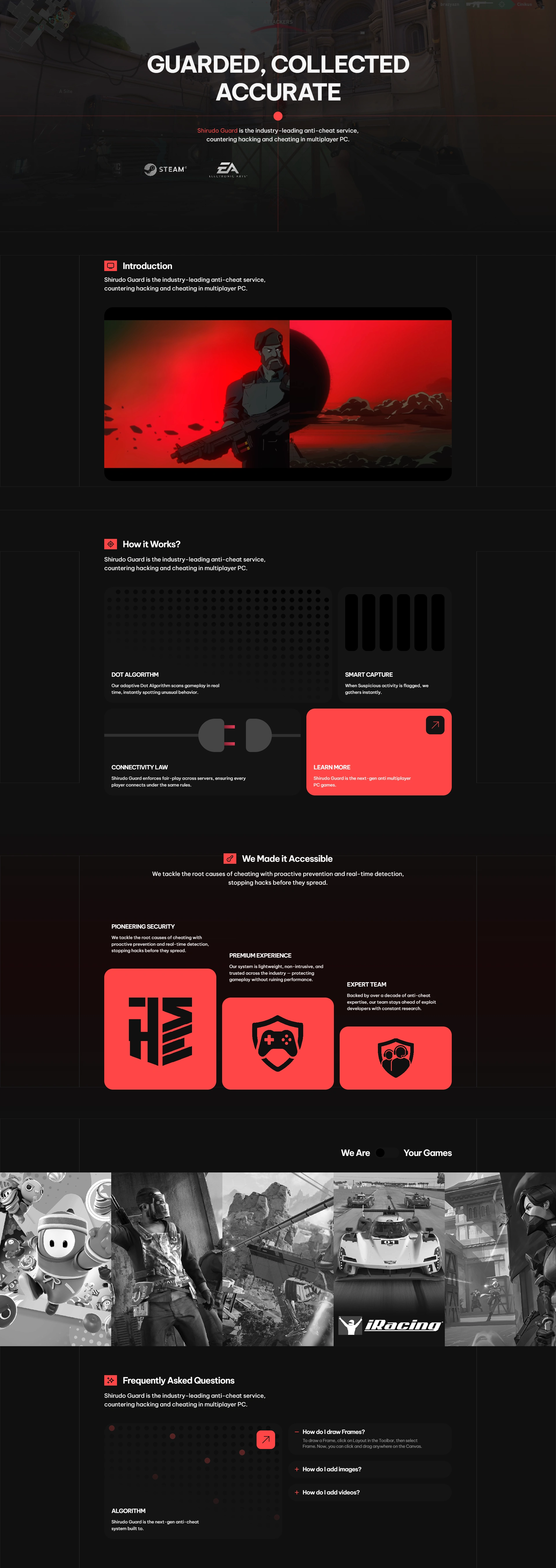
Latest Version of This Project Development (The image might looks pressed due to compression)
Conclusion
After all that..
In the end, these refinements were not about changing the original vision, they were about translating it into motion, interaction, and experience that feel natural in a real-world environment.
The design evolved from a static composition into a functional, breathing interface that mirrors how Easy Anti-Cheat operates: always active, always aware, always precise.
Every tweak, from typography rhythm to micro-interaction timing, was guided by the same principle, to make the system feel alive and trustworthy.
The final result is a website that doesn’t just present information, but embodies vigilance and control through its behavior. It’s a refined balance of technology and design, showing that even in simplicity, precision can tell a powerful story about protection, integrity, and the future of fair play in gaming.
Try it yourself. Give me your thoughts. Thanks :)
Like this project
Posted Oct 9, 2025
Redesigned Easy Anti-Cheat's website for improved usability and market fit in gaming/esports.
Likes
1
Views
4
Timeline
Sep 28, 2025 - Oct 8, 2025
Clients
Easy Anti-Cheat