Premium SaaS Fintech Landing Page Design

Bota Aitymbetova

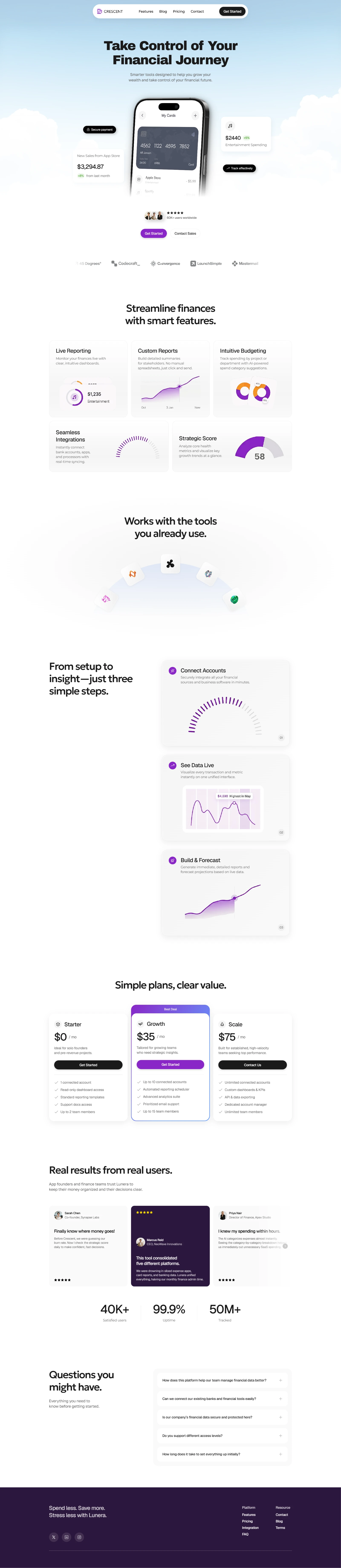
Problem: Fintech platforms often struggle to make complex financial tracking, budgeting, and forecasting feel simple and trustworthy. Users get overwhelmed by dry dashboards and hard-to-read data, leading to high drop-offs.
Solution: Designed a modern, high-converting landing page in Framer for a mobile-first financial management platform. The design balances a clean light aesthetic with vibrant purple accents, dynamic bento grids, and clear visual hierarchy to instantly convey trust and clarity.
What I did:
Hero Section: Created an impactful top fold featuring realistic device mockups, key financial stats, and immediate social proof to build instant trust.
Feature Showcase: Structured features into intuitive bento-grid components (Live Reporting, Custom Reports, Intuitive Budgeting) for effortless scannability.
Integrations & Steps: Built visual sections highlighting tool compatibility and a simple 3-step onboarding flow (Connect --> Live Data --> Forecast).
Conversion Optimization: Designed a clean pricing table, interactive testimonials, social proof counters, and an organized FAQ accordion.
Responsive & Framer-ready: Fully optimized layout for seamless responsiveness across mobile and desktop interfaces.
Result: A sleek, trustworthy, and user-centric web presentation that simplifies complex financial tools into an engaging, high-converting user experience.
Like this project
Posted Jul 26, 2026
High-converting Fintech landing page in Framer. Features clean light UI, interactive bento grids, pricing tiers, and smooth responsive layout.