Case study: Neison Nord Identity and Web Design on Behance

Igor Polyakov


Case study on branding and website design for Nelson Nord, the Software company in Estonia.
Our team is immersed in the universe of software industry decision-making. The Neison Nord website has been developed to make collaborating with this company easier. Neison Nord is a software programming, web, and application development company in Nordics.
Project
We developed a new brand identity, website design, and custom illustrations for Neison Nord company. This project's creative team from our side included Igor Polyakov, Sajhib Hossein, and Susanna Talvi.
Client
The team at Neison Nord works with you to create a custom-made software solution to suit your business needs. They work with you to create a roadmap and timeline for the project and will adjust it if necessary. The team is dedicated to delivering high-quality software that meets your business needs. They are always open to feedback and suggestions, so you can be sure you are getting what you need. Neison Nord will always be there to support you and your team throughout the life of the project.
We operated on the trademark identity and website design for this company. Because the design system and website were designed to be accessible and affordable, we created a branding strategy that was simple and accessible. This approach helped them connect with their customers and explain the benefits of their products.
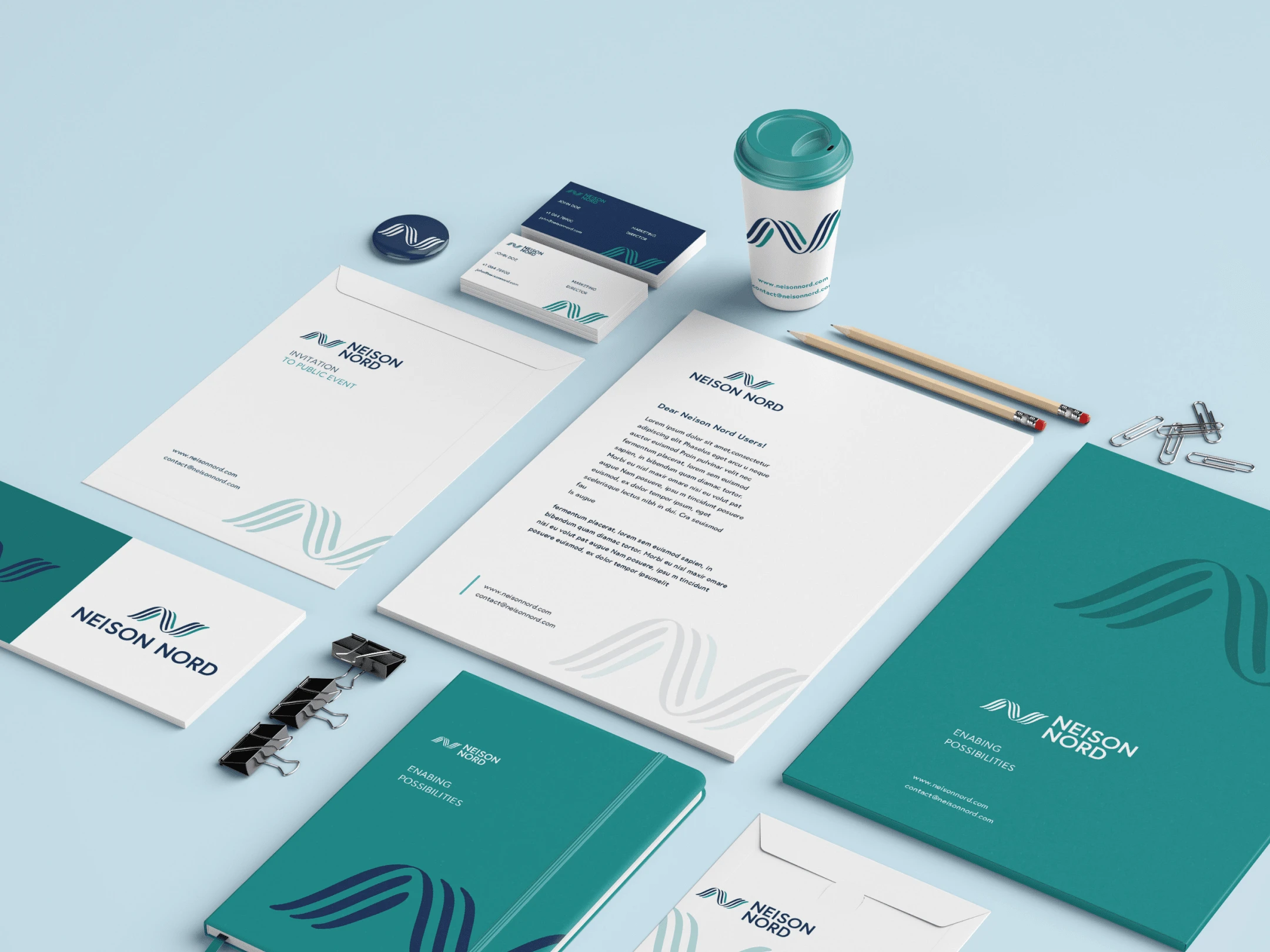
Identity Design
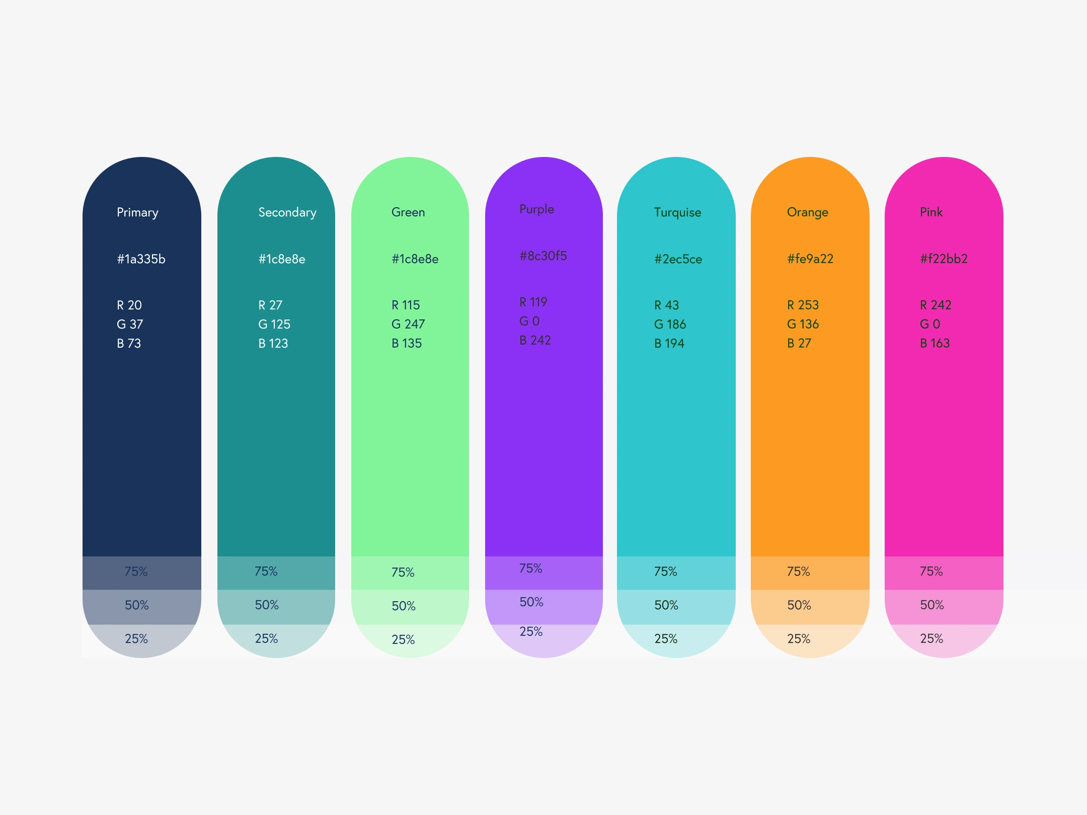
To begin with, we researched the software and development industries in the Nordics, the difficulties consumers faced, and where the company's message was being communicated. We emphasized the service's critical advantages, innovation, professionalism, and modernity. The team wanted to create a visual identity design method that could shift from more businesslike to more emotional. The software industry was connected by color psychology and the psychology of novelty, professionalism, and technology through color to create an instant visual connection. The bright and vibrant colors make a quick graphic link to the topic of originality, professionalism, and technology. The brand uses green, orange, and blue hues extensively.
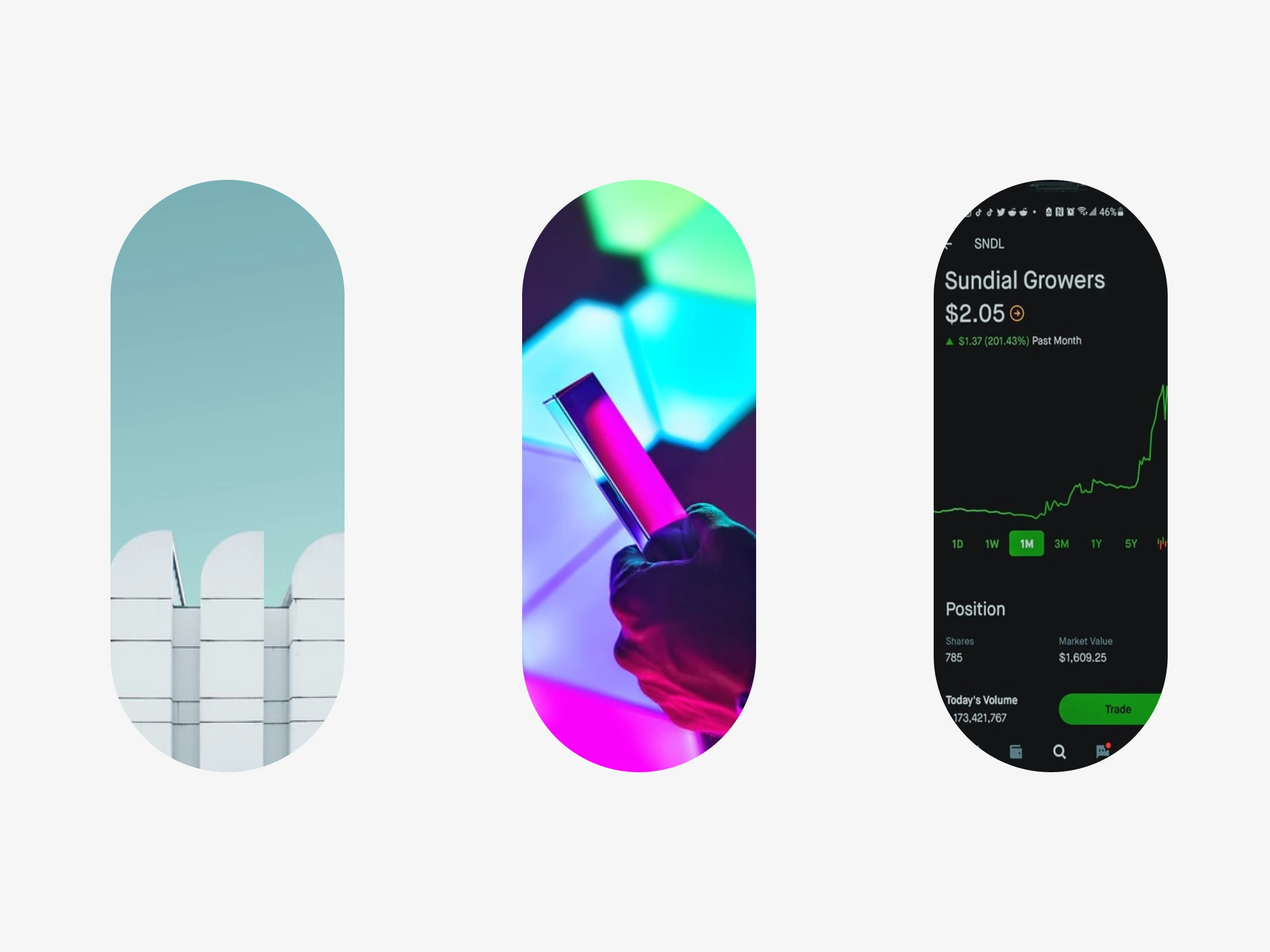
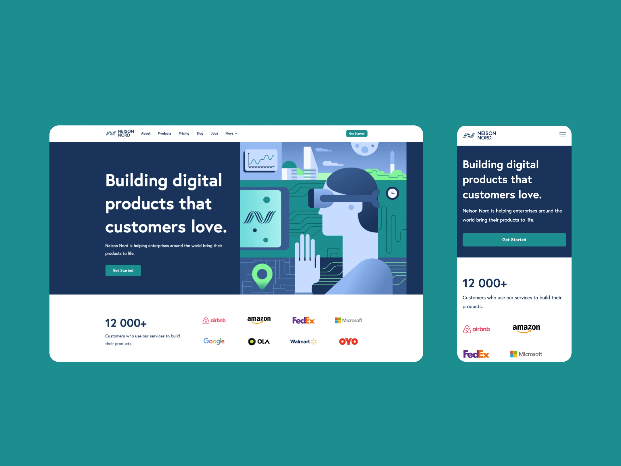
Web Design
The following phase of customer experience design, boosting the effectiveness of the service display and communicating the brand online, was to construct a website. The team initially created a framework that would be practical and particular to the wide assortment of target customers. They then moved on to developing a website.
Like this project
Posted Jul 13, 2023
We developed a new brand identity, website design, and custom illustrations for Neison Nord company. This project's creative team from our side included Igor P…
Likes
0
Views
16


Branding for Hietakari on Behance
MediTech Framer Template on Behance