Ybiance: Corporate Brand Identity
Ybiance: A corporate training firm that helps businesses reach their full potential through expert led trainings and development.

Overview
To create a logo that represents the symbol of growth and Ybiance's focus on driving measurable results to their clients through corporate trainings and management solutions

Brand Values
Professionalism, Customer focus, Innovation, Collaboration, Measurable results, Growth.
Process
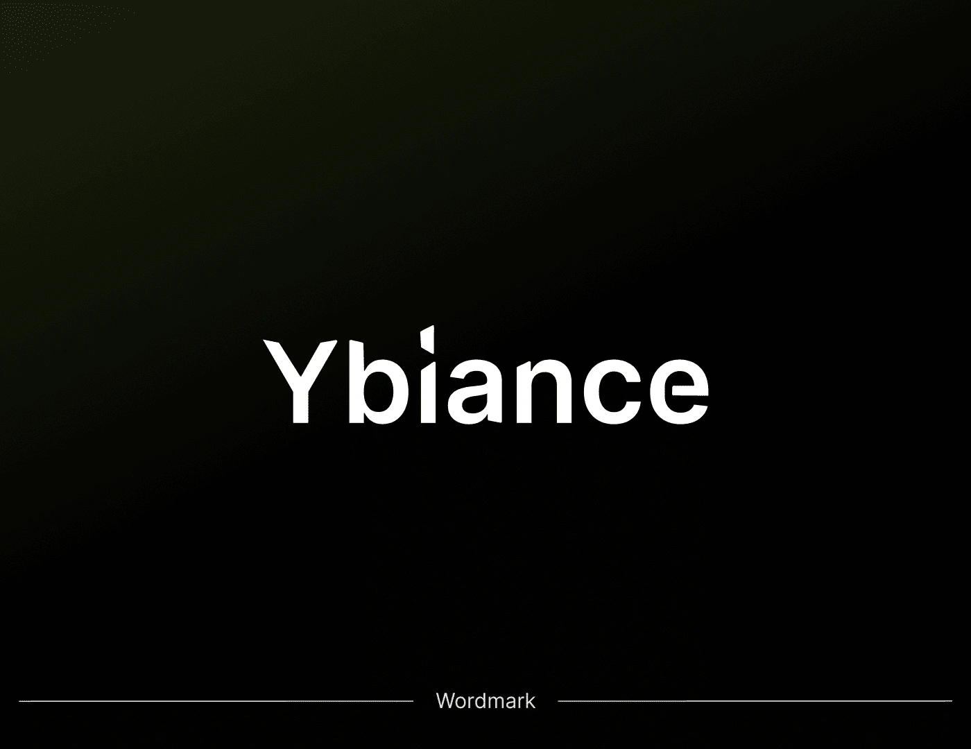
The logo design process began with research and understanding of the brand's core values and mission. I focused on creating a visual representation of growth and success through the use of a percentage symbol. The symbol was chosen to emphasize Ybiance's commitment to driving measurable results for their clients.
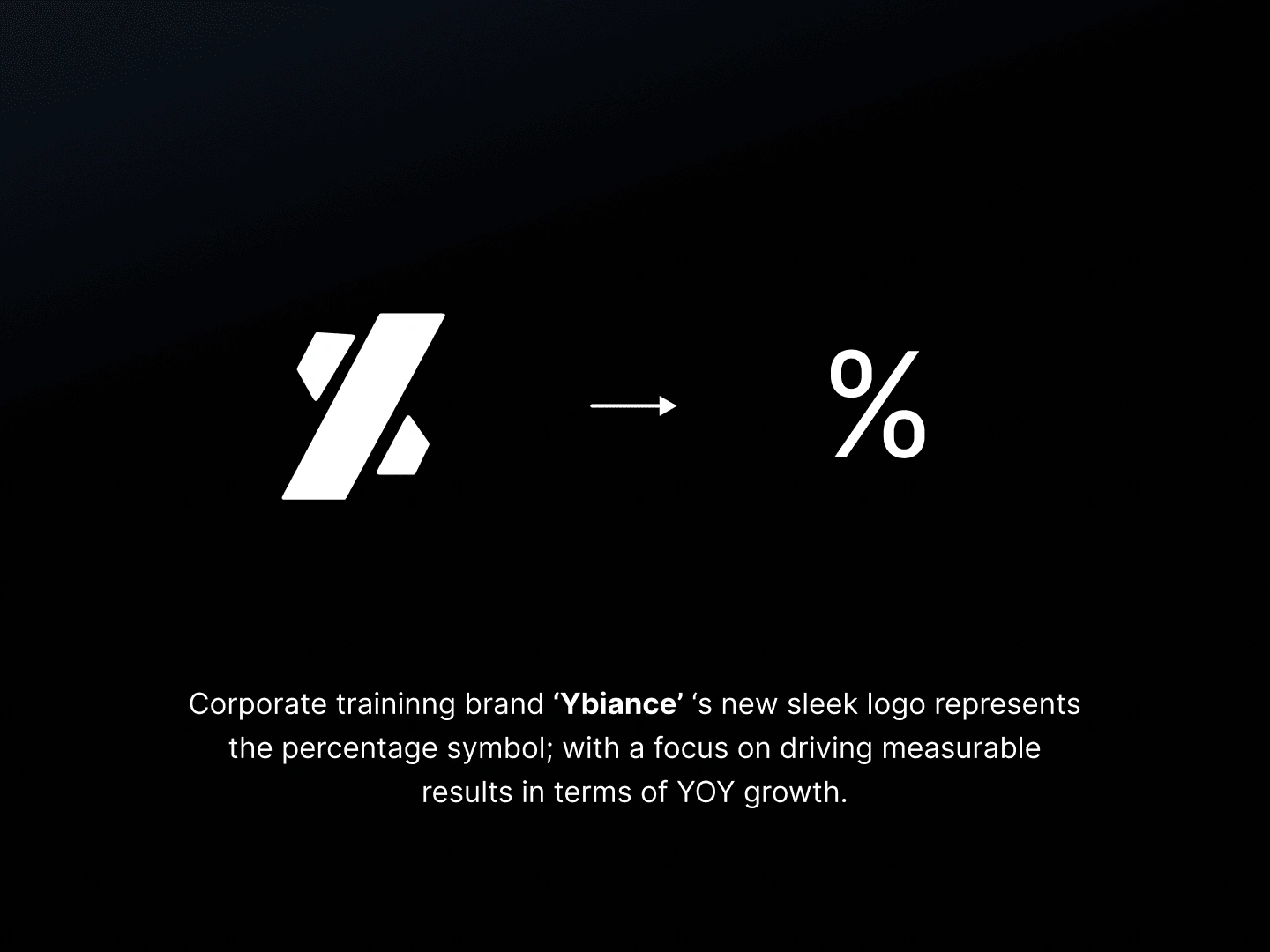
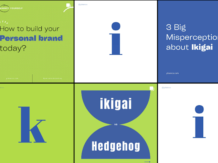
The logo was designed with a sleek and modern look, using a combination of corporate blue and green colors to represent growth, stability and professionalism. The typeface was carefully selected & customised to balance the clean and modern look of the logo.

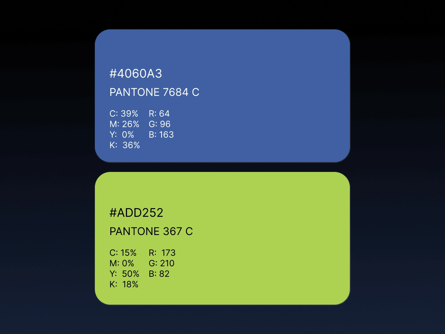
Color style guide
Result
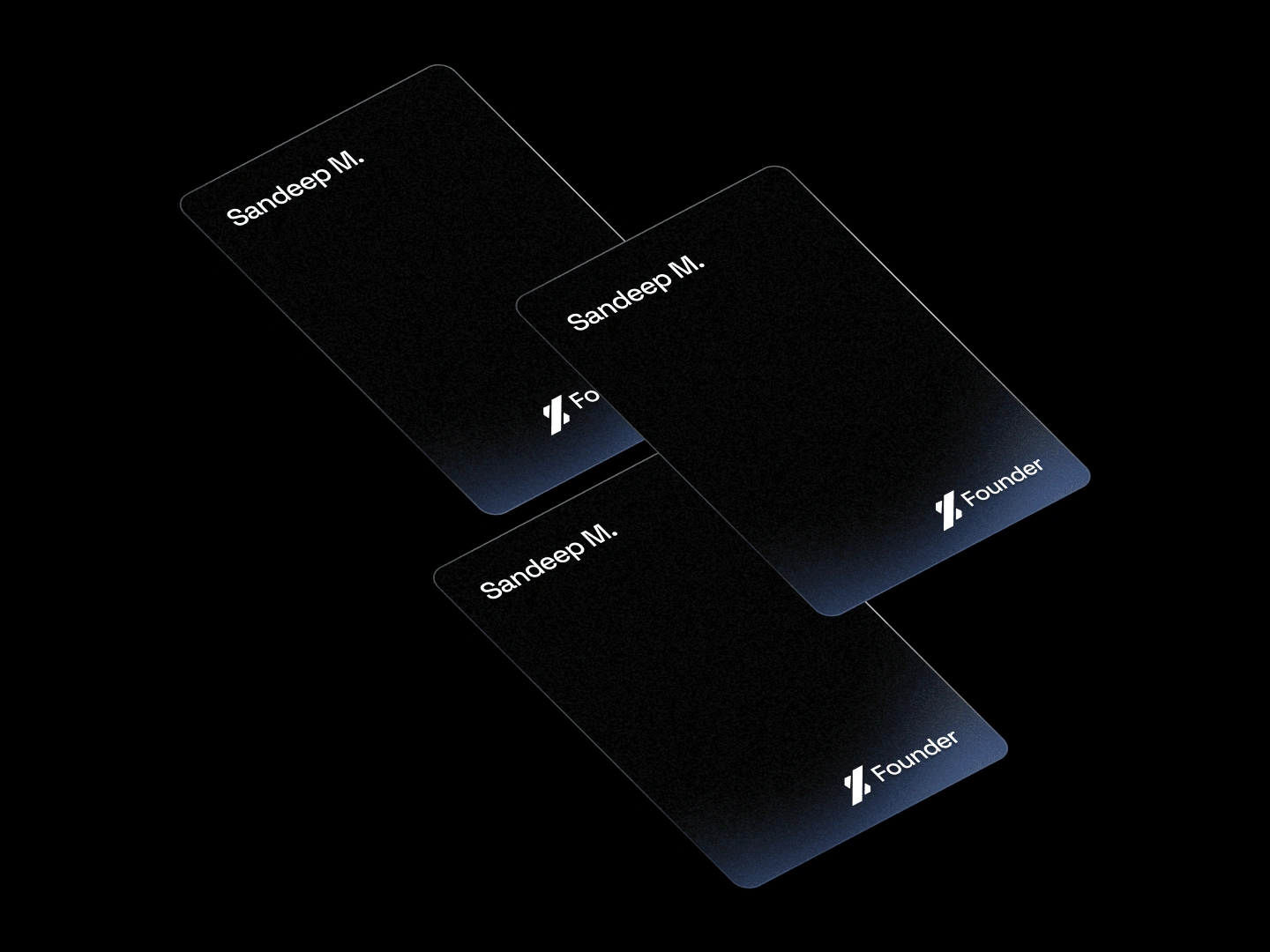
The final logo design was well received by the client and effectively communicates the brand's message of driving measurable results and YOY growth. The logo has been successfully integrated into Ybiance's marketing materials and has helped to build brand recognition and credibility among its target audience.
Like this project
Posted Jan 29, 2023
A logo that represents the symbol of growth and Ybiance's focus on driving measurable results.

