Communicating brand products offering through UX copy.
Opeyemi Adesina
Background
Kadick integrated limited pride itself as a solution provider leveraging technology to deliver scalable and sustainable solutions across industries.
The inspiration behind Kadick was to provide top-notch distribution and delivery services for fast-moving consumer goods across Nigeria. We are more than a distribution and procurement agency. We are a group of people passionate about creating a win-win environment for all our stakeholders.
The Problem
Visitors can’t find up-to-date information about our product and services on the current website.
The current website has not gone through a redesign for 4 years. The contents on the website do not communicate the new product and service offerings.
The old website shows Agency Banking only as a product, visitors do not see other product offerings like eGate systems, Rechargely, and KKredit.
My Role & Approach
I was responsible for the design, UX writing, and user testing of this project. I worked with a couple of colleagues at the office at different stages of the design to ideate, develop content, get feedback and test the designs created.
We started the project with a kickoff meeting together with the team leader who was doubling for the project owner.
During the kickoff meeting, I was able to ask some questions about what we seek to achieve and the problems we intend to solve with the redesign.
Data gathering with survey and interview sessions
With the information I gathered at the kickoff meeting, I further conducted research with the aim to understand the brand, competitors, and visitors' issues with the current website.
To gain insights, I shared a survey with colleagues and had one-on-one sessions with some of them. In addition to that, I carried out a competitive analysis of brands that are directly and indirectly related to Kadick's business model.
These brands include; Paystack, TeamApt, Reloadly, Interswitch Group, Tunga, and Seamfix.
Key Findings
The quality and quantity of content on the current website need improvement.
The website is not mobile responsive.
Available career opportunities within the organization should be visible on the website.
Majority of visitors, visit our website to learn about our company and get necessary information about our products and services.
With the new findings after the research, we decided to further split and redefine the project goals to capture visitors' needs and solve their frustrations.
Redefined Goals
Increase the quality and quantity of content.
Clearly communicate Kadick's integrated product and service offerings.
Improve mobile-friendliness.
Drive job seekers to our careers page.
Analyzing & restructuring of contents
To understand the old site and its content, I ran a content audit listing all available information and features. Based on this, I agreed with my team on what to keep, what to kick, and how content can be integrated into a more intuitive information architecture.
Identifying the contents to keep and discard, I created a structure for the contents on each page of the website, placing high-impact and important contents first and others following.
High Fidelity Design
Homepage
Before the redesign, the homepage was cluttered, lacked balance and alignment, and most of the visual elements were inconsistent with what the company stands for. So, I decided to take a minimalistic approach with strong use of images and a video on the landing screen to lay emphasis on the copy.
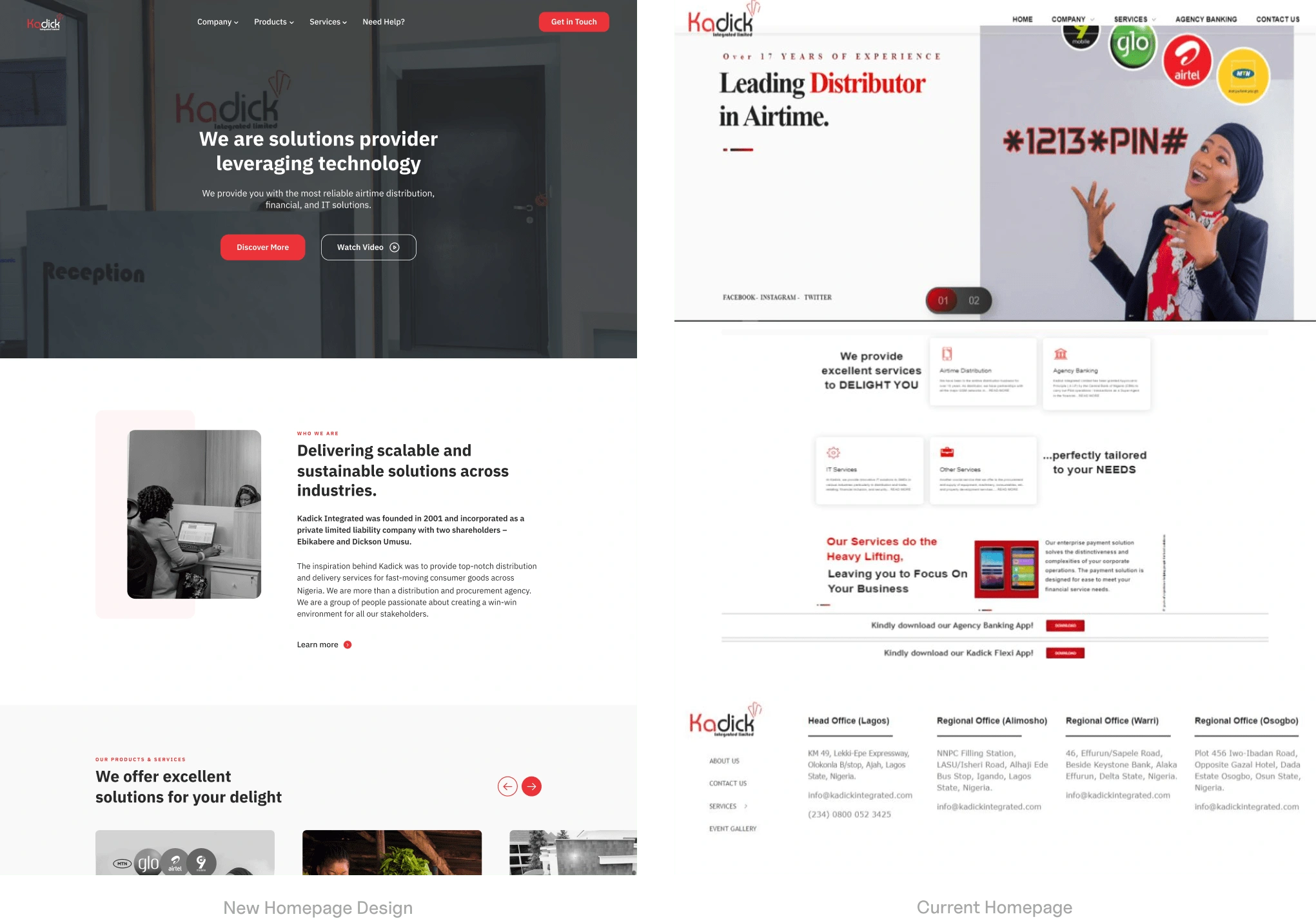
L: After & R: Before of the Home Page
About Us page
We audited the old copy and replaced them with new ones that communicate the company’s value proposition. In other to stick our proposed value in the minds of our visitors and prospective clients, we added a documentary video about our firm.
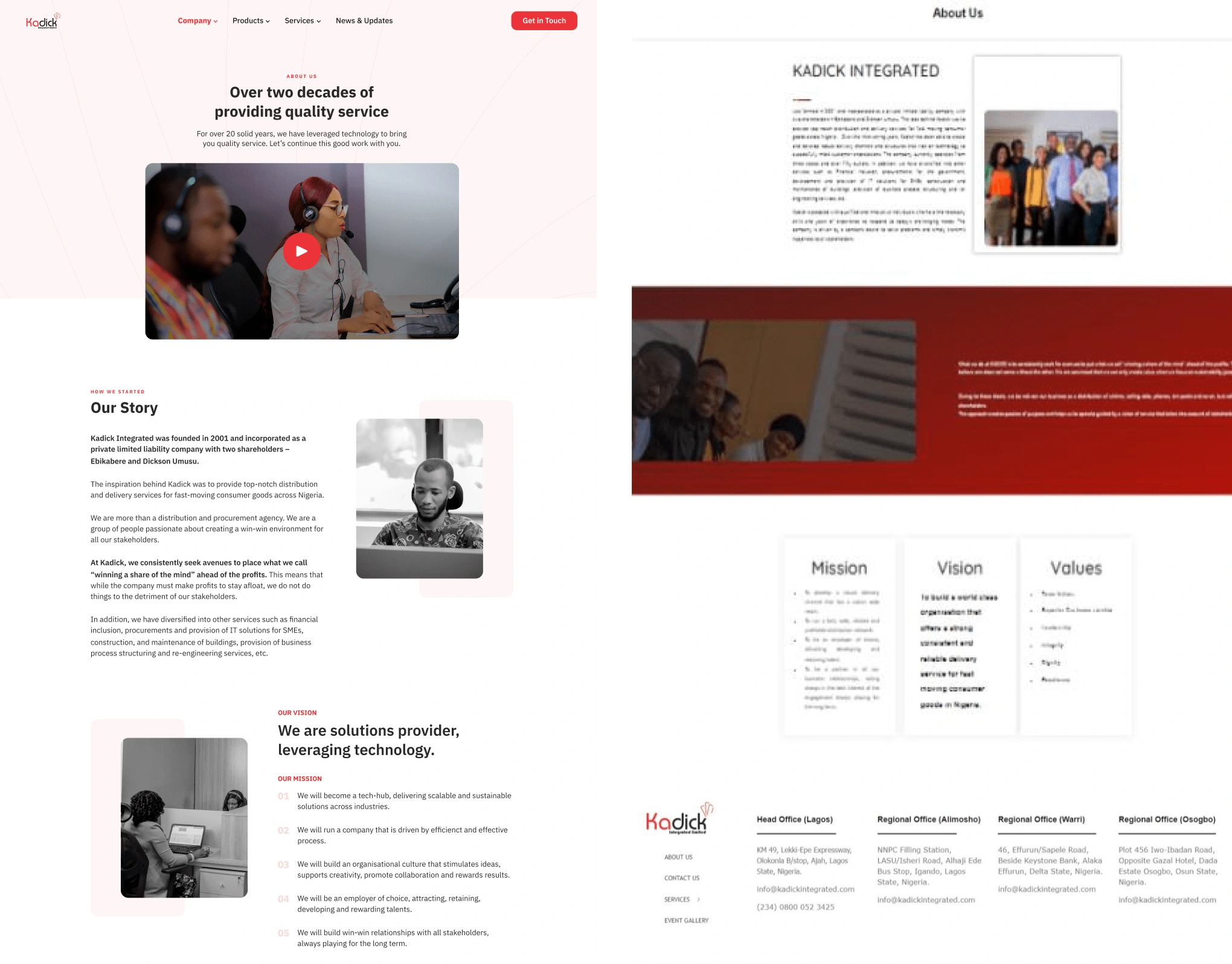
L: After & R: Before of the About Us Page
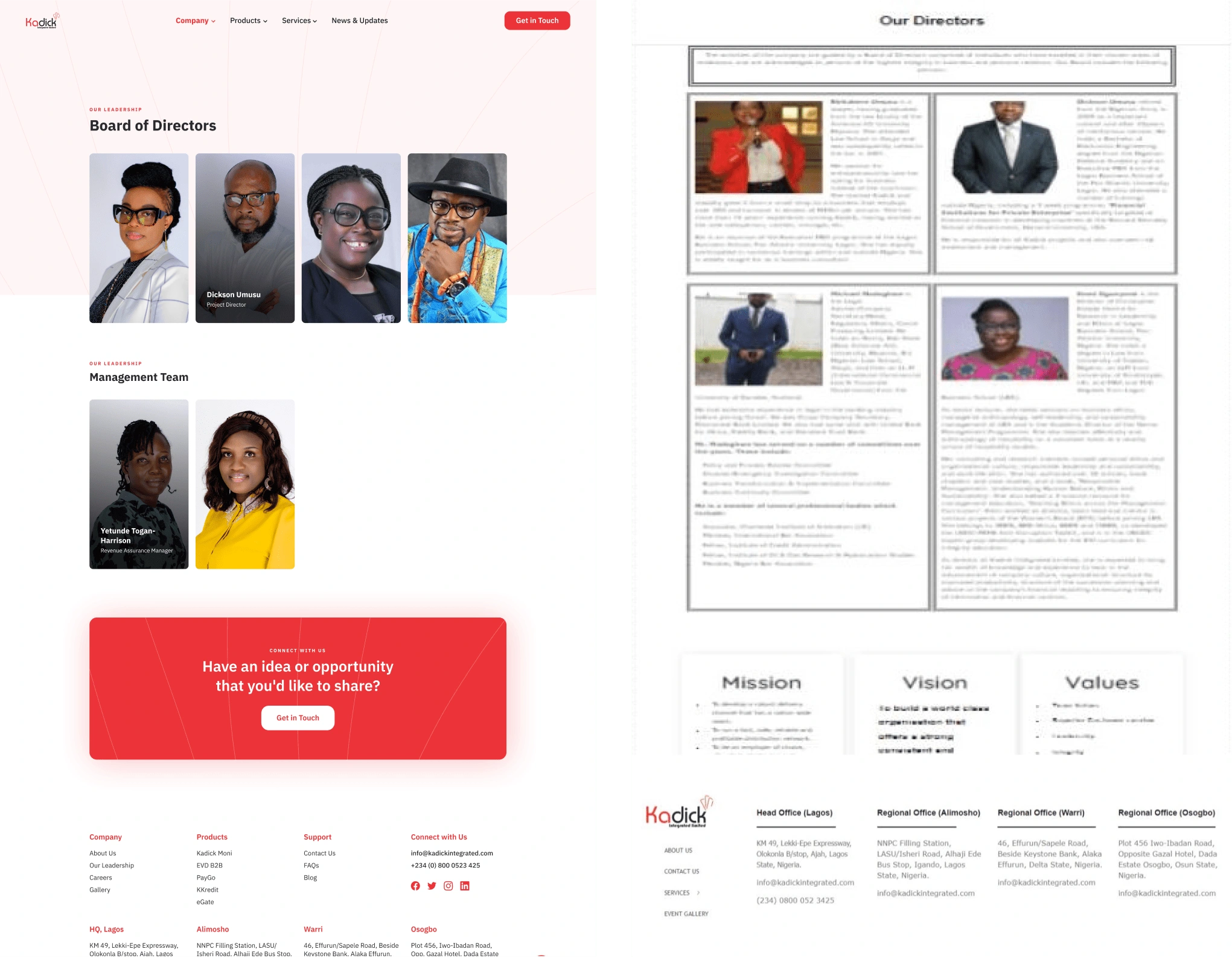
Our Leadership
The layout of the copy and images on the old design was really poor. So, I decided to first rename it from “Our Directors” to “Our Leadership” because members of the management were added, then I reduce the copy to just the headlines and hover texts, and a click on any director’s image, a modal pops ups with the bio of the director.
More Pages
Like this project
Posted Feb 15, 2025
Redesign Kadick's integrated official website to communicate brand offerings clearly.
Likes
0
Views
3