Conversational UX Design for Guia da Bolsa
Mayara Almeida Soares
🎨 Designing the Experience
From the beginning, I wanted the Guia da Bolsa to feel more like a conversation than a system. The goal was to reduce fear, not just provide information — and that meant designing with empathy, structure, and language clarity.
🧭 User Journey & Flow Design
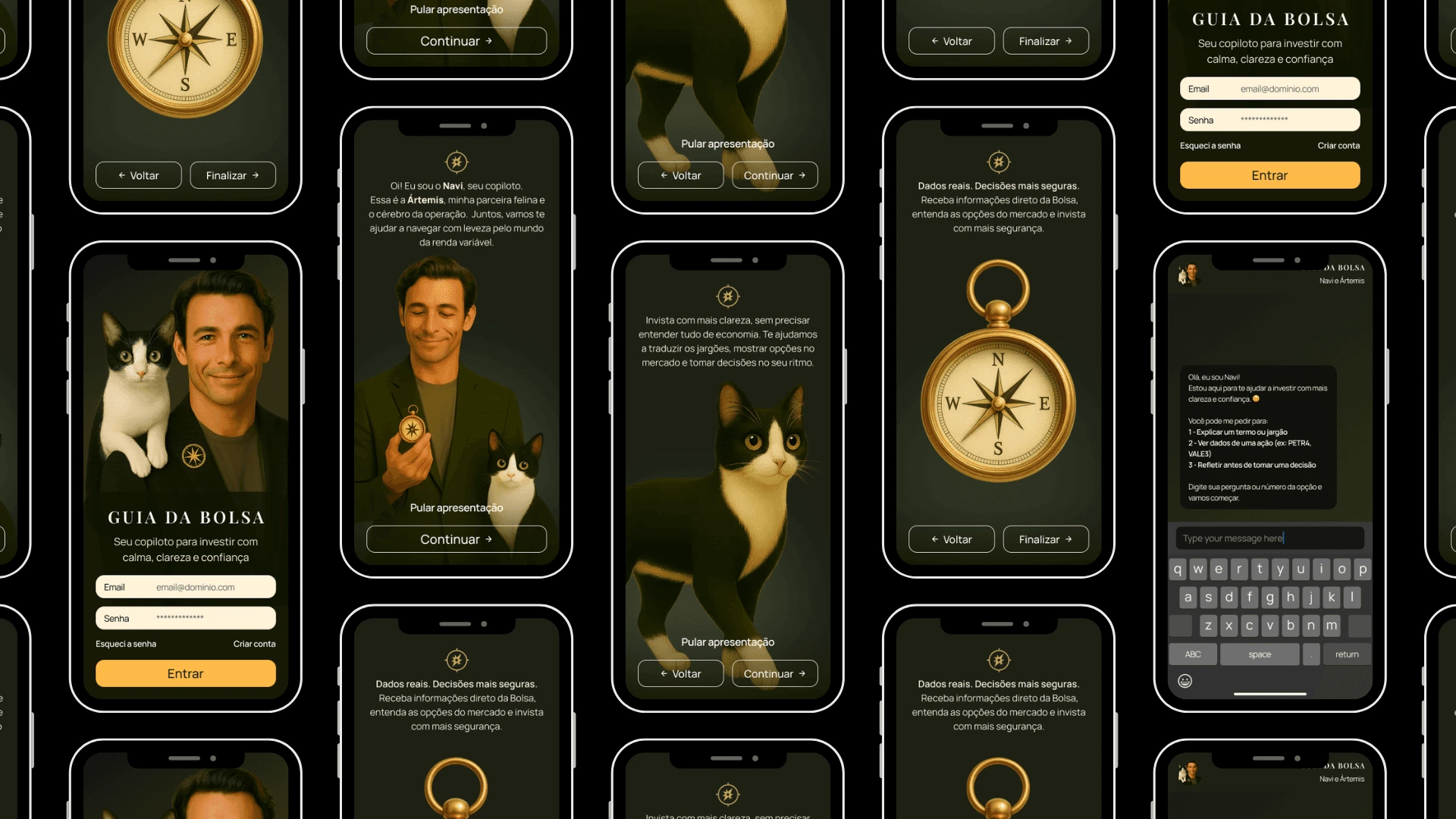
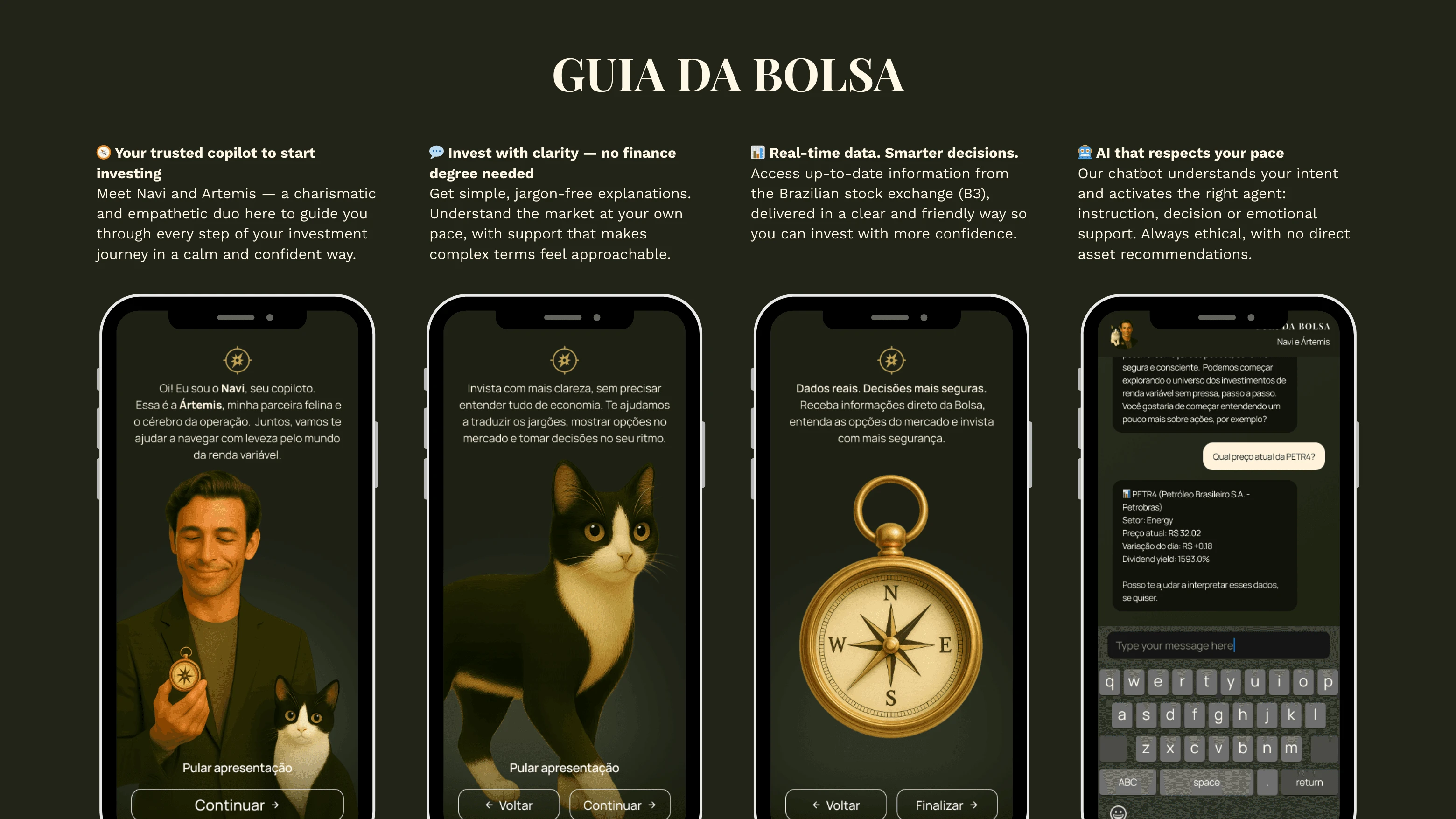
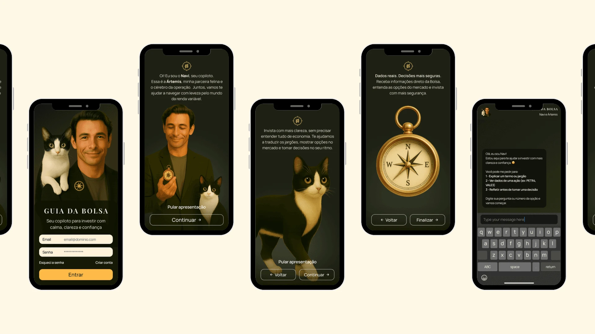
I mapped the emotional journey of a beginner investor: curiosity, confusion, fear of making a mistake, and the desire to learn without feeling judged. That became the foundation for the app's structure, starting with an onboarding that introduces two characters (Navi and Artemis), followed by a conversational assistant that adapts to the user’s needs in real time.
🤖 Multi-agent Architecture
The assistant uses a multi-agent AI structure, where each agent plays a specific role:
instruction_agent: explains financial terms and concepts in simple, human languagedecision_agent: helps users reflect on investment choices using real stock dataclarity_agent: offers emotional support when fear or doubt show up in the conversationThese agents are coordinated through an intelligent router that detects the intent behind each user input and triggers the most appropriate response, either through keyword logic or, when needed, generative AI via Gemini.
💬 UX Writing & Decision Architecture
The writing style was carefully crafted to feel friendly, accessible and emotionally safe. I avoided jargon, used analogies when helpful, and maintained a supportive tone throughout the assistant’s replies — especially in moments of hesitation or emotional friction.
Each interaction was designed to:
Reduce cognitive overload
Encourage reflection, not urgency
Empower the user to decide at their own pace
This balance between generative intelligence, structured decision flow and human-centered writing allowed me to prototype a truly conversational product — where the user is not just guided, but genuinely understood.
🎨 5. Visual Identity
The visual identity was designed from scratch to create a calm, intelligent, and emotionally safe space — far from the cold interfaces common in financial products.
Characters: Navi and Artemis bring warmth and trust to the user experience. They were created not just as visuals, but as strategic anchors in the conversation.
Color palette: A mix of olive green, muted gold, and soft cream for a sense of clarity, warmth, and balance.
Typography: Playfair Display for titles (credibility + elegance), and Manrope for body text (readability + modernity).
Onboarding: A narrative sequence that introduces the assistant through guided storytelling, helping users feel safe and seen from the start.
This section demonstrates my ability to connect branding with user experience, designing visuals that go beyond aesthetics — they build trust through intention.


How Navi and Artemis were designed to build trust and emotional connection with first-time investors.
During early research, I mapped common emotional barriers faced by beginners in the stock market:
Fear of making mistakes
Feeling like investing "isn't for people like me"
Distrust of cold, technical platforms
To make the experience more human and emotionally safe, I created two original characters with distinct roles in the product narrative and interaction:
🧭 Navi (The trustworthy co-pilot.)
Navi was designed to feel empathetic, experienced, and approachable — guiding users through complex topics with clear language and no judgment.
He is the main conversational interface and the bridge between the user and the market.
🐾 Artemis (The analytical cat)
Inspired by my real-life cat, Artemis represents curiosity, emotional intuition, and calm.
She appears to soften the user experience, providing emotional support and reinforcing clarity.
🎯 Why characters?
They humanize the AI → making the interaction feel more like guidance, not just automation
They create emotional engagement → users feel accompanied, not alone
They help structure information → each character represents a purpose (instruction, support, reflection)
They are memorable → users are more likely to remember and trust a product with personality
Like this project
Posted Jun 2, 2025
Designed a conversational app for beginner investors with empathetic UX and AI agents.