Fabrica Identity
Alexandra Stump
Fabrica is an international communication research center.
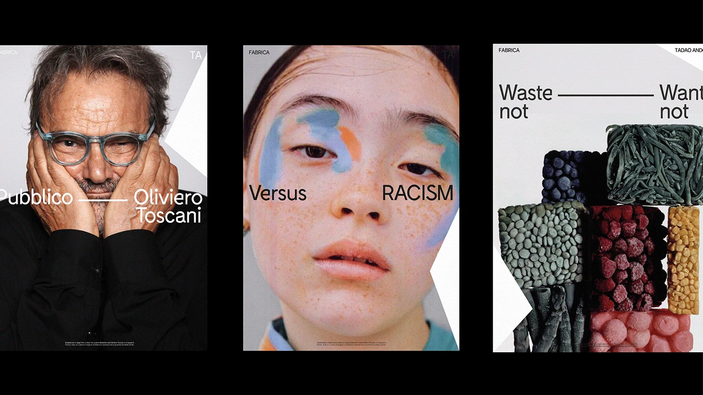
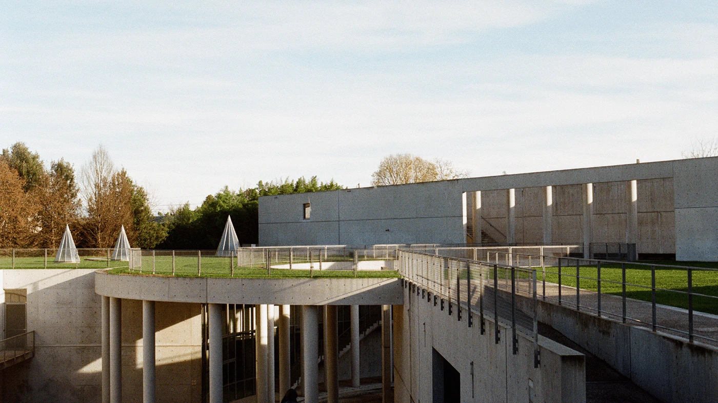
Established in 1994 from a vision of Luciano Benetton and Oliviero Toscani, it is based in Treviso, Italy, in a space of magical architecture restored and augmented by Tadao Ando.
Task
-
The task of this student work was to create an identity for a building.
Idea
-
I chose this place, because being a member of Fabrica I was fascinated by the architecture of the building from day to day. Fabrica consists of 2 parts: 1st is Villa Pastega Manera, which was built in the 17th century by the Pastega family, the 2d «modern» part was created by famous Tadao Ando, Japanese architect, in the 90s.
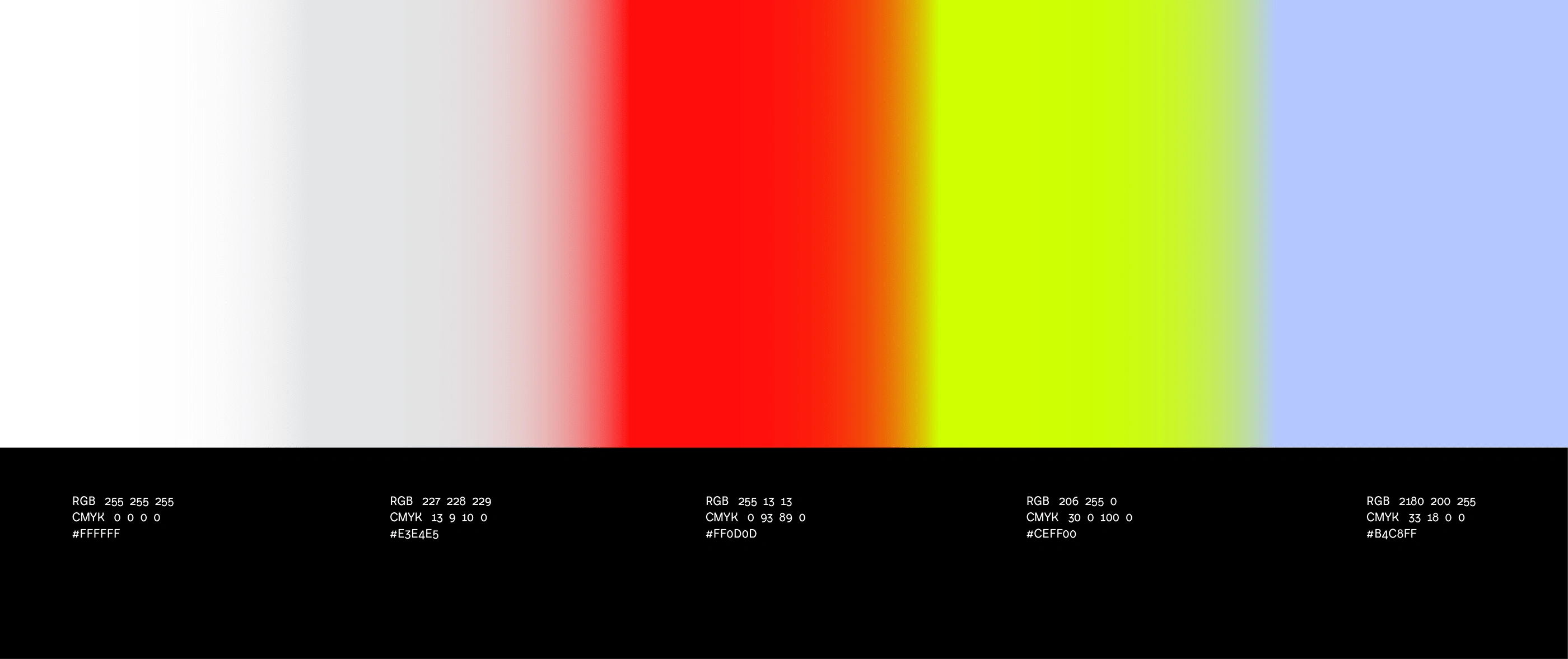
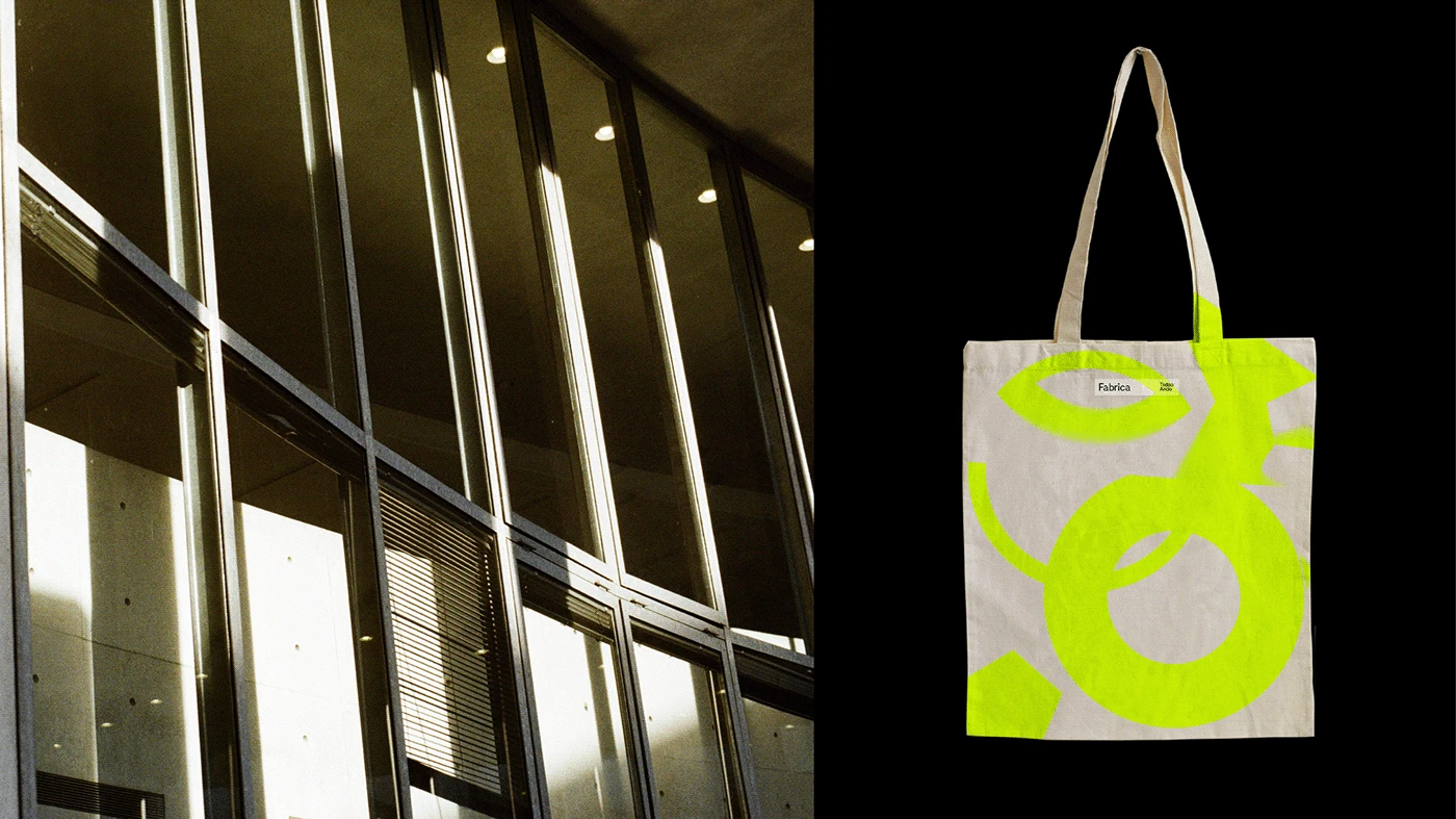
These 2 parts are very different and have a lot in common at the same time. I looked at the building and took the glassy surfaces, such as water and glass, as a main metaphor for identity, as these surfaces exist in both parts. Also I decided that typography and graphic should be very laconic and minimalistic, as both parts of Fabrica, and supported this laconic style with bright colours, as the white building of Fabrica is located in the countryside, where the Italian nature is always bright and colourful.
[personal project]
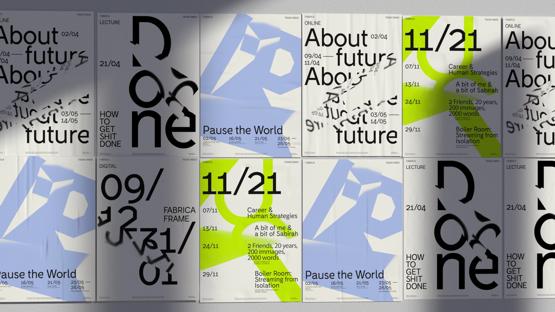
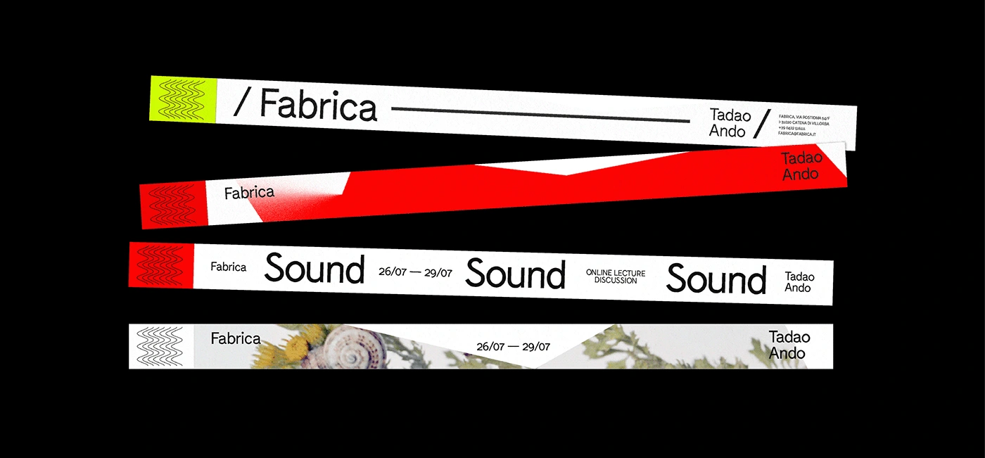
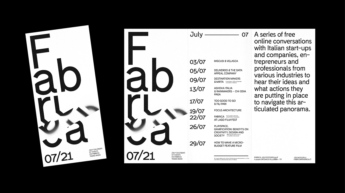
The main language of typography and graphic is laconic such as Fabrica of Tadao Ando.
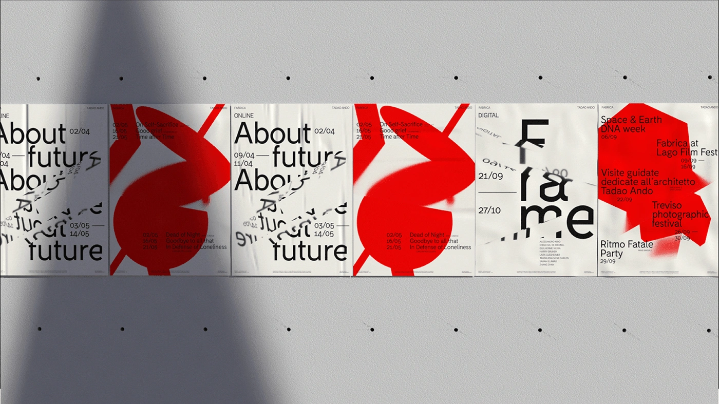
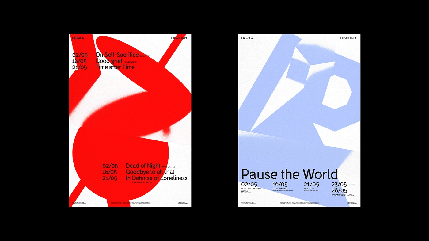
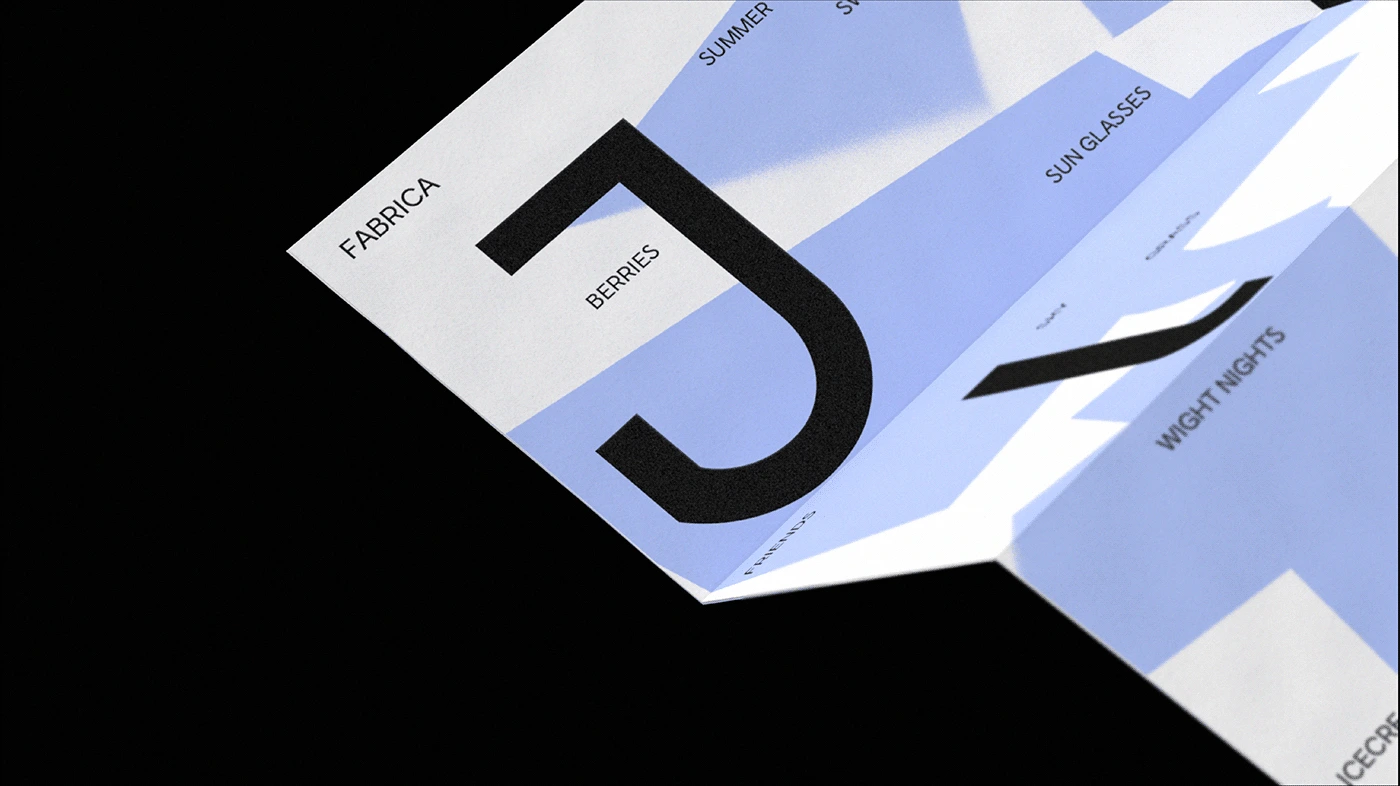
Series of posters for different events are made in the same style, but can vary in the scale of typography, creating new compositions every time. Also in these posters I am using this «mirror» effects a metaphor of grassy textures of the building.
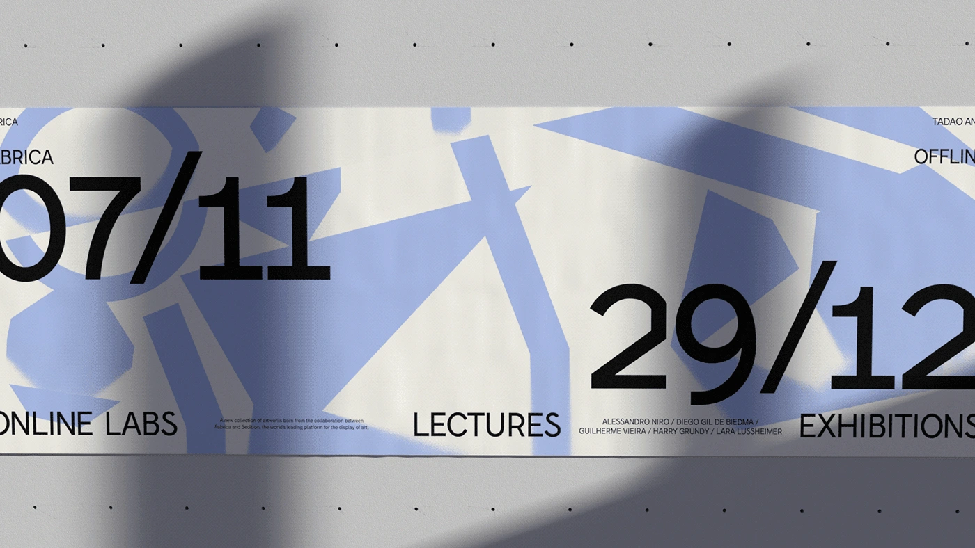
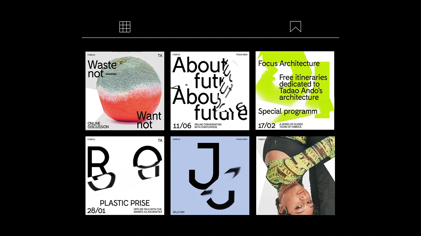
When we need to announce a month's program or an event/festival that consists of different events, we use another kind of graphic. I took simple geometrical shapes that we can see in the architecture of Fabrica and made compositions in the same style as typography. But here the typography is untouched, we «play» only with shapes.
Photo-style of Fabrica is also specified. It is preferable to use photos with a calm grey background and colourful accents. In photographic posters typography and shapes are untouched, the main focus should be on picture.
Like this project
Posted Feb 8, 2024
Identity for an international communication research center.