Quanto - Neo Bank App
Seba Torresi
QUANTO – Redesigning to survive (and dying in the attempt)
Quanto wanted to be Paraguay’s first real digital bank, designed for people tired of bureaucracy, hidden fees, and banking that sounded like a lawyer wrote it.
But the Alpha version was going nowhere. Slow decisions, messy UX, and weeks turning into months while competitors launched faster.
Then the clock hit zero: the bank backing us got shut down by the Central Bank.
We had less than 24 hours to shut everything down.
I didn’t redesign the UI, I restructured survival.
At that point, polishing wasn’t an option. We needed to ship or sink.
I made the call to rebuild the interface and create a scalable design system from scratch.
No more high-res wireframes pretending to be a product, we needed real structure, clarity, and dev-ready components.
While doing that, I led:
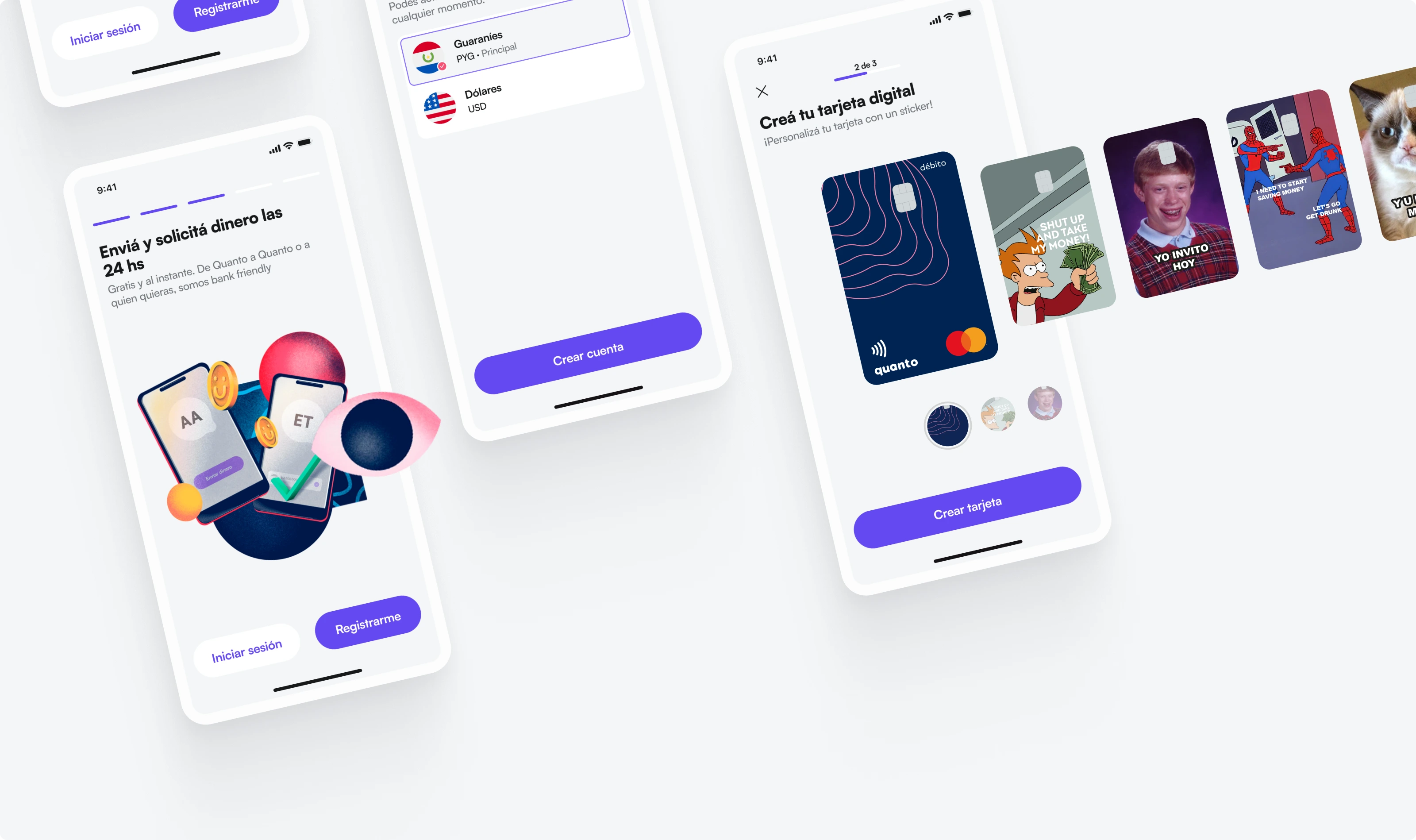
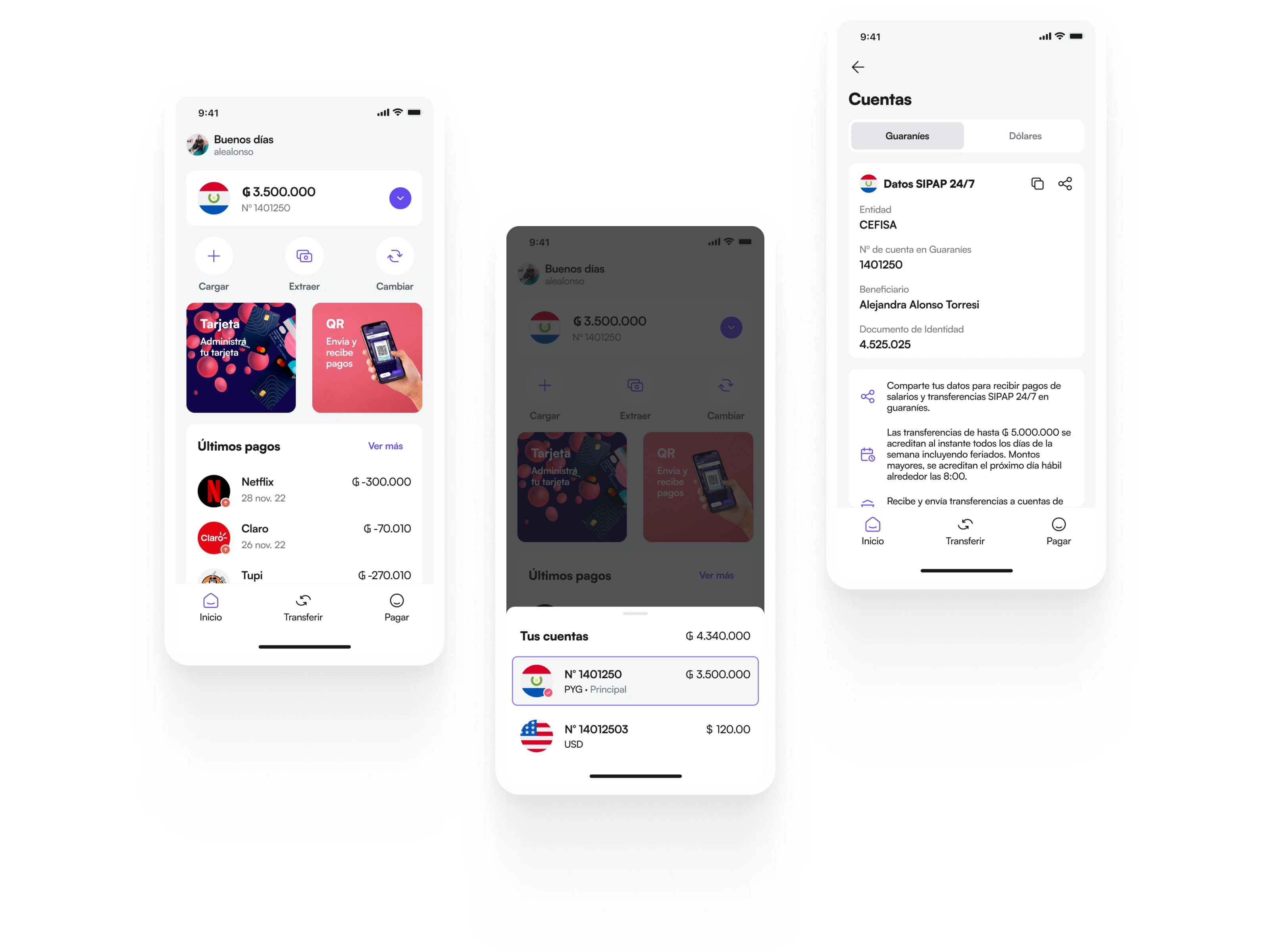
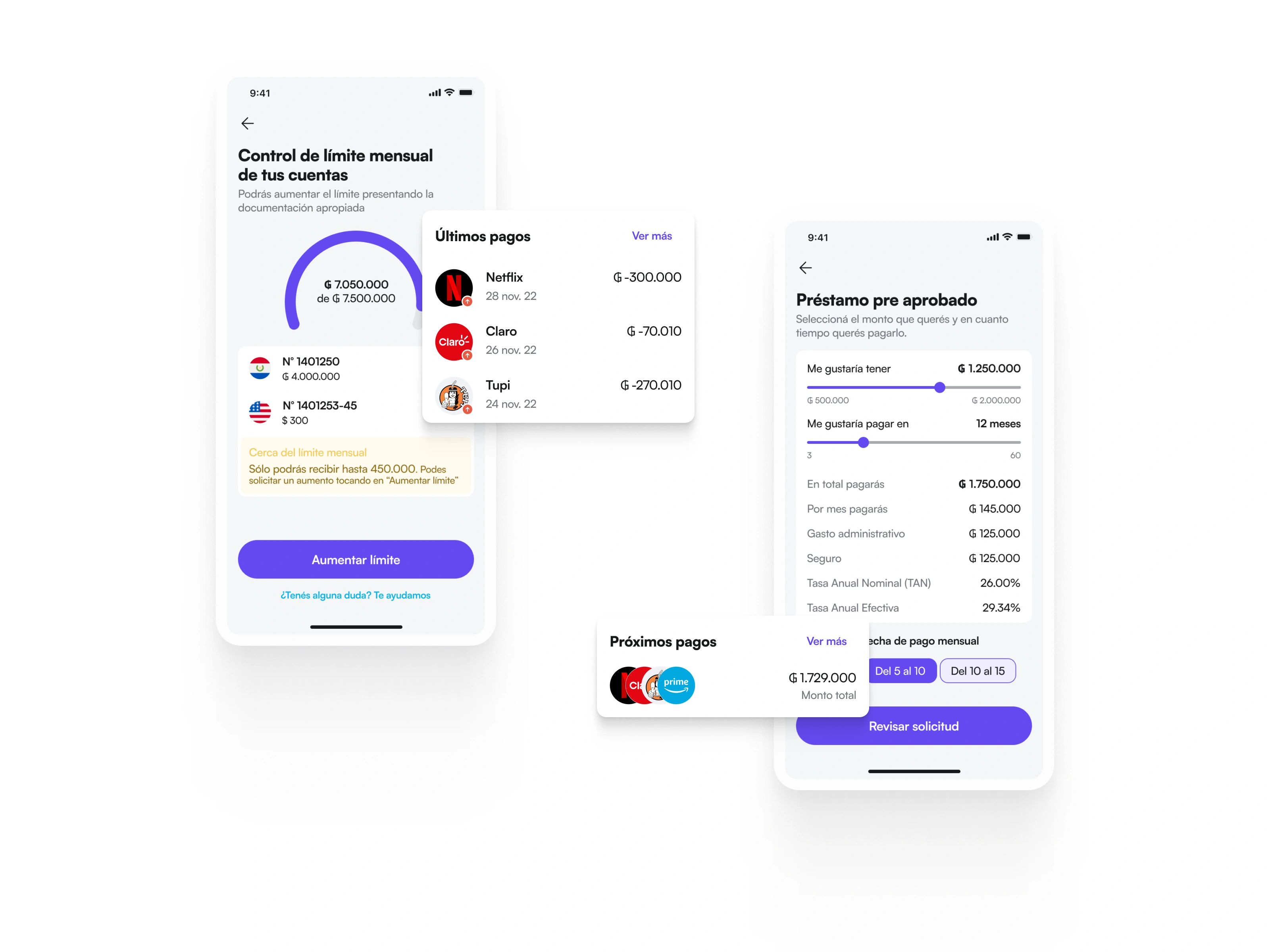
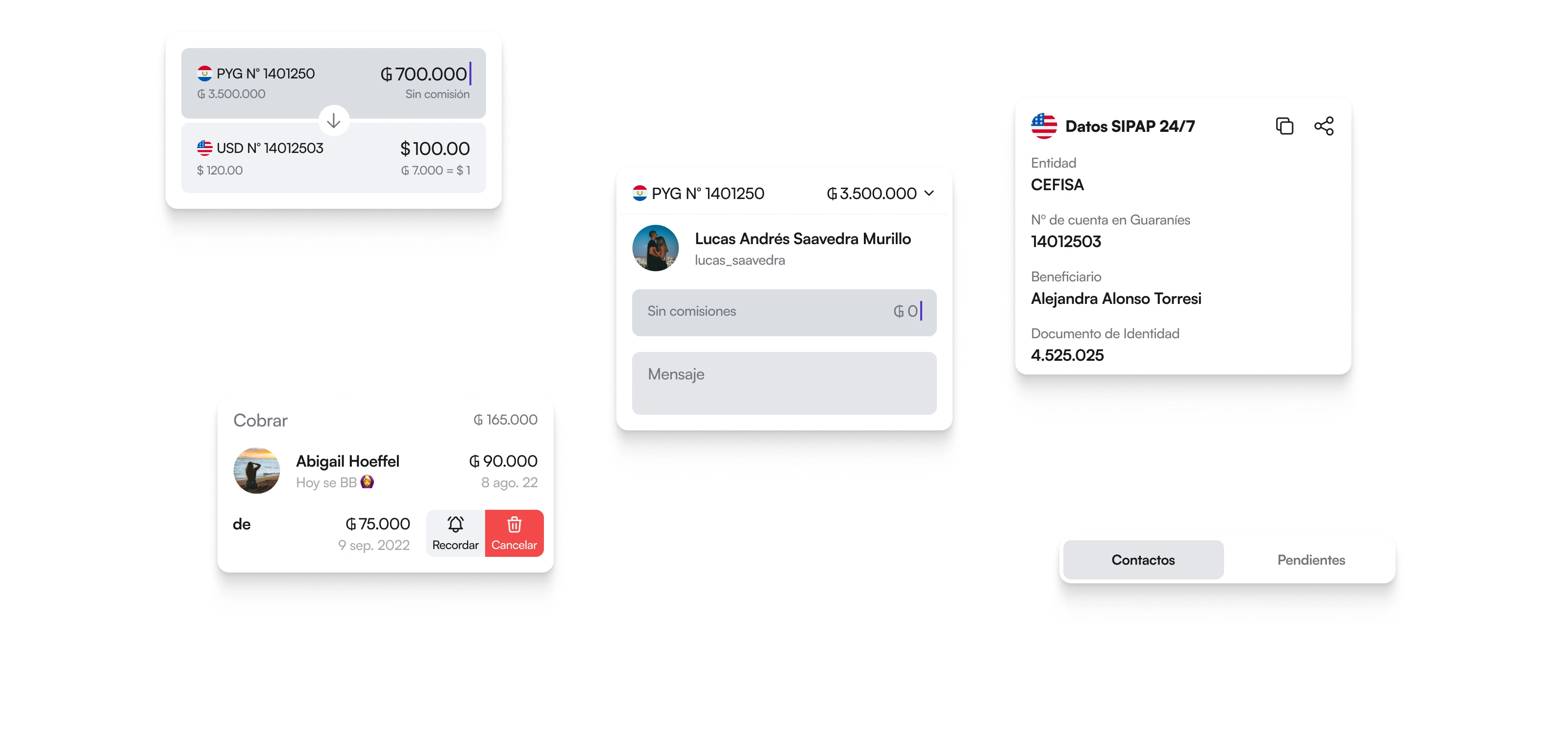
Full redesign of key flows (payments, transfers, account control).
Over 25 usability tests in 8 weeks.
A new visual identity that aligned the product and brand emotionally.
A transition from chaos to coherence across more than 150 screens.
We were ready. And still, it was too late.
The Beta was finally real: leaner, clearer, more human.
Users loved the simplicity, the transparency, the tone.
We had no time to get market metrics, but everything we built pointed in the right direction.
And yet… the rug was pulled. We didn’t ship.
Lesson learned, the hard way.
Design doesn’t die from bad UI, it dies from waiting too long.
We tried to be better than the competition, when we should have focused on being faster than irrelevance.
If I could go back, I’d still build the system, but I’d ship sooner, rougher, and smarter.
Perfect is fragile. Released is real.
Like this project
Posted Nov 6, 2025
Quanto is a frictionless banking experience. I contributed to the brand and user experience, developing over 70 features for local and international payments.
Likes
0
Views
1
Timeline
Aug 1, 2022 - Dec 30, 2022