MKOV: Making a decade of art searchable

Karyna Aviutska


MKOV: Designing a Content Model for a Decade of Artistic Practice: A UX Case Study (2020)
8 min read
Jul 7, 2026
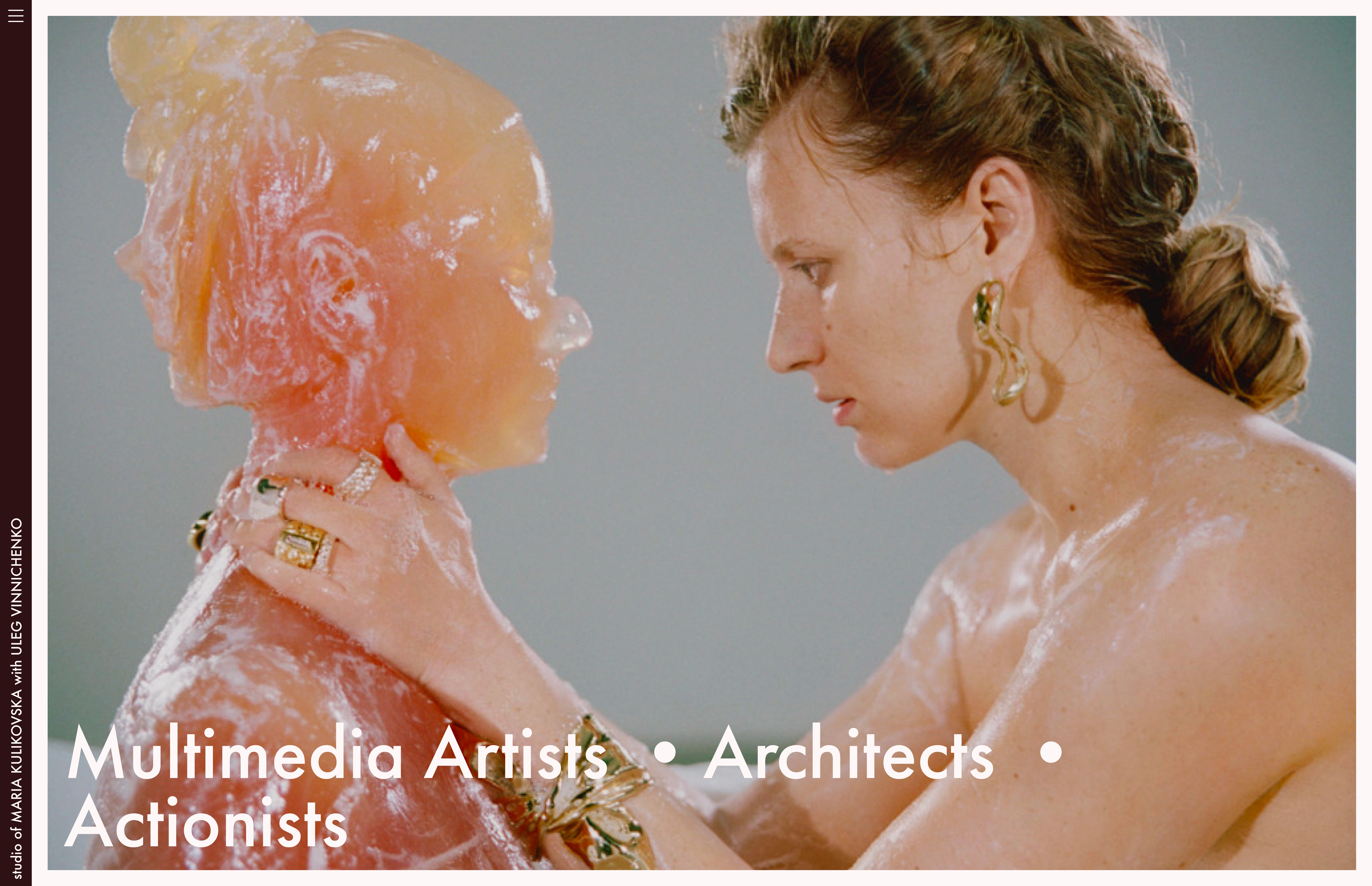
Maria Kulikovska and Oleh Vinnichenko, the multimedia artists and architects working together as MKOV.
Turning a decade of scattered practice into one searchable archive. Maria Kulikovska is a Kyiv-based multimedia artist and architect working across performance, sculpture, and spatial installation. Her solo practice spans 2010 onward; since 2017, she has worked in collaboration with her husband Oleh Vinnichenko under the joint authorship MKOV.
Discovery
Two months before I opened Figma
I sat with Maria across in-person sessions in Kyiv and follow-up calls — asking how she described the same sculpture to a gallery versus a curator versus a journalist, and what happened between a request landing in her inbox and her hitting send.
Press enter or click to view image in full size
Discovery activities, their outputs, and the time each one took.
The existing site was on WordPress: flat category navigation, nothing linked, a project page with thumbnails and a paragraph. Plugins broke regularly; PHP errors showed up on live pages. Some works were in Ukrainian on an English-language site. Less than 20 works were surfaced out of a practice that had been growing since 2010.
Press enter or click to view image in full size
The old WordPress site: a cluttered project page and a text-heavy CV, with no path between them.
There was nothing to migrate. What I was being asked to do wasn’t a refresh — it was a rebuild. An archive for a practice that wanted to be readable from the outside, by galleries asking about dimensions, curators looking for connecting threads, journalists writing on deadline, collectors evaluating provenance. And maintainable from the inside by Maria, alone, for years.
How studio communication actually looked like
Most of our conversations were about jobs. What someone is trying to accomplish when they land on a work page. I mapped these as formal JTBD statements for five audiences: Maria, galleries, curators, journalists, collectors.
Press enter or click to view image in full size
Jobs-to-be-Done statements mapped across five audiences: Maria, Collector, Gallery Manager, Curator/Art Professional, and Audience/Followers.
Old workflow
A request from any direction — a gallery email, a curator, a grant deadline — triggered the same process: open cloud/local folder, find photos/texts, exhibition history, cross-reference press on third-party sites, find/assemble/renew a custom PDF, follow up on missing files. Time varied; some requests took an hour, some stretched over days.
Press enter or click to view image in full size
The old workflow: manual searching, assembling, and PDF-building for every incoming request.
Mapping this made another structural problem visible: beyond the missing content, nothing was connected. A work page had no path to the exhibition that showed it. An exhibition page had no path to the works it contained. People who research artists — galleries, curators, journalists — think in relationships. The site didn’t.
Updated workflow
Instead of assembling materials for each request, Maria types a work name into search and shares the URL. The work page carries everything a gallery needs — images, dimensions, exhibition history, press, related works — in one place.
Press enter or click to view image in full size
The updated workflow: Maria searches the site once and shares a direct URL that answers the request.
The shift from assembling to sharing is what shaped everything that came next.
Reference review
We started with a handful of artists Maria admired — Olafur Eliasson, Ai Weiwei, Anish Kapoor, Marina Abramović. She brought references every week, and kept adding throughout the project. She’d find something on a gallery site, in a catalogue, in a Vogue feature, and send it over. “What about this layout for the exhibition page.” “Look how they handle the press section.”
Most of what we looked at was visual, or functional — how galleries present a single exhibition, how press sections are structured, how image grids scale. These weren’t direct references. They were calibration: what the field expects, and where it falls short.
We also pulled from architecture studios. Not for art direction, but for restraint — grids, whitespace, typography that doesn’t compete with the work.
Press enter or click to view image in full size
Reference screenshots from architecture studios, pulled for restraint rather than art direction.
But the pattern that mattered wasn’t visual. It was structural: the archives that worked at scale — Eliasson’s especially — weren’t just visually clever. They were interconnected. One exhibition page connected to location, dates, presented works, related shows. You could enter from anywhere and keep going.
Press enter or click to view image in full size
Olafur Eliasson’s exhibition page, where every detail links outward to location, dates, works, and related shows.
Synthesis
MKOV had a workflow problem. Every artist pitch required manual assembly from scratch. The website needed to be first a communication tool, then a showcase.
Define
Content audit
The audit ran from December 2018–April 2020 — not a one-time scan, but a slow excavation. Maria and I pulled works out of cloud folders, old Macs, removable drives, third-party publication sites, and scanned catalogues. New works kept surfacing throughout.
It produced three artefacts, in this order.
A folder system. Before anything touched a CMS, we agreed on a naming convention:
YYMM_ProjectName at the top level, then (if it's a big project) 01_Venue, 02_Venue, 03_Venue inside by exhibition order. The filesystem became the first working taxonomy — year, project, venue, asset type — and it mirrored the IA we'd build later.Press enter or click to view image in full size
The folder system: a naming convention that became the first working taxonomy.
A spreadsheet. Alongside with folders and content itself, every work got indexed: title, medium, dimensions, year, series, exhibitions, press, current location. The whole practice lived in one readable view.
Press enter or click to view image in full size
The spreadsheet: every work indexed by title, medium, dimensions, year, series, exhibitions, and press.
A qualitative pass over the lot. Which works had photography good enough to ship. Which were missing dimensions, dates, or exhibition context. Which existed only in Ukrainian and needed English. The output wasn’t a finished archive — it was a map of gaps, which became the brief for the next 18 months of content work.
The folder structure told us what the content was. The spreadsheet told us what each piece had. The gaps pass told us what was missing. Together they defined what the system had to support.
Content model
Maria’s practice maps to four entity types: Artworks, Events, Publications (press, links), and Architecture.
Artworks span five mediums — Performative Sculpture, Drawings & Paintings, Actions & Performances, Process & Ideas, and Collaborations & Other Objects. Each artwork carries a required schema: title, short description, medium, dimensions, year, the series it belongs to, exhibitions it appeared in, and press that covered it.
Events have title, description, venue, city, dates, works shown, and press. Publications are mostly third-party links, but if not — source/publisher, author, description, date, works mentioned. Architecture logs project name, description, location, dates, and images.
Every entity links to the others. An artwork knows its exhibitions. An exhibition knows its press. Press links back to the work or practice it covers.
Press enter or click to view image in full size
The content model: six entity types linked by explicit, typed relationships.
Series and Artwork share the same external relations — both can be shown at events and covered in publications. But they use two different page templates.
A standalone Artwork gets its own page. When Artworks belong to a Series, the Series becomes the entry point in category listings — individual works remain visible beneath it, grouped. The Series date spans the full range: a work from 2010 and one from 2013 surface the Series under 2010–2013, so filtering by year catches both.
This distinction is conditional by design. A series of 800 watercolours — one actually exists, it’s called 888 — is catalogued as a single Series entry, not 800 individual art objects. Works made in different years can still belong to one series if the concept connects them. Two sculptures a decade apart, a performance split across two cities — the template handles both.
The model was the answer to the Synthesis question — how do you navigate by relationships instead of hierarchy. The answer: typed entities with explicit links.
Information architecture
With the content model in place, the IA wrote itself.
Seven sections at the top level — Artworks, Exhibitions, Publications, News, Architecture, About, Contact. Four of them map directly to content entities. News sits outside the model as an editorial layer — studio updates and announcements, no structured metadata. About and Contact are utility pages.
Press enter or click to view image in full size
Site map diagram showing seven top-level sections branching from Home — Artworks, Exhibitions, Publications, News, Architecture, About, and Contact — each expanding into subpages, with dashed lines indicating cross-entity relationships.
Flat enough for Maria to navigate as editor — every entity type is one click from the top. Connected enough for a gallery manager to follow any thread without hitting a dead end: start from a work, land on an exhibition, land on press, circle back to the series.
The depth lives in the cross-links, not in the menu.
Platform choice
The platform had to meet four criteria: Maria maintains it solo, the cost holds for a self-funded studio long-term, the CMS supports a growing archive with relationships between content types, and the layout is flexible enough for individual project pages.
Press enter or click to view image in full size
Comparing Tilda, Webflow, Squarespace, and Cargo on cost, maintainability, CMS power, and layout flexibility.
Tilda won on cost and maintainability. The CMS constraint — standard blocks only, no relational content types — was a known tradeoff at the time. How severe the constraint would be — once the full scope of Maria’s archive came together — wasn’t clear until later.
Wireframes
The wireframing process was shaped by one constraint I didn’t fully understand until I was already inside it: Tilda’s CMS only works with standard blocks. Custom layouts are possible with Zero Blocks — but Zero Block pages can’t connect to the CMS. Any custom page becomes a dead end the moment you try to pull content from a collection.
I tested the editorial direction anyway. Tighter typography, bespoke grid, custom section treatments per project type. It looked right. Then I tried to wire it to the CMS and hit the wall.
So the template decisions weren’t about aesthetics — they were about what the system could actually sustain. Standard blocks, consistent structure, four reusable templates. Less precious in screenshots. Something Maria could run.
Press enter or click to view image in full size
Wireframes for the four reusable templates: Homepage, category, series, and artwork pages.
The result was four reusable templates:
Homepage
Medium category page — entry point per medium, scannable list of Series and standalone Artworks
Series page — groups related Artworks, becomes the listing entry point in category view
Artwork page — single work with full metadata, high-res images, exhibition history, press, related works
About — CV download, artist statement, contact
Each template was tested against two questions: can a gallery manager find what they need without help, and can Maria add a new entry without me. She added a project independently on the first try.
The Delivered System
Every page carries the same metadata structure: title, description, medium, dimensions, year, exhibition history, and publication mentions. The consistency is the feature — a gallery manager landing on any work page gets the same complete picture, every time.
Search is global and always accessible. Not as a feature — as the primary workflow tool. The entire pitch process depends on it: type a work name, share the URL, done.
The visual language follows Maria’s practice rather than leading it. Restrained typography, generous white space, full-bleed imagery. The design recedes so the work can speak.
Press enter or click to view image in full size
The delivered artwork page for “Stardust,” combining a full-bleed image with structured metadata and related content.
Like this project
Posted Jul 24, 2026
I designed the taxonomy, content model, and information architecture that turned a decade of scattered artistic practice into one searchable system.
Likes
0
Views
0
Timeline
Dec 1, 2018 - Apr 30, 2020