UX Audit and Onboarding Redesign for Public Healthcare App

Min Maung

Context
A UX audit of a live public hospital app. The original onboarding flow had a single rigid path: one ID type, one way in. For a public healthcare app serving a wide range of patients (citizens, foreign residents, visitors needing emergency care), that's a real barrier. I wanted to see how much of the friction could be stripped out with a focused redesign.
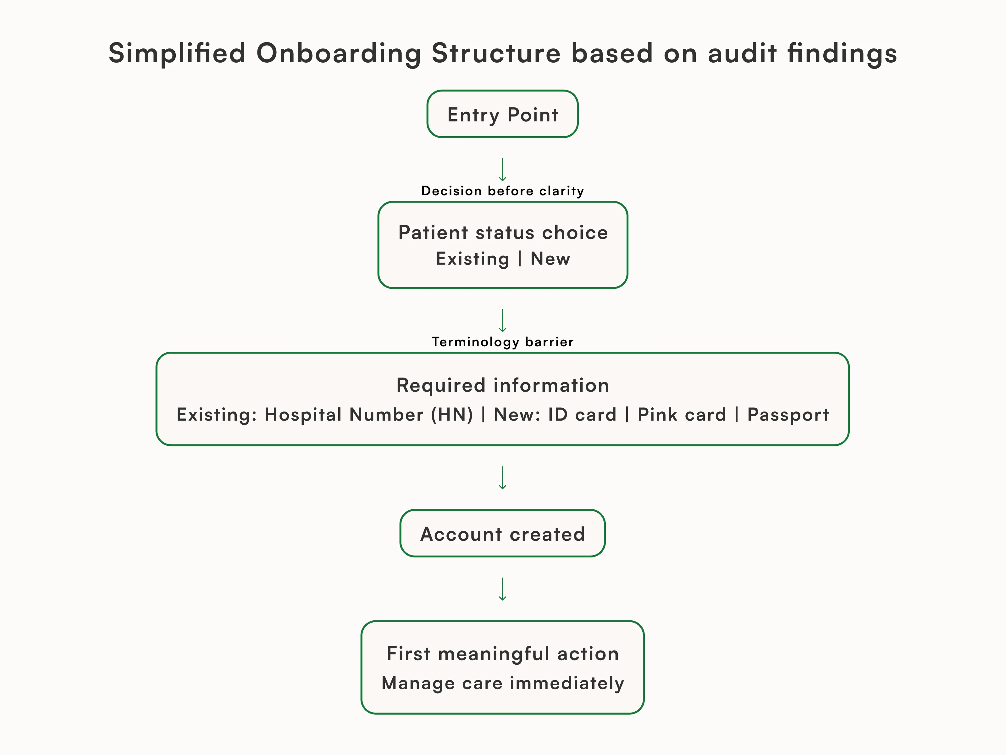
What I found
The existing sign-up required a specific national ID to create an account. No alternatives. If you didn't have that ID on hand, or you held a different document type (passport, residence permit, insurance card), you were stuck. There was also no distinction between patient types, so the app treated every user the same regardless of their situation. And there was no guest access path at all for someone who just needed to book an urgent visit.
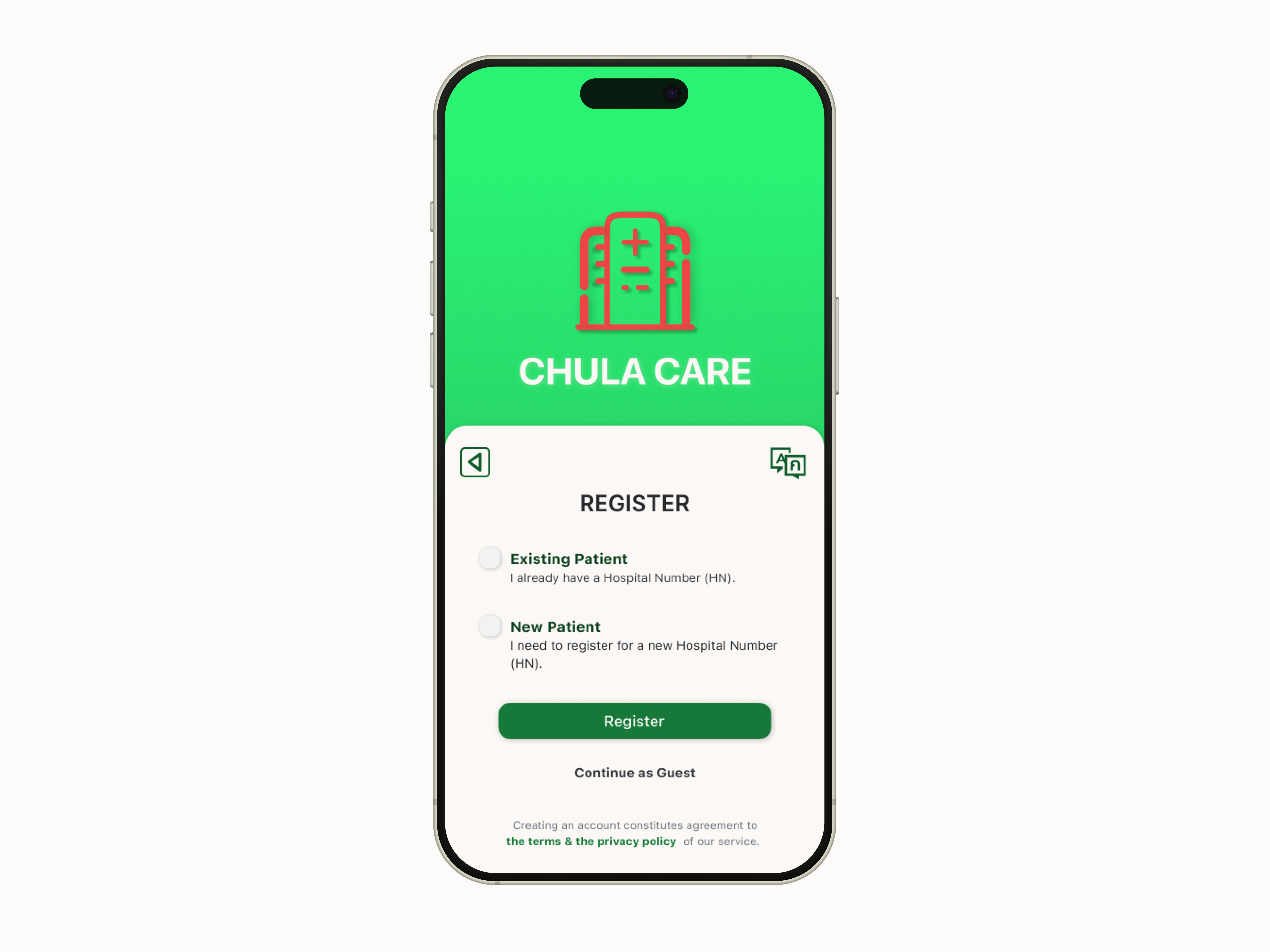
What I redesigned
I restructured onboarding around three things:
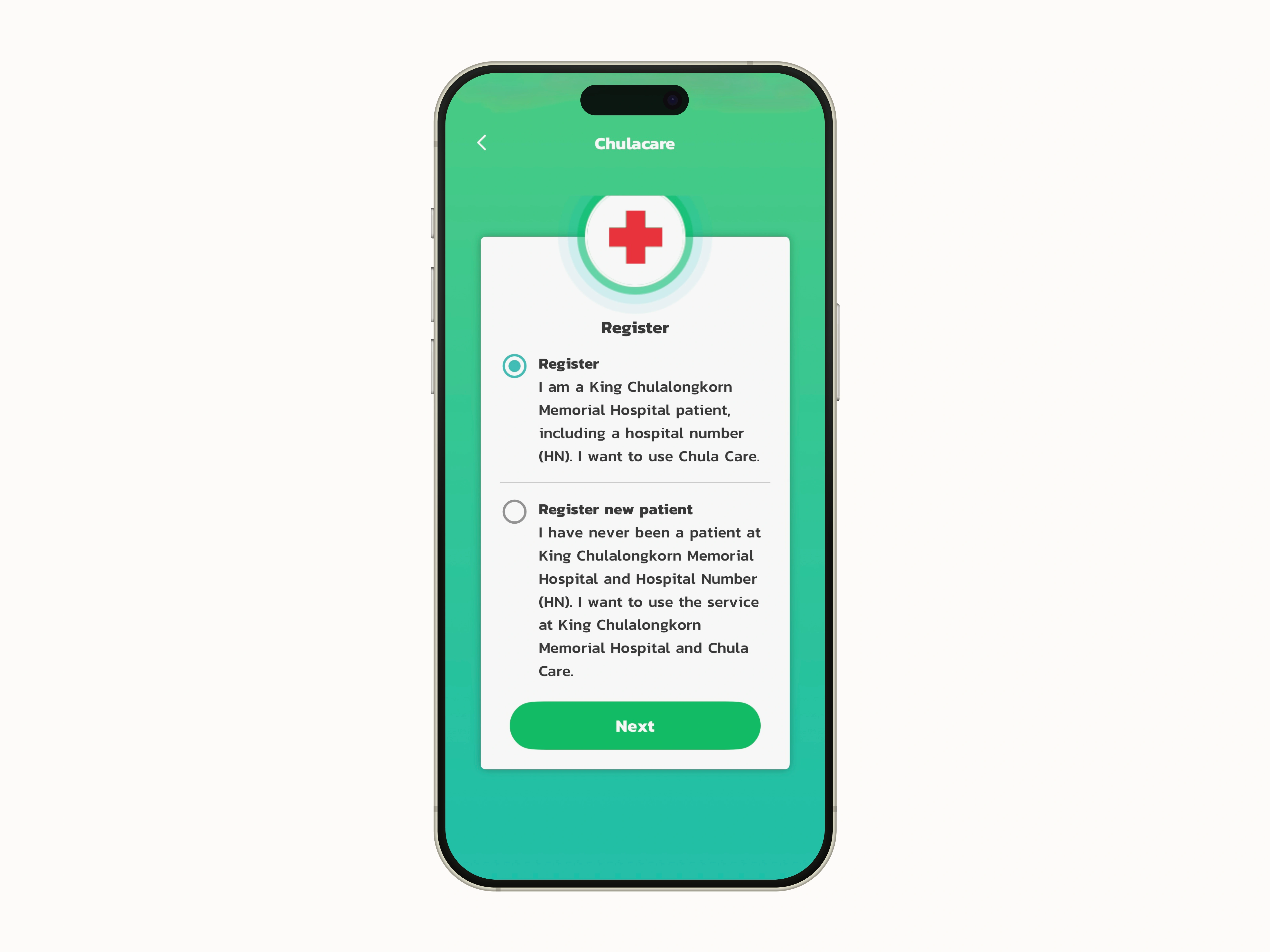
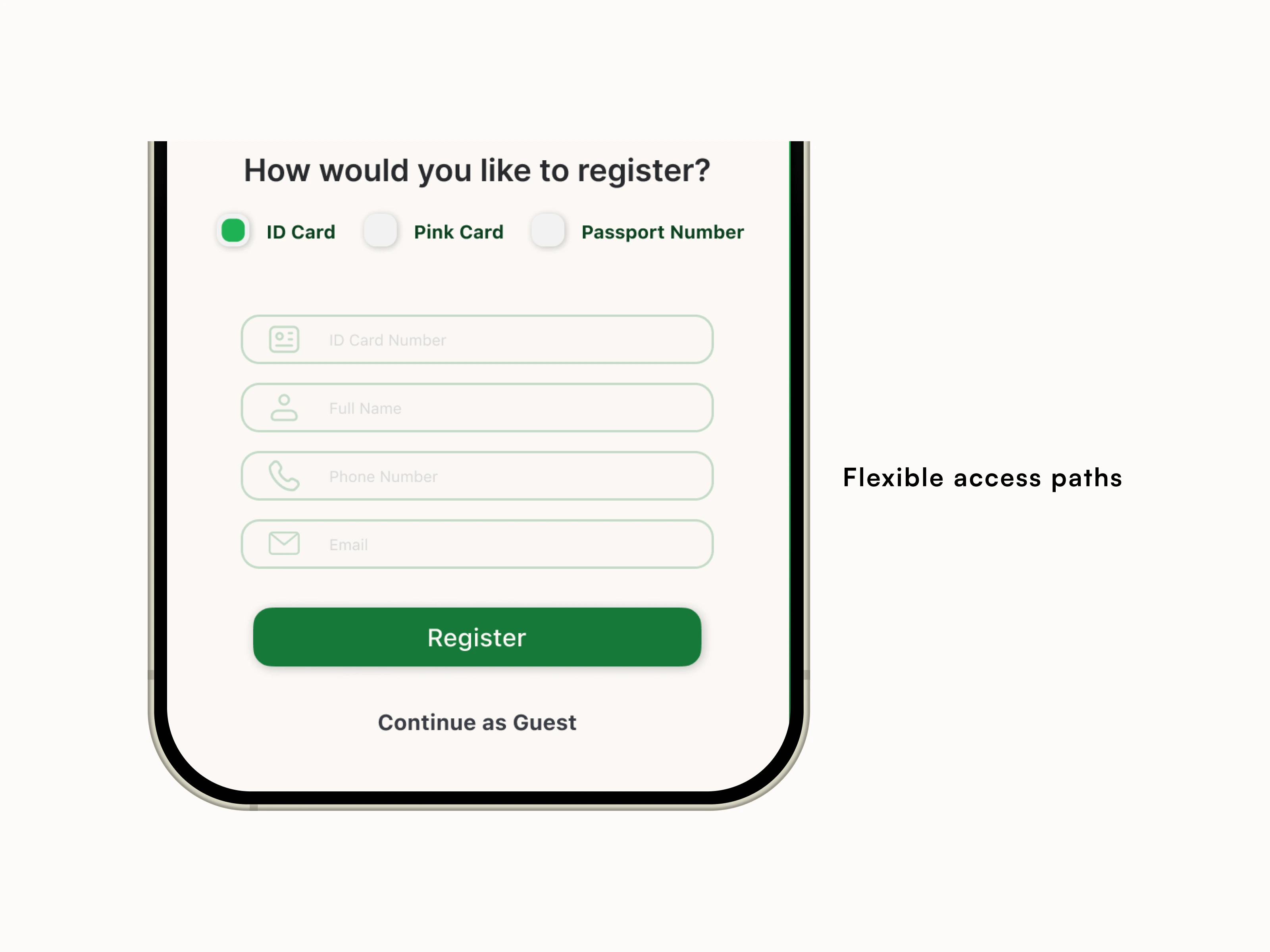
Multiple ID options. Instead of gating sign-up behind a single document, I designed a flow that accepts several ID types so more patients can actually get through registration.
Patient-type paths. I added distinct flows for different patient types so the app asks the right questions for each situation, rather than forcing everyone through a generic form.
Guest access. For patients who need quick access without full registration, I added a lightweight guest path that reduces the barrier to booking.
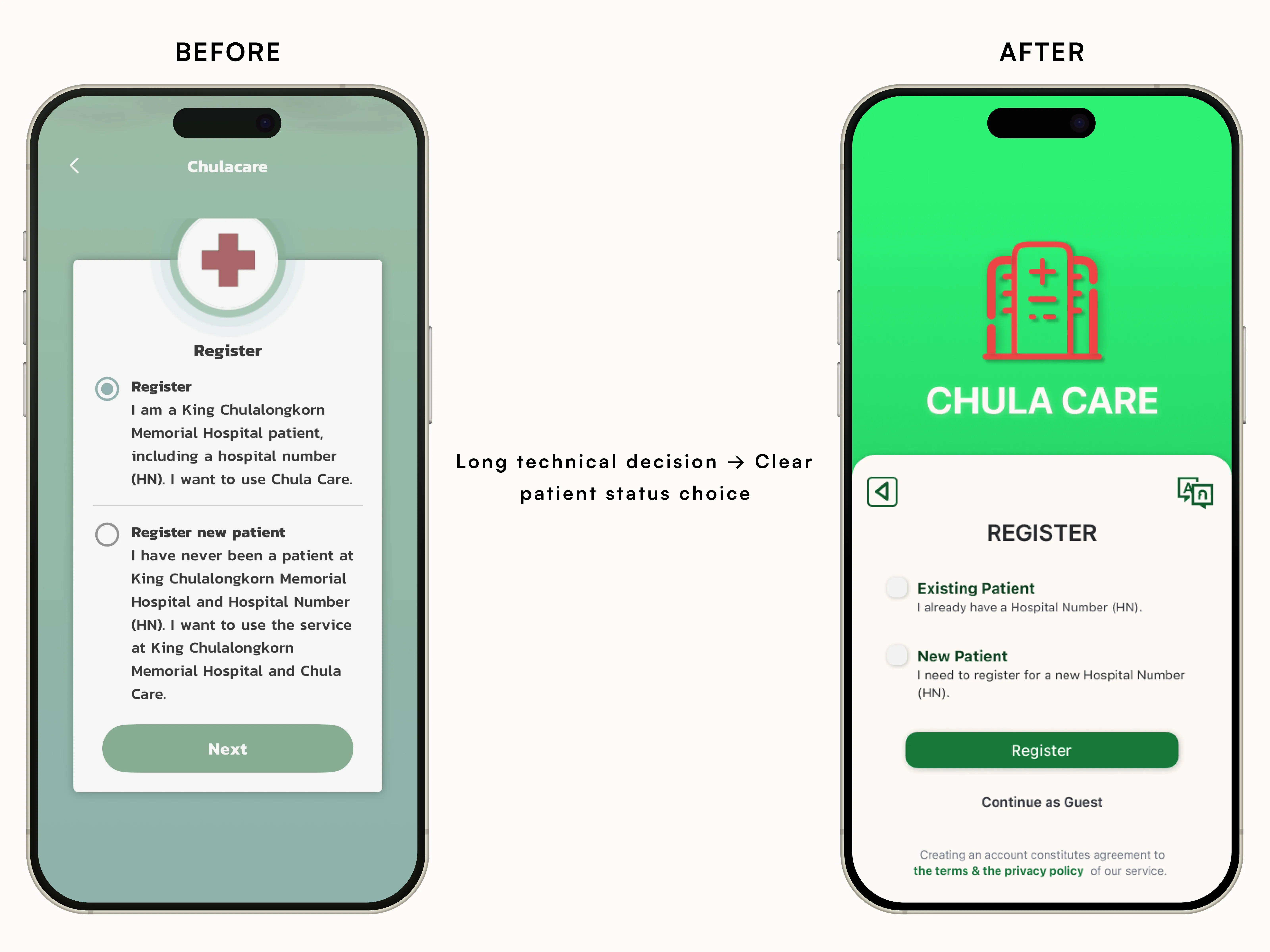
The goal throughout was to reduce cognitive load: fewer dead ends, clearer choices, and a path forward for every type of patient who walks through the door.
Like this project
Posted Dec 29, 2025
Audited a live hospital app and redesigned onboarding to reduce cognitive load, clarify patient paths, and support multiple ID types and guest access.
Likes
0
Views
3