Bodega Visual Identity Design
Sarah Park
Overview
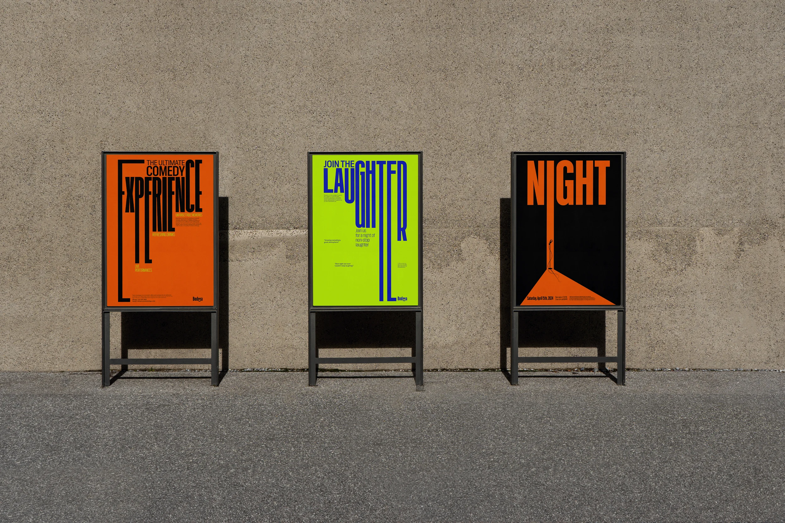
Bodega reimagines the neighborhood corner store as a dual identity, shifting from familiar by day to unexpectedly comedic by night.
The visual system centers on stretched typography and playful distortions, capturing the humor, rhythm, and underground energy of a hidden comedy club tucked behind a familiar storefront.
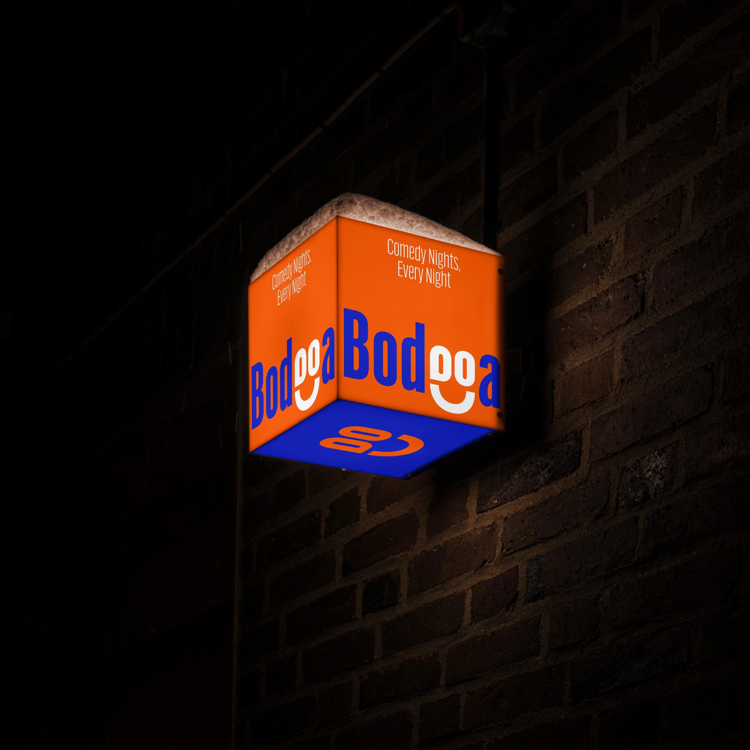
Bright accents on a dark base highlight the contrast between the bodega’s everyday familiarity and its unexpected nighttime identity.
The Typography System
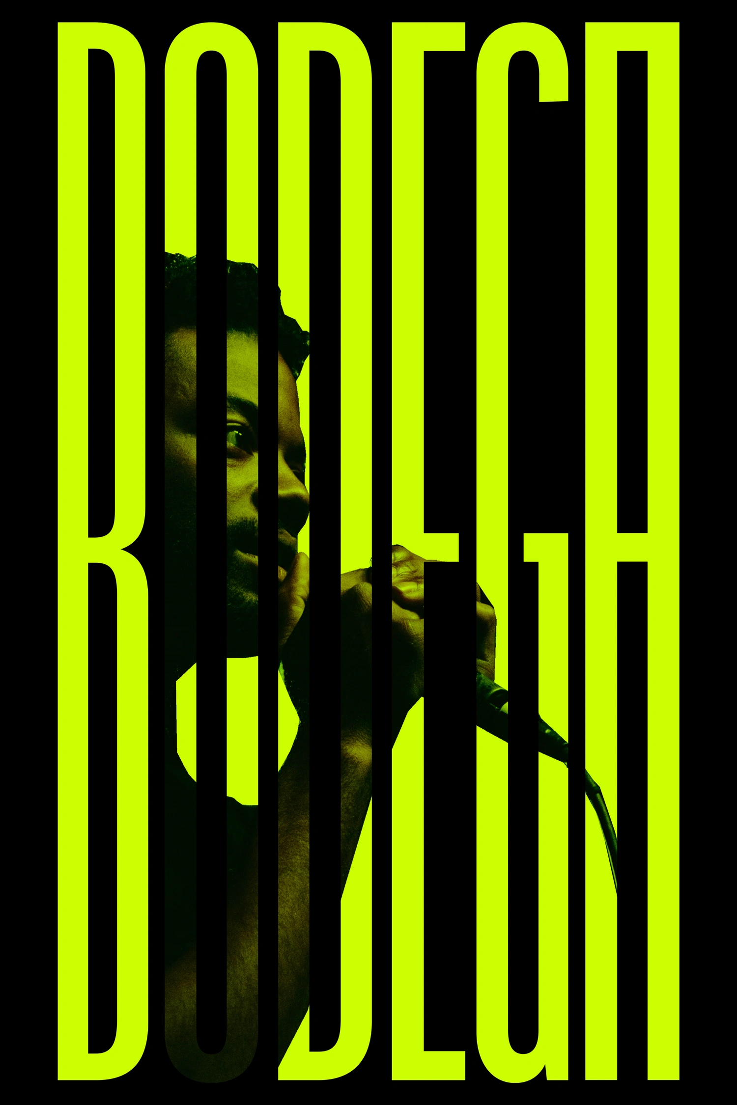
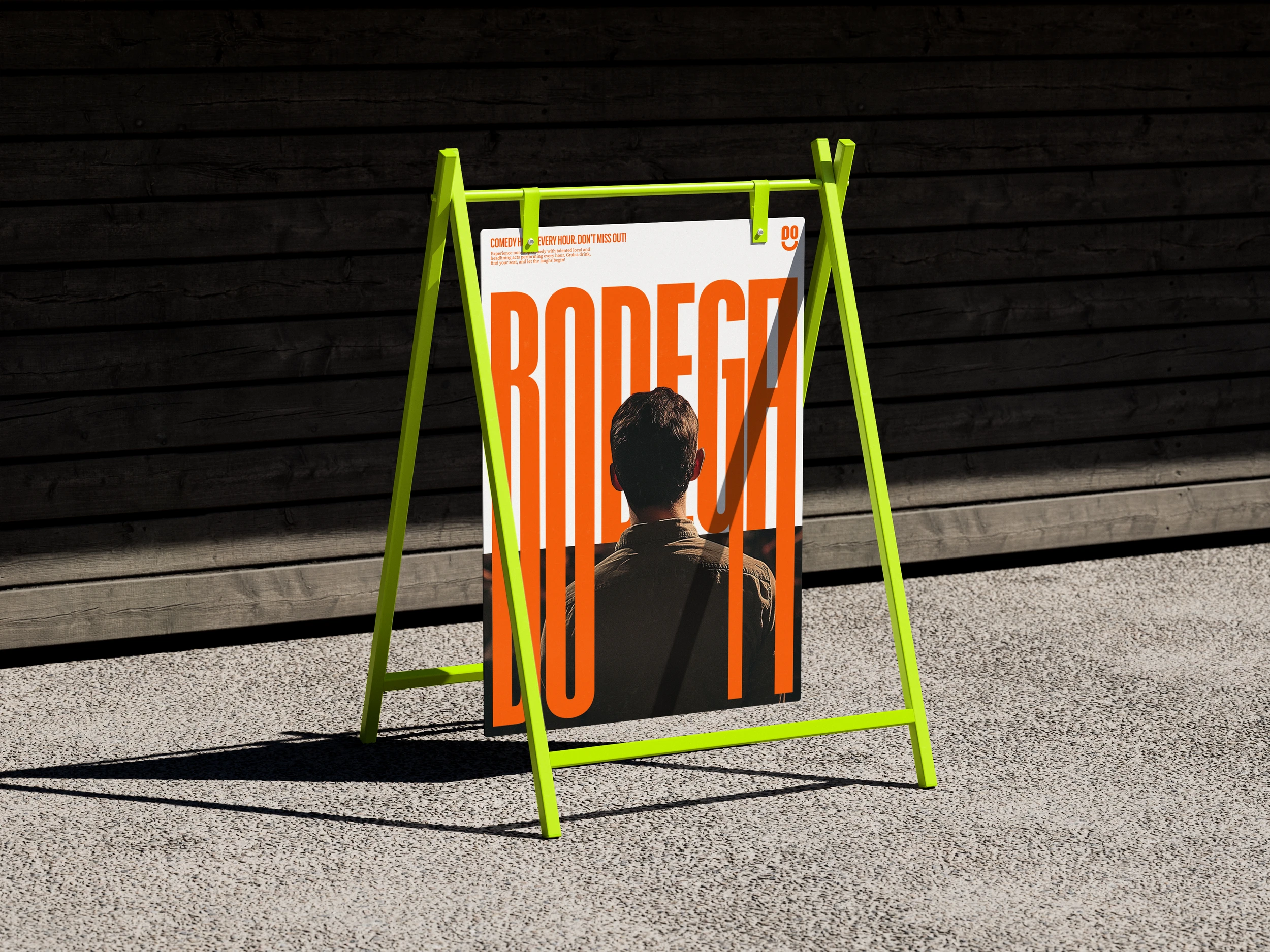
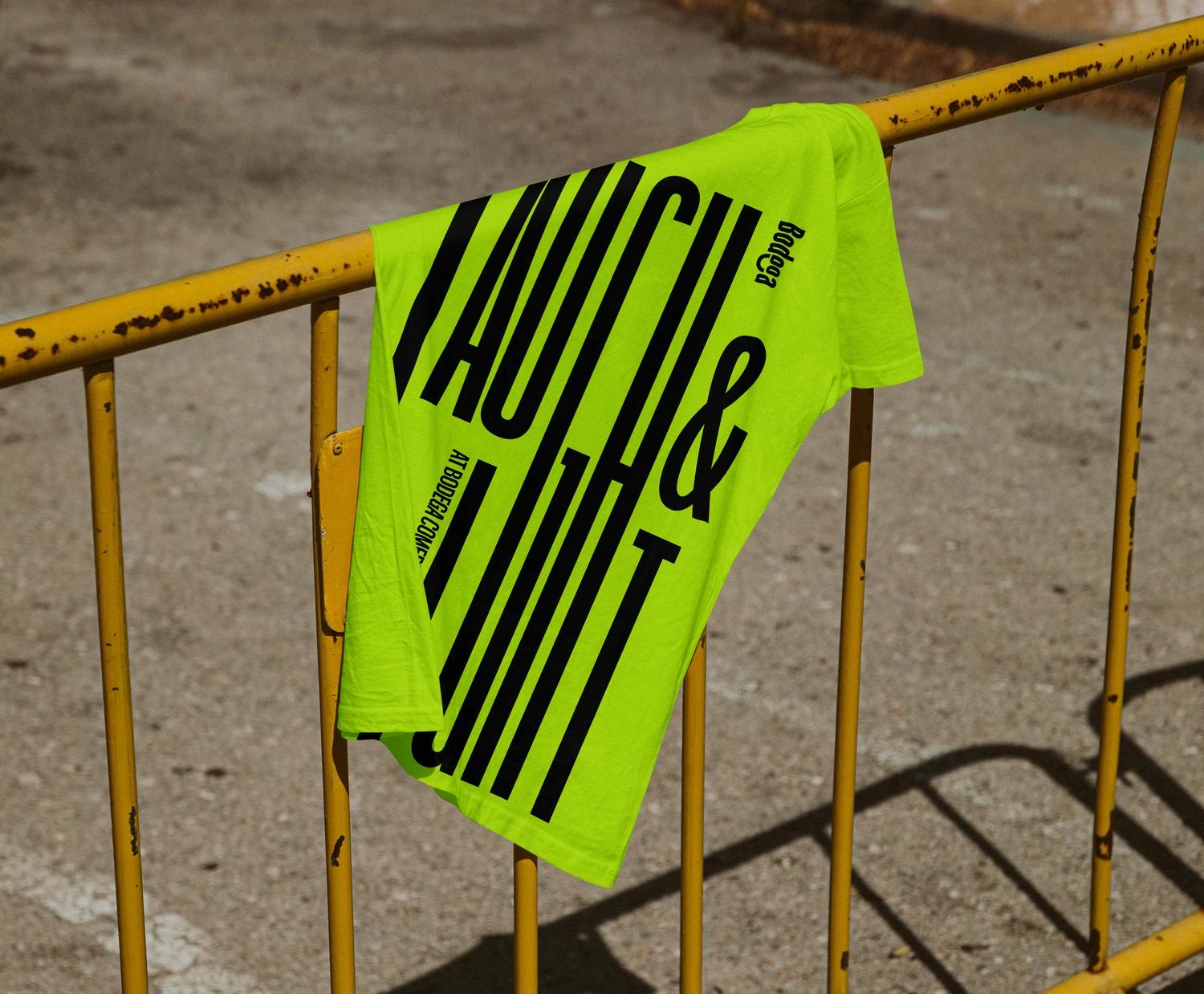
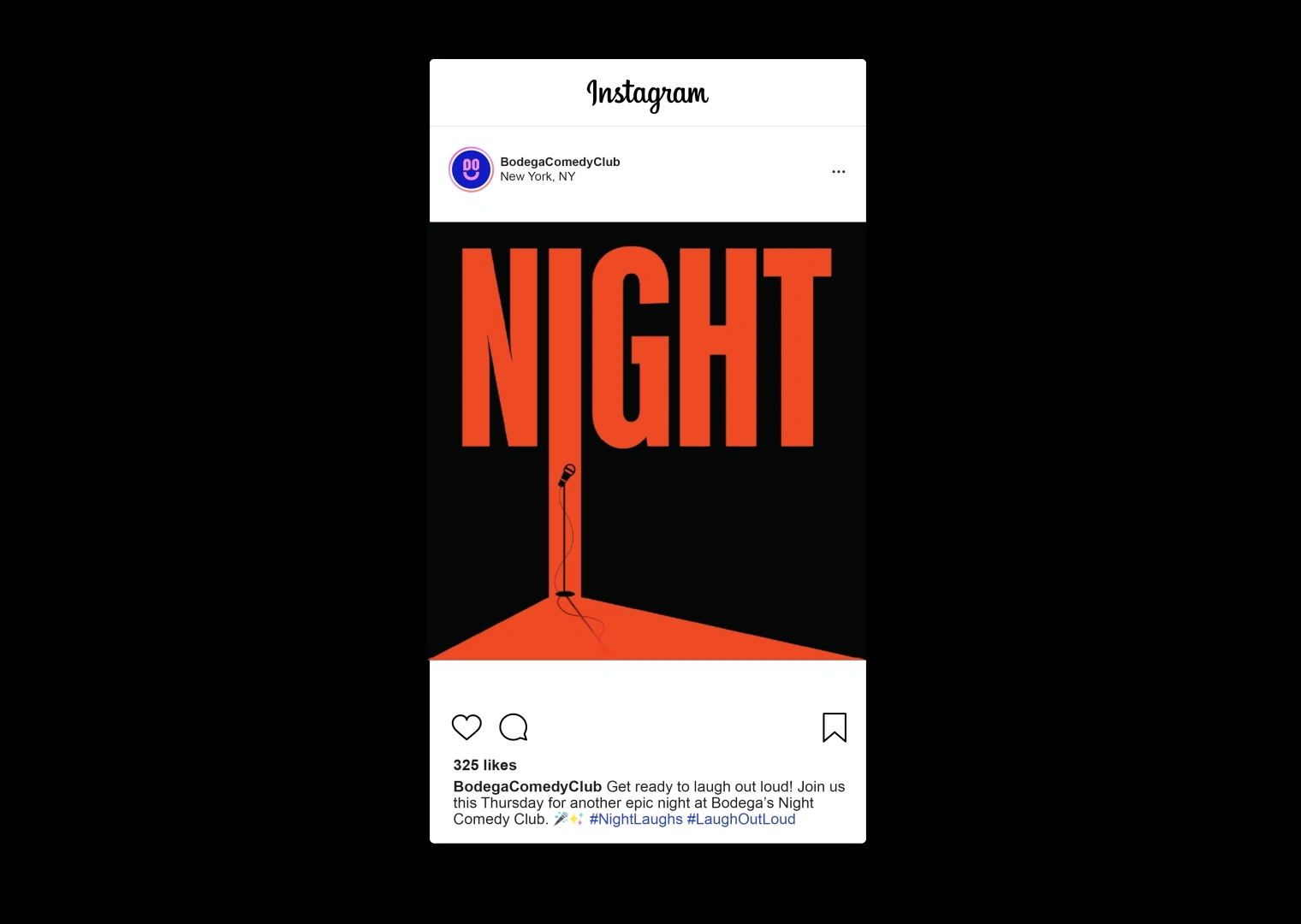
The identity is driven by distorted and stretched letterforms, creating a playful and expressive typographic language.
The exaggerated forms reflect the comedic tone of the space while introducing a distinctive visual rhythm that can flex across signage, posters, and promotional materials.
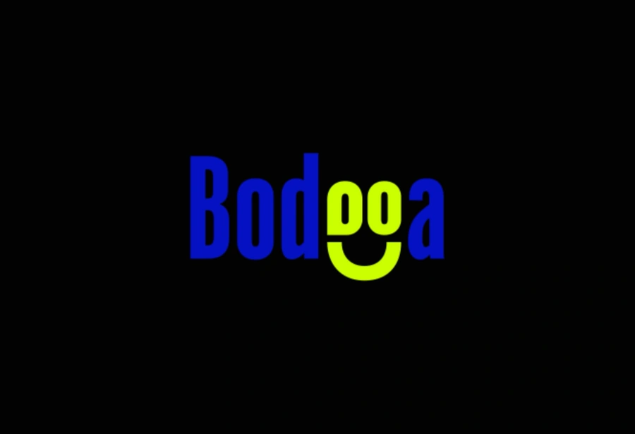
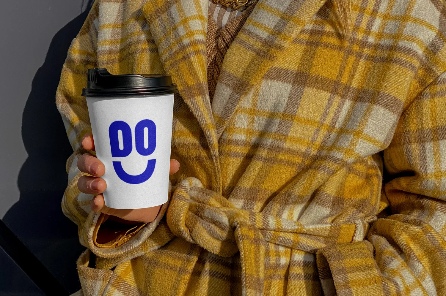
The logo subtly transforms the letters “e” and “g” into a smiling face. This hidden gesture captures both the warmth of the neighborhood bodega and the playful spirit of the comedy club that emerges after dark.
Like this project
Posted Mar 13, 2026
A rebranding concept that transforms the familiar neighborhood bodega into a hidden comedy club.
Likes
0
Views
0
Clients
Bodega