Omara Brand Identity Design
Noemi Anna Galazek
This project began as a logo design for a yoga teacher whose practice focused on the connection between body, mind, and soul, deeply inspired by the grounding presence of mountains. Although the initial concept was not selected, I decided to explore it further: I chose to reframe and expand it into a complete brand identity.
Brand Introduction
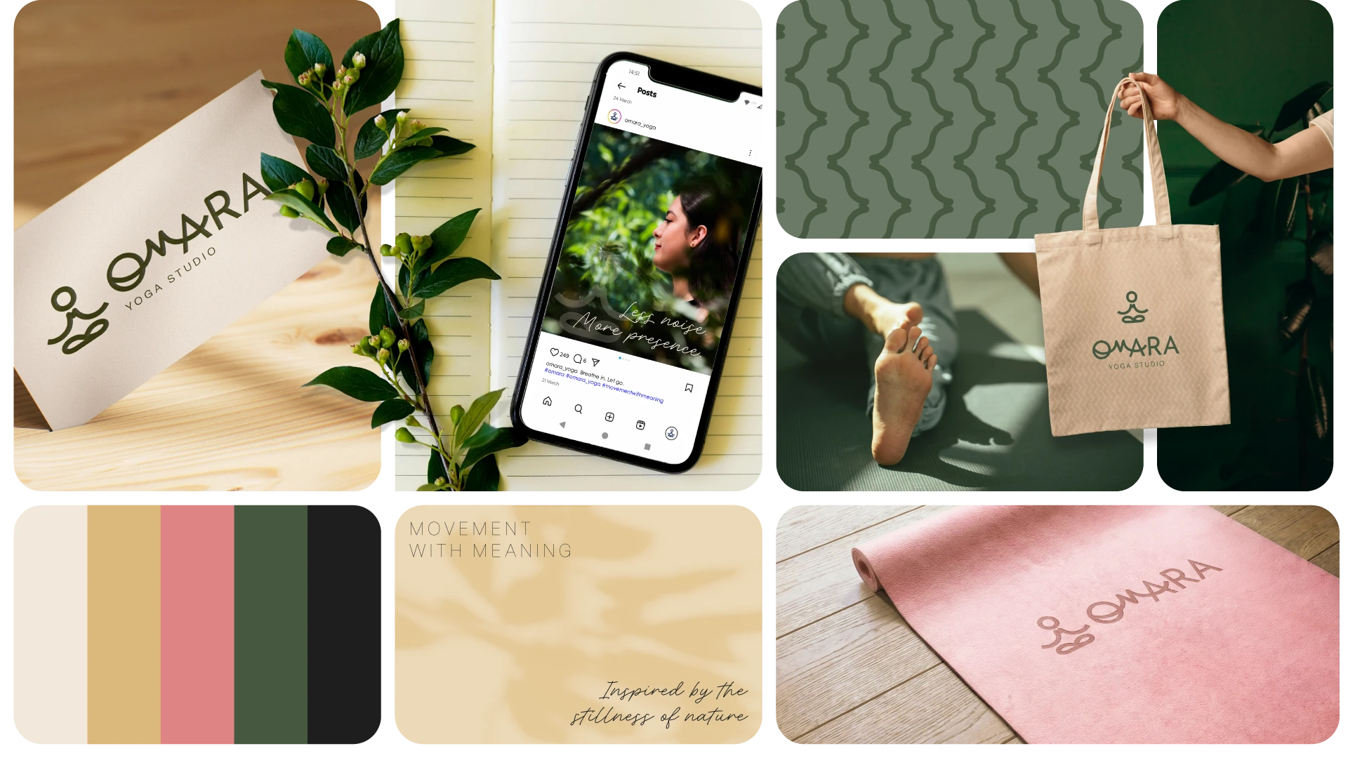
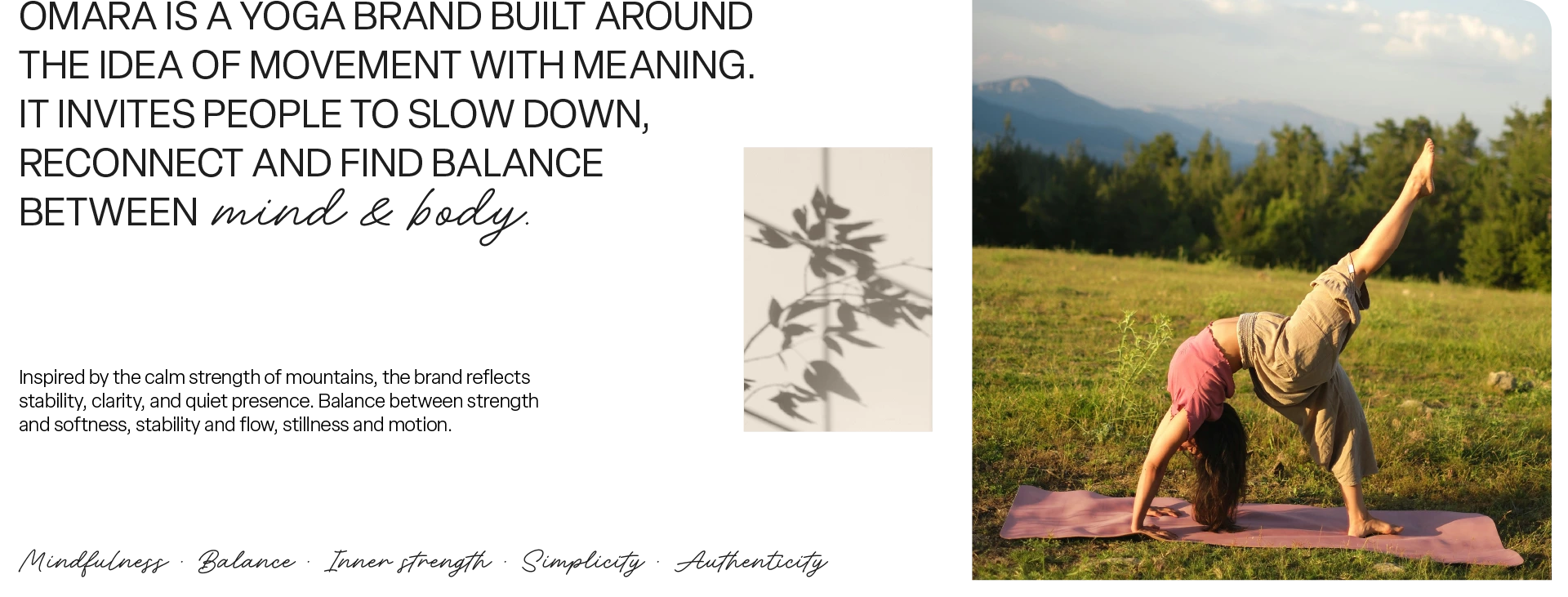
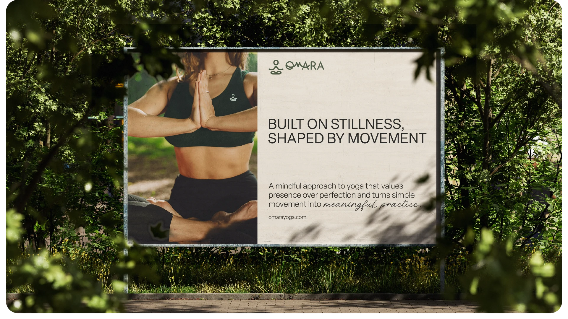
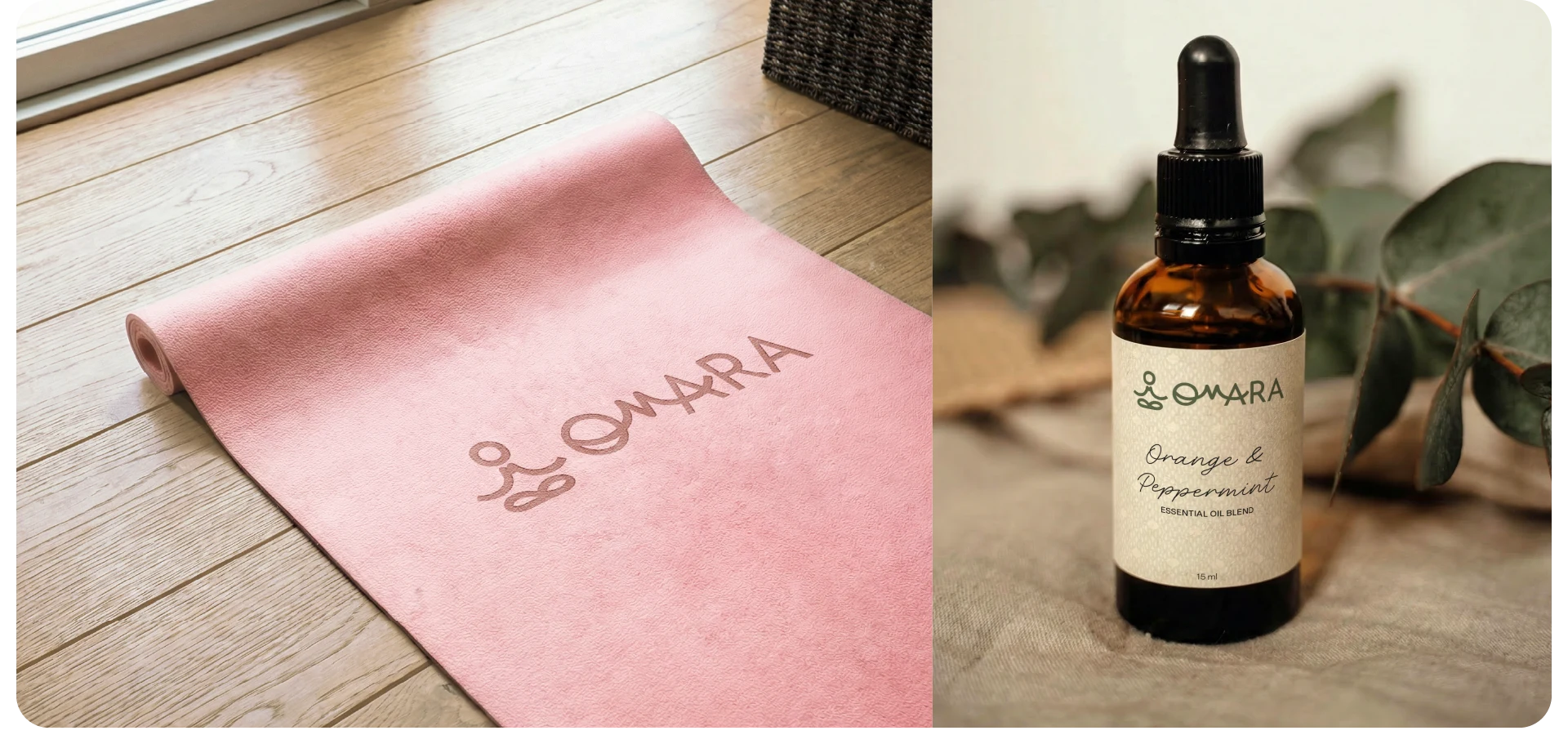
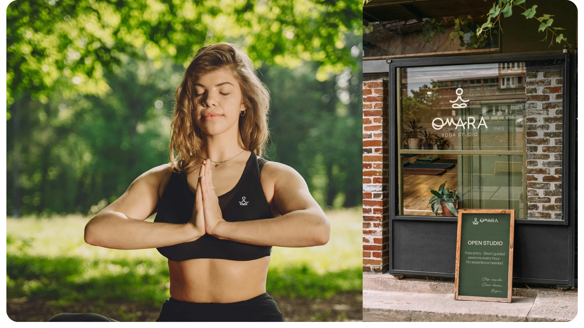
Omara is a yoga brand built around the idea of movement with meaning. It invites people to slow down, reconnect and find balance between mind & body. Inspired by the calm strength of mountains, the brand reflects stability, clarity, and quiet presence. Balance between strength and softness, stability and flow, stillness and motion.
Visual language
Natural textures, mountain silhouettes, open spaces, soft light. The typography is clean and refined, paired with a fresh yet grounded colour palette.
Logo
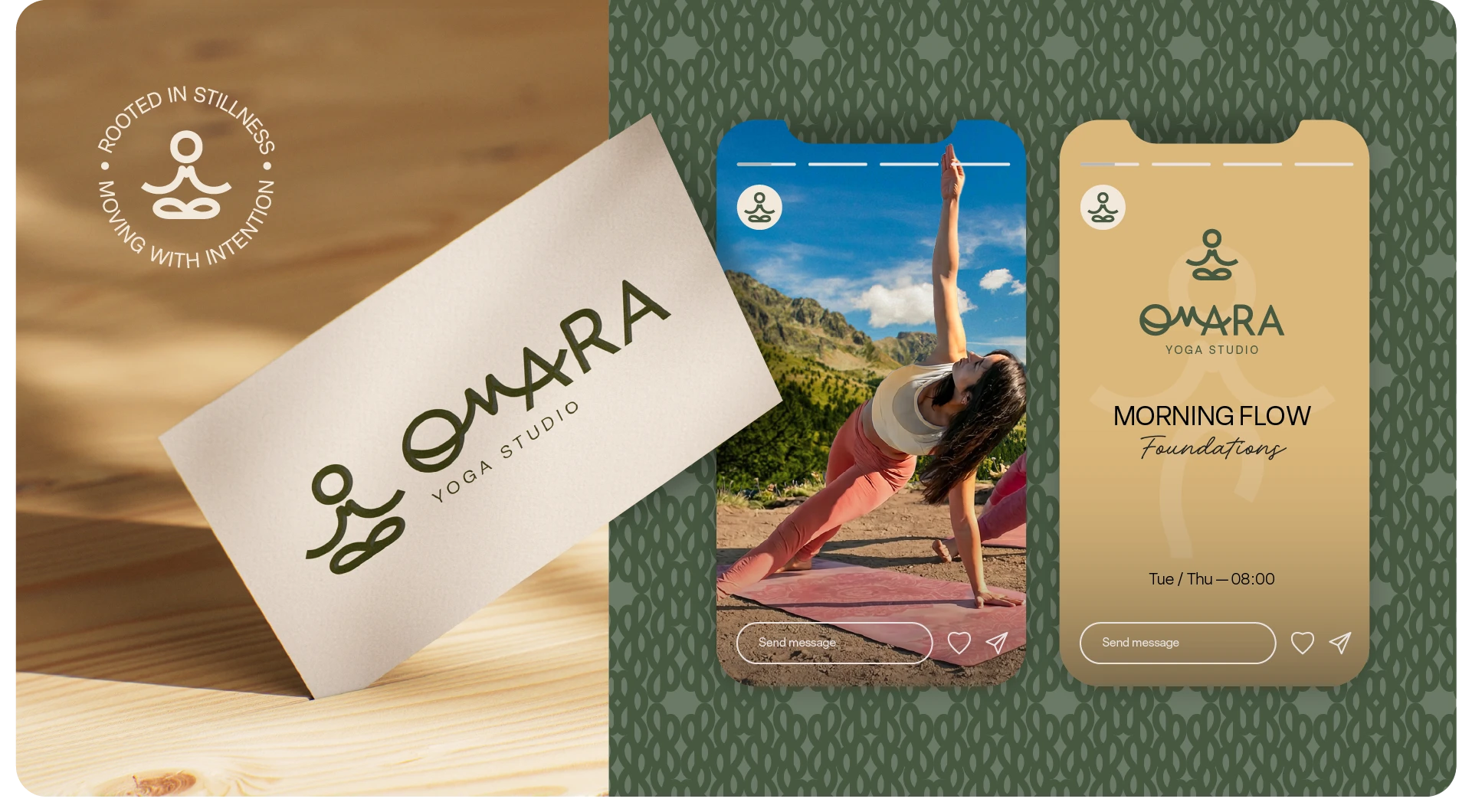
The logomark was inspired by the lotus position for meditation as well as pranayama (breathing exercises) because it provides the practitioner with a stable base for long periods of sitting. At the heart of the design is a minimal mountain form, symbolising stability, clarity. At the same time, the shape subtly reveals the letter “M”, referencing the initial of the yoga teacher.


Like this project
Posted Apr 1, 2026
Omara is a yoga brand built around the idea of movement with meaning. It invites people to slow down, reconnect and find balance between mind & body