IGNITE Packaging Redesign — 18 SKUs, Global Launch

Muhammad Asad Khan


The Client
IGNITE International Brands Ltd. is a US-based lifestyle and consumer brand with a global footprint. Known for bold branding and premium positioning, IGNITE sells nicotine and energy pouches in markets across Europe, the Middle East, and the United States. Their products are manufactured by Global Snus UAB, a Lithuania-based production partner specializing in pouch manufacturing at scale.
The Challenge
IGNITE's existing packaging needed a complete redesign. The old designs weren't keeping pace with the brand's growth or the increasingly competitive shelf landscape in the pouch category. The brief was clear: create a packaging system that looks premium, stands out under retail lighting, scales across a growing SKU range, and meets regulatory requirements in every country the product ships to.
That last part is where most packaging projects get complicated. Every market has its own rules around health warnings, ingredient disclosures, nicotine content labeling, and language requirements. A design that works in Sweden won't pass compliance in the UAE without significant adaptation. The system needed to handle all of that without breaking the visual identity.
The Scope
18 SKUs redesigned from scratch:
12 nicotine pouch variants (different strengths and flavors)
6 energy pouch variants
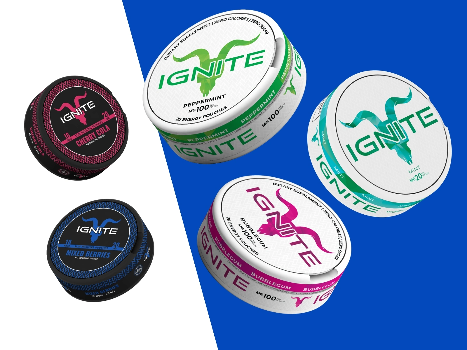
Every SKU received a full label redesign, not a template swap. Each flavor needed its own color identity within the broader IGNITE system, strong enough to differentiate on shelf but consistent enough to read as one brand family when displayed together.
The Process
Label Design (Adobe Illustrator):
Each label was built in Illustrator with production specs baked in from day one. Bleed, dieline, color separations, and Pantone references were locked before any creative exploration started. This meant zero surprises at the print stage. The typography, hierarchy, and layout structure were designed as a modular system so new SKUs could be added without redesigning from scratch each time.
Multi-Country Regulatory Adaptation:
For each market, I prepared separate print-ready files with localized content: translated ingredient lists, country-specific health warnings, adjusted nicotine strength disclosures, and barcode placements that met local retail scanning standards. The underlying design grid stayed consistent across all versions, so the brand looked the same whether you picked up a tin in Stockholm or Dubai.
3D Mockups (Cinema 4D + Adobe Photoshop):
Before anything went to production, every SKU was rendered as a photorealistic 3D mockup on the actual tin geometry. This wasn't just for client presentations. It was a functional step in the process: color and contrast that look strong on a flat artboard don't always translate to a curved, reflective metal surface under store lighting. The mockups caught issues that would have been expensive to fix after printing.
Photoshop was used for final compositing, lighting adjustments, and creating marketing-ready visuals from the 3D renders.
The Result
All 18 redesigned SKUs went into full production. The packaging is now live on IGNITE's official website and selling in retail markets globally. The modular design system I built means new flavors and product extensions can be added without starting over, just slot into the existing framework.
This project is ongoing. I continue to prepare print files for new SKUs and additional market expansions as IGNITE grows their pouch product range.
IGNITE Packaging
Like this project
Posted Jun 28, 2026
Redesigned 18 SKUs of nicotine and energy pouch packaging for IGNITE International Brands, with multi-country regulatory print files and 3D mockups. Now live and selling globally.
Likes
3
Views
14
Timeline
Jan 1, 2024 - Jun 1, 2026
Clients
IGNITE International Brands
Global Snus UAB