[re] Building the Onboarding Experience
Context
The Problems
We had heard feedback from users that they were confused on what they could do on Contra and why they should complete their profile on Contra. We determined that the initial onboarding experience overwhelmed users with multiple calls to action and was not streamlined. We also learned that users wanted to "choose their own adventure" to discover all of the functionality on our platform, rather than be forced to create a profile.
The Goals
Improve the onboarding experience to increase number of Independents / Clients with profiles
Increase the % of Independents and Clients that find value on Contra after sign-up
Reduce user confusion
The Metrics
Time to value for Independents: ensure that every Independent on Contra can find value on the platform, minutes within signing up
Time to value for Clients: ensure that every Client on Contra can quickly find Independents or post a job to hire
Monthly Active Users: Drive retention over time for Independents and Clients. We believe if users get value from Contra by getting hired or hiring, they will be more likely to use Contra long-term.
Our Process
Audit of current product experience
Our incredible Product Designer, Alex Brown, did a deep dive on the current onboarding experience on Contra. She mapped out every step in the onboarding process, with highlights of what's working and what's confusing for users.
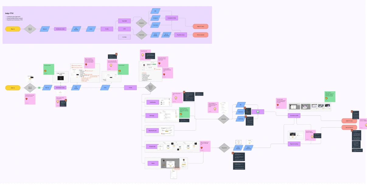
Audit of the independent onboarding experience - the sheer size shows the confusion!
Competitive research of other platforms
We then did a deep dive on other platforms to learn about best practices and discover patterns / UIs that we liked and wanted to draw inspiration from. We used pageflows for this research.
💡I highly recommend pageflows for quick research - they compile core product flows from the most exceptional technology products around. With one click, you can see onboarding, payment, and email flows from 100s of companies!
Define the product requirements
Based on our audit + competitive research + product goals, we defined the initial product requirements to be referenced in the design exploration phase. In summary:
Delineate clearly between client and Independent sign-up experiences
Help users see how the onboarding information was used to build their profile
Use the Contra chat to welcome users to the platform and explain the core features they could engage with
Use a "guided onboarding" experience to familiarize users with our core features
The product requirements included mapping out at a detailed level the key user education points we wanted to communicate:
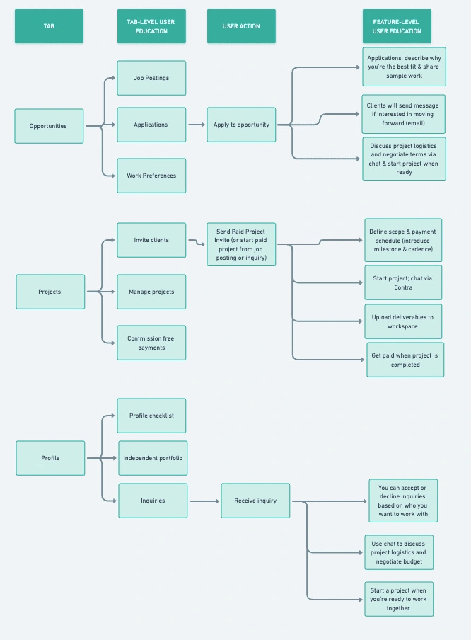
A mock-up of the user education flow on Contra!
Design exploration
Alex went to work on designing. She started with basic wireframes so that we could align on the direction and general strategy, before diving into hifi designs. At Contra, we have weekly design critiques which are an opportunity for our team (product, design, engineering, leadership) to come together and review designs for an in-progress project. In between these weekly critiques, we share asynchronous updates via Loom to continue the feedback cycle. We iterated on the designs for ~2-3 weeks before moving to user research.
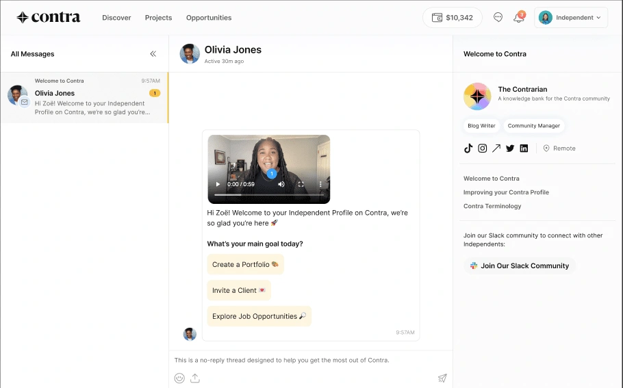
The welcome chat for Independents - complete with a video from our own Olivia Jones!
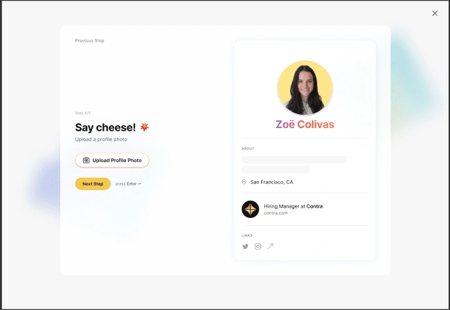
The new onboarding screen for clients - the profile is built as they complete onboarding!
User research
We wanted to ensure that the new designs would solve our core problems. The main questions we investigated during user research:
Do users understand how their profile is built?
Do users know what they can do on Contra?
Do users understand how to navigate the onboarding flow and the platform?
We used UserTesting.com for this research to get unbiased feedback. The results were very strong with majority of users having clarity on what Contra was and how they'd use it. We iterated on the designs based on the feedback to clarify language and UX.
Development Handoff
We finalized designs and then handed off to engineering for development. At Contra we use Linear for all task management. The Product Manager is responsible for breaking out the project into user stories (after reviewing with an engineer) and then engineers "groom" the stories to prepare for development. We sized this up as a ~3 week project for 1.5 engineers.
Testing
Once the feature was completed, we spent a lot of time testing it for core functionality and UI. At Contra, we conduct team-wide UAT (user acceptance testing) - engineers, product managers, and designers of the team go through the feature end to end to capture any bugs or improvements. These are addressed before we rollout.
Tracking
A feature is only as good as it's impact. At Contra, we're focused on making measurable changes to the product so we can quantify impact. We use Segment tracking on the frontend to track user interactions. We mapped out these events and instrumented the tracking before shipping this feature to production.
Ship it!
The Outcomes
.... TBD, the feature will be shipping next week!
Like this project
Posted Oct 6, 2022
Onboarding is a critical part of the product experience as it's a user's first touchpoint. We rebuilt this recently, learn about the process here!
Likes
2
Views
84


