Redesigning a pricing page experience
Priyank Shah
Redesigning pricing page of checkoutpage.co which offers checkout pages and forms to sell your products and services
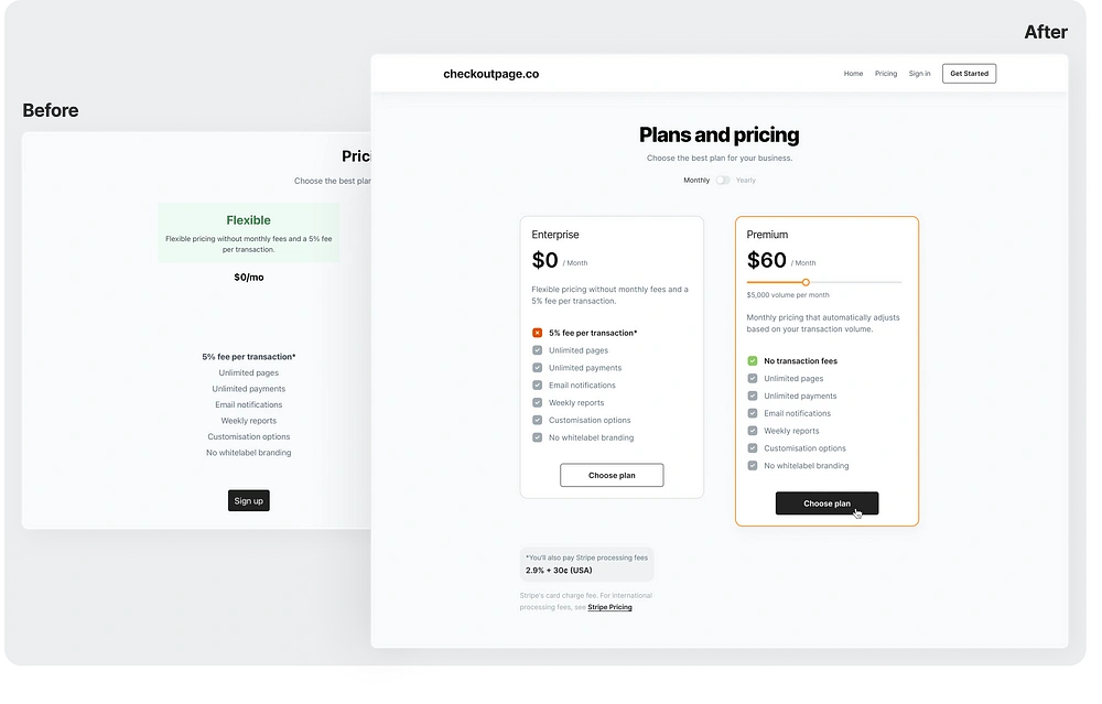
Before and after comparison
Checkoutpage.co is the easiest way to sell subscriptions and handle one-off payments. It is owned and developed by Sander. Recently, I had a visit the site and I really liked how to website is developed. I visited the pricing page and noticed some UX as well as UI issues in there. So, I decided to redesign it from a UX designer’s perspective.
Sit back and read through the story on how I managed to solve some of the UX/UI issues in the design. Let’s do it 🔥
Problems & solutions
I will mainly be redesigning the pricing section of the website. Here’s what the current design looks like:
The current design
The current design of the pricing page looks quite minimal and good. The colors look completely fine to me with a cool feel. Though there won’t be much changes in the layout and hierarchy, there are a few in typography, alignment, etc.
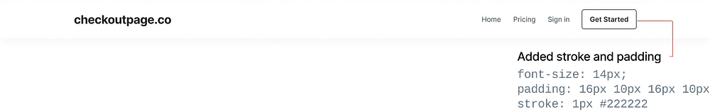
1. Navigation bar
Starting off, the first thing I looked upon is the top navbar. It had several issues in alignment, typography, size and effects. Here’s what it looks like:
Current navigation bar
In the left, the name of the website is a link. Well, it doesn’t look like a clickable one. So I tweaked the text and changed it to ‘checkoutpage.co’. I really wish, I had access to the logo of this product. It would settle perfectly in the left end of nav bar and combined with the title.
Next, I noticed the nav link items to the right of title. Unfortunately, it matches with the title and also doesn’t provide a proper top-level navigation system. I added a ‘Home’ link to it and shifted everything to the right beside the CTA buttons.
Yes, next comes up the CTA buttons. I feel the copy of both the CTA is confusing. Hence, I changed ‘Sign up’ to ‘Get started’ and made the primary button a secondary one. This de-emphasised it and perfectly matched with the other items.
Pro Tip :👉 Always pair verbs with nouns to provide context to your buttons. (eg. “Invite colleagues” is better than just “Invite”.
Lastly, I changed the width of the nav bar to full viewport width as most of the websites have currently. It feels properly aligned and denoted a ‘universal’ navigation while scrolling down. Also, I slightly increased the height of the nav bar to 76px for giving a bit of breathing room to the elements inside.
Here’s what the redesign of the nav bar looks like:
Redesigned navigation bar
2. Header section

Existing page header
Next, up is the header section which includes the page heading and the sub heading. Not much issues here.
I just increased the font weight of the heading and changed the copy to ‘Plans and pricing’. I also added a switch for monthly and annual payment as I thought it was needed as a good alternative option for the user.
Here’s how it looks
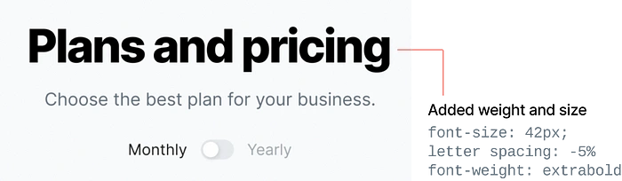
Redesigned page header
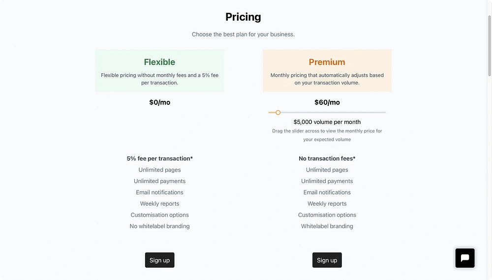
3. Packages section
Okay, so the main part in the redesign. The packages section has the most issues visually as well as UX wise. Here’s how it looks currently:
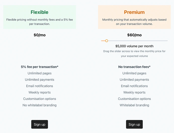
Existing packages section
The main problems here are:
1. The header section and the content section of the package doesn’t feel connected.
2. Price looks very small and is the main focus of any package.
3. Centre aligned features section isn’t good for proper scanning through eyes.
There are definitely small issues in spacing and buttons.
The Solution:
Increasing the size & weight of pricing.
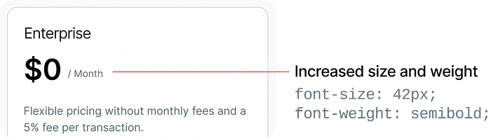
Package header redesign
2. Aligning the features section with checkbox icon and respective features
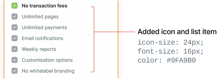
Redesigned feature list
Pro tip: 👉 Try to align large blocks of text to the left as I increases easy scanning through content and organising all text to one single margin.
3. The CTA button seemed like not in relation with the plan and said something different than what we expect. Instead, I tweaked it by changing the label to ‘Choose plan’ and making it a secondary button. Have a look at how Notion does it:
Notion plans page inspiration
Let’s have a look at the final button version:
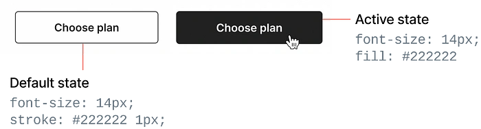
CTA button redesign
4. Boxing every plan in its seperate card and giving hover effects.
Take a look at how dribbble achieves it:
Dribbble pricing cards inspiration
Redesign of pricing cards
Final comparison 🔥
Wrapping up all the edits and changes. Here is the final output after redesigning the pricing page experience.
Final comparison of before and after redesign
Final words
Overall I made a few tweaks here and there and in the end, the design improved a lot.
Like this project
Posted May 7, 2024
Redesigning pricing page of checkoutpage.co which offers checkout pages and forms to sell your products and services
Likes
0
Views
19