Wooha: Landing Page Design for a Charity
Thomas Boussy
Charity goes bold
For the Wooha project, we aimed to redefine the look and feel of water-focused charity initiatives by moving away from the clichés and instead opting for a bold, black-and-white aesthetic.
Grab attention
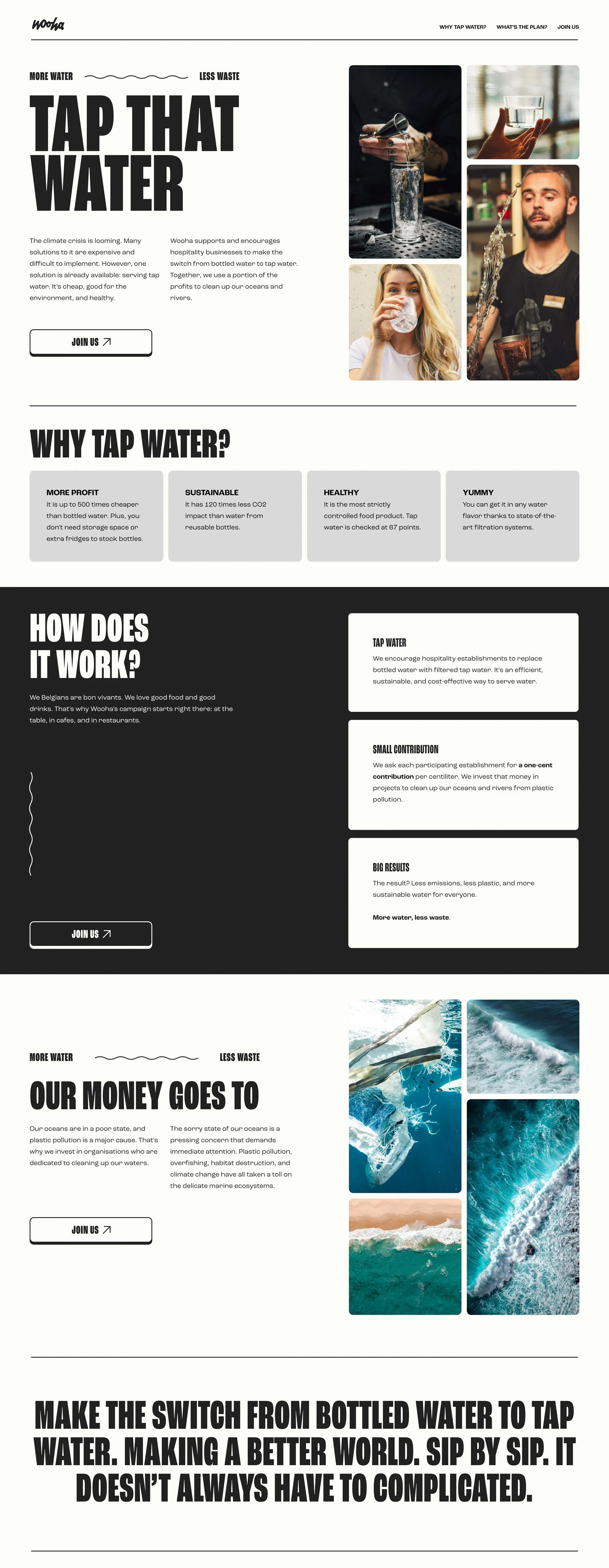
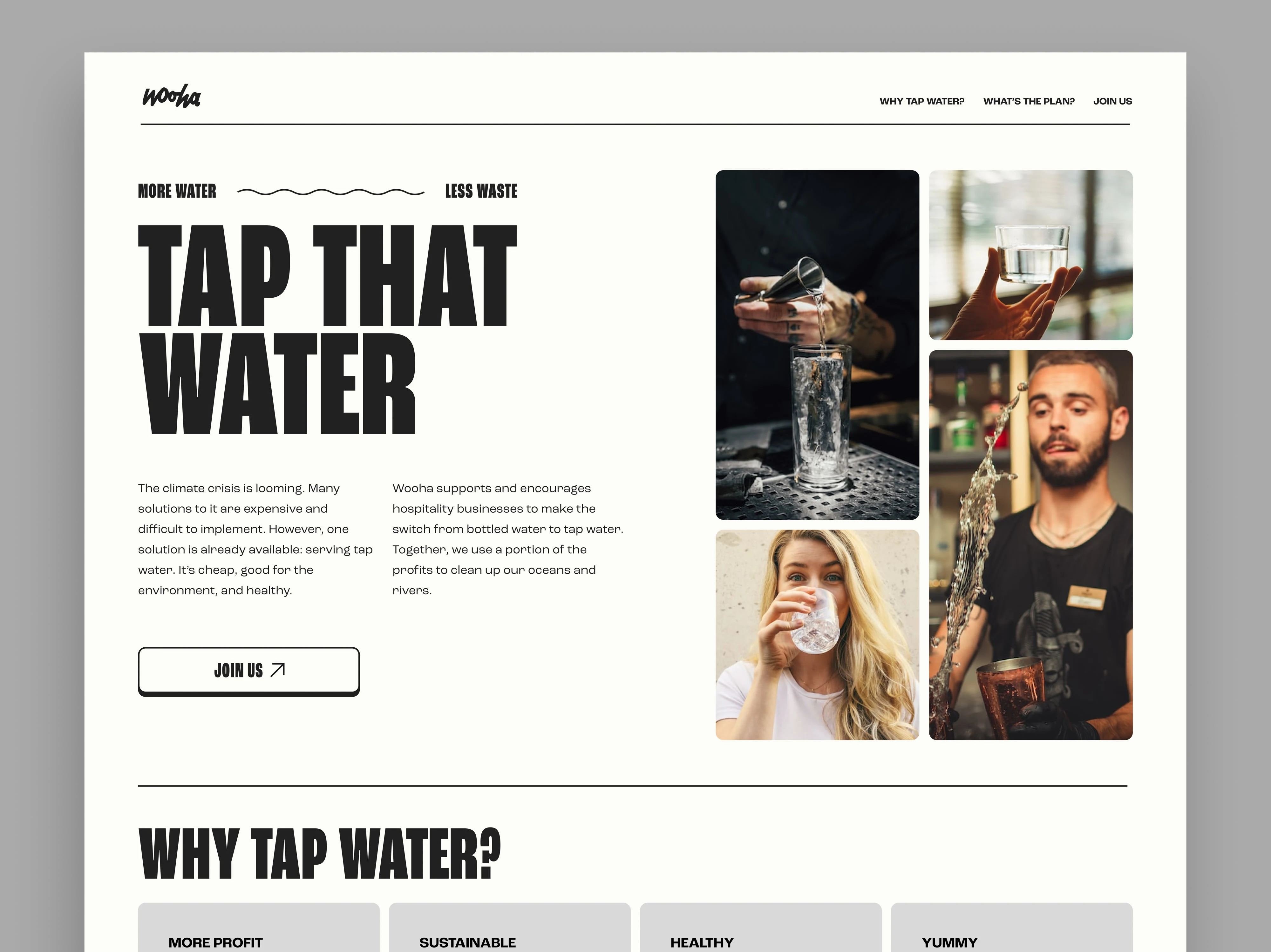
The prominent tagline "TAP THAT WATER" immediately grabs attention with its assertive tone and oversized, bold font. This strong, straightforward messaging cuts through the noise and directly addresses the solution—serving tap water as an eco-friendly alternative.
We also designed the logo.
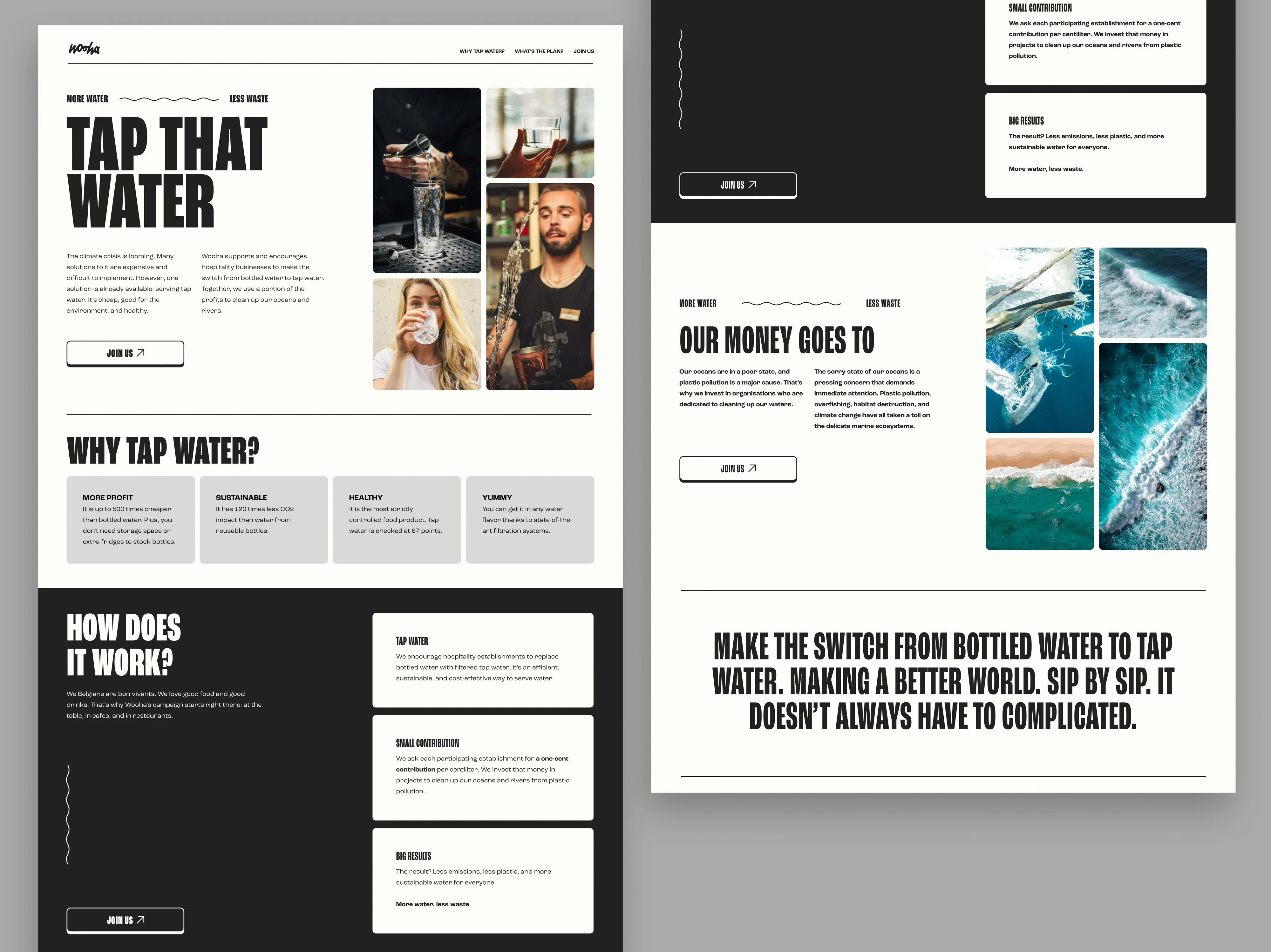
Full Landing Page
Hero Header Section
Black-and-white
By using a black-and-white color scheme, Wooha distinguishes itself from typical charity websites that rely on blue tones associated with water. This monochromatic palette adds a sense of cool and professionalism.
The Wooha website design takes a fresh approach to water charity by appealing directly to restaurants with a sophisticated, minimalist aesthetic. By rejecting clichés and focusing on the practical, sustainable benefits of tap water, Wooha positions itself as a forward-thinking, stylish initiative.
Landing Page
Like this project
Posted Aug 31, 2023
A water charity without the color blue? This bold, black-and-white design strays away from all cliches concerning charity and water.
Likes
1
Views
84