Mintjens Projects
Joren Brosens
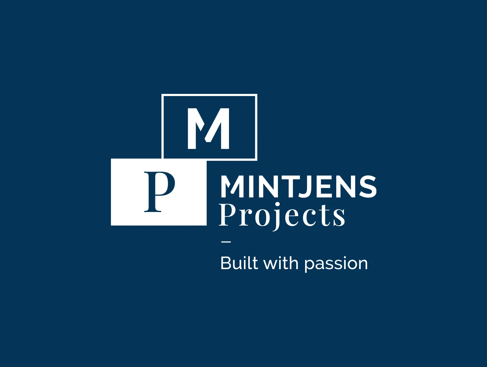
About Mintjens Projects
Mintjens Projects is a construction company based in Antwerp - Belgium. Their focus is mainly on the realization of luxury renovation and modern construction projects.
Introduction
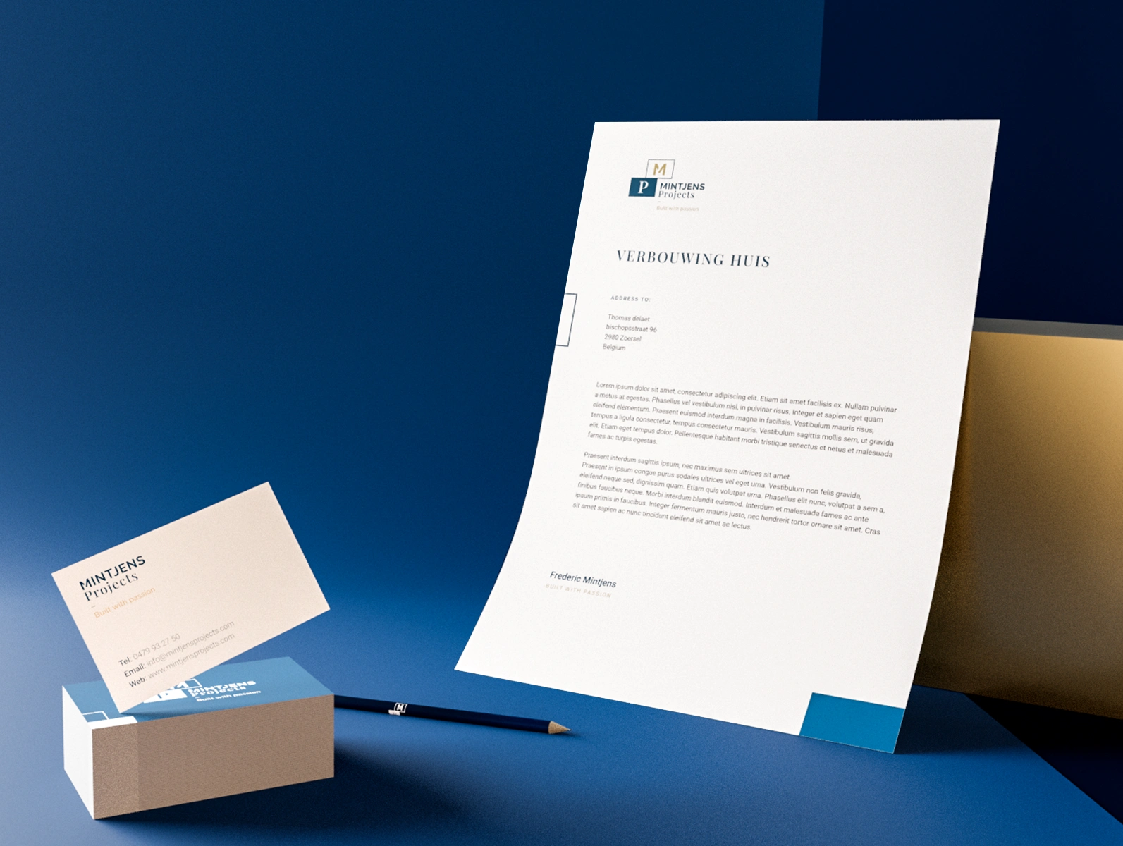
I developed an identity focused on the main activity from the company. This gave me the idea to make a brand around shifted building blocks that reflect the flexibility of the company. The combination of an authentic and modern typeface illustrates perfectly what the company stands for, namely renovation and new construction.
Branding
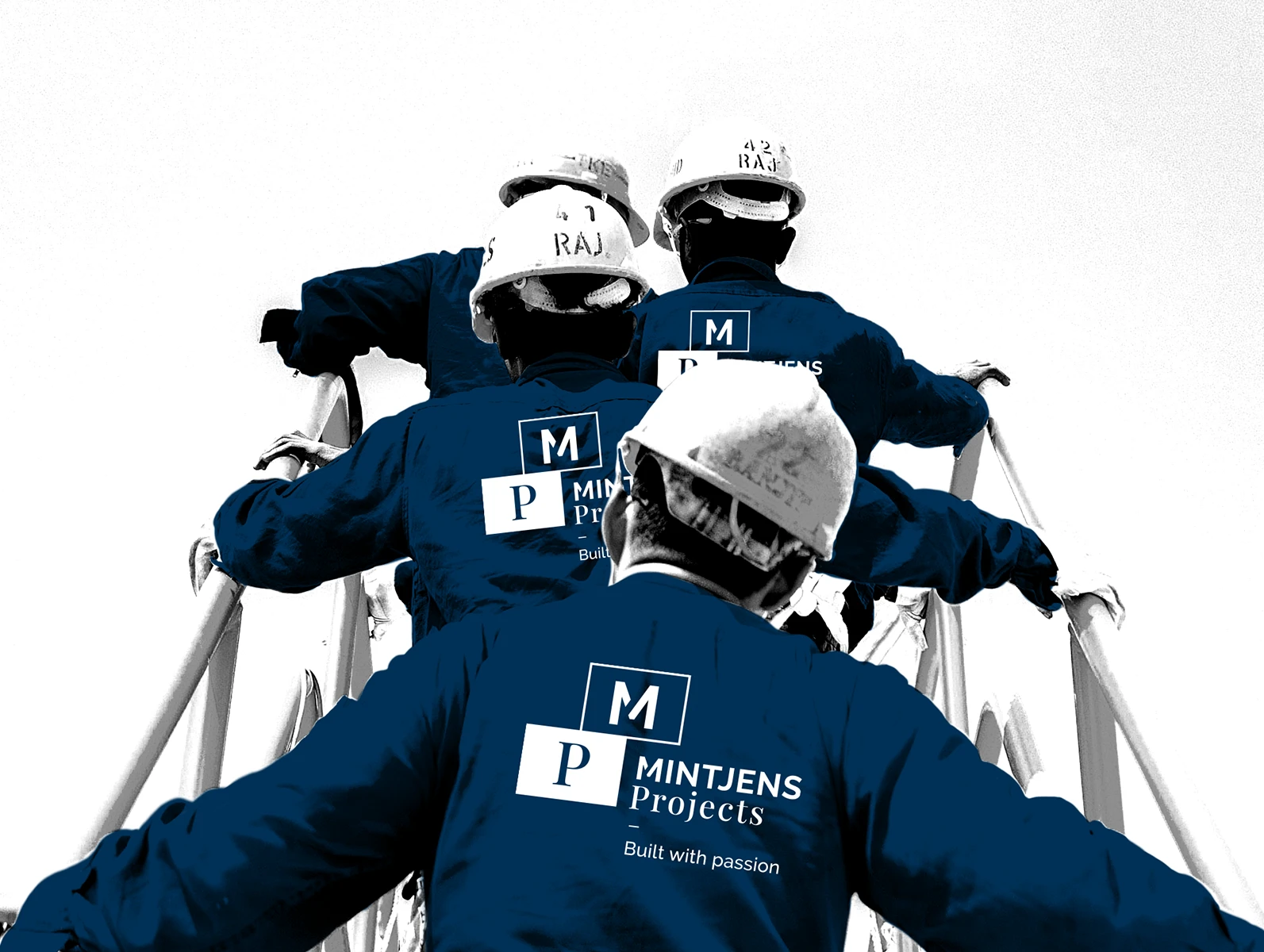
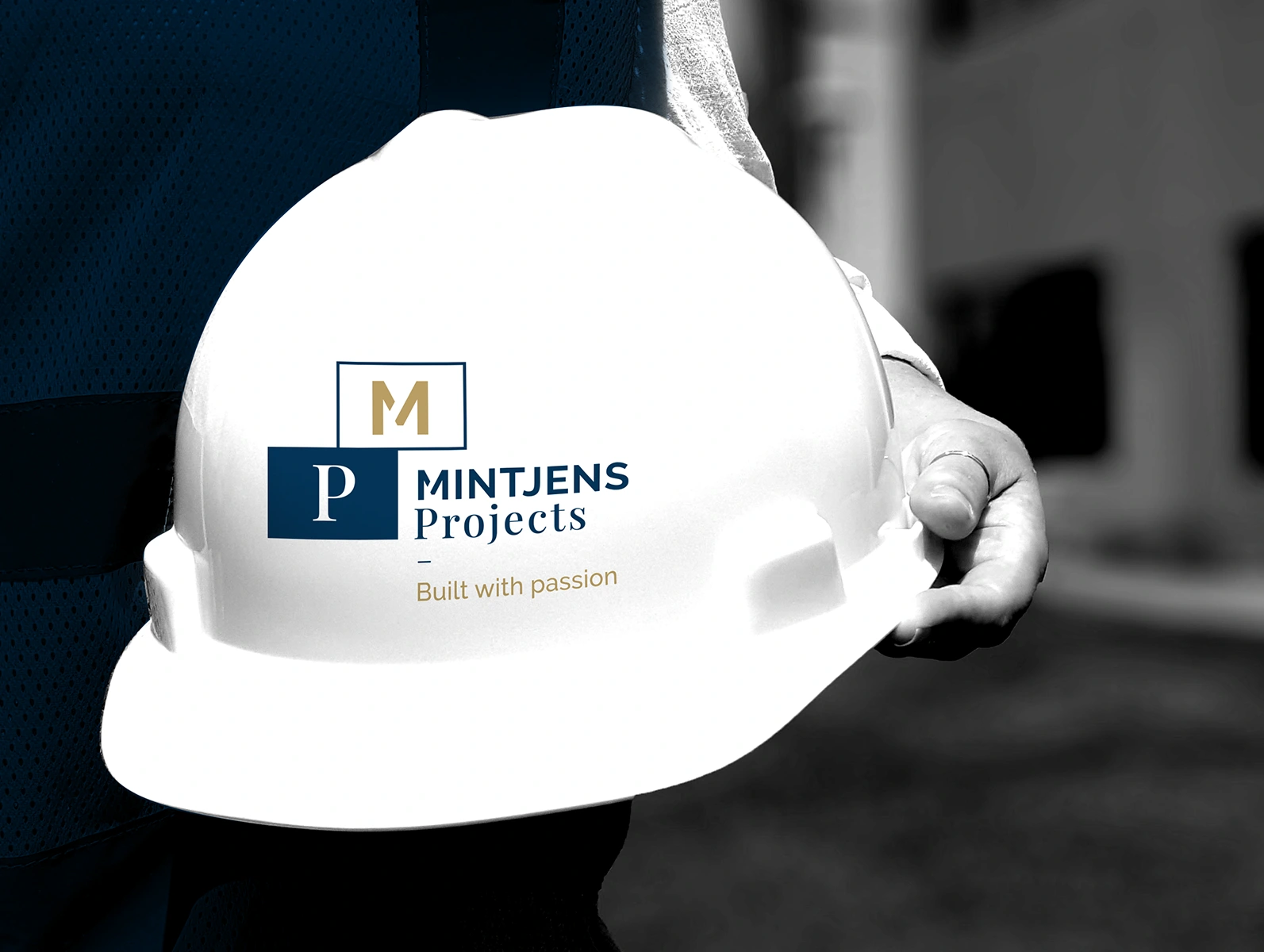
The moved bricks are representing the fundamental base for the branding. It gives the company a modern and dynamic look and feel. The use of black and white images and the corporate colours (gold, dark blue) give the brand a premium look as well.
Clothing
To give the company more visibility I gave them personalized clothes, construction fences, car wrapping and more.
Like this project
Posted Apr 30, 2025
Contact me for collaboration: info@jorenbrosens.com