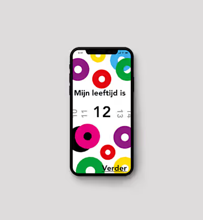
Unpopular opinion: Following design trends can suck to Accessib…
As UX/UI designers it can be very tempting for us to get caught up in the latest trends. Taking inspiration from platforms such as Dribbble and Instagram can inspire us to use new cool-looking UI elements from unconventional navigations to funky typography. There are constantly new things to try out. As tempting as it is to make pretty and trendy designs, when it comes to accessibility, following these trends blindly can actually do more harm than good.
One of the main issues with design trends is that they often prioritise aesthetics over usability. For example, a popular trend in recent years has been using low-contrast and pastel colour schemes. These designs are usually visually striking, however, it can give people with visual impairments quite a hard time finding out the hierarchy and navigating through the app or website which leads to a bad customer/user experience.
Similarly, the use of non-standard fonts or typography can cause problems for users with dyslexia or other reading difficulties.
When designers prioritize following trends over accessibility, they are essentially excluding a portion of their audience from fully engaging with their designs. Moreover, it can be especially problematic for users with disabilities, who may rely on specific design features or elements to navigate websites or apps.
I know from my own experience that it is very tempting to make everything look pretty and trendy, but as UX designers we really have to make sure our designs are accessible for people with disabilities. It might be evident for a lot of us but here are some design patterns which will help you prioritize accessibility in your design.
Use colour schemes with clear contrast.
Choose fonts that are easy to read
Make sure that interactive elements are easy to use and navigate.
Use visual hierarchy to convey the relative importance of information, with the most important elements being more prominent and easily noticeable than less important ones.
Finally, I want to advise you to take inspiration from existing products rather than concepts on websites like Dribbble. Concepts are often not complete user flows with so many shortcomings because it’s simply just focussing on showing off pretty designs. A big advantage of doing this is that you will be inspired by user flows that are already familiar to users which will avoid confusion in your product.
Be willing to speak out against inaccessible design practices when they see them. By raising awareness about the importance of accessibility in design, we can work towards a future where all designs are inclusive and welcoming to all users, regardless of their abilities.
In conclusion, as UX/UI designers, we have a responsibility to create designs that are accessible to all users, regardless of their abilities. While it can be tempting to follow the latest design trends, prioritizing accessibility over aesthetics is crucial for providing a positive user experience. What steps will you take to prioritize accessibility in your next design project? Share your thoughts in the comments below!
Like this project
Posted Jun 13, 2023
As UX/UI designers it can be very tempting for us to get caught up in the latest trends. Taking inspiration from platforms such as Dribbble and Instagram can i…
Likes
0
Views
5


