LockedIn HQ Brand Identity Design
Iyanu Oluwaleye
LockedIn HQ — Athlete Branding for the Digital Era
LockedIn HQ is a lifestyle and athlete-empowerment platform — built by athletes, for athletes.
At its core, it’s a digital hub that helps athletes own their brand, grow their visibility, and monetize their grind.
Instead of relying on scattered social platforms or third-party managers, LockedIn HQ gives athletes everything they need in one ecosystem.
Overview
LockedIn HQ is a lifestyle and athlete empowerment platform built by athletes, for athletes, giving them tools to own their brand, grow their visibility, and monetize their grind.
My Role
Lead Brand Designer — handled complete brand identity direction, from logo concept and visual system to brand tone, palette, and product integration.
Challenge
The core challenge was to create a brand identity that felt both athletic and digital, representing focus, community, and empowerment without leaning too heavily on any one sport. The goal was to build something scalable, bold enough for merch, clean enough for the app, and meaningful enough to represent a movement.
Approach & Solution
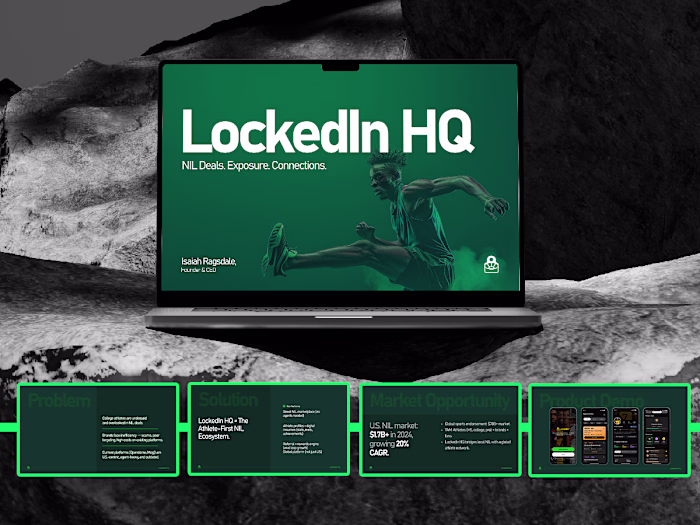
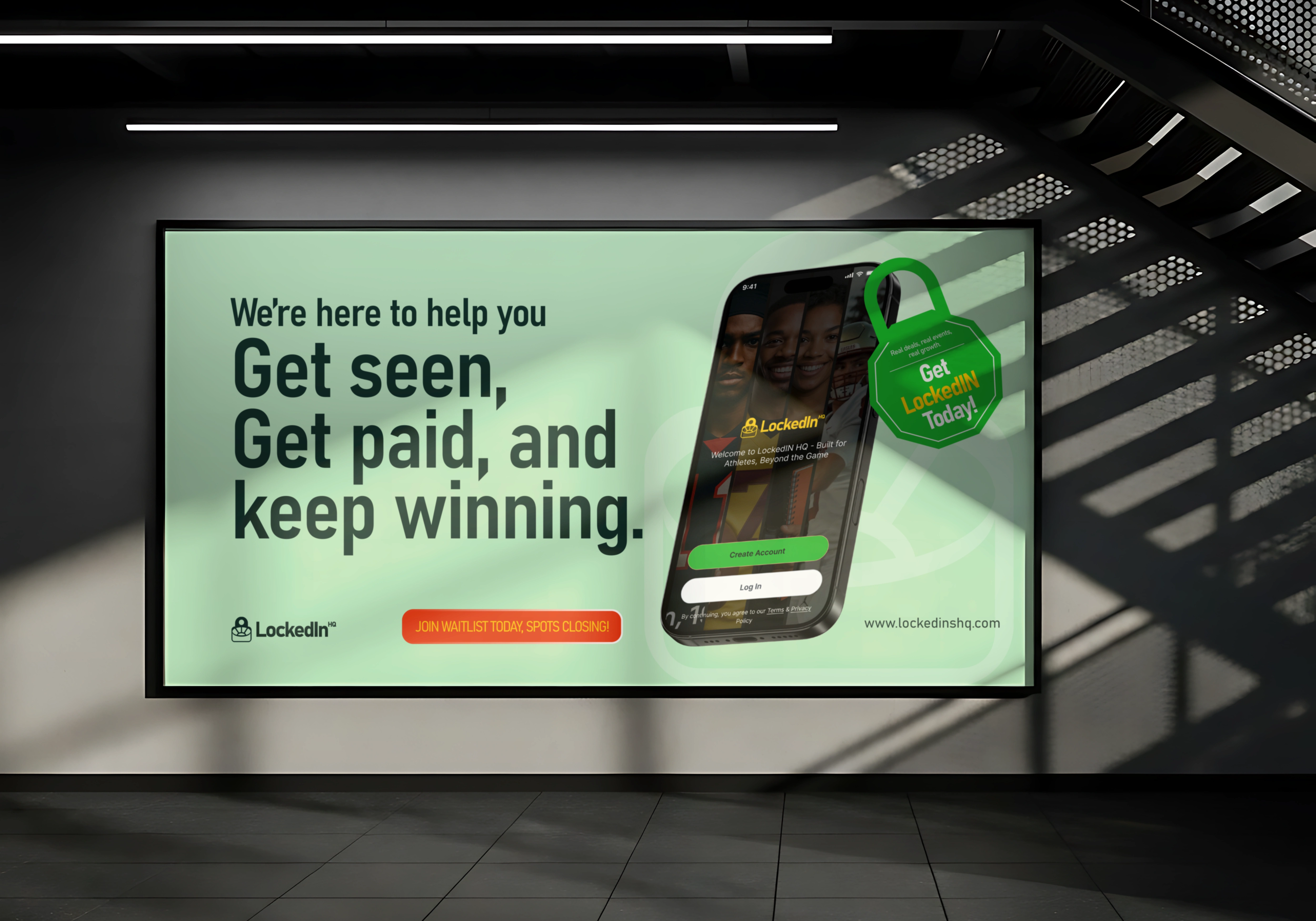
I explored multiple logo directions, combining track arcs, ball elements, and stadium forms, to symbolize the blend of focus and competition. The final mark, shaped like a padlock and stadium, embodies the LockedIn mindset: focus, discipline, and ownership.
I developed a full brand system that extends across digital, motion, and print, pairing clean typography with a modern black/white foundation, energized by bold accent tones. Every element reinforces the idea of being locked in, driven, focused, and built for the modern athlete.
Result
The rebrand positioned LockedIn HQ as a distinct athlete-first ecosystem, bridging sports culture, technology, and empowerment. It’s more than an app identity, it’s a movement for athletes ready to own their narrative.
The mindset behind it is simple:
Being Locked In means focus, discipline, and ownership — on and off the field.
LockedIn HQ ----Personal Profiles, Opportunities Hub, Monetization Tools, Community & Events
So LockedIn HQ isn’t just an app, it’s a movement redefining what it means to be an athlete in the digital age.
Thank You!
Like this project
Posted Oct 15, 2025
I led the rebrand for LockedIn HQ - an athlete-first platform empowering players to own their brand, showcase their grind, and monetize their journey.
Likes
1
Views
6
Timeline
Jul 15, 2025 - Aug 7, 2025
Clients
Joseph