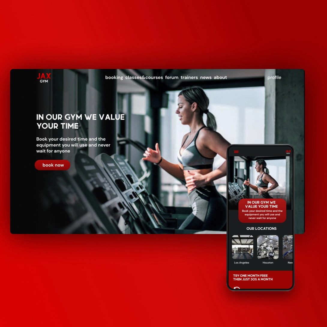
Jax Gym Case Study

I think every person who has used a gym can remember a time when they were about to do their set at a certain machine and then someone takes the spot before they can reach it. Or the gym is simply too crowded and you start to feel overwhelmed. Maybe you've never gone to the gym and you want to start but just don't know how and you get confused by everything you see in the gym. And so I started this process to try and help that issue people have had for a very long time.I worked on that with JAX gym
JAX gym is a gym chain with locations all over America. Jax gym prides itself on being open to everyone and their fitness goals. Most users are teenagers and adults ages 18-40 although JAX gym is looking to inspire elderly people to be more active. JAX gym goal is to make the gyms more organized and inspire more people to start their fitness journey
The problem
The gym is often crowded and that results in some equipment or machines being busy because there’s not enough for all gym members. Another problem is that new people don’t know where to start with their gym and fitness journey and feel intimidated.
The goal
Make the equipment and machines be available for everyone to use during their time at the gym and make sure none of the things they want to use are busy or taken by someone else. Another goal is to Inspire new people to join the gym and start their fitness journey.
My role:UX designer responsible for every aspect of the JAX gym website
Responsibilities:Conducting interviews, paper and digital wireframing, low and high fidelity prototyping, conducting usability studies, accounting for accessibility, iterating on design and responsive design.
Like this project
Posted Aug 7, 2022
Creating a booking feature for a local gym
Likes
0
Views
21


