Album Concept Designs for Fictional Artist
In a digital creative academic project, I was tasked to
conceptualising an overall album debut for a fictional artist given as a brief to hit the different criteria
Designing advert materials to promote the album debut and increase album sales
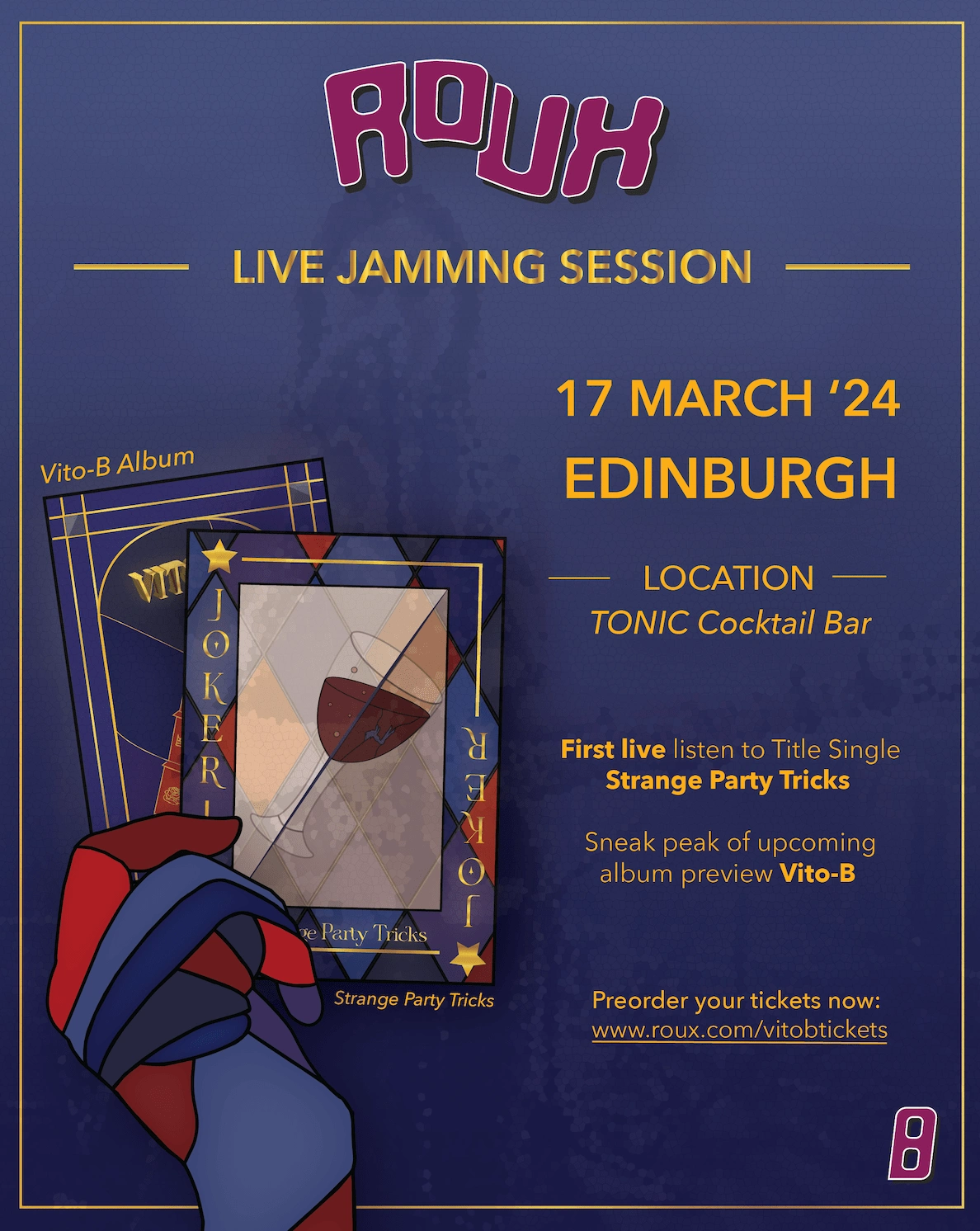
Roux, a non-binary artist who loves Glasgow style and technicolor Vintage aesthetic, is looking to promote her debut album Vito-B, and the latest single Strange Party Tricks.
This is my logo design process for her. After evaluating many different styles and typography, I decided to go with a Margenta colour to symbolise sense of imaginative, passion and creativity, and balance - traits I would want Roux's album to convey.

I also aimed for a simple and recognisable logo to harbor a depth that lingers in people's minds, especially as they uncover its subtle, often overlooked meanings - crafted to foster a sense of exclusivity, making fans feel like insiders.
I also came up with a poker deck album concept to make Roux's debut a unique and interactive one - where each card displayed is related to the songs in her album. I played around with the concept of 2 sides of everything after analysing how poker cards look like for the Joker, Kind, and Queen cards.
Hearts - 2 sides of passion
A fire element, everyone has a passion fuelled by their dedication but might not always have the energy and gas to ignite it forever, and the duality of a passion will be represented by the colours of the fire in this card.
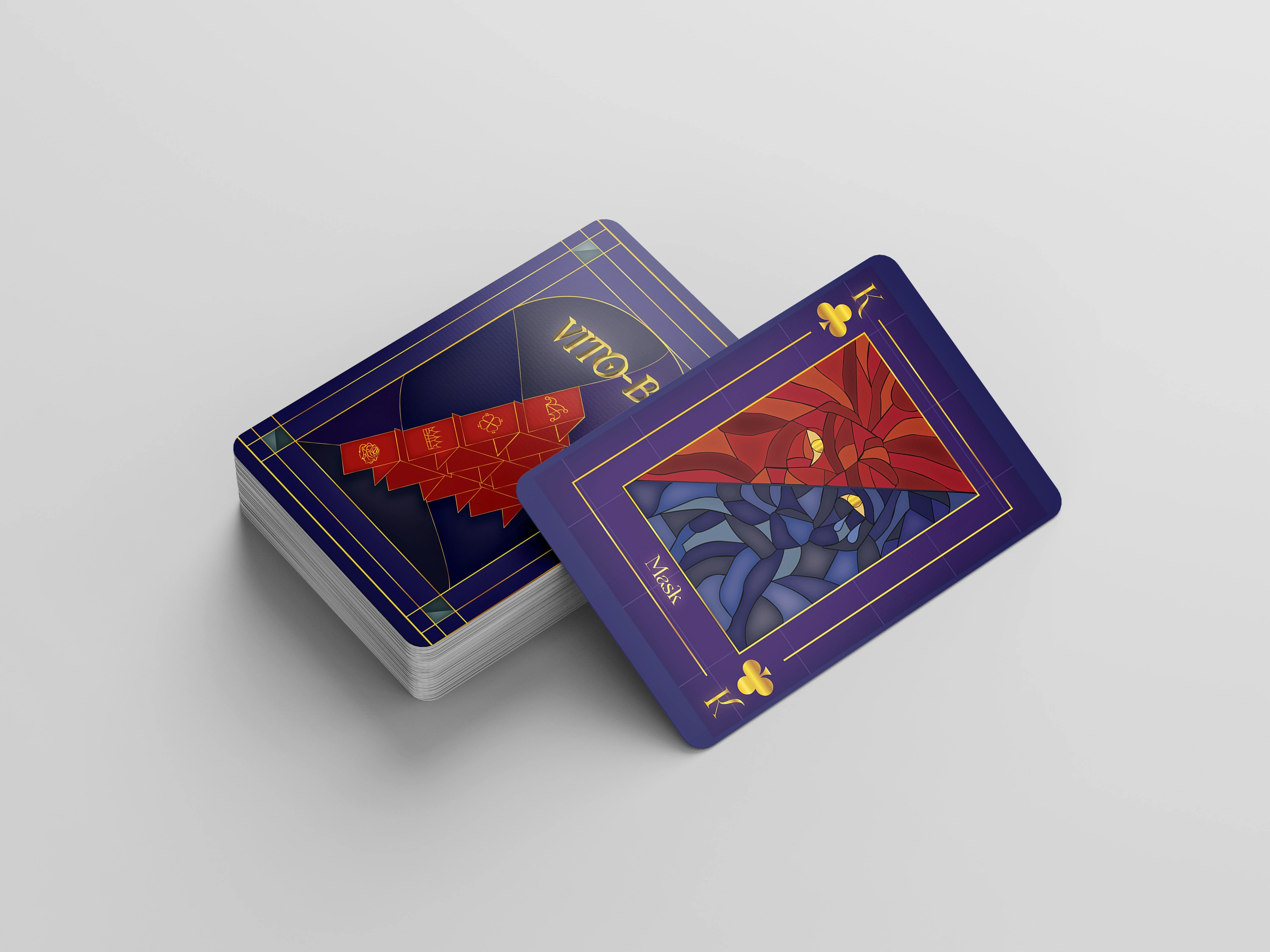
Kind- 2 sides of masculinity in men
One thing men still face in society is toxic masculinity - where one side will be showing the strong-headed and fierce side of man, while the other will portray the more emotional side of men.
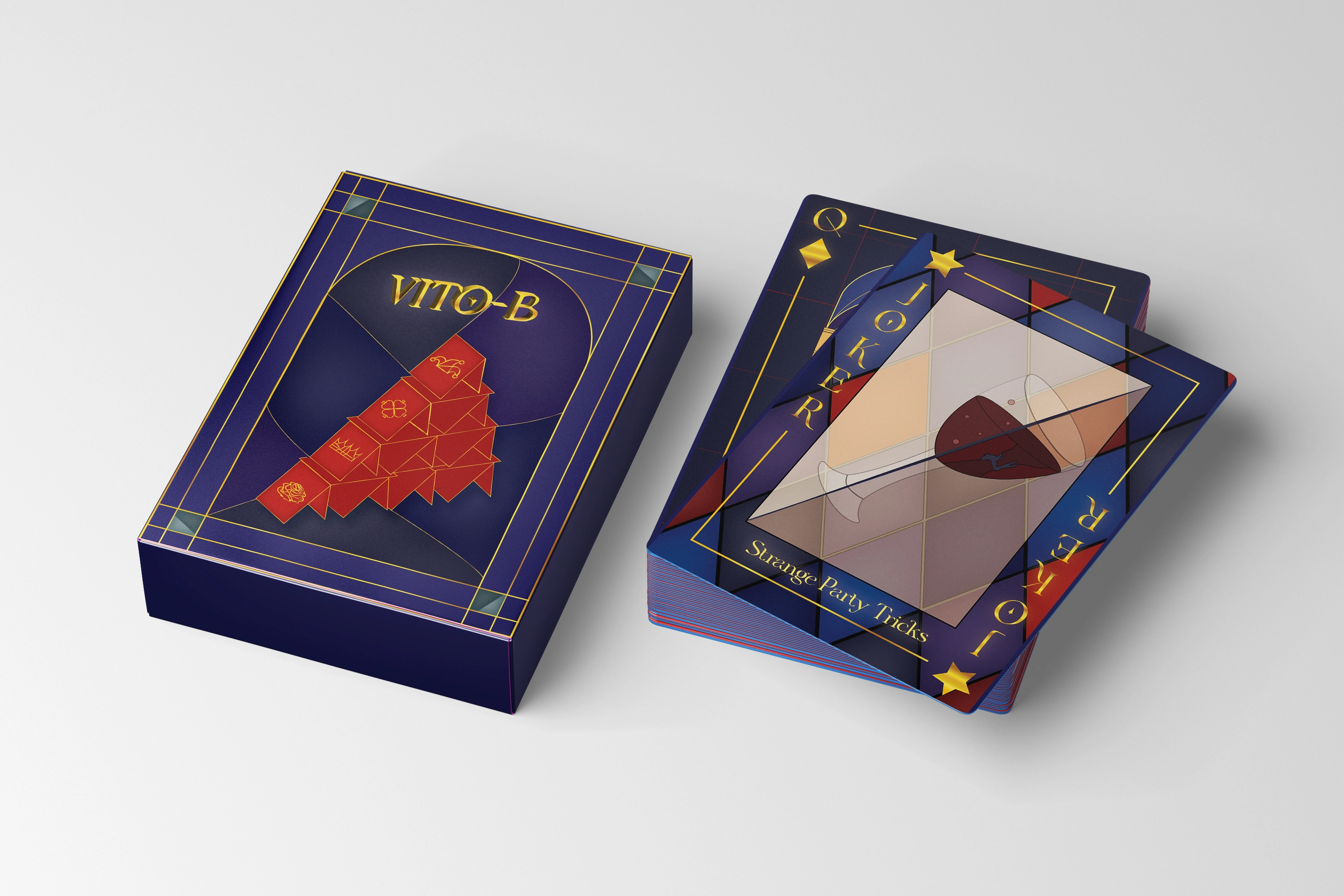
Joker / Jester - 2 sides of fun
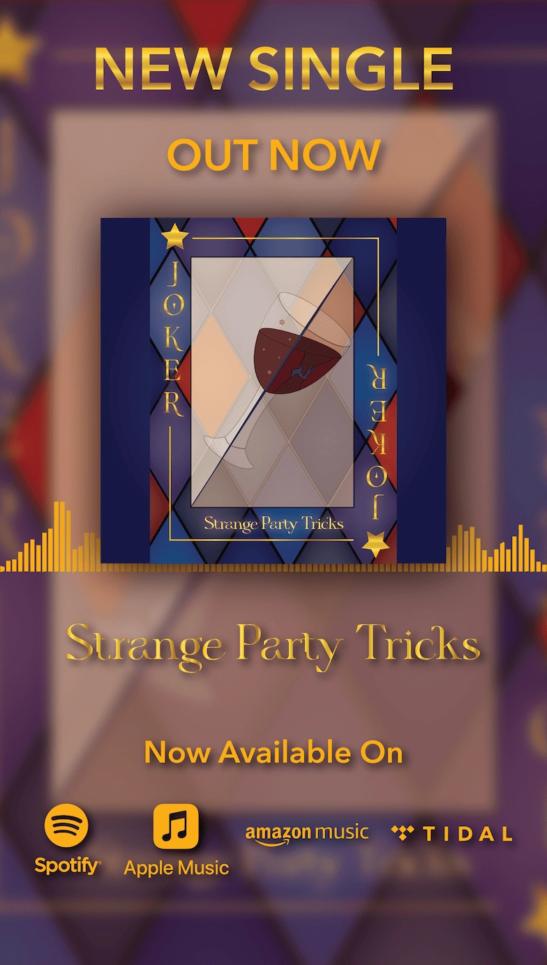
As the wild card, I wanted to show two sides: fun versus addiction, and I used a wine glass to represent the overall fun, with someone drowning on one side to represent addiction.
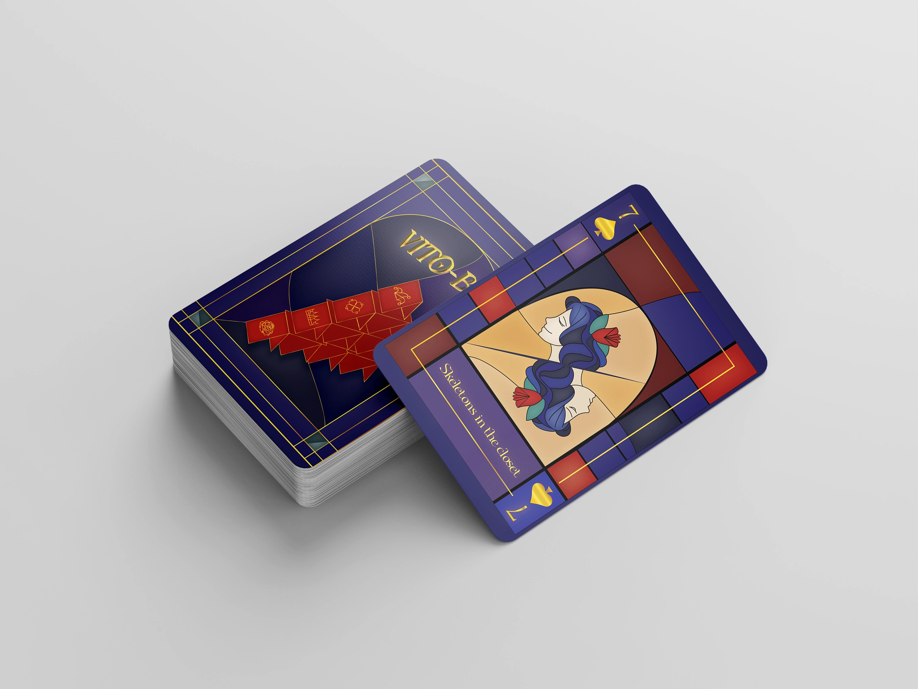
Spades - 2 sides to emotions
A water element, this was inspired by the Greek mythology story of Narcissus. As humans, we all have our 'public' and 'private' faces, and the design will be a woman crying and being sad to signify our 'private' faces, and her smiling to signify her 'public' face.
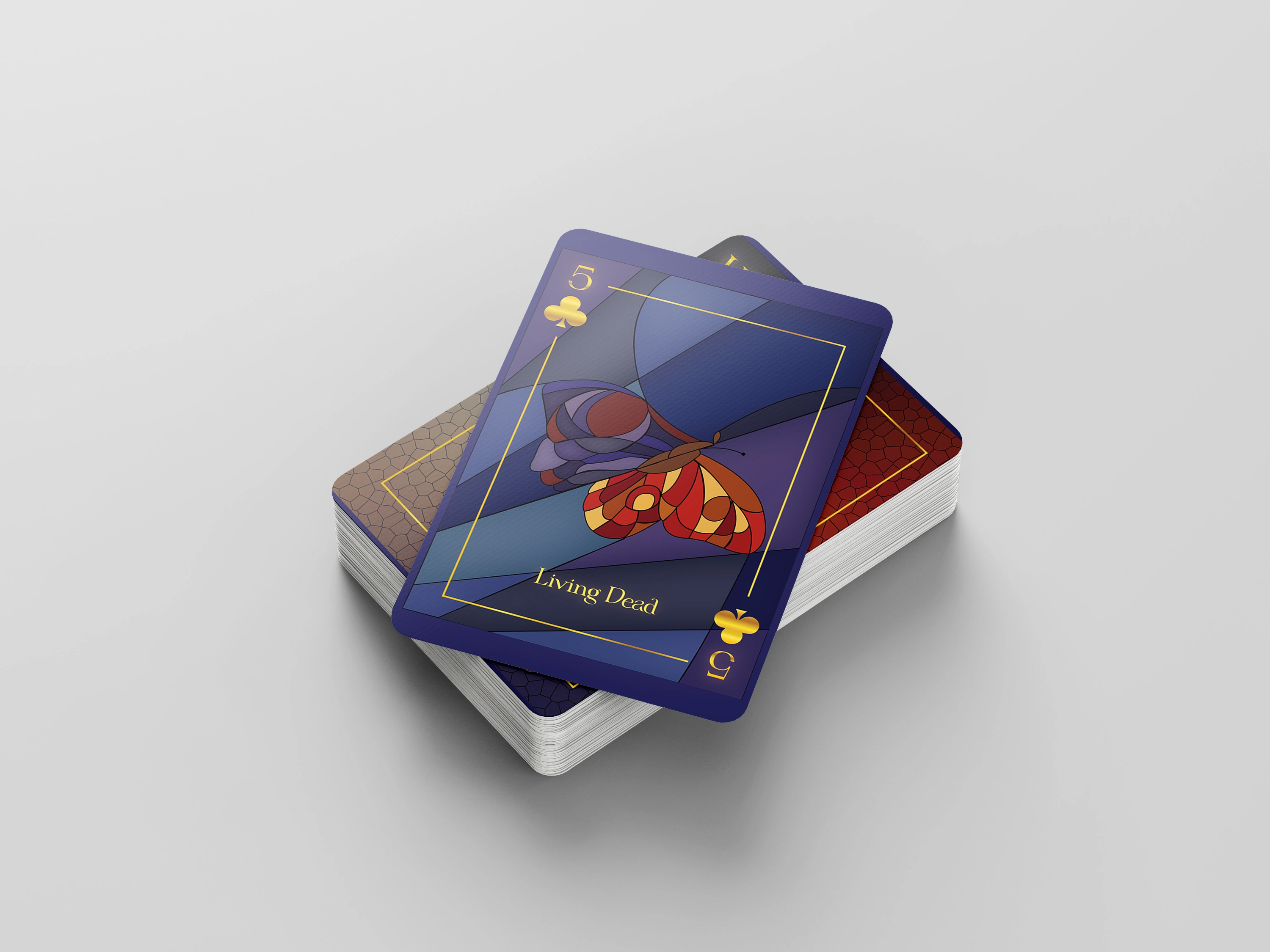
Clubs - 2 sides of nature and life
An earth element, this card will be symbolised by a butterfly versus a moth, one wing signifying life while the other means death.
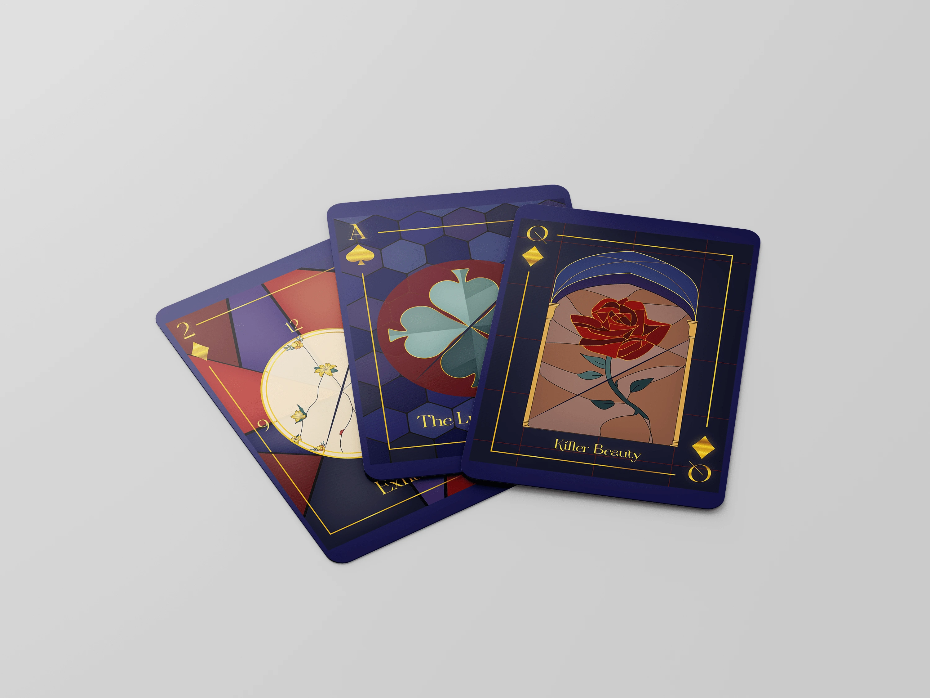
Diamonds - 2 sides of growth and progress
An air and autumn element, this is to represent progress - with the rough illustration of a watch and clutters of flowers to show growth.
Ace - 2 sides of luck
Being the highest card in a deck for some games, I used the symbol of a four-leaf clover to symbolise luck, and used variations of colours to represent good and bad luck.
Queen - 2 sides of beauty
Similarly to the King card, I brainstormed the struggles women face in society these days and combined the symbolism of the rose and the thorn to show the different perceptions of beauty.
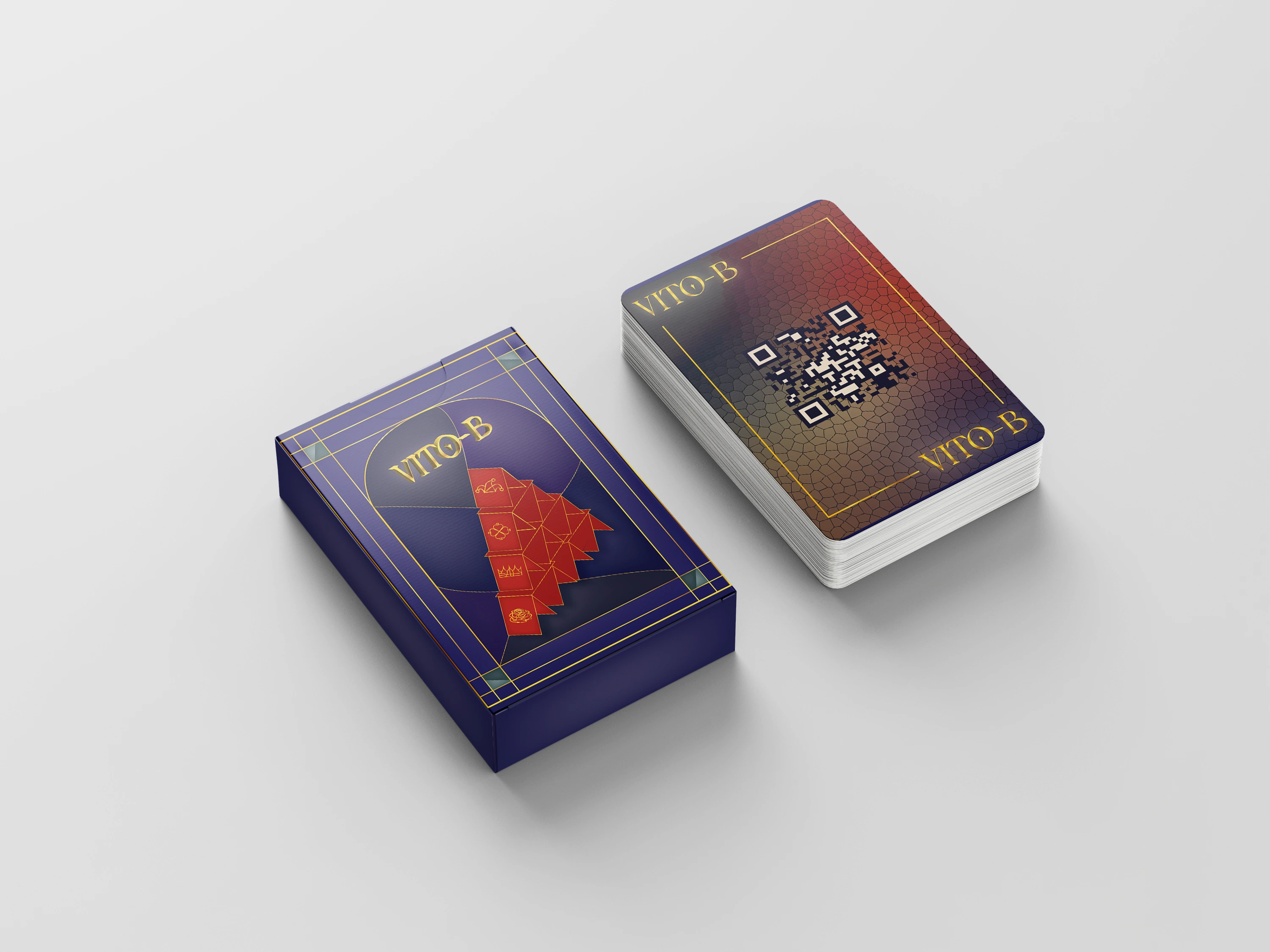
I also created the back design of the card to drawback to the purpose of this creative project - to promote her album and increase exposure. The pack design was designed as a House of Cards - to link back to the royalty/kingdom /castle aesthetic for this album.
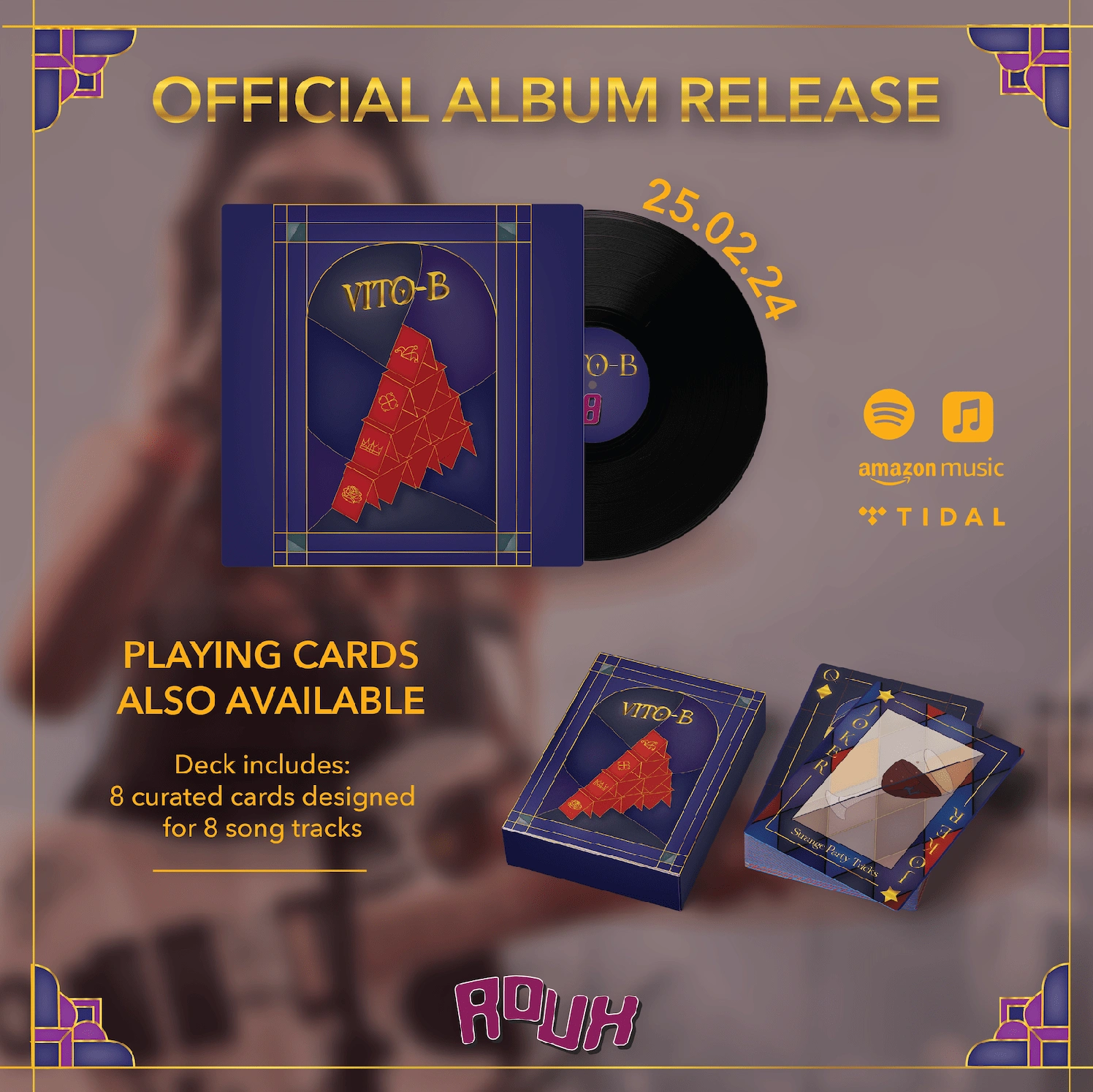
These are the adverts created to further promote this on social media, and as poster design.
Like this project
Posted Apr 27, 2024
As a creative academic project, I conceptualised, planned and designed collaterals for a debut album for a fictional artist.
Likes
0
Views
19


