Brand development and Rebrand
Jo Wilkinson
Brand development
Client: Reed in Partnership
Deliverables: Brand design & development, brand guidelines, office wall graphics, print & PPT templates, Annual Report design
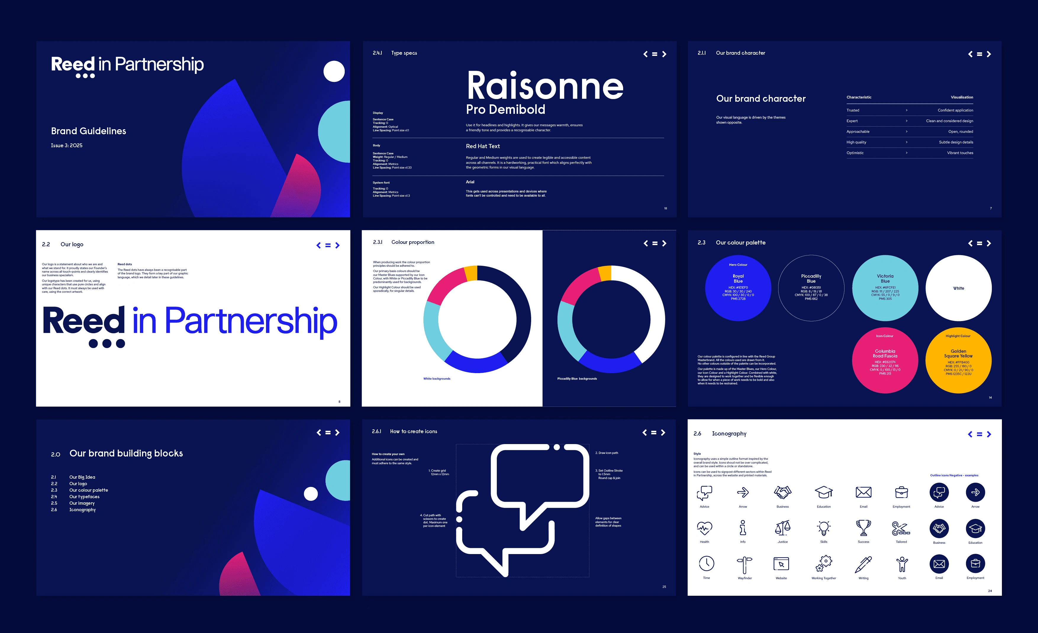
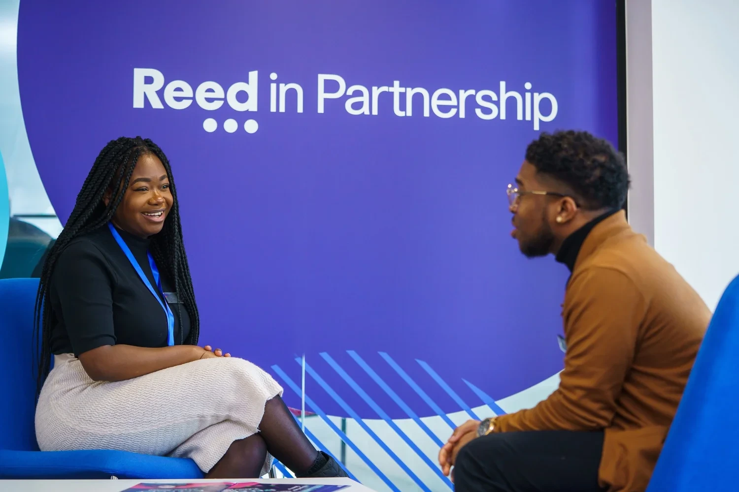
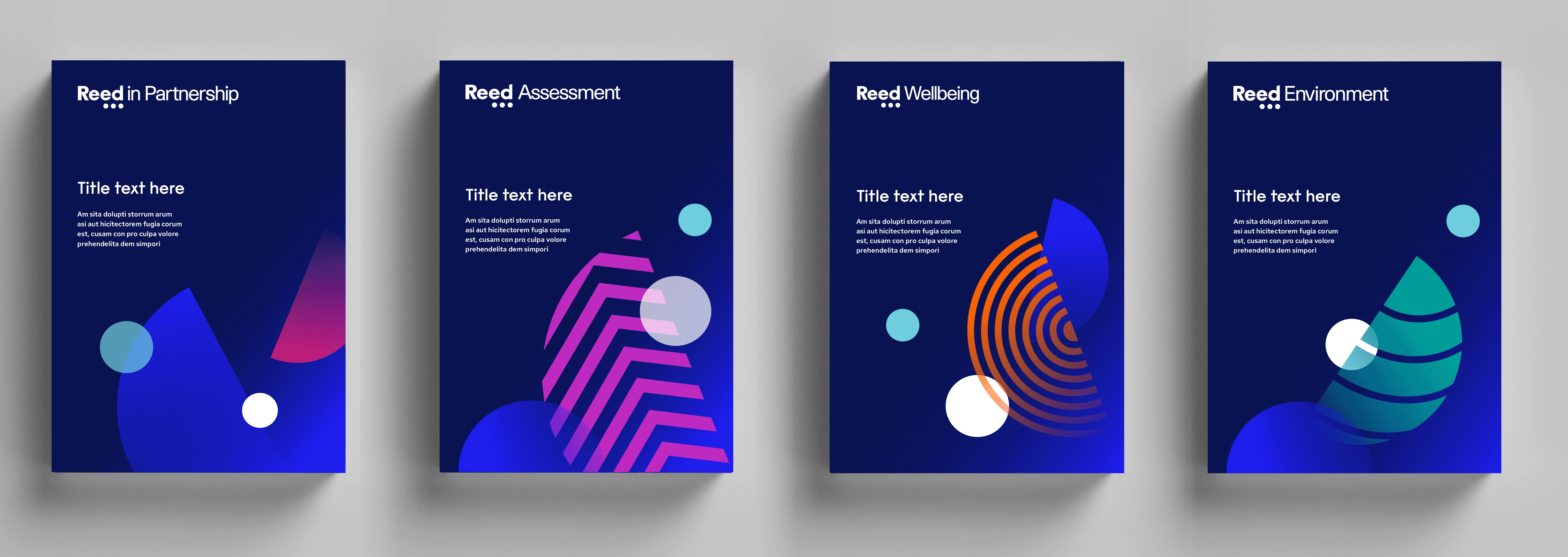
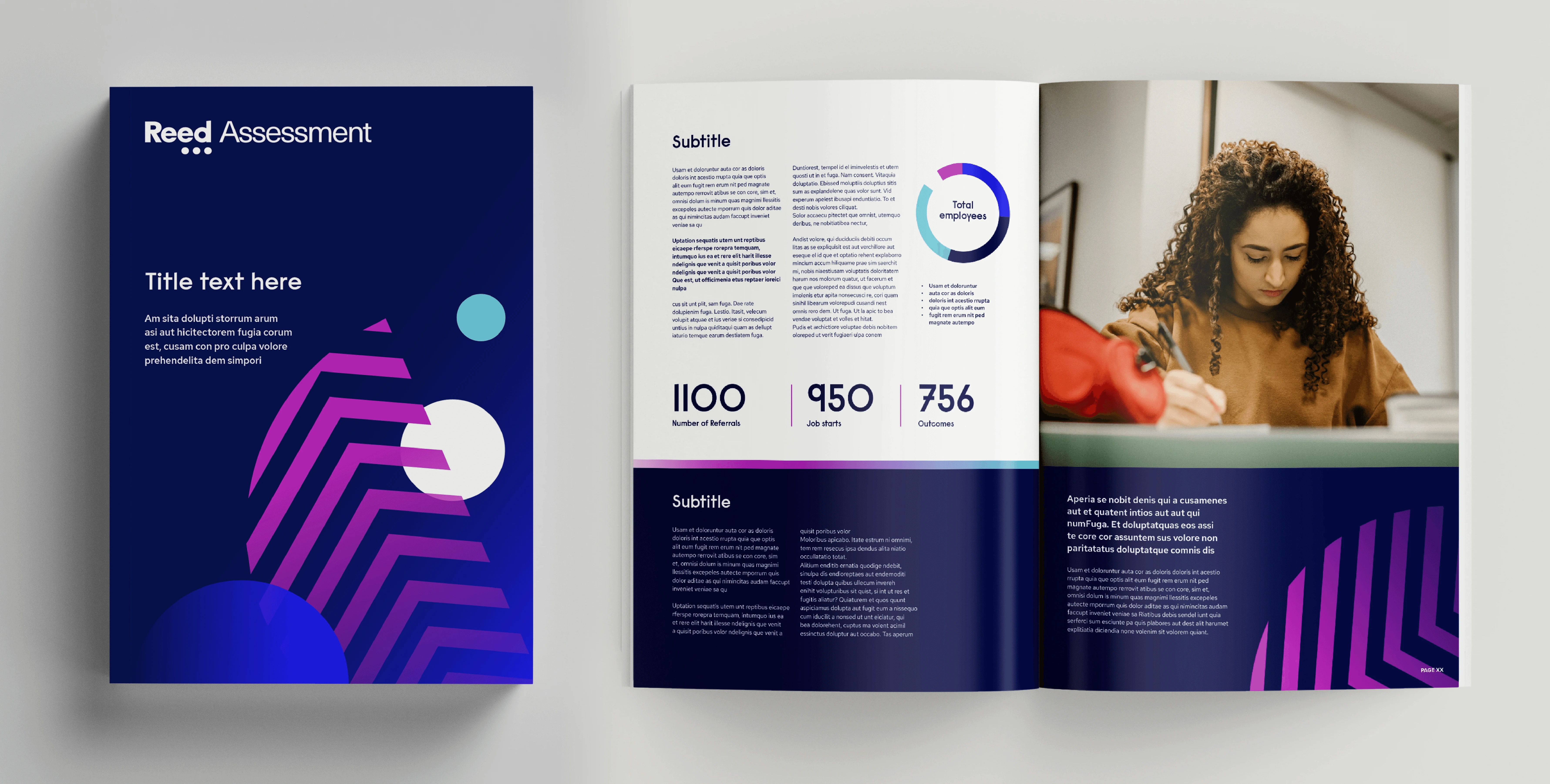
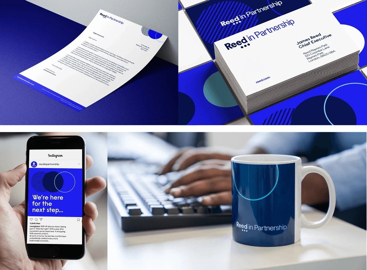
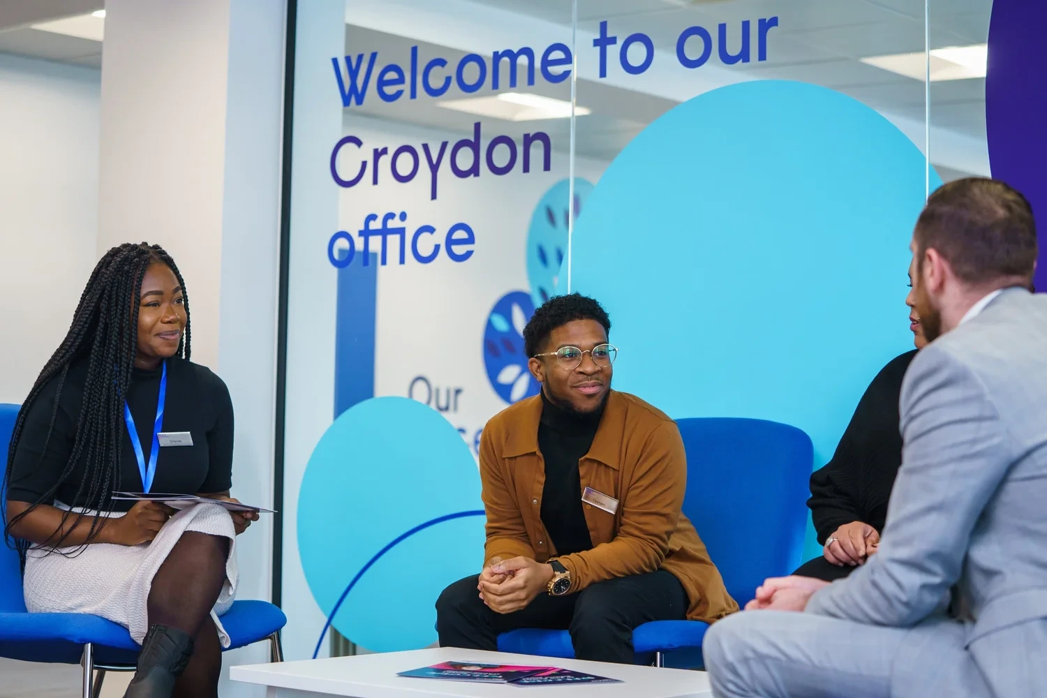
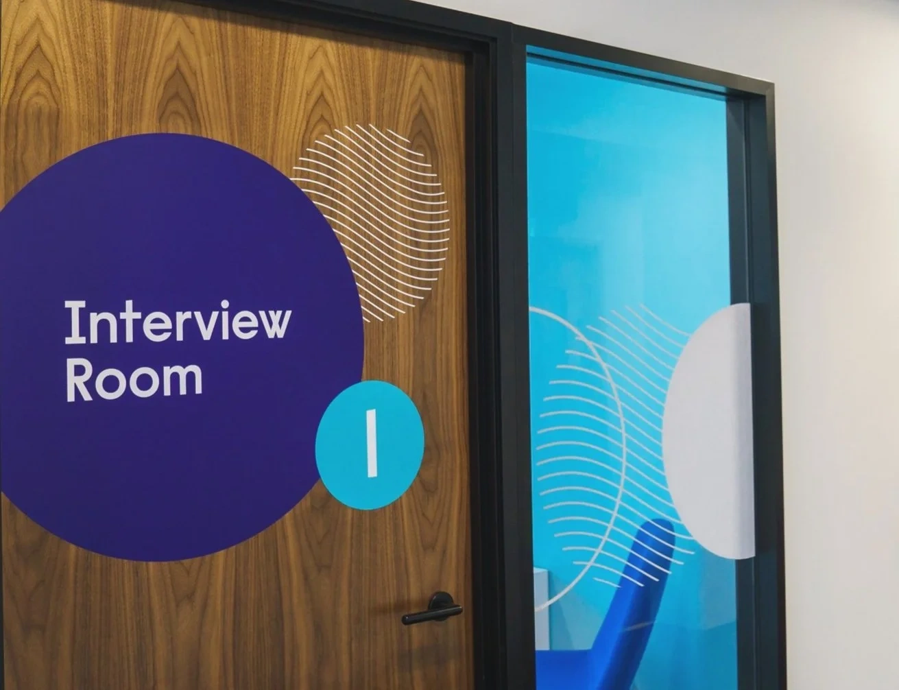
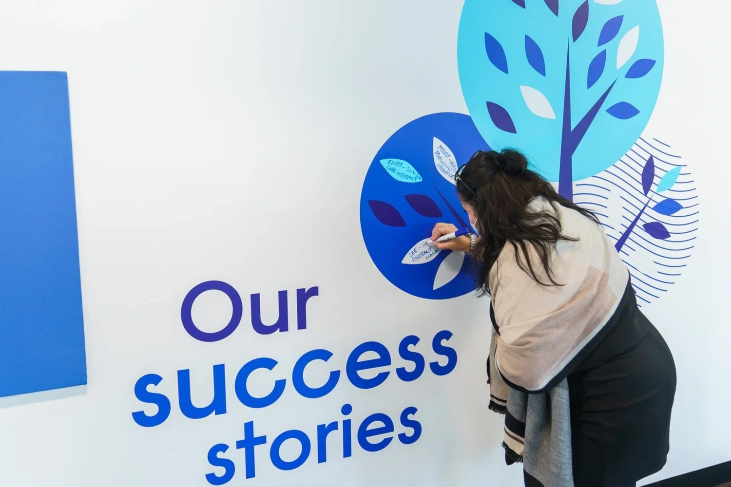
Reed in Partnership provides career services that change people's lives for the better. The new brand was created to reflect tones of positivity, vibrancy, dynamism and optimism. The three dots, symbolising 'what's next…' in a career, were used to create circular graphic devices to identify the brand. Each sub brand used core masterbrand colours plus individual highlights and circular graphic shapes to represent each division.
Brand development image 9
Brand development image 10
Brand development image 11
Brand development image 12
Brand development image 13
Brand development image 14
Brand development image 15
Brand development image 16
Brand development image 17
Brand development image 18
Brand development image 19
Brand development image 20
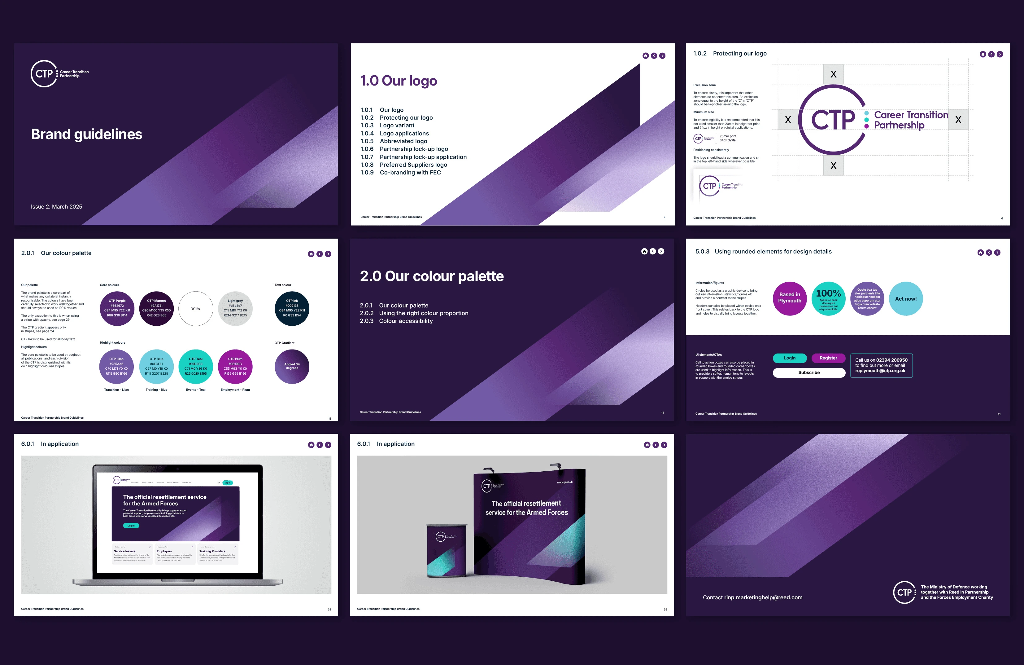
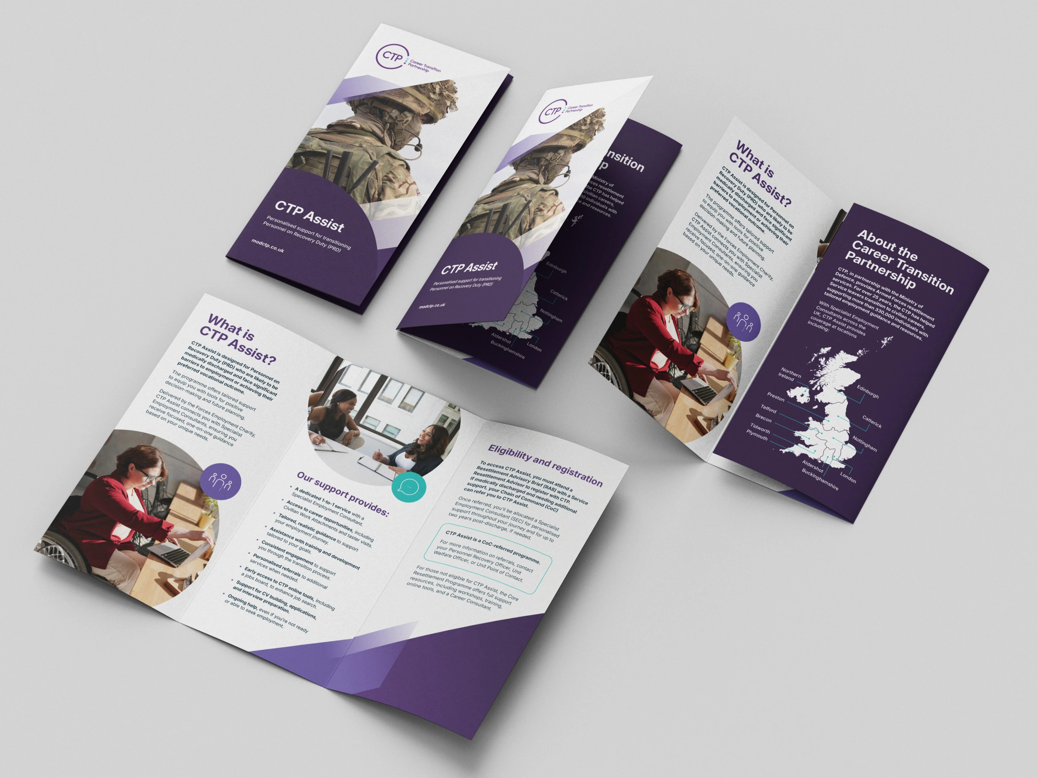
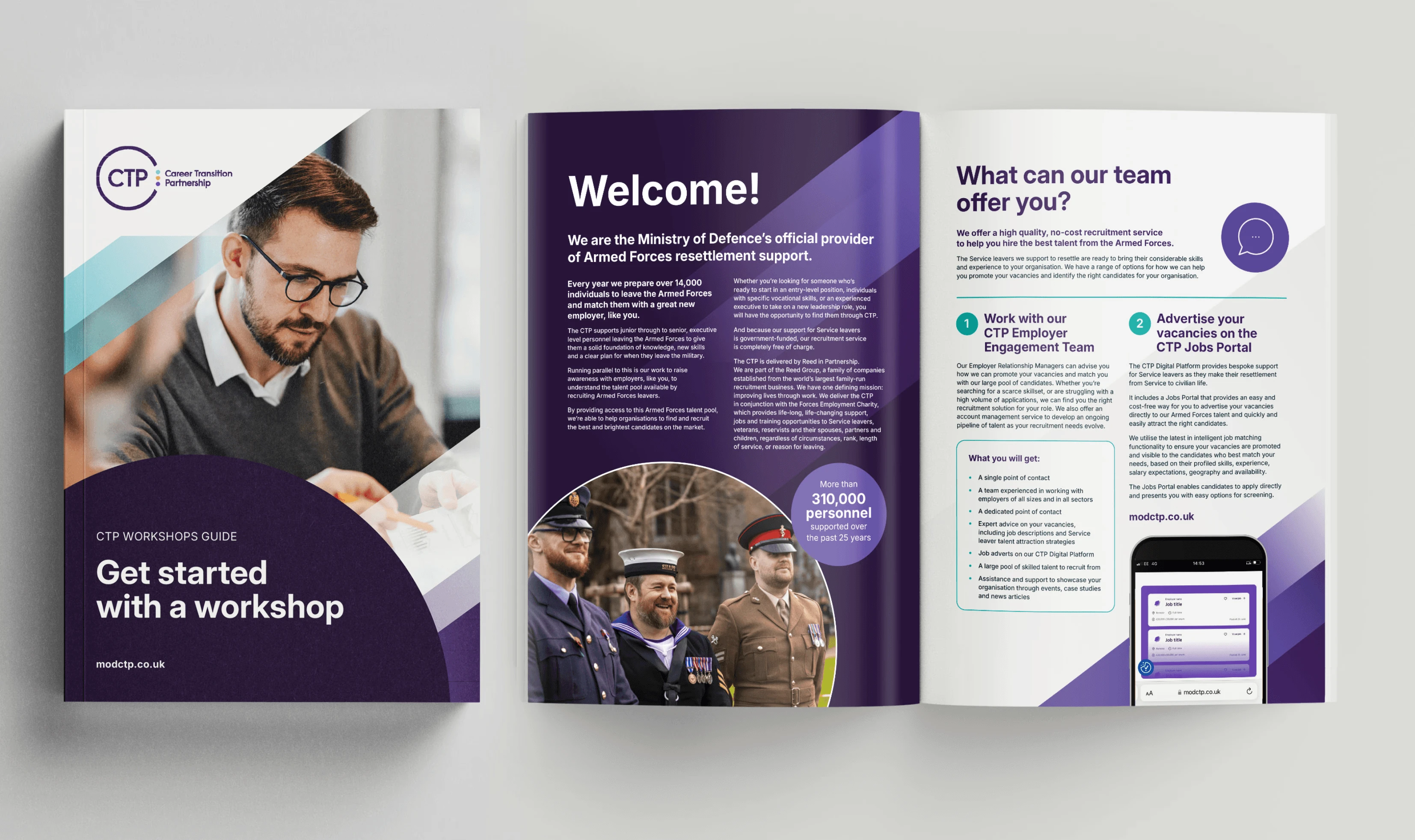
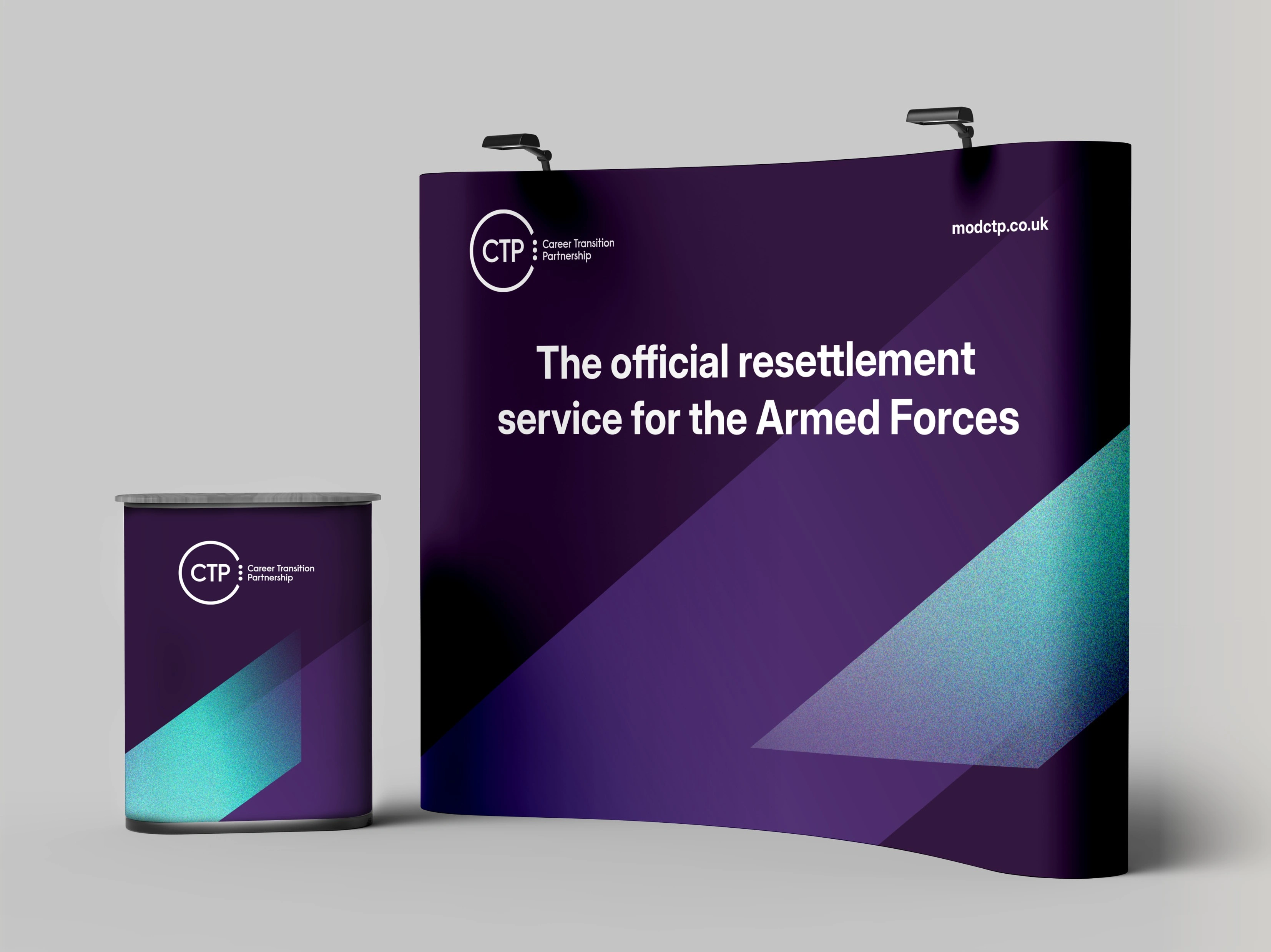
Rebrand
Client: CTP
Deliverables: Brand design & development, guidelines, Exhibition design, assets and templates
The rebrand for the Career Transition Partnership (CTP) updates the identity to better reflect its role in helping Armed Forces personnel move into civilian careers. It simplifies a complex service into a clearer, more accessible experience, making support easier to understand and navigate.

Like this project
Posted Jun 10, 2026
Developed two branding projects for Reed in Partnership and CTP, enhancing their identities and deliverables.
Likes
0
Views
0