Clario AI - Branding Project
Samer Oukour
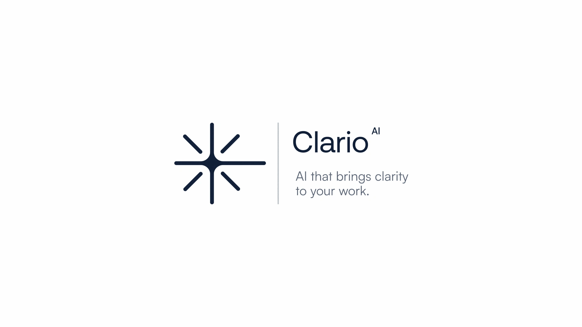
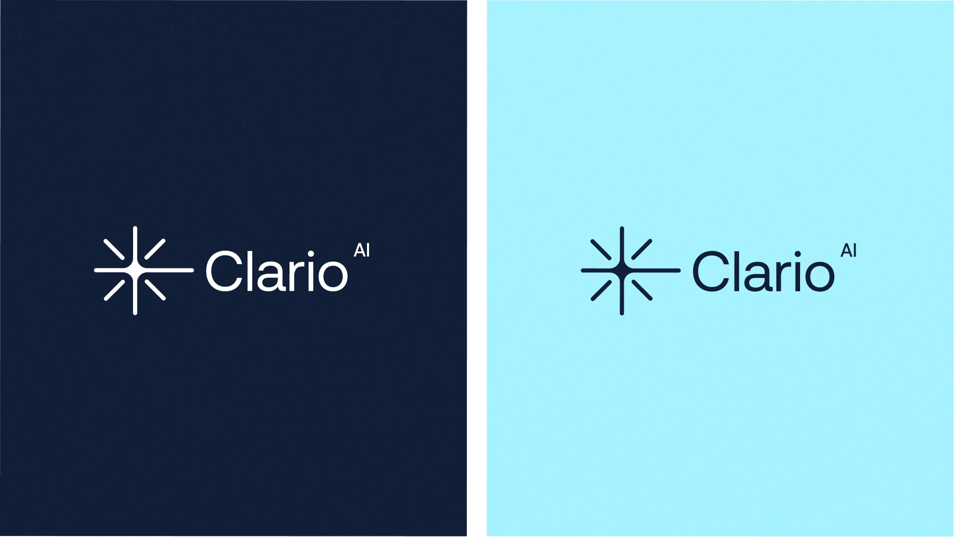
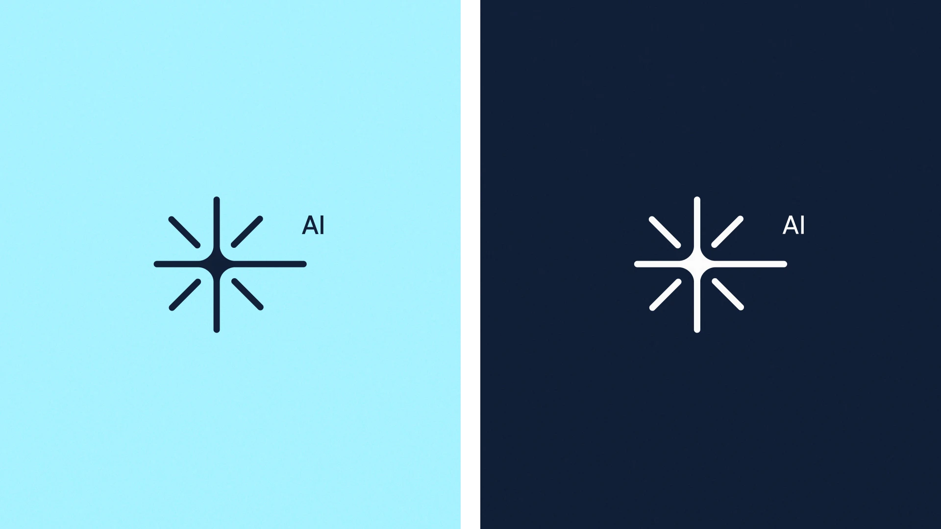
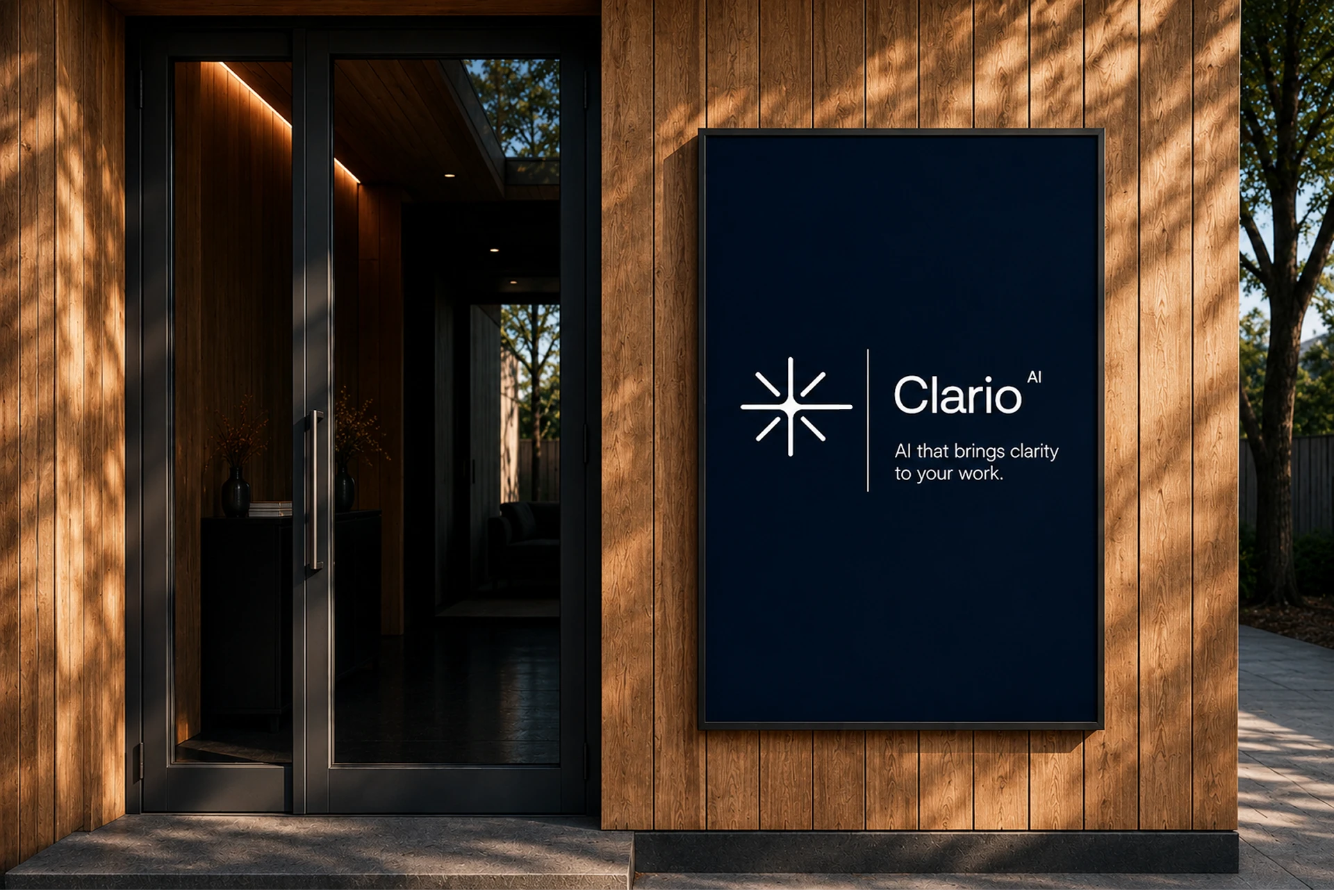
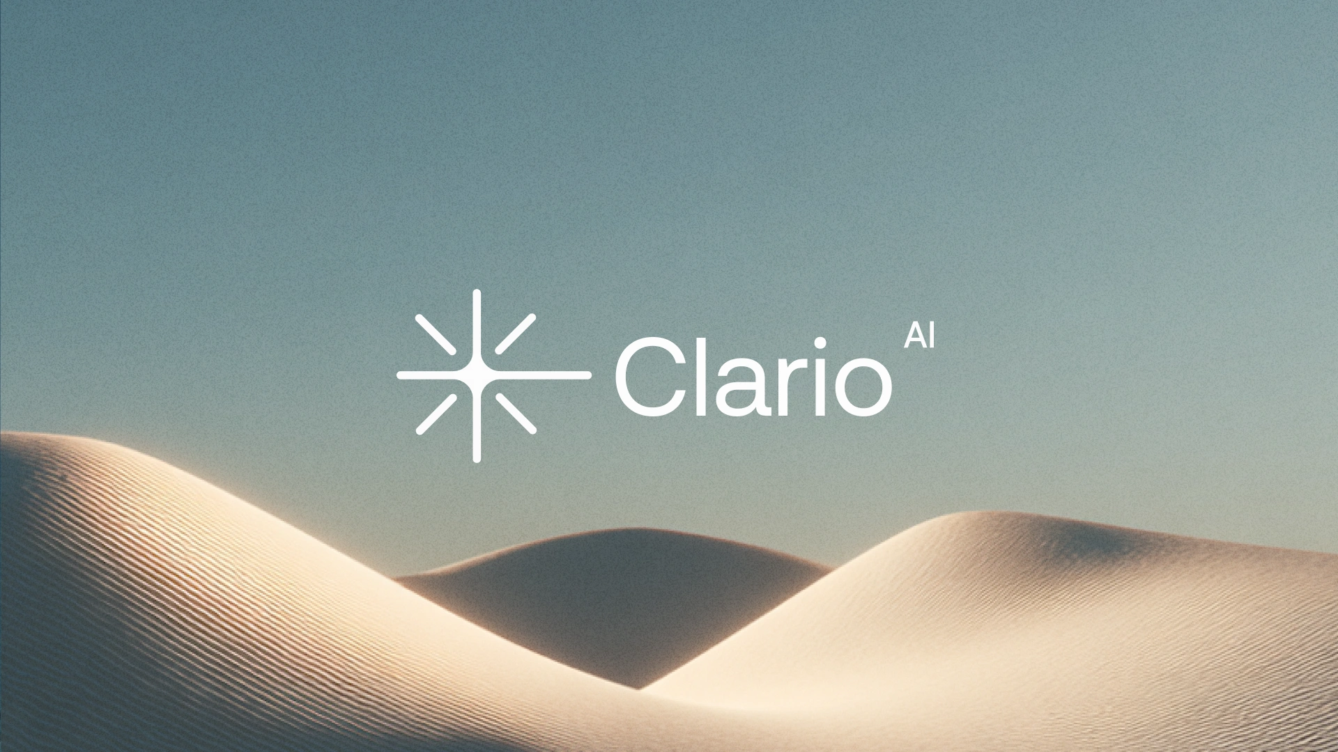
The Clario AI logo was built around one simple idea: bringing clarity into complex information.
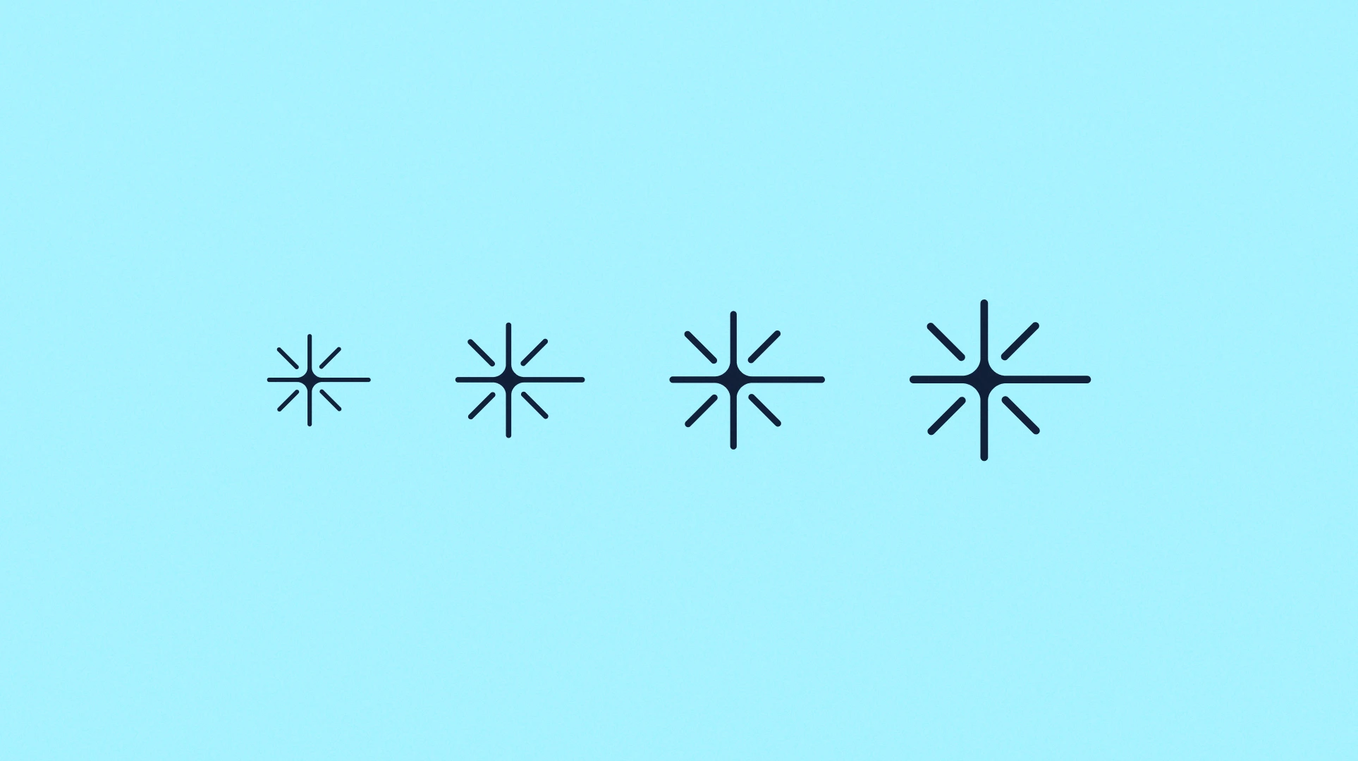
I wanted the symbol to feel clean, focused, and easy to recognize without relying on the typical “AI” look that most brands use today. The shape combines a soft star like form with rounded geometry to represent clarity, direction, insight, and the organized flow of information.
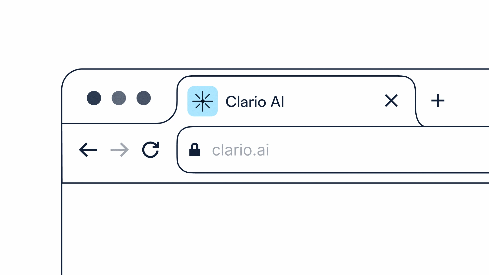
A big goal with this logo was creating something timeless and flexible, a mark that could work naturally across product UI, marketing, posters, and brand environments while still feeling premium and recognizable.
The overall direction was inspired by light, focus points, navigation systems, and the idea of clarity emerging from noise.


Like this project
Posted May 17, 2026
modern AI branding concept focused on clarity, intelligence, and simplicity
Likes
4
Views
17