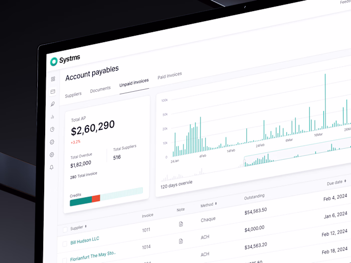
Systms – Dashboard & Experience Design for a Finance Platform
Uxryno Studio

Systms is a powerful and next-generation platform that helps businesses handle their money better whether it's tracking cashflow, automating payments, or getting access to credit.
It was already a well-used product with a strong foundation. But it needed a visual and user experience upgrade to feel more modern, easy to use, and ready to scale. That’s where we came in to help turn a solid product into a smooth, thoughtful experience people enjoy using.
What We Designed
This wasn’t a brand new build, it was a redesign of a well established and working finance product. The challenge was to make it more intuitive without disrupting what users already trusted.
We focused on improving how things looked and worked from the brand style to the dashboard layout so that everything felt more connected and easier to understand.
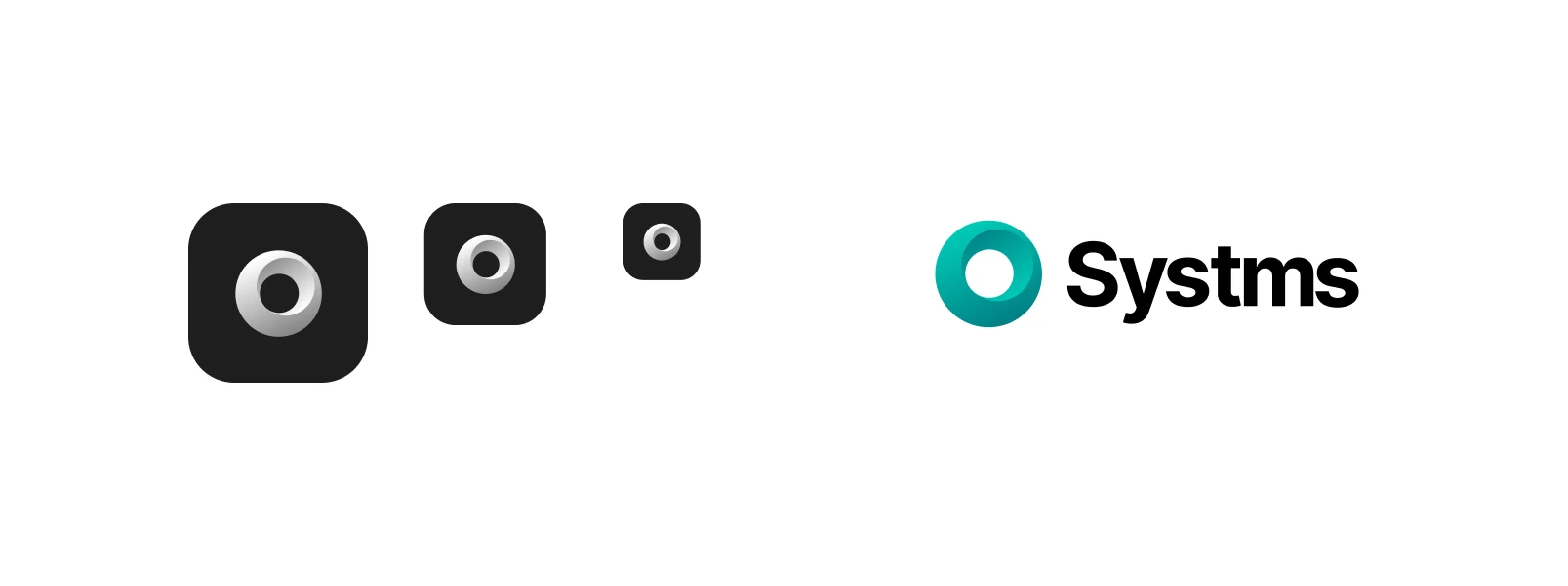
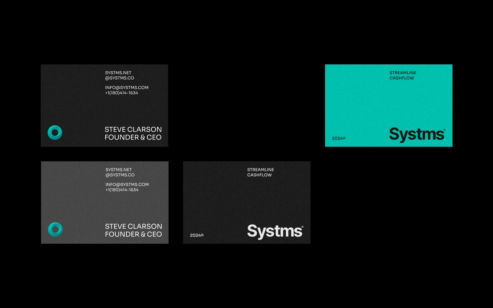
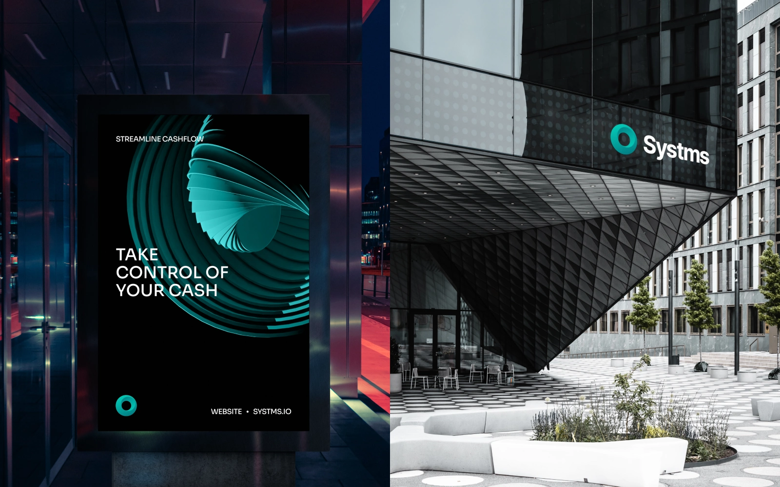
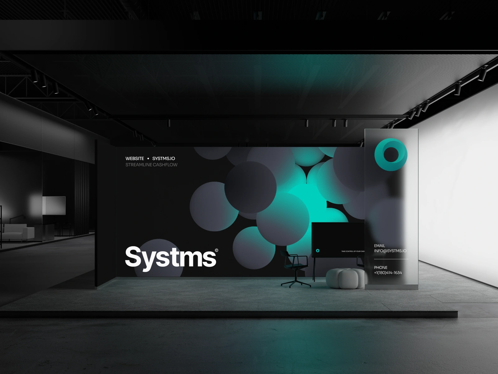
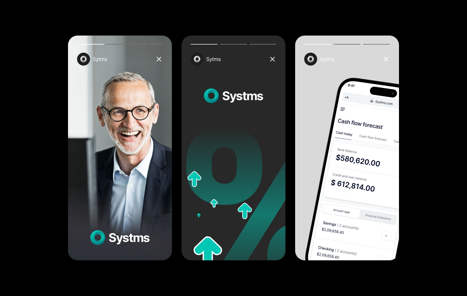
Brand Refresh
We refreshed the look and feel of the brand to make it more professional, friendly, and focused.
Tone of Voice: Clear, calm, and helpful, no buzzwords, just useful information.
Visual Language: Clean layouts with more space, better structure, and less clutter so people can find what they need faster.
We wanted it to feel familiar for existing users, but much easier to navigate and use day-to-day.
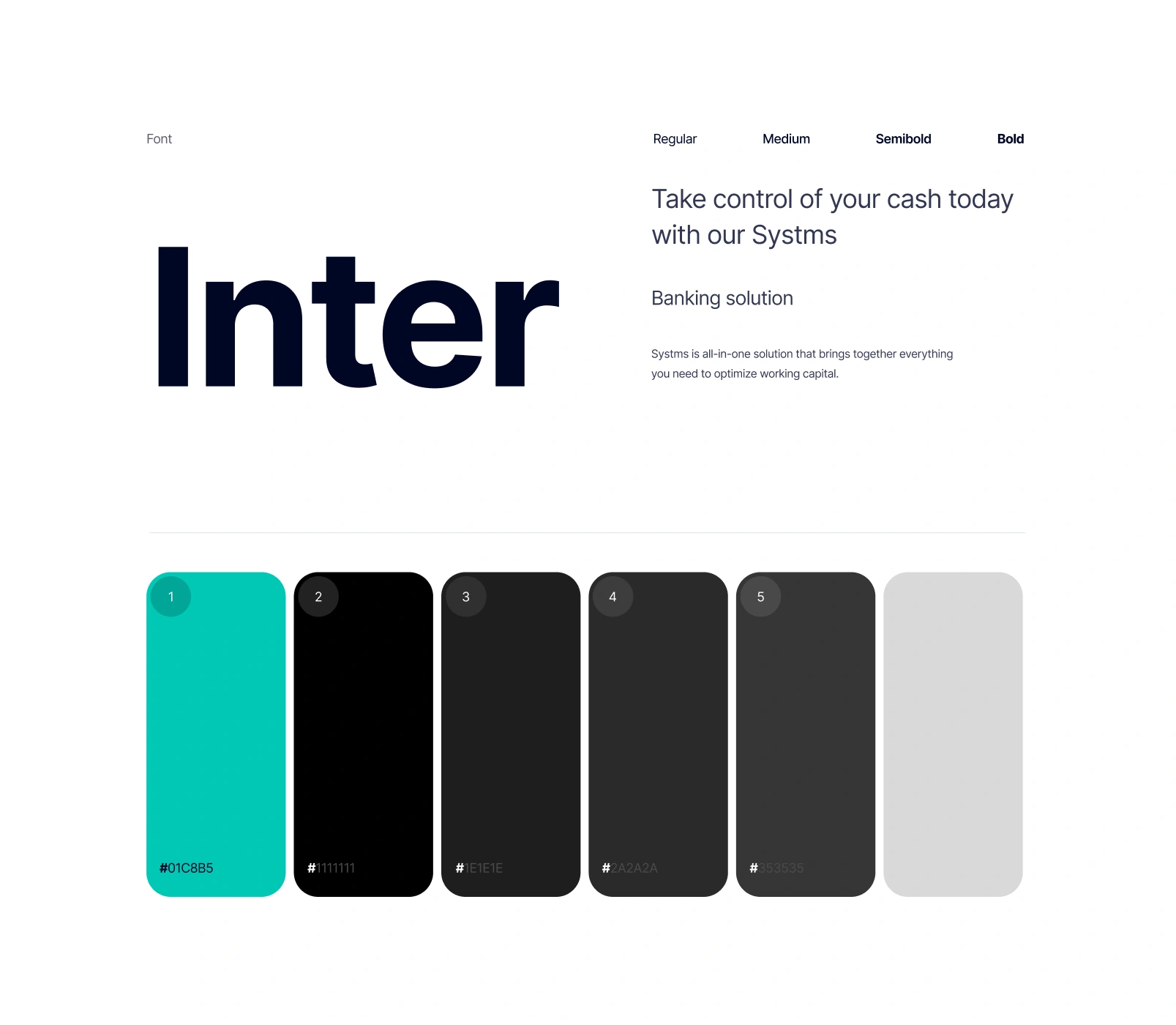
Visual System
We designed a visual system that feels modern, accessible, and aligned with the needs of a data-heavy product.
For typography, we chose Inter, A highly legible, flexible typeface that works well across dense dashboards and smaller UI elements. It helped establish a clear visual hierarchy while keeping the overall interface clean and readable.
The color palette is grounded in neutral grays, supported by a vibrant teal accent used for highlights, actions, and key data points. This combination brings just enough energy to guide users without overwhelming them helping the product feel professional, focused, and easy to navigate.
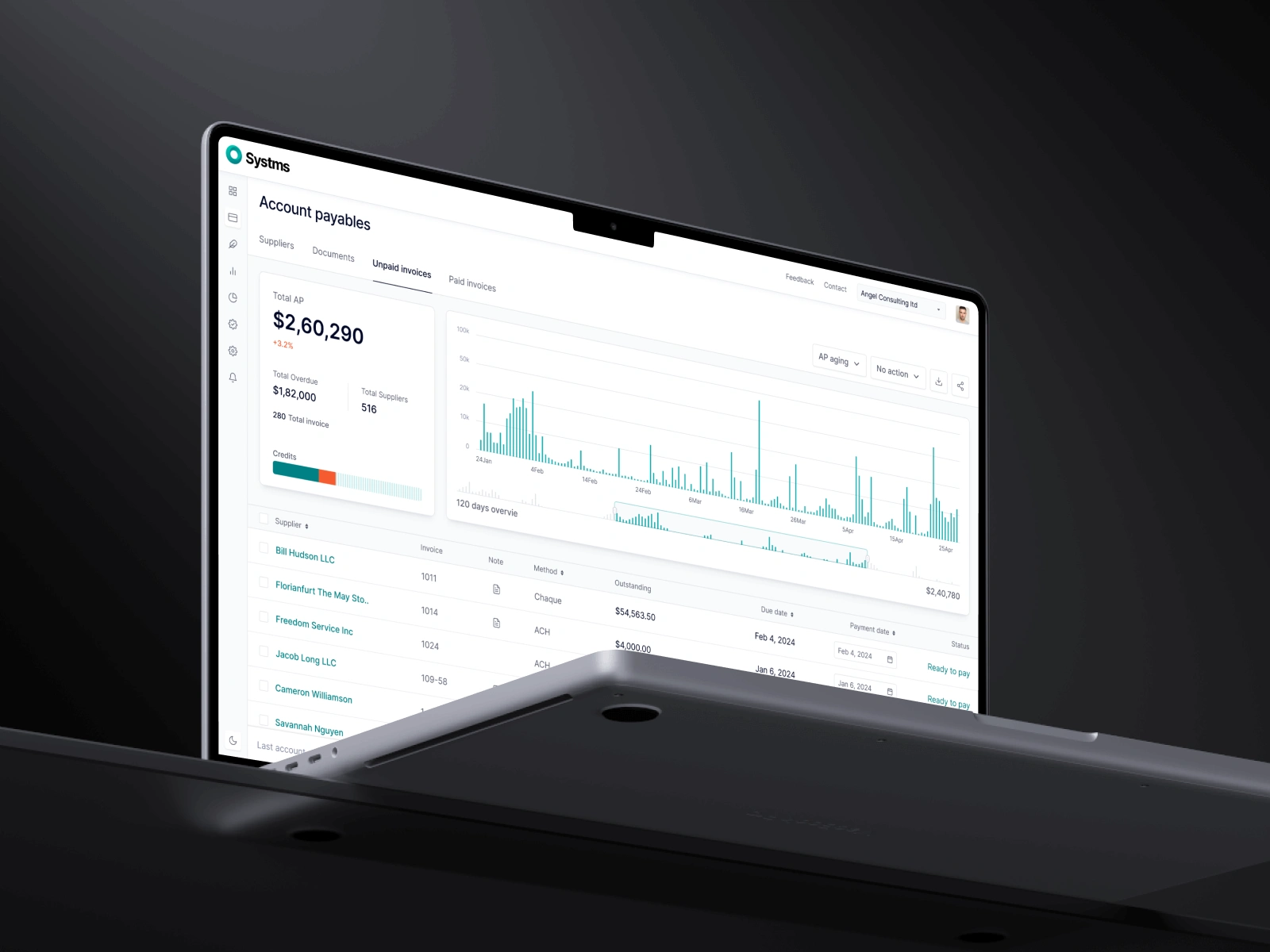
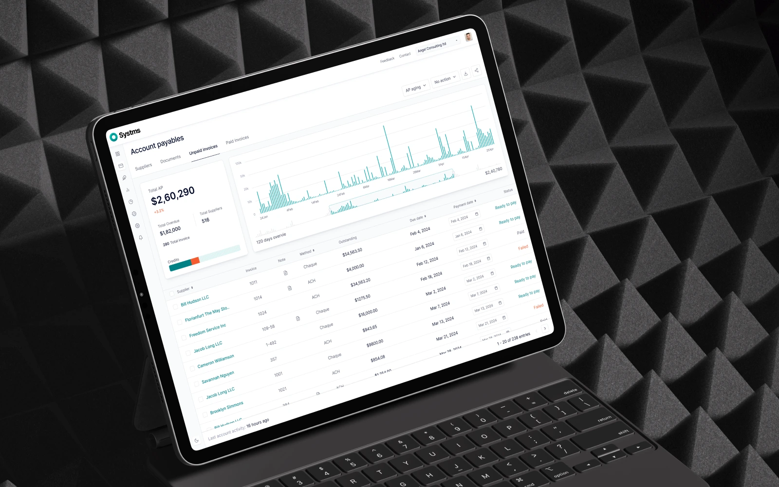
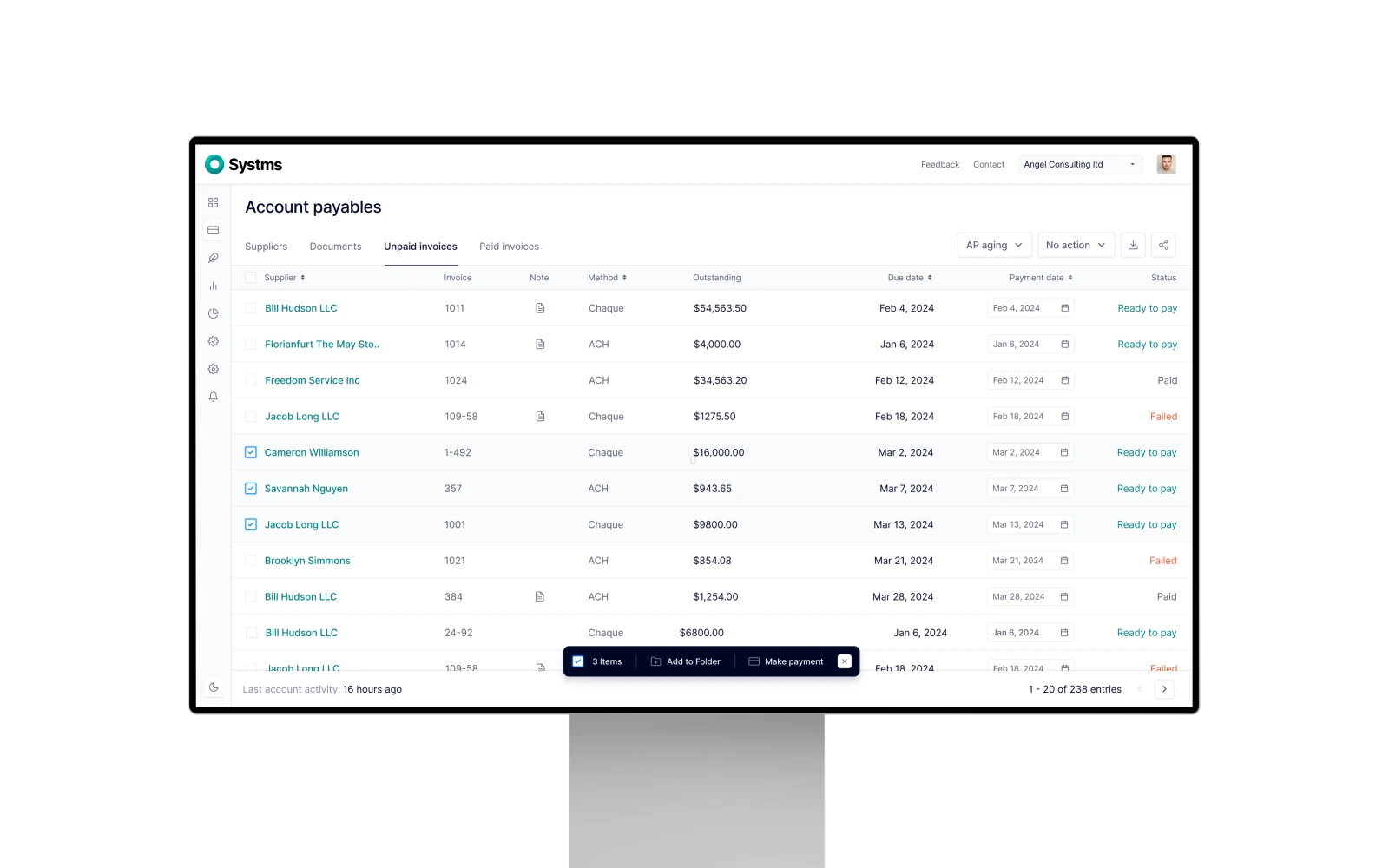
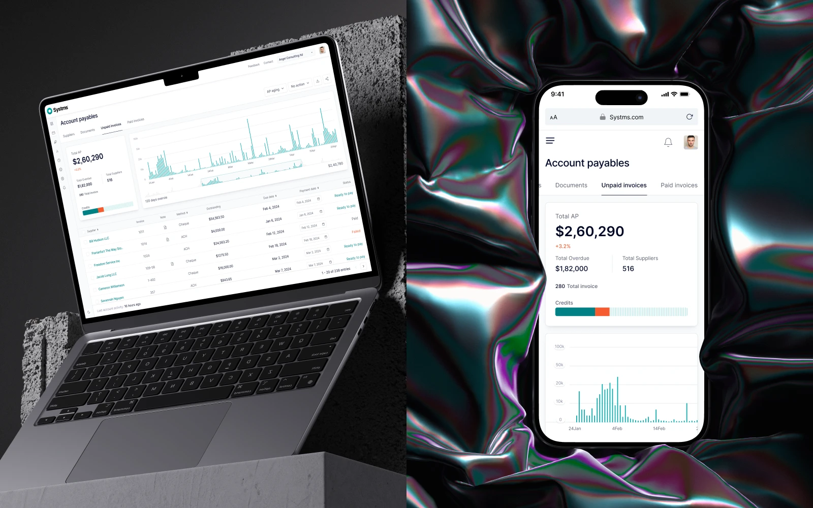
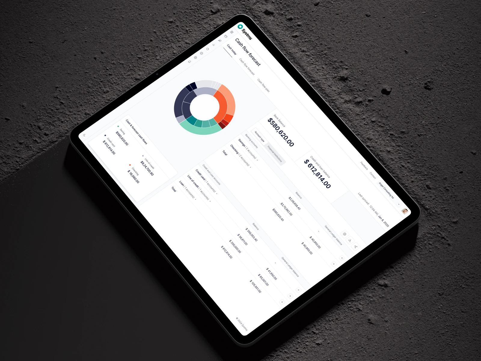
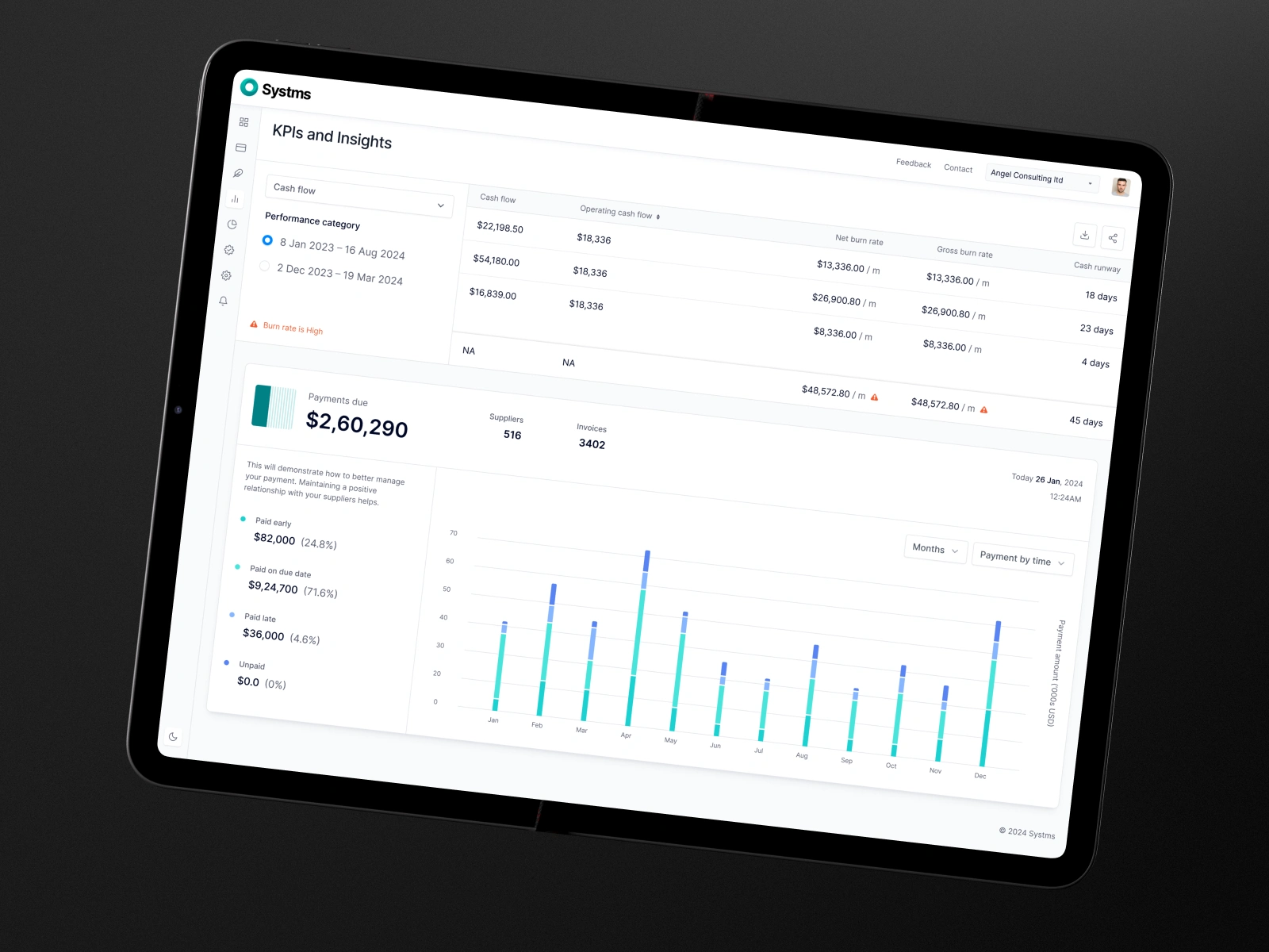
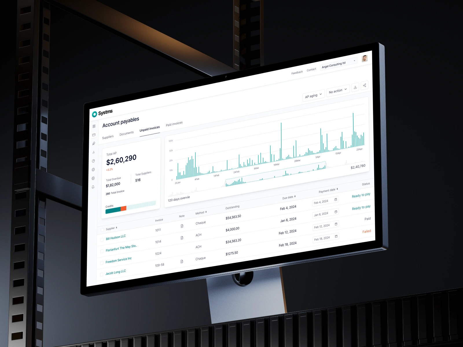
Dashboard & UX Improvements
Our goal was to help users feel more in control of their financial tasks.
We redesigned the experience to:
Show important numbers and KPIs clearly
Use card layouts to organize content
Make tasks like planning, approvals, and forecasting easier
Keep things consistent across tools and integrations
Build reusable design elements so the product can grow easily
The result is a dashboard that’s simpler to use but still powerful under the hood.

Results
Systms now feels modern, organized, and easy to understand while still being as capable as ever. The new design gives the team a solid foundation to grow, and users a better way to manage their finances. It’s a product that feels just as smart as it is and one that’s ready for whatever comes next.

Like this project
Posted Jul 16, 2025
Redesigned Systms for a modern, intuitive user experience.