SaaS solution for internal maintenance management
Introduction
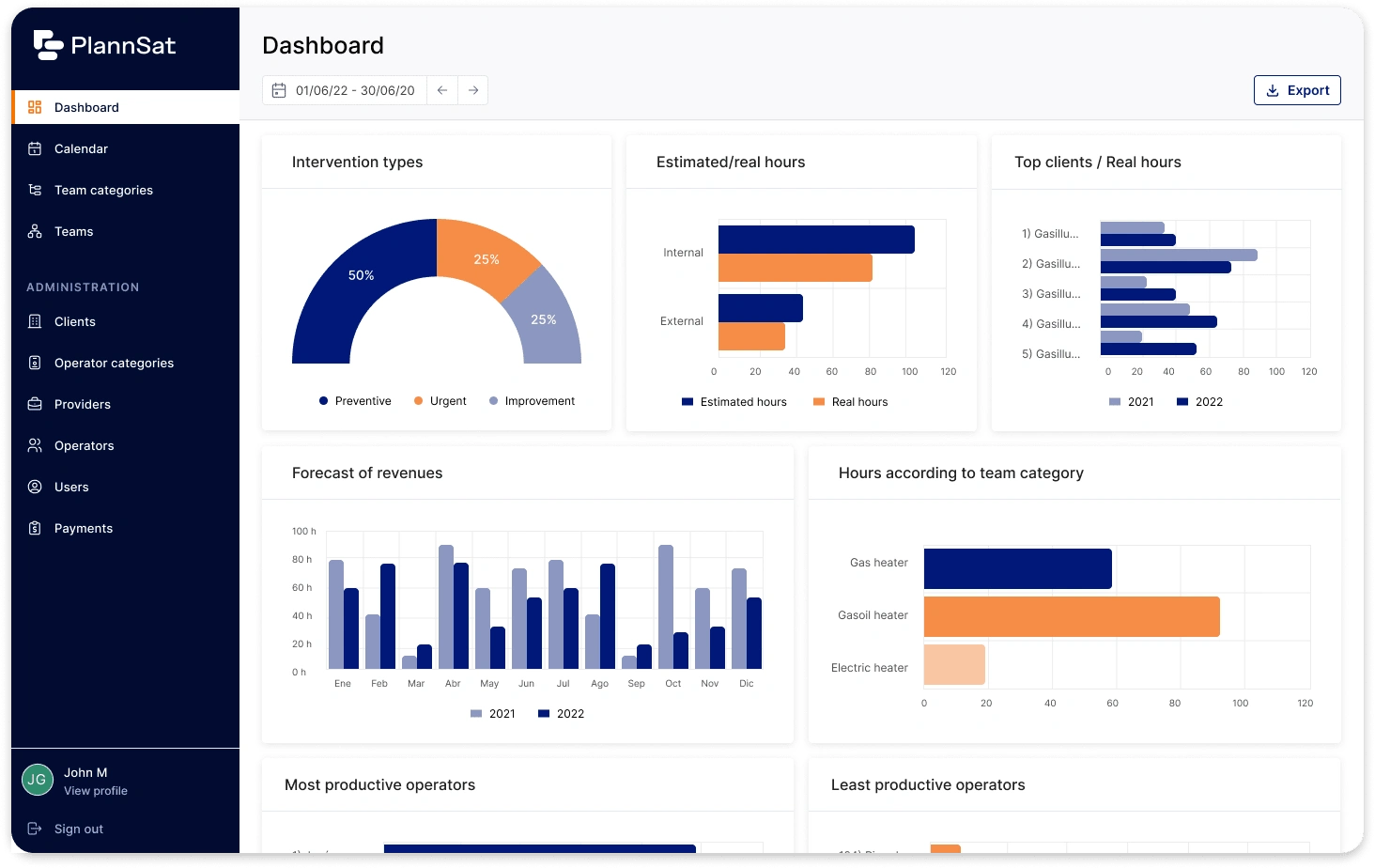
PlannSat wanted to create a new tool to manage maintenance processes.
They had a list of features and some wireframes, but they needed help defining a easy to use experience and professional looking visuals.
Objectives
Redesign the wireframes and flows shared for a easy to use and effective user experience.
Design the visuals based on the created branding for both desktop and tablet.
Create a UI kit for scalability and consistency.
Process

Discovery
Main activities:
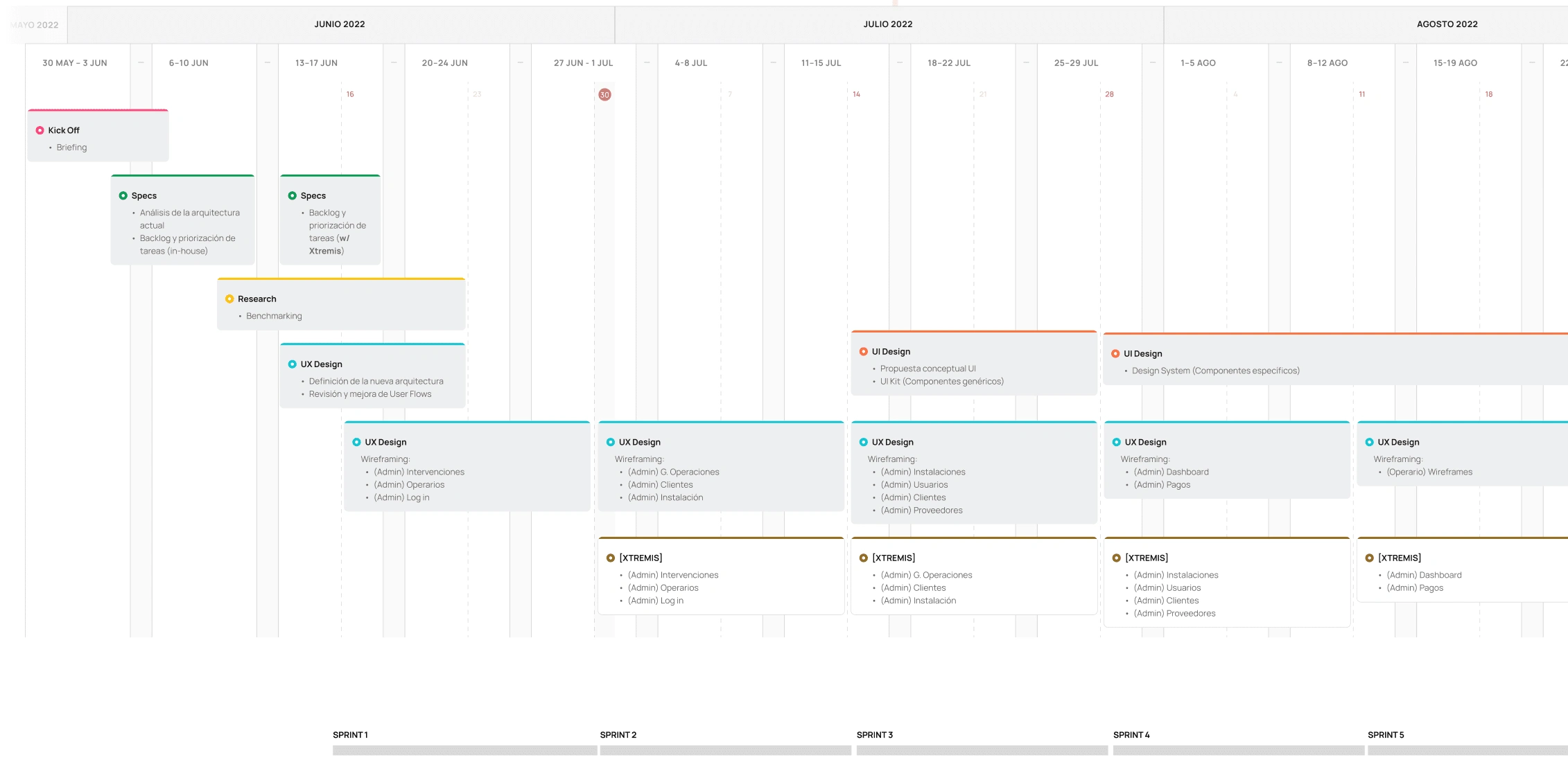
Workshop: 2h session with the client to (1) understand the objectives behind the tool, (2) identify the potential users and their needs and (3) define the requirements and limitations for the development process.
Defining the users: we established two main Personas, focusing on their journeys and use cases related to the tool.
User Story Map: we defined the main features we should include on the tool, based on the previously defined requirements.
Benchmarking: analyzed competitors and main SaaS tool references to identify opportunities and inspire our design.

Conceptualization
Main activités:
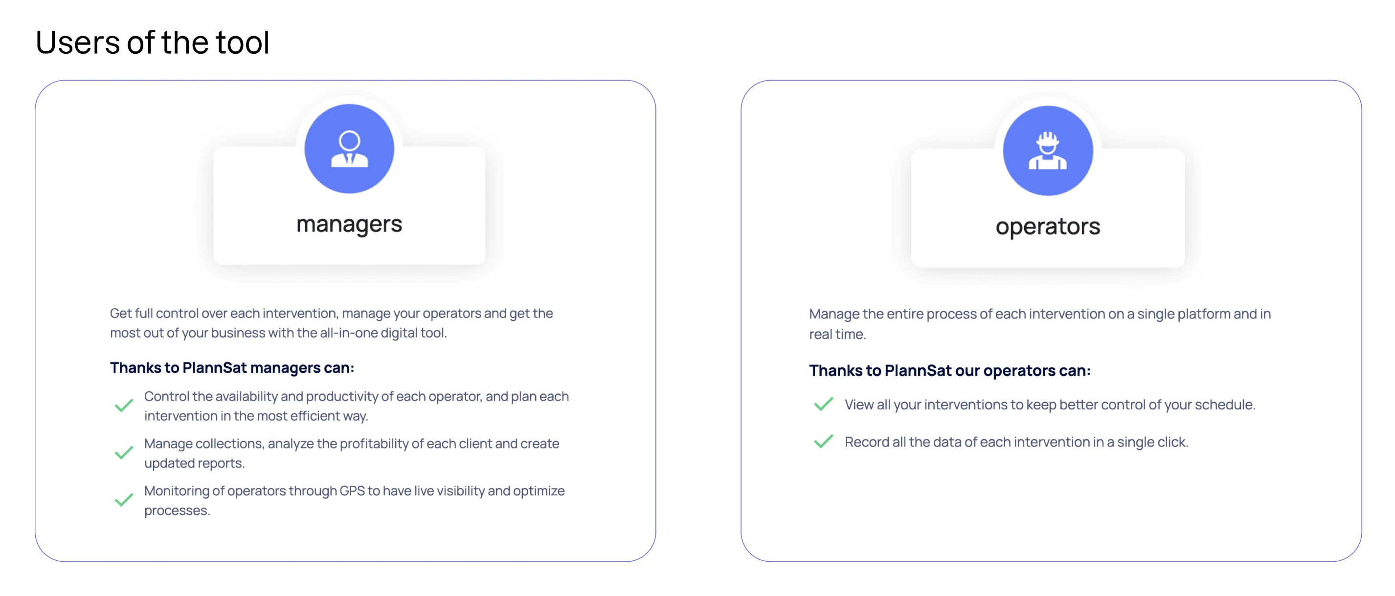
Userflows + low fidelity wireframes: The client shared some wireframes of the main features they wanted to add to the product. We analyzed them, add some changes and create user flows to visually represent the whole experience of the users.
High fidelity wireframes: once the whole flow was validated, we created some high fidelity wireframes. Before investing time on the UI process, we iterated these wireframes with the client and development team to make sure we were all on the same page.


UI Design
Main activities:
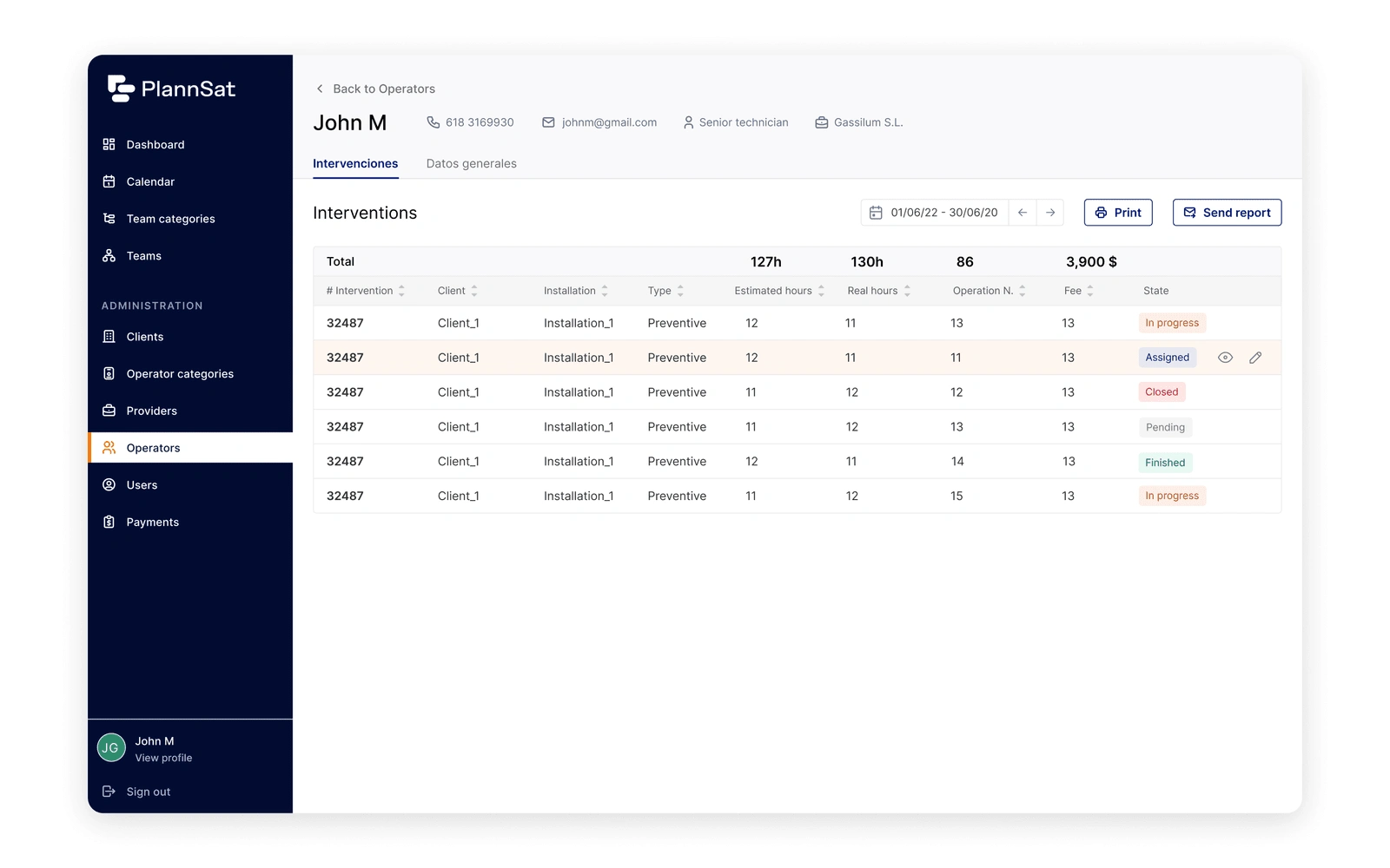
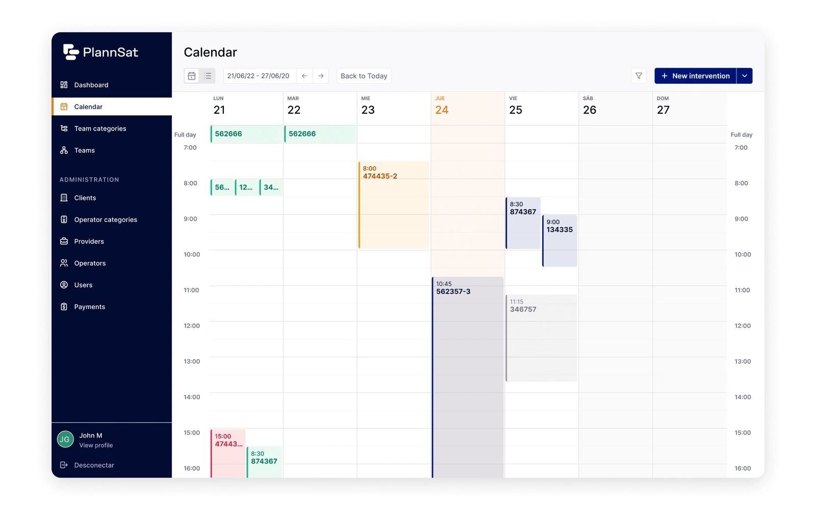
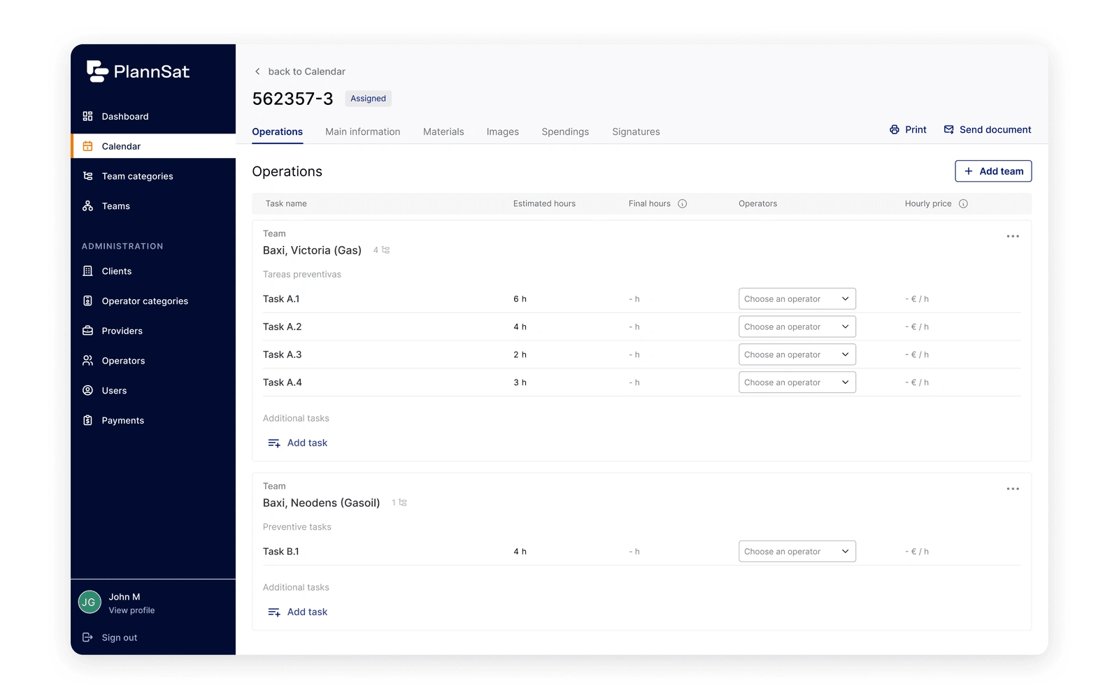
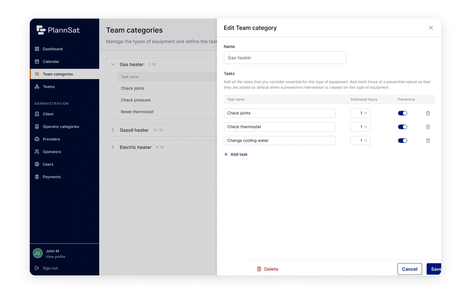
UI Concept: Based on the new branding they shared with us, we defined a UI concept to validate our approach before starting to work on each of the pages.
Design of all the pages: we designed the whole tool both for desktop and tablet versions.
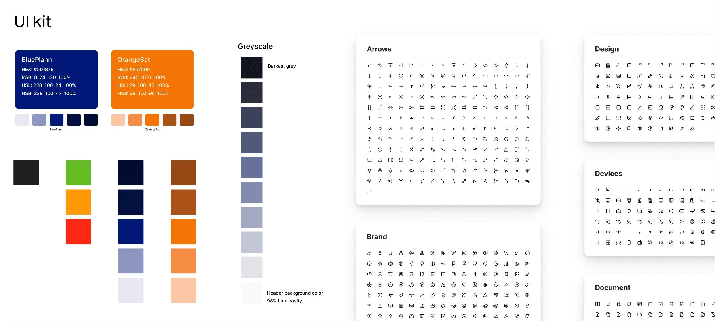
UI Kit: to ensure consistency both throughout our process and in future designs, we established a UI library with the foundations (typography, colors, use of logos, icons, etc.)

Development
Main activities:
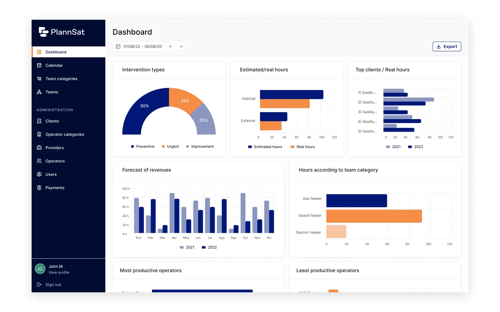
Support through the development process: to ensure the correct application of the design and help with questions, we had an open and continuous communication via slack with the front-end team.
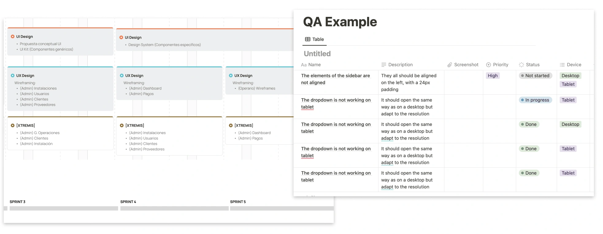
QA: we evaluated the quality of the development page by page and created several Notion tables listing bugs and improvement sorted by priority.
Landing page to market their tool
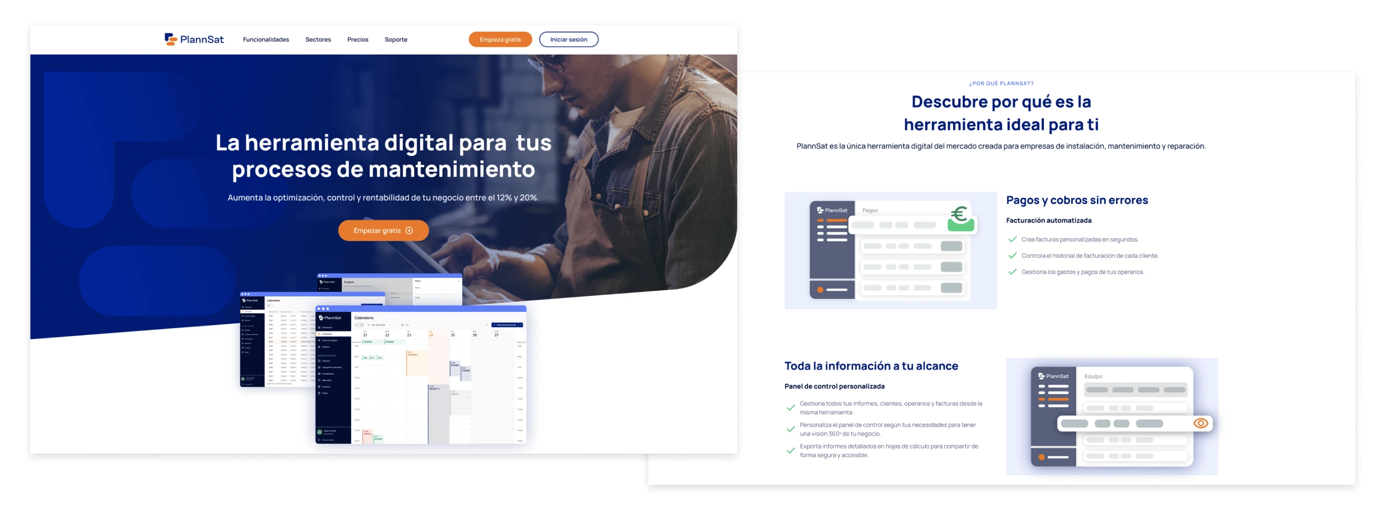
I also created a new landing page using a no-code tool.
Like this project
Posted Oct 18, 2024
Designed a new SaaS tool for operators and managers to manage their internal maintenance processes. I led the entire process from user research to development.
Likes
0
Views
8

