Apicure Balm - packaging and rebrading
Dimitris Klagkos
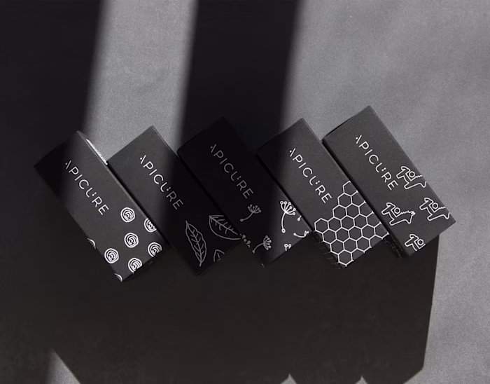
Apicure Balm
Packaging design
Apicure is a family run business from the north of Greece, that produces soaps and cosmetics (and other similar products) with natural ingredients - most important of which, is honey.
Their main line of products was a series of ointments based on honey. Despite being very good, they suffered from the bad reputation that similar products have, in Greece.
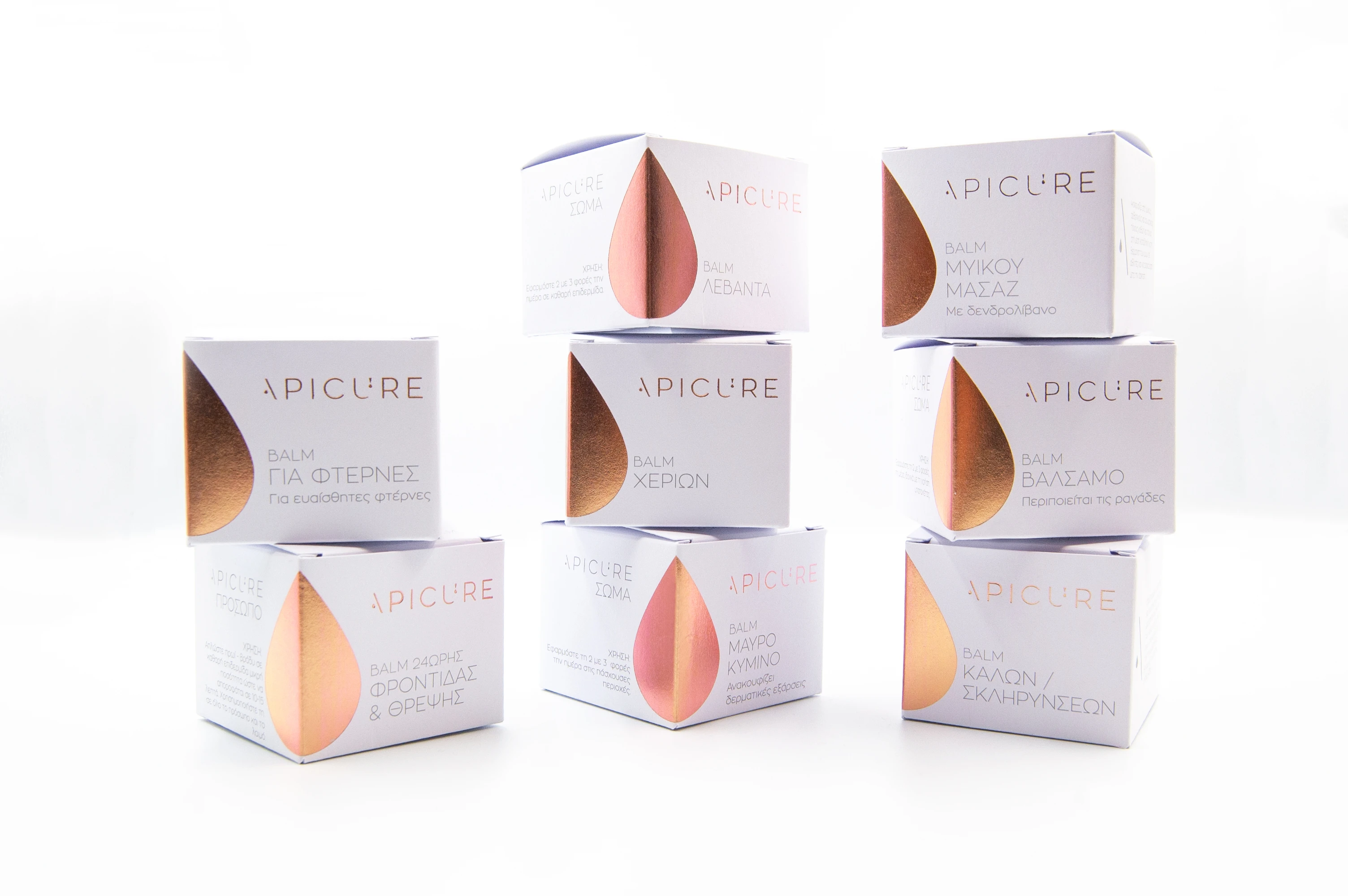
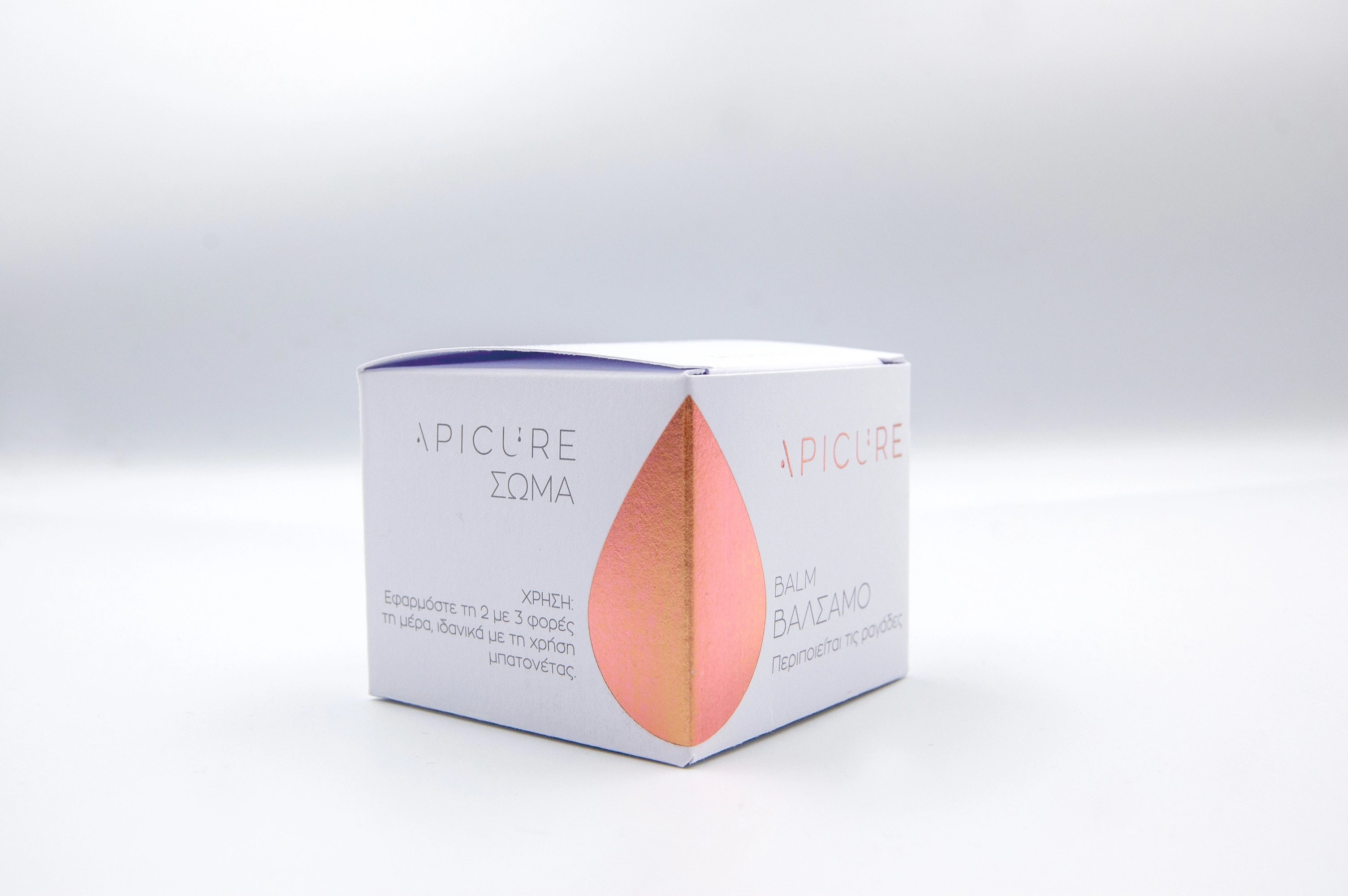
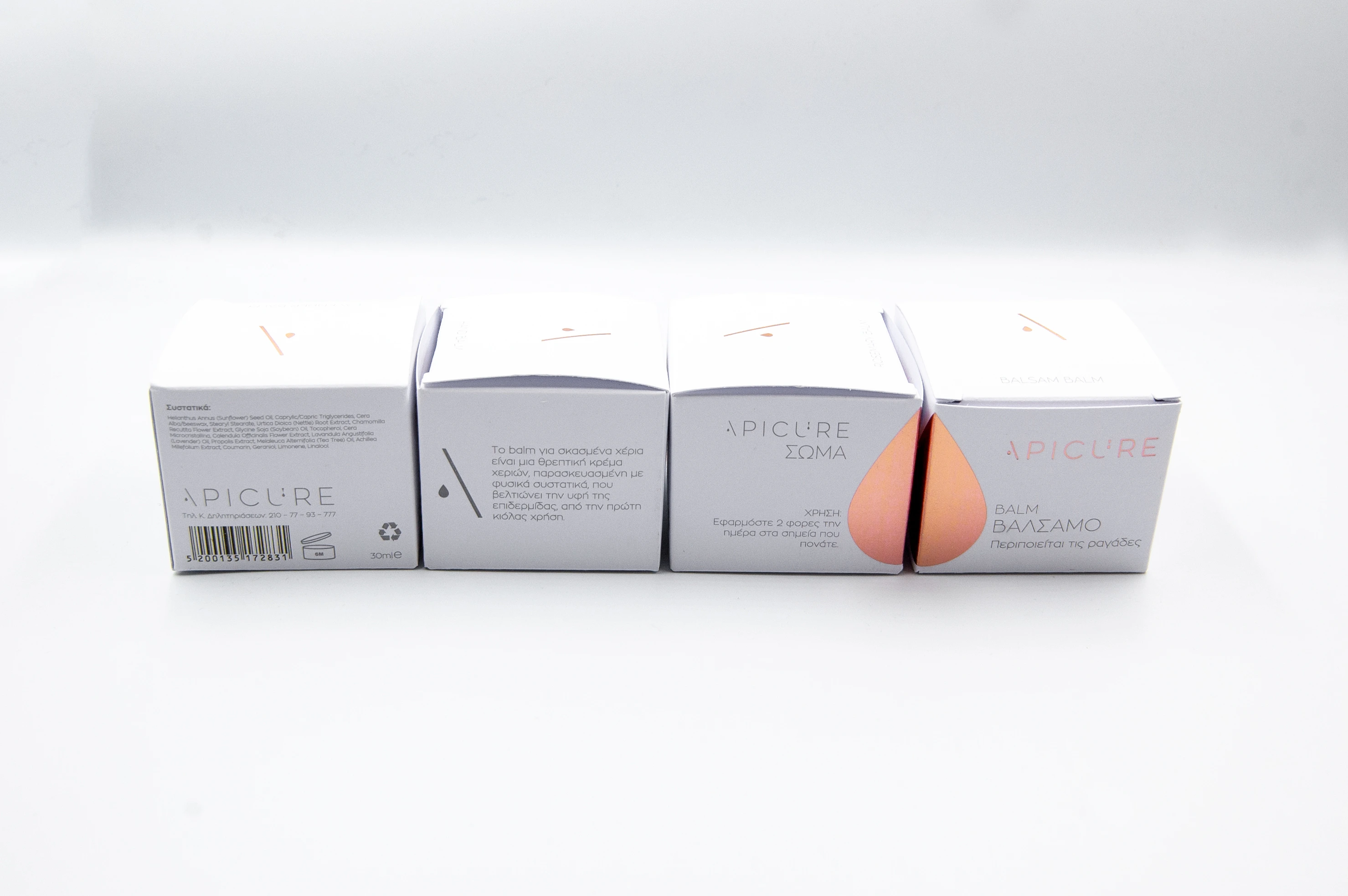
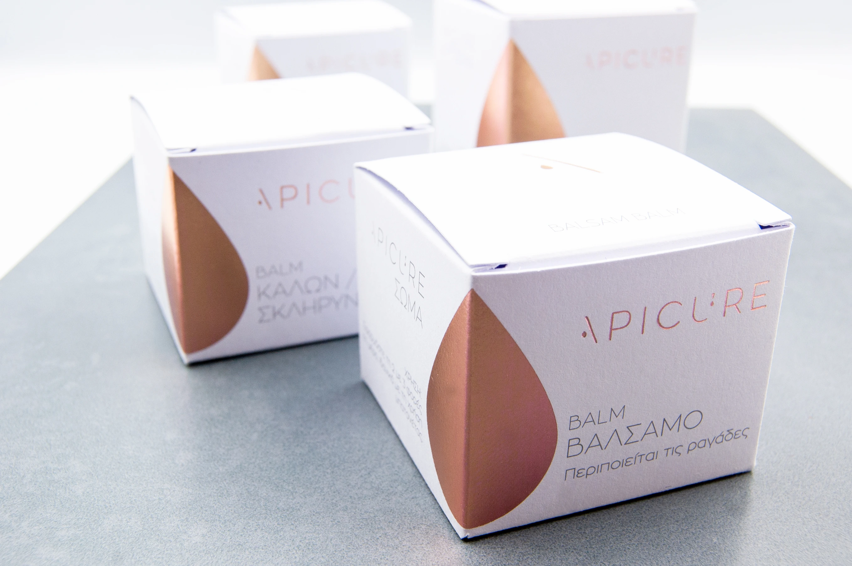
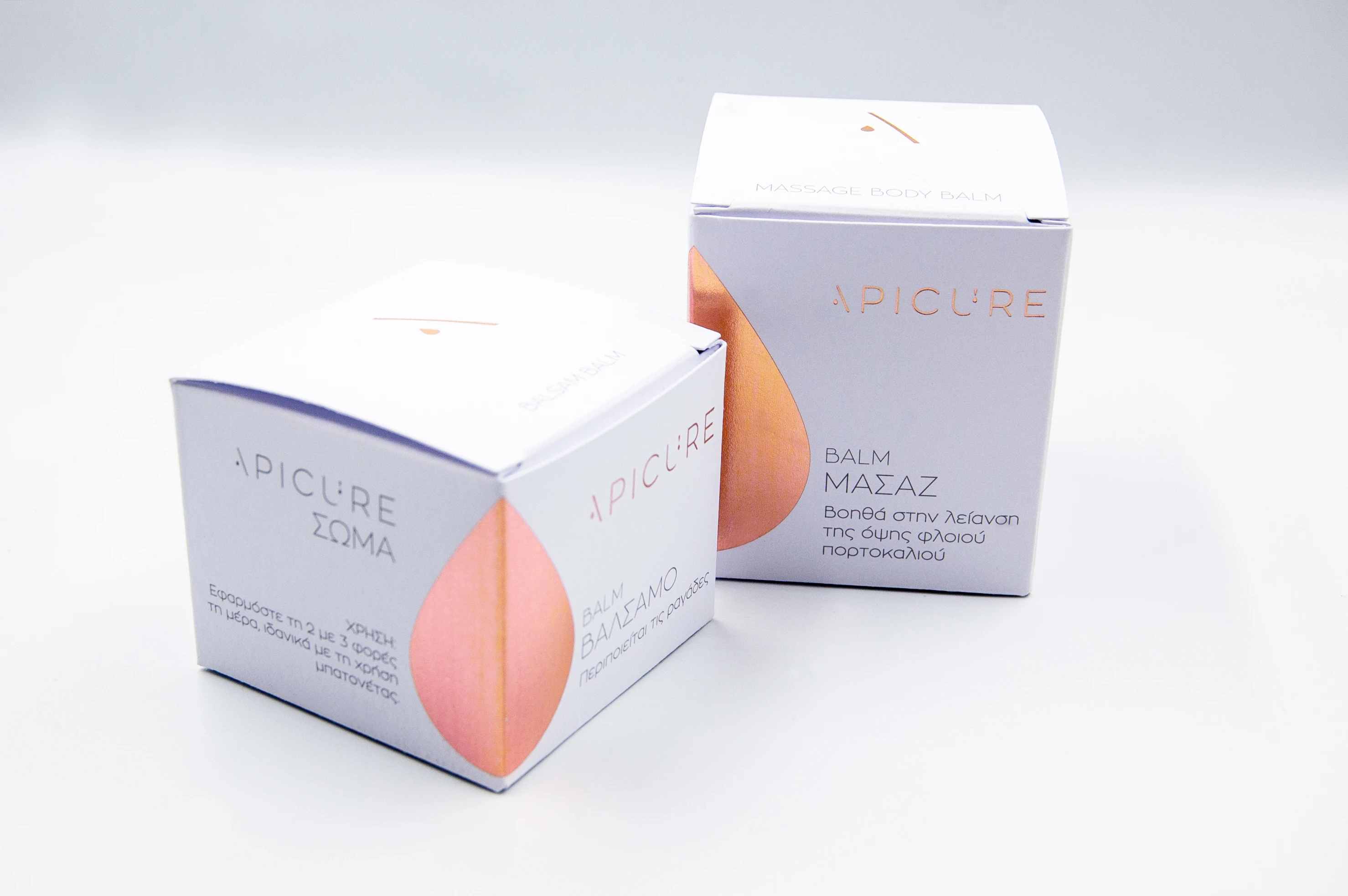
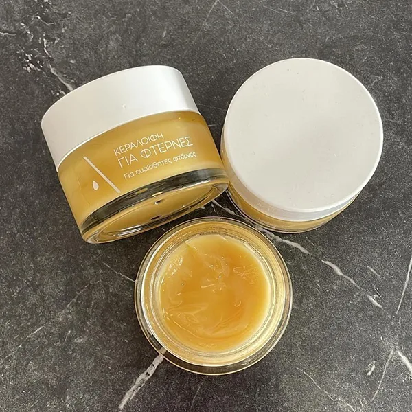
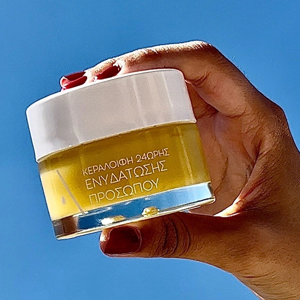
During the re-branding of the company, we completely redesigned the packaging. We wanted to show that the it's a premium but affordable product. It's not just an ointment but part of a series of a cosmetics line. The line itself was renamed to "Apicure Balm".
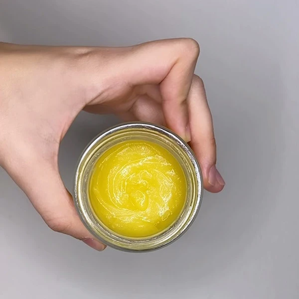
We changed the main colour of the packaging from kraft, to white, with foil details in order to level up the product. We also chose to use gold foil for the main decoration and specific details (the logo) and also the jar changed from black to transparent with white text. It created a lighter and brighter feel, more suitable for the product.

Like this project
Posted Jul 22, 2025
Apicure managed to "upgrade" their balm products to a premium level and crate a new identity for the whole product line.