There's a design principle I
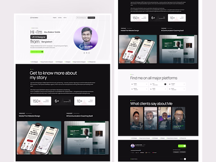
Abu Bookor Siddik
There's a design principle I keep coming back to when working on wellness products: the design should be the first dose of calm.
Not the meditation. Not the copy. The colors, the space, the illustrations — before a user reads anything, those are already doing something to them. Or they should be.
That's the idea behind this Headspace onboarding redesign. Three screens, three moments inside someone's first minute with the app.
Screen 1 — Create an Account
Signup flows usually feel like admin. This one needed to feel safe. A gentle floating 3D illustration, clean social login options, a lot of room. The goal was: no pressure, no friction, just a sense that they're in the right place.
Screen 2 — Research-based meditation
The first content slide makes the product promise concrete: "Just 10 days of Headspace can increase happiness by 16%." Surrounded by sleepy, closed-eye characters. The visual does the softening before the stat lands.
Screen 3 — Mindfulness all the time
Crystals, a pagoda, a dove, some botanical elements. A meditative world that builds on the previous screens. Same dark pill CTA throughout — "Let's keep going →" — which is about as low-pressure as a button can get.
Like this project
Posted Jun 3, 2026
There's a design principle I keep coming back to when working on wellness products: the design should be the first dose of calm. Not the meditation. Not the ...
Likes
0
Views
2