Rachel the SLP
A SLP with a heart for providing educational companions for the highest level of therapy.
Rachel’s goal is to provide quality materials to other SLP’s allowing them to pivot lessons at any time to provide the best therapy. The tools she provides allows for no-prep lessons, quick lesson ideas, and useful games and materials to enhance any SLP’s database.

Engage, involve, and make it fun
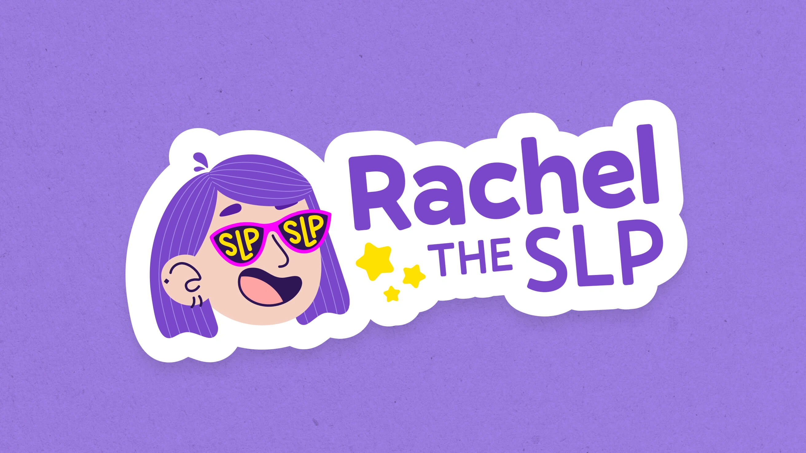
Looking at the demographic of Rachel’s target user – low-performing children with learning disabilities – we needed to create a system that is engaging and fun, but also easy to read for all user levels. The logo was approached with a fun, illustrated personal brand, and all supporting materials include bright colors, a simple geometric font, and lots of fun illustrations.
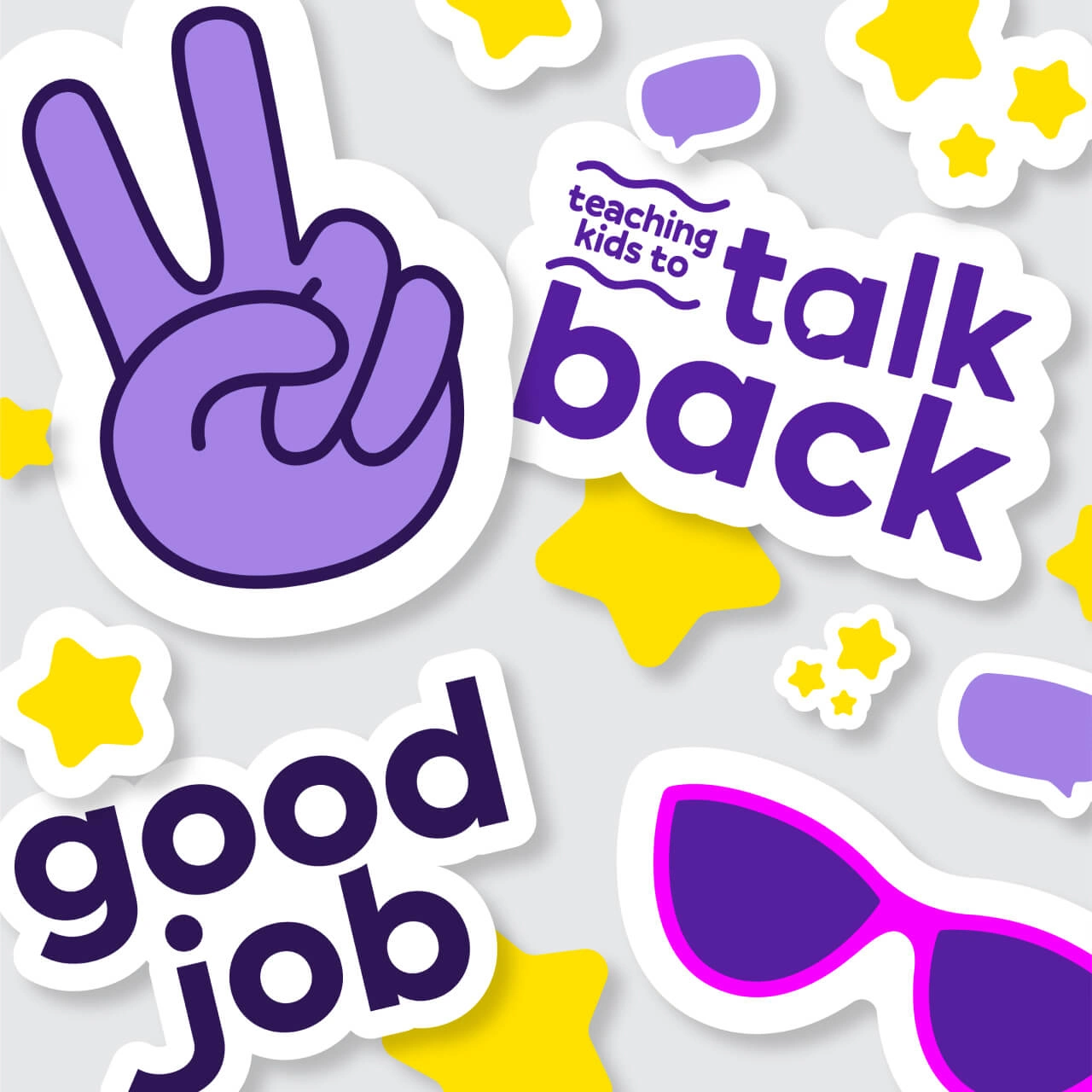
With a visual brand that outperforms the competition and supporting collateral that are useful, fun and engaging, Rachel the SLP is starting her journey with a huge head start in the market. She continues to create tools that help SLPs focus on what’s important: therapy.
Deliverables
Logo Family
Print Collateral
Visual Identity
Like this project
Posted Jul 10, 2024
We created a strong visual brand identity for a Speech Language Pathologist to help her reach her target audience.
Likes
0
Views
0


